
The best highlighter colors for color-coding study notes are those that establish a clear visual hierarchy, balancing high-visibility warm tones with cooler, muted shades. Rather than using colors randomly, an effective system assigns specific cognitive tasks to distinct shades, ensuring that your eyes can scan a page and instantly categorize information without experiencing visual fatigue. By matching the visual weight of a color to the importance of the text, you transform highlighting from a passive coloring exercise into an active study tool.
Understanding How Color Impacts Readability and Memory
Selecting the right color for your notes requires understanding how different shades interact with your eyes and brain. Visual contrast is the most critical factor in text legibility. If a color is too dark or saturated, such as a deep purple or dark blue, it can obscure the underlying black ink of your printed textbooks or handwritten notes. This forces your eyes to strain, defeating the purpose of highlighting. High-contrast, light-toned colors ensure that the text remains perfectly readable while still drawing immediate attention.
Color psychology and memory association also play a significant role in how we process information. Warm colors, such as yellow, orange, and pink, naturally stimulate the brain and draw the eye first. These shades act as visual alarms, making them ideal for high-priority information. In contrast, cool colors like green, blue, and violet are perceived as calming and secondary, making them excellent for supporting details that do not require immediate action.
Products mentioned in this guide
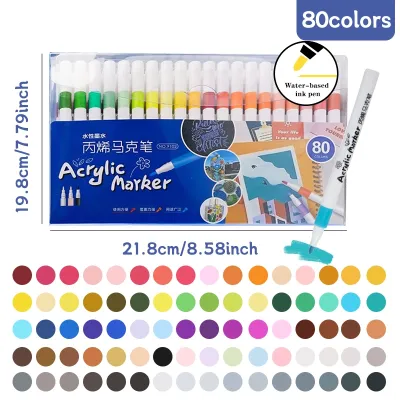


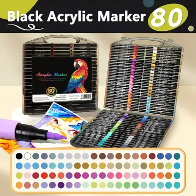
Prices are valid at publication and may change. Please refer to the product page for the latest price.
Additionally, managing visual fatigue is essential during long study sessions. Under bright fluorescent library lights or the intense glare of a desk lamp, highly saturated neon highlighters can reflect light and cause eye strain. Opting for pastel, mild, or muted color palettes can significantly reduce glare, allowing you to study comfortably for hours without experiencing headaches or visual exhaustion.
Matching Highlighter Colors to Specific Study Tasks
To build an effective color-coding system, you must assign specific colors to distinct academic tasks based on their cognitive weight and review priority. Cognitive weight refers to how fundamental a piece of information is to your overall understanding of a topic. If you use the same color for a major concept and a minor detail, your brain treats them with equal importance, leading to visual clutter.

By mapping your highlighter palette to specific categories of information, you create a predictable visual landscape. This allows you to bypass the process of reading every word when reviewing, as your brain automatically recognizes the meaning behind each color. The key is to maintain a strict division of labor among your highlighters, ensuring that no two colors serve overlapping purposes.
Key Terms, Definitions, and Core Concepts
Foundational knowledge, primary arguments, and core definitions require the highest level of visibility. For these elements, warm and high-visibility tones like classic yellow or soft orange are highly effective. Yellow is universally recognized as the most visible color to the human eye, making it the perfect choice for the absolute core of your study material.
When you highlight a key term or a primary definition in a warm tone, it immediately separates itself from the surrounding background text. This ensures that when you open your notebook or textbook during a quick review session, the most critical concepts are the very first things you see, establishing a strong starting point for your study path.
Examples, Evidence, and Supporting Details
Once the core concepts are established, you need a way to mark the examples, case studies, and evidence that support them. For these secondary details, cooler and more muted shades like light blue, mint green, or soft teal are ideal. These colors have a lower visual weight, meaning they do not compete with your warm-toned definitions for your attention.
Using a cool color for supporting details creates a clear visual hierarchy on the page. You can easily see how an example connects to a definition without getting bogged down in the text. This distinction is particularly useful for essay preparation or open-book exams, where you must quickly locate both a theoretical concept and its real-world application.
Questions, Confusions, and Review Items
Not all information in your notes is fully understood on the first read. To flag unresolved questions, confusing formulas, or high-priority exam topics, you should use a distinct, high-contrast color such as pink, coral, or a vibrant purple. This color acts as an active call to action, signaling that this specific section requires further research, clarification from a teacher, or targeted active recall.
By dedicating a specific color to items that need review, you can streamline your study sessions. Instead of rereading entire chapters, you can flip through your pages and focus solely on the flagged areas. This targeted approach is highly efficient for spaced repetition, ensuring you spend your valuable study time addressing your weakest areas.
Building and Maintaining Your Color-Coding System
The most common pitfall when starting a color-coding system is over-highlighting, often referred to as the “full-page highlight” trap. When a page is covered in a rainbow of colors, the visual hierarchy collapses, and nothing stands out. To prevent this, you must limit your active palette to a maximum of three or four colors. Keeping your color choices minimal reduces decision fatigue while you are reading, allowing you to focus on understanding the material rather than deciding which marker to pick up.
To maintain consistency across different notebooks, subjects, and study sessions, create a simple color legend. You can draw this key on a sticky note and keep it stuck to the inside cover of your binder, or write it directly on the first page of your notebook. Referencing this key regularly ensures that a color used for a definition in July still means a definition in October, preventing confusion when exam season arrives.
When highlighting, practice the “read first, highlight second” rule. Read an entire paragraph or section to understand its context before touching your highlighter to the paper. This simple habit allows you to identify the truly important points and prevents you from mindfully marking up sentences that turn out to be minor introductory remarks.
Choosing the Right Ink and Tip for Your Notes
The physical characteristics of your highlighters are just as important as their colors. In the humid tropical climate of the Philippines, paper fibers in standard notebooks and intermediate pads can absorb moisture from the air. This makes the paper more porous and highly susceptible to ink bleed-through and ghosting, where the color seeps through to the back of the page. To prevent this, match your highlighter’s ink type to your paper quality. Water-based inks are standard but can bleed on thin paper, while gel highlighters or dry wax highlighters glide smoothly without wetting the page, making them excellent for thin textbook pages or delicate Bible paper. Pastel and mild ink formulas also tend to use lighter pigment concentrations, which naturally reduces the risk of heavy ghosting.
The shape of the highlighter tip also dictates its usability. Chisel tips are the most versatile, allowing you to draw broad lines over standard printed text or use the sharp point for fine underlining. If you frequently study dense textbooks with small fonts or like to write color-coded notes in the margins, a dual-tip highlighter featuring both a chisel tip and a fine bullet tip offers the precision you need.
Before fully adopting a new set of highlighters, always perform a simple three-step test on a blank back page of your notebook. First, conduct a smudge test by writing with your favorite gel pen or ballpoint pen, waiting a few seconds, and highlighting over it to check if the ink smears. Second, observe the drying time to ensure the ink sets quickly without leaving wet pools that can transfer to other pages. Finally, check for text obscuration to guarantee the color remains transparent enough to read easily under your typical study lighting.
Frequently Asked Questions (FAQ)
Should I use different color systems for different subjects?
Maintaining a universal color system across all your subjects is generally the most effective approach because it builds strong, automatic habits. Your brain does not have to relearn what pink or blue means when you switch from studying history to chemistry. However, if a specific subject has unique structural demands—such as a law course requiring distinct colors for case names, statutes, and rulings—you can customize your system. The key is to keep the core framework consistent and only introduce specialized colors when the subject matter absolutely demands a unique classification.
What if I make a mistake or want to change my color code later?
If you make a highlighting mistake or decide to transition to a new color system, you do not need to rewrite your entire set of notes. For minor errors, you can use white correction tape to cover the highlighted area and write over it, or use erasable highlighters that feature a specialized ink-removing tip. If you are transitioning to a completely new color code in an existing notebook, do not try to retroactively change old pages. Instead, place a clear sticky note or a divider page marking the date of the transition, draw your new color legend on it, and apply the new system going forward.
Community discussion
Share your experience or ask a question. Comments are reviewed before publication.