
Selecting the right Kirena marker colors for aesthetic study notes is not about finding a single magic shade, but rather about curating a balanced palette that enhances readability while keeping your pages visually organized. In the Philippines, where tropical humidity can affect ink absorption and paper behavior, choosing the right combination of highlighters and markers is essential for clean, smudge-free notes. By focusing on soft pastels, muted earth tones, and strategic high-contrast accents, you can transform dense lecture notes into highly readable, visually soothing study guides.
Aesthetic note-taking has evolved from simple underlining to a structured visual system. Kirena markers offer a range of pigments, but their effectiveness depends heavily on how you pair them with your primary writing pens and the specific paper weight of your notebooks. Developing a systematic approach to color selection ensures that your study materials remain highly functional tools for exam preparation rather than just decorative pages.
How to Choose the Right Kirena Colors for Readability and Aesthetics
The primary purpose of any study marker is to make key information stand out without obscuring the text beneath it. When evaluating Kirena colors, you must consider the contrast ratio between the marker ink and your notebook paper. A marker that is too dark will drown out black or blue gel pen ink, making the text illegible and causing significant eye strain during late-night review sessions. Conversely, a shade that is too light will fail to draw the eye to critical terms.
Products mentioned in this guide
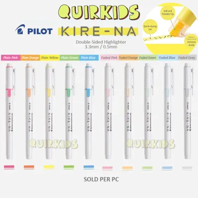
Prices are valid at publication and may change. Please refer to the product page for the latest price.
For long study sessions, pastel and mild tones are generally more comfortable for extended reading than traditional neon shades. Neon colors emit a high visual vibration that can quickly fatigue your eyes when applied to large blocks of text. Pastel shades, such as soft lavender, mint green, and pale peach, provide a gentle contrast that highlights information while keeping the overall page layout calm and inviting. Reserve bright neons for urgent formulas, exam dates, or critical warnings that require immediate attention.
Lighting conditions also play a significant role in how marker colors appear on your page. A pastel shade that looks perfectly balanced under natural sunlight might appear washed out or overly grey under harsh fluorescent classroom lights. When selecting your core palette, test the colors under the lighting environment where you do most of your studying to ensure the contrast remains comfortable for your eyes.
Before purchasing, inspect the manufacturer packaging and labels for key specifications. Look for indicators of lightfastness and fade resistance, which help ensure your notes remain legible months or even years after you write them. Pay attention to the designated ink type—whether water-based or alcohol-based—as this dictates how the marker behaves on standard school paper. Water-based inks are typically preferred for double-sided note-taking because they are less prone to severe bleed-through.
Recommended Kirena Color Palettes for Organized Study Notes
For humanities, literature, and history, a warm, muted palette creates a reflective and scholarly aesthetic. Consider combining dusty rose, olive green, warm beige, and terracotta. These colors mirror natural elements and work beautifully on cream-colored or ivory paper. You can use terracotta for main historical figures, olive green for key dates, and dusty rose for thematic concepts. This approach keeps your pages looking cohesive and sophisticated, encouraging deeper engagement with the reading material.

Science, technology, engineering, and mathematics (STEM) notes require a highly structured, functional color-coding system. Here, a high-contrast primary and secondary palette is highly effective. Pair a crisp sky blue with a soft yellow and a muted teal. Use the sky blue exclusively for definitions, the yellow for core formulas or equations, and the teal for step-by-step problem-solving steps. This strict division of labor allows your brain to categorize information instantly when scanning a page before an exam.
Integrating color psychology into your palettes can also enhance cognitive recall during exams. For instance, blue is widely associated with calm and focus, making it excellent for complex theories, while green is known to improve concentration and is ideal for supporting details. By aligning your aesthetic choices with these psychological triggers, your color-coded notes become an active tool for memory retention rather than just a passive design project.
If you prefer a minimalist aesthetic or want to maximize a limited collection, monochromatic shading is an excellent strategy. This technique involves using different values of a single color family—such as three varying shades of blue or grey—to establish a clear visual hierarchy. Use the darkest shade for main headings, the medium shade for subheadings, and the lightest shade for highlighting body text. This method creates a clean, professional look that prevents your notebook from becoming a chaotic rainbow of distracting colors.
Evaluating Kirena Ink Performance and Paper Compatibility
Before committing a new Kirena marker to your main notebook pages, it is crucial to perform a swatch test. Different paper weights (measured in grams per square meter, or GSM) react uniquely to marker inks. On thin 60 GSM or 70 GSM paper, heavy ink application can cause feathering, where the ink spreads sideways along the paper fibers, or ghosting, where the color shows through to the reverse side. For optimal results with dual-tip markers, aim for notebooks with at least 80 GSM to 100 GSM paper, which can handle layering without compromising the back of the page.
In humid tropical climates, ink drying times can slow down significantly. This is a critical factor for rapid note-takers and left-handed writers whose hands naturally glide across freshly written lines. Test how quickly the Kirena ink sets on your preferred paper. If you are pairing the markers with gel pens, always write the text first, let it dry completely, and then highlight over it. Alternatively, apply the marker color first and write on top of it once dry to guarantee crisp, smudge-free lines.
The texture of your notebook paper also influences both ink absorption and nib wear over time. Smooth, coated papers allow the marker to glide effortlessly, reducing friction and preserving the crispness of the chisel tip, though they may require slightly longer drying times. Textured or toothy papers absorb ink much faster, which minimizes smudging but can cause the marker tip to fray prematurely if you apply too much pressure.
Examine the physical characteristics of the marker nibs during your test runs. High-quality chisel tips should deliver a consistent ink flow without pooling at the end of a stroke. Check for edge crispness; a clean, sharp edge allows you to underline precise lines of text or write small marginalia in the borders of your notebook. If the nib feels mushy or releases ink unevenly, it may indicate poor storage or a damaged tip, which will disrupt the clean lines required for aesthetic notes.
Building and Maintaining Your Kirena Marker Collection
To ensure you are getting genuine Kirena markers with optimal ink quality, purchase from authorized stationery retailers or official brand storefronts on reputable online marketplaces. Counterfeit or poorly stored markers often arrive dried out, with frayed nibs or altered color pigments that do not match the official swatches. Reading customer reviews regarding packaging quality and delivery times can help you identify reliable sellers.
When building your collection, decide whether to invest in a curated full set or purchase individual color picks. In the Philippines, individual markers typically range from ₱40 to ₱80, while complete thematic sets can range from ₱300 to ₱800 depending on the pack size. If you have a specific aesthetic in mind, such as a warm earth-tone theme, buying individual open-stock markers is often more cost-effective than buying a large set containing bright neon colors you may never use.
If your lighter marker nibs accidentally pick up dark ink from a gel pen during highlighting, do not discard them. You can easily clean the tip by scribbling gently on a piece of scrap paper until the dark residue bleeds out and the original pastel color runs clear. This simple maintenance step prevents permanent discoloration and keeps your aesthetic palettes looking bright and clean.
The way you store your markers directly impacts their lifespan and ink distribution. For dual-tip markers, horizontal storage is highly recommended. Storing them flat ensures that the ink remains evenly distributed between both the fine tip and the broad chisel tip. If stored vertically, one end will inevitably dry out while the other becomes oversaturated and prone to leaking. Keep your marker cases in a cool, dry place away from direct tropical sunlight to prevent the plastic barrels from warping and the ink from evaporating prematurely.
Frequently Asked Questions (FAQ)
Can I use Kirena markers on both sides of thin notebook paper?
Using markers on both sides of thin paper requires careful technique to avoid ruining your notes. Always test the ink opacity on a discreet corner or a back page of your notebook before starting. To protect the subsequent pages from ink transfer, place a thick blotter page or a plastic pencil board directly beneath the sheet you are working on. Additionally, adjust your writing pressure and increase your stroke speed; lingering too long in one spot causes the ink to pool, which guarantees bleed-through on thin paper.
How do I prevent my pastel Kirena markers from looking washed out?
Pastel markers can sometimes appear too faint, especially on off-white or recycled paper. To maximize their vibrancy, utilize controlled layering: let the first stroke dry completely before applying a second layer directly over it to deepen the hue without oversaturating the paper fibers. Keep in mind that high-brightness, pure white paper naturally reflects more light, making pastel inks look crisper and more defined. Finally, always pair your pastel highlights with high-contrast black or dark blue gel pens, as the dark text provides the necessary visual anchor to make the soft colors pop.
Community discussion
Share your experience or ask a question. Comments are reviewed before publication.