
Handmade greeting cards are highly valued because they convey personal effort, creativity, and genuine sentiment. Every element, from the choice of cardstock to the layout of the embellishments, plays a critical role in the final presentation. When designing these miniature works of art, finding a way to include names, dates, or short messages without disrupting the main visual composition can be a challenge. Incorporating a small label tag offers an elegant, tactile solution that bridges the gap between functional information and aesthetic appeal.
These miniature accents act as dedicated spaces for personalized text, keeping the primary artwork clean and uncluttered. Whether you are crafting cards for birthdays, weddings, or local seasonal celebrations in the Philippines, selecting the correct tag ensures your design feels cohesive and professional. By understanding the physical properties, material compatibility, and visual weight of different tag styles, you can elevate your papercrafting projects from simple hobbies to heirloom-quality keepsakes.
The Role of Small Label Tags in Handmade Card Design
A card’s main canvas is often dedicated to intricate techniques such as watercolor painting, paper quilling, detailed stamping, or complex die-cutting. Forcing a handwritten signature or a recipient’s name directly onto these elaborate backgrounds can disrupt the visual flow or, worse, ruin hours of careful work if the ink runs. A small label tag provides a physical separation, creating a dedicated, safe zone for handwriting or small stamped sentiments. This separation allows the background artwork to remain the focal point while still accommodating necessary personalization.
Products mentioned in this guide
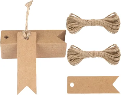
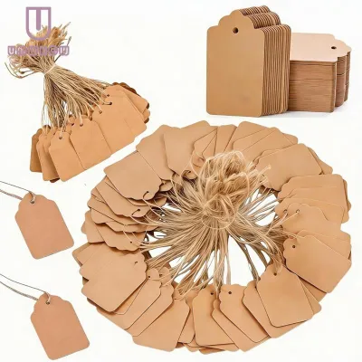
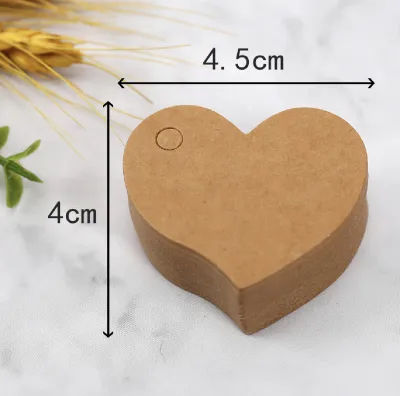
Prices are valid at publication and may change. Please refer to the product page for the latest price.
Beyond their practical utility, these tags introduce a three-dimensional element to flat paper surfaces. Elevating a tag with a small piece of foam adhesive or letting it dangle freely from a piece of natural fiber twine creates shadows and depth. This physical layering enhances the tactile experience of receiving a handmade card, encouraging the recipient to touch, turn, and interact with the design. The contrast between the card’s base paper and the tag’s material adds texture, which is a hallmark of high-end, artisanal stationery.
Using small tags also marks a clear departure from mass-produced, store-bought greeting cards. In a world dominated by digital messages and generic printed media, a card featuring a hand-tied, beautifully lettered tag signals thoughtfulness and deliberate craftsmanship. It transforms the card from a temporary greeting into a keepsake that recipients are likely to display on their desks or save in memory boxes. For local crafters selling their work at artisan markets in Manila or gifting them to loved ones, these small details establish a signature style that defines quality.
What to Look for When Selecting a Small Label Tag
Choosing the ideal tag requires looking beyond mere appearance; you must evaluate how the physical properties of the tag interact with your writing instruments, adhesives, and the card itself.

Material and Texture
The weight and finish of the paper are foundational to how the tag performs and feels. For a premium hand-feel, select tags made from cardstock ranging between 200 GSM and 300 GSM (grams per square meter). Lightweight paper below 150 GSM tends to curl or warp when handled, especially in humid environments. The texture of the paper—whether it is a smooth hot-press finish, a textured cold-press surface, or a slick glossy coating—dictates how light reflects off the tag and how it complements the card’s overall theme. Matte finishes offer a classic, understated look that pairs well with most card designs, while textured papers add a rustic, organic touch.
Attachment Methods
How you secure the tag to your card affects both the visual layout and the structural integrity of the paper. Pre-punched tags featuring a small, clean hole allow you to thread twine, ribbon, or metallic thread, which can then be tied to the card’s spine, wrapped around a folded panel, or anchored with an eyelet. If you prefer a flush, modern look, self-adhesive tags or flat-backed tags secured with double-sided tape are excellent choices. However, in the tropical climate of the Philippines, high relative humidity can weaken low-quality adhesives over time. It is crucial to use acid-free, high-tack adhesives or reliable tape runners to prevent the tag from peeling away from delicate cardstock. If you are using liquid glues, apply them sparingly with a fine-tip applicator to avoid warping the paper fibers as they dry.
Surface Compatibility
Before committing to a specific style, you must verify how the tag’s surface reacts to your chosen medium. Matte cardstock is highly porous and absorbs water-based inks quickly, making it excellent for fountain pens, water-based brush markers, and standard stamping inks. Conversely, glossy or coated surfaces resist water, causing water-based inks to pool, bead, or smudge easily. For glossy tags, you will need permanent solvent-based inks or specialized alcohol markers. If you plan to use heat embossing—a popular technique where powder is melted onto stamped ink to create a raised, shiny texture—the tag material must be heat-resistant and thick enough to withstand the high temperatures of a hot-air craft tool without scorching or warping.
Top Small Label Tag Styles for Handmade Greeting Cards
Different card designs call for distinct visual styles. Matching the tag’s aesthetic to the theme of your card creates a unified presentation.
Kraft Paper Tags for Rustic and Vintage Designs
Unbleached kraft paper tags, with their characteristic warm brown tone and visible organic fibers, are the quintessential choice for rustic, vintage, or eco-friendly card designs. This material exudes a natural, unpretentious charm that pairs exceptionally well with botanical illustrations, pressed flowers, or simple line drawings. The neutral brown hue acts as a soft background that does not compete with other design elements. These tags are highly accessible and are often sold in economical bulk packs ranging from ₱50 to ₱150 for a set of fifty, making them a staple for high-volume crafting.
To enhance the rustic appeal, pair kraft tags with natural fibers such as jute twine, rough-textured baker’s twine, or thin waxed cotton cord. These materials add a tactile, homespun quality to the card. When lettering on kraft paper, standard black archival pigment ink provides a clean, classic contrast. For a more striking look, use opaque white gel pens or white gouache; the bright white pigment stands out beautifully against the earthy brown background, mimicking the look of delicate chalk art.
Vellum or Translucent Tags for Elegant Layering
Vellum is a semi-transparent, frosty paper that offers a sophisticated, modern aesthetic. Because vellum allows the colors and patterns beneath it to show through, it is incredibly useful for layering over complex backgrounds, such as watercolor washes or busy patterned papers. A vellum tag adds a soft, diffused overlay that tones down loud backgrounds, making the written sentiment highly legible without completely hiding the artwork underneath.
Layering vellum requires careful planning because standard adhesives will show through the translucent paper. To secure a vellum tag invisibly, place tiny glue dots or double-sided tape directly behind the areas where you have written or stamped, masking the adhesive. Alternatively, you can secure the tag physically using a small metal brad, a delicate eyelet, or by sewing a simple line of stitching along the edge of the tag using a needle and embroidery thread. Keep in mind that vellum is non-porous; water-based inks will take a significantly long time to dry on this surface, especially during the humid rainy season in the Philippines. To prevent smudging, use quick-drying solvent inks or apply embossing powder and set it with a heat tool.
Chalkboard and Dark Cardstock Tags for High Contrast
For modern, festive, or formal greeting cards, dark cardstock tags in shades of deep charcoal, midnight navy, or forest green create a dramatic, high-contrast look. These dark surfaces provide an excellent backdrop for metallic and opaque inks, making the text appear to glow. This style is particularly popular for holiday cards, wedding invitations, and milestone birthday greetings where a touch of elegance is desired.
To write on dark cardstock, select highly opaque writing instruments. Metallic paint markers in gold, silver, or bronze deliver a rich, reflective finish that catches the light beautifully. White pigment ink or light pastel gel pens can be used to create detailed faux-chalkboard lettering. When integrating these dark tags into your card design, balance their visual weight by pairing them with lighter card bases, pastel envelopes, or bright accent ribbons to ensure the overall presentation remains balanced and does not feel overly heavy.
Clear Adhesive Labels for a Minimalist Finish
If your design aesthetic leans toward clean lines and modern minimalism, clear adhesive labels made of thin polyester or vinyl are an outstanding option. Once applied to a card, the border of the label virtually disappears, leaving only the printed or handwritten text visible. This creates a striking visual illusion where the words appear to float directly on the surface of the cardstock, watercolor paper, or patterned background.
Applying clear labels requires a steady hand and a clean environment. To prevent unsightly dust particles or fingerprints from getting trapped under the adhesive, handle the labels by their edges using fine tweezers. Apply the label slowly from one edge to the other, using a flat plastic scraping tool or a clean bone folder to smooth out any trapped air bubbles as you go. For printing, ensure you select labels compatible with your specific printer type; laser printers use heat to fuse toner onto the plastic, whereas inkjet printers require labels with a specialized, ink-receptive coating to prevent the ink from running. For hand-lettering, use fine-tip permanent markers or oil-based paint pens, allowing them to cure fully before handling.
Sizing and Placement: How to Avoid Overwhelming Your Design
Even the most beautiful tag can ruin a card if it is disproportionately large or placed awkwardly. Achieving a balanced layout requires a careful understanding of scale, visual weight, and spatial harmony.
Proportion Rules
The size of your tag must scale naturally with the dimensions of your greeting card base. For standard card sizes commonly used in papercrafting—such as the A2 size (4.25 by 5.5 inches) or the larger A6 size (4.5 by 6.25 inches)—a small tag should serve as a subtle accent rather than the dominant feature. Ideally, a small tag should not exceed 1.5 inches (approximately 3.8 centimeters) in its longest dimension. Keeping the tag compact ensures there is plenty of negative space around it, allowing the card’s primary artwork to breathe and preventing the layout from feeling cramped.
Placement Strategies
Where you position the tag determines how the recipient’s eye moves across the card. Placing the tag in the bottom right-hand corner is a classic composition choice; it mimics the natural reading flow from left to right, serving as a final sign-off or signature. For symmetrical or minimalist cards, centering the tag near the bottom edge provides a grounded, formal look. If your card features a busy background, you can hang the tag from a ribbon tied around the card’s fold, allowing it to move freely. Another elegant option is to use the tag as a functional seal on the exterior envelope, building anticipation before the recipient even opens the card.
Visual Weight vs. Physical Size
It is important to distinguish between a tag’s physical dimensions and its visual weight. Visual weight refers to how much attention an object draws to itself. Darker colors, high-contrast borders, and dense, thick materials (like heavy chipboard) carry significant visual weight, making them appear larger than they actually are. A small, 1-inch black tag can dominate a pastel card just as much as a 2-inch translucent vellum tag would. When using bold, dark, or highly textured tags, reduce their physical size slightly to maintain visual balance. Conversely, you can use slightly larger tags if they are made of light, airy, or semi-transparent materials that blend softly into the background.
Ensuring Smooth Calligraphy and Handwriting on Your Tags
For many crafters, hand-lettering or calligraphy is the defining feature of a handmade card. Writing on a tiny surface requires precision, the right tools, and proper preparation to ensure a flawless finish.
Testing for Bleed and Feathering
Before you begin writing on your actual tags, always perform a quick test on a scrap piece of the identical material. This is especially important when working with handmade or artisanal papers, which can vary wildly in their sizing (the chemical treatment applied to paper to regulate its absorbency). Write a few test lines using your chosen pen and ink. Observe the edges of the lines closely under bright light. If the ink spreads outward along the paper fibers, creating a fuzzy, blurred appearance, the paper is feathering. If the ink leaks through to the back of the tag, it is bleeding. If you observe these issues, you may need to switch to a drier pen, a thicker ink, or a tag with a smoother, less porous coating.
Pen and Ink Pairings
Matching your writing tool to the tag’s surface is key to achieving crisp, legible lettering. For standard matte cardstock, pigment-based fineliners (such as the Sakura Pigma Micron) are highly reliable because they dry quickly and resist water. If you enjoy brush calligraphy, look for small-tip brush pens with firm, elastic nibs (such as the Tombow Fudenosuke), which allow for precise control on small surfaces. For dip pen calligraphy, traditional iron gall ink or acrylic-based inks work beautifully on heavy, sized cardstock because they hold their shape without spreading. Avoid using highly fluid fountain pen inks on highly absorbent, un-sized tags, as they are prone to severe feathering.
Smudge Prevention
Managing drying times is critical, particularly in the humid climate of the Philippines, where moisture in the air can delay ink drying times significantly. After lettering a tag, place it in a safe, dry area and resist the urge to touch the ink to check if it is dry. To protect your work while writing, place a clean piece of scrap paper or blotting paper under your hand to prevent the natural oils from your skin from transferring to the tag, which can create spots that resist ink. If you are in a hurry, you can use a craft heat tool on its lowest setting to speed up the drying process, or apply a fine layer of clear embossing powder over wet pigment ink and melt it to seal the design permanently.
Frequently Asked Questions (FAQ)
Can I use regular printer paper to make my own small label tags?
Standard printer paper, which typically weighs between 70 GSM and 80 GSM, is generally not recommended for making standalone small label tags. Because it lacks structural rigidity, tags cut from printer paper will easily bend, crease, or tear when handled, and the edges are prone to fraying. If you want to use a specific design printed from your computer, a great workaround is to adhere the printed paper to a sturdier backing, such as a piece of 220 GSM kraft paper or colored cardstock, using acid-free double-sided adhesive sheets. This adds the necessary thickness and weight, giving your DIY tags a professional, durable finish.
What is the best way to attach a non-adhesive tag without damaging the card?
To secure a non-adhesive tag flat against your card without causing damage, avoid standard liquid school glues, which contain high water content that can warp, wrinkle, or discolor both the tag and the cardstock. Instead, use micro glue dots, high-quality double-sided tape, or dry tape runners, which provide a strong, instant bond without moisture. If you prefer a removable or dangling tag, use a craft awl or a small 1/16-inch hand punch to make a tiny, clean hole in the card fold or corner. Thread a thin piece of embroidery floss, metallic thread, or baker’s twine through the hole and tie it securely, preserving the structural integrity of the card while adding a charming tactile element.
Community discussion
Share your experience or ask a question. Comments are reviewed before publication.