
Selecting the ideal marker and highlighter colors depends entirely on your specific task. Studying benefits from a limited palette of high-contrast neon or soft pastel colors to categorize information; journaling thrives on cohesive, muted color families that allow for creative layering; and professional note-taking requires low-profile, highly legible dark tones paired with a single vibrant accent color. Selecting the right hue is only half the battle, as ink properties must also match your paper type and local environmental conditions, such as high humidity, which can dramatically affect drying times and smudging.
Understanding Color Functions and Ink Properties
Using color effectively requires a basic understanding of how ink interacts with paper and how our eyes perceive contrast. When highlighting, the primary goal is to make specific text stand out without obscuring the underlying print. High-contrast colors work best on bright white paper, while cream or ivory pages often pair better with softer, muted tones to prevent visual fatigue during long reading sessions.
From a cognitive perspective, different colors trigger distinct mental responses. Warm colors like red, orange, and bright yellow naturally draw immediate attention, making them excellent for urgent deadlines, critical formulas, or high-priority warnings. Cool colors like blue, green, and purple promote a sense of calm and organization, making them ideal for broad categorization, supporting details, or general vocabulary terms.
Products mentioned in this guide
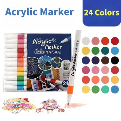
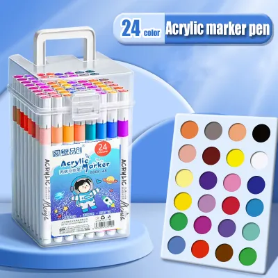
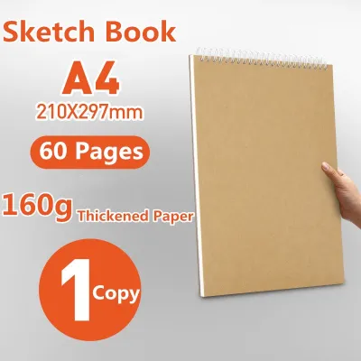
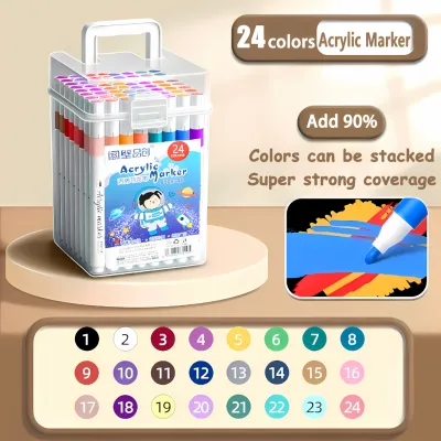
Prices are valid at publication and may change. Please refer to the product page for the latest price.
The chemical base of your writing instrument also dictates its performance on the page. Water-based inks are the standard for highlighters and journaling pens because they resist bleeding through medium-weight paper, though high tropical humidity can occasionally extend their drying times. Alcohol-based inks offer exceptional vibrancy and seamless blending, but they dry almost instantly and are highly prone to bleeding through standard notebook paper, requiring specialized heavy cardstock.
Color Strategies for Studying and Exam Preparation
When preparing for exams, the golden rule of color coding is restraint. Limiting your core palette to three or four distinct colors prevents cognitive overload and keeps your study guides clean. If your pages turn into a chaotic rainbow of neon pink, green, yellow, and blue, your brain will struggle to identify which information is actually important during quick review sessions.

For dense textbook reading, high-contrast highlighters are essential for pulling out key concepts. Neon yellow remains a classic choice because it has the highest light reflectance, allowing the black text underneath to remain perfectly legible. If bright neons cause eye strain under your desk lamp, soft pastel highlighters offer a gentler alternative while still providing enough contrast to guide your eyes down the page.
For active recall tools like flashcards, mind maps, and bold headings, switch to dark, opaque markers. A deep blue, dark green, or black chisel-tip marker creates sharp, authoritative titles that are easy to read from a distance. When drawing mind maps, using a single dark color for each major branch helps your brain visually map the relationships between complex concepts, reinforcing your memory retention.
Building Aesthetic Palettes for Bullet Journaling
Bullet journaling allows for a more creative and personalized approach to color selection. Instead of high-contrast neons, many journaling enthusiasts prefer muted palettes or earthy tones like dusty rose, sage green, warm gray, and soft terracotta. These cohesive color schemes create a calming visual environment for daily logging, habit tracking, and monthly spreads without distracting from your written tasks.
Layering different inks is a popular technique for adding depth to your journal pages, but it requires careful execution to avoid damaging the paper. Always allow your base layer of ink to dry completely before applying a second color over it, especially in humid climates where moisture lingers on the page. Avoid layering alcohol-based markers over water-based inks, as the alcohol solvent can reactivate the water-based pigment and cause messy smudging.
To create a sophisticated visual hierarchy without cluttering your pages, try working within a single color family. Using varying shades of blue—such as a light sky blue for background highlighting, a medium slate blue for subheadings, and a deep navy for fine-line writing—adds dimension and structure. This monochromatic approach keeps your spreads looking organized, elegant, and highly functional.
Maintaining Clarity in Professional Note-Taking
In a professional workplace, note-taking should prioritize speed, legibility, and a clean presentation. Stick to low-profile, highly legible colors like black, deep gray, navy blue, or dark forest green for your primary text. These classic tones ensure your meeting minutes and project outlines look polished and are easy to read during fast-paced business discussions.
To keep your professional notes highly scannable, designate a single, distinct accent color strictly for action items, deadlines, or urgent follow-ups. A soft coral, a muted teal, or a deep red works beautifully for this purpose. When you scan your notebook later, your eyes will immediately jump to these critical flags, ensuring no important task is overlooked.
Avoid using overly bright neon shades in professional settings, as they can appear unprofessional and cause uncomfortable glare under harsh office fluorescent lights. Opting for subtle, professional highlighters in mild or pastel tones ensures your documents remain readable and presentable during shared business presentations or collaborative reviews. Whether you are using a budget-friendly ₱30 highlighter or a premium imported pen, a clean and restrained color scheme always leaves a better impression.
Testing for Paper Compatibility and Bleed-Through
Before committing to a specific set of markers or highlighters, it is crucial to evaluate how the ink behaves on your specific notebook paper. Check manufacturer labels and packaging for key terms like “quick-dry,” “bleed-resistant,” or “water-resistant.” While these claims are helpful indicators, actual performance can vary widely depending on the paper’s weight and texture.
To avoid ruining your favorite journal or study guide, always perform a localized swatch test. Use a blank page at the very back of your notebook or a spare insert sheet to draw small color blocks. Write a few words with your standard gel pen and highlight over them to check for smudging, then turn the page over to inspect for ghosting (ink showing through) or full bleed-through.
Based on your observed ink behavior, you can strategically dedicate specific pens to different paper types. Standard school notebooks and thin-paper planners (often around 50 to 70 gsm) are highly susceptible to bleed-through, making them best suited for dry highlighters or light pastel water-based highlighters. For heavy-stock journals or sketchbooks (100 to 160 gsm), you can safely use juicy brush pens, dual-tip markers, and even light alcohol-based markers without worrying about ruining the reverse side of your pages.
Frequently Asked Questions (FAQ)
How many highlighter colors should I use for effective studying?
Limit your study palette to three or four distinct colors. Assign a specific, unchanging meaning to each color—such as yellow for main ideas, green for vocabulary, and pink for exam dates. Using more than four colors increases cognitive load, making it harder for your brain to quickly categorize and recall information.
Do pastel highlighters work better than neon ones for reading?
Pastel highlighters are generally better for long reading sessions because they reduce eye strain and glare under bright study lights. However, neon highlighters offer superior contrast and are highly effective for quick, high-priority scanning. Choose pastels for dense textbooks and neons for urgent, high-priority notes.
How can I prevent marker colors from bleeding through my journal pages?
To prevent bleed-through, choose water-based or pigment-based markers rather than alcohol-based ones, and opt for notebooks with thicker paper (at least 100 to 120 gsm). Always perform a swatch test on a back page first. If you must use a heavy marker on thin paper, place a plastic pencil board or a scrap sheet of thick paper directly behind the page to protect the rest of your journal.
Community discussion
Share your experience or ask a question. Comments are reviewed before publication.