
Designing a custom notebook involves choosing every detail, but standing before the choice between cream and white book paper often stalls the process because it is difficult to visualize how the background shade will interact with your daily writing tools and long-term comfort. The choice depends on your primary use case: cream paper reduces visual fatigue and offers a classic, warm aesthetic ideal for long-form journaling and reading, while bright white paper provides maximum color contrast and crisp line definition, making it the better option for technical sketching, vibrant color inks, and modern, high-contrast layouts. By understanding how these tones interact with light, ink, and binding, you can select the ideal foundation for your custom stationery project.
How do cream and white tones affect eye strain and writing comfort?
Cream and white paper tones affect your eyes differently because of how they reflect light and contrast with dark inks. Cream paper absorbs more light and reduces harsh glare, whereas white paper reflects a higher percentage of light to deliver sharp, high-contrast visibility. Choosing between them requires balancing your typical writing environment with the duration of your writing sessions.
Dark inks, such as black or deep blue, on stark white paper create a high-contrast environment. While this makes text highly legible in short bursts, the extreme contrast can cause visual fatigue over hours of continuous reading or writing. The eyes must work harder to adjust to the bright background surrounding the dark text, which can lead to strain during extended journaling sessions.
Products mentioned in this guide
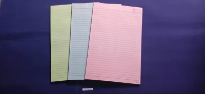
83 Lazada user ratings
High-quality woodfree lDurable and portable design, Ideal for note-taking, Quality: good quality Excellent paper quality, No ink bleed, Desi…Read full reviewShow less
High-quality woodfree lDurable and portable design, Ideal for note-taking, Quality: good quality Excellent paper quality, No ink bleed, Design: good designUnique patterns, Eye-catching, Beautiful cover designs, Price: affordable price 100 percentGreat value, Reasonable cost,
Looks very nice and color is what we wanted. Paper looks smooth and hopefully writing on it will also be smooth.
Quality:Thick pages, Well-made, Design:Beautiful cover designs, Price:Reasonable cost,
Great product. Fast delivery.
Quality:very good Design:nice
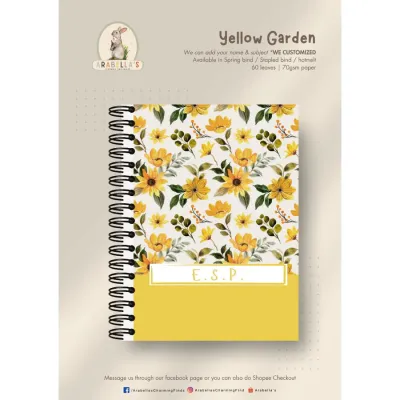
7 Lazada user ratings
pretty mini notebooks
Prices are valid at publication and may change. Please refer to the product page for the latest price.
Cream paper softens this contrast, creating a gentler transition for the eyes. The warm, off-white undertones absorb a portion of the blue light spectrum, making the page appear softer under both natural and artificial light. This makes cream paper a preferred option for long-form writers who spend hours filling pages.
Glare and light reflection also vary significantly between the two tones. Under bright overhead fluorescent lights or direct sunlight, white paper can act like a mirror, bouncing light directly back to your eyes. Cream paper diffuses this light, making it more comfortable to use under varied lighting conditions, including dim bedside lamps or bright office spaces.
Subjective comfort often aligns with your writing pace and purpose. For long-form journaling, creative writing, or extensive reading, cream paper is generally preferred because it mimics the natural, low-strain environment of traditional published novels. For quick note-taking, rapid brainstorming, or bullet journaling where you need to scan pages quickly for specific tasks, the high contrast of white paper helps key points stand out immediately.
How do different inks behave on cream versus white book paper?
The visual appearance and behavior of your ink depend heavily on the paper’s base tone, as cream paper shifts the perceived color of translucent inks while white paper preserves their true pigment. Because paper color does not dictate physical ink absorption on its own, you must evaluate how the paper’s specific sizing and finish handle bleed-through and feathering. Understanding these interactions prevents unexpected color shifts and messy pages.

Dark inks look exceptionally crisp on white paper, but on cream paper, they take on a slightly warmer, softer appearance. This softening can make black ink look more like a dark charcoal, which many writers find aesthetically pleasing. However, if you require absolute color accuracy for color-coded notes or artistic sketches, white paper is the reliable choice.
Metallic pens, such as gold, silver, and bronze, often pop beautifully on cream paper, blending with the warm background to create an elegant, cohesive look. On white paper, these same metallic inks look stark and modern. Conversely, pastel highlighters can lose some of their distinction on cream paper, as the yellow or ivory undertones of the paper can alter the pastel shades, turning a light blue highlighter slightly greenish. On white paper, pastel and neon colors retain their exact intended hue.
Bleed-through, feathering, and ghosting are primarily functions of paper weight, fiber density, and chemical sizing rather than color. However, ghosting—where you see the shadow of writing on the reverse side—can sometimes be more noticeable on bright white paper because of the high contrast of the dark ink showing through the sheet. To observe these traits, perform a simple test: write with your wettest pen, let it dry, and inspect the reverse side under a direct light source to check for fiber feathering or bleed-through.
Before committing to a bulk order for a custom notebook, it is essential to test your preferred writing instruments. Fountain pen inks, which are often water-based and translucent, can shade and sheen differently depending on the paper’s color and coating. Gel pens and ballpoints are more forgiving, but their drying speed can vary based on the paper’s surface smoothness. Always request sample sheets to run a trial with your specific pen collection.
Which paper tone best fits your notebook's aesthetic and purpose?
Your notebook’s aesthetic should align with its intended purpose, with cream paper lending itself to classic, vintage, and artistic designs, while white paper suits modern, minimalist, and highly structured layouts. Choosing the right tone ensures that the physical notebook complements the style of the content you plan to create. This alignment is crucial for both personal satisfaction and professional branding.
Cream paper evokes a sense of heritage, craftsmanship, and warmth. It is the traditional choice for literary novels, personal diaries, and sketchbooks meant for charcoal or sepia ink. If your custom notebook features a leather, fabric, or earth-toned cover, cream paper creates a cohesive, organic feel that enhances the tactile experience of a premium journal.
White paper feels clean, professional, and contemporary. It is the standard for corporate notebooks, planner inserts, and technical journals where precision is paramount. If your notebook cover has a bright, saturated color or a sleek, minimalist design, white paper maintains that clean aesthetic throughout the interior, making it ideal for professional environments.
If you plan to print custom elements like dot grids, lined pages, or illustrations, the paper tone will affect the printing ink. On white paper, grey dot grids or colored lines print precisely as designed, maintaining their true colors. On cream paper, the background color will blend with the printing ink; for example, light grey lines may take on a warm, brownish tint, and colored illustrations might lose their cool-toned accuracy. You must adjust your print files to account for the warm base of cream paper.
What must you verify before ordering custom book paper?
Before finalizing your custom notebook order, you must verify the physical properties of the paper to ensure it meets your functional requirements and fits your binding method. Relying solely on digital mockups can lead to unexpected results in texture, color accuracy, and durability. A systematic verification process prevents costly mistakes during production.
Always request physical swatches or sample packs from your paper supplier or printing partner. The term “cream” can range from a pale ivory to a deep, buttery yellow, and “white” can vary from a natural, unbleached white to a bright, blue-toned white. Seeing and feeling the paper in person is the only way to confirm the exact shade and texture before committing to a full run.
The weight of the paper, measured in grams per square meter (GSM), directly impacts its durability and ink resistance. Standard book paper ranges from 70 GSM to 120 GSM. A higher GSM generally offers better resistance to ghosting and bleed-through, but it also makes the notebook thicker and heavier. You must balance the weight with the total page count to ensure the notebook remains portable and easy to open.
Paper has a grain direction determined during manufacturing, which is critical for the structural integrity of your notebook. For a notebook to open smoothly and lie flat, the grain must run parallel to the spine. If the grain runs perpendicular, the pages will feel stiff, resist turning, and may warp over time. Additionally, ensure the paper’s thickness and weight are compatible with your chosen binding method, whether it is thread sewing, perfect binding, or wire-o binding.
Community discussion
Share your experience or ask a question. Comments are reviewed before publication.