
To start painting with Daniel Smith watercolors, you do not need a massive, expensive set of dozens of colors. Instead, beginning with a highly curated selection of six to ten essential tubes—specifically a split-primary system of warm and cool primaries, supplemented by a few key earth tones—gives you the ultimate mixing power while saving money. This focused approach prevents you from overspending on unnecessary “convenience” colors and teaches you the foundational skills of color theory. By selecting individual tubes carefully, you can build a highly versatile, professional-grade palette tailored precisely to your preferred painting style and subject matter.
Understanding Daniel Smith Pigments and the Limited Palette Approach
Daniel Smith watercolors are highly regarded by professional artists globally due to their exceptional pigment load and high-quality gum arabic binder. The brand formulates its paints to maximize the concentration of pure pigment in every tube, resulting in vibrant washes and outstanding tinting strength. In tropical environments like the Philippines, where high relative humidity can make cheap student-grade paints remain perpetually sticky or even develop mold in the palette, investing in professional-grade paints is highly practical. The premium gum arabic binder in Daniel Smith paints remains stable, allowing the paint to dry to a firm state in your palette pans and rewet smoothly with a damp brush without crumbling or molding.
For beginners, starting with a “limited palette”—a small, deliberate selection of high-quality colors—is far superior to purchasing a large, pre-mixed set of cheaper paints. Large sets often contain convenience mixtures made from multiple pigments, which easily turn muddy when blended. A limited palette forces you to learn how pigments interact, helping you understand how to control transparency, staining, and granulation on your paper. By mastering a small set of colors, you will achieve greater color harmony in your artwork, as all the hues in your painting will share the same foundational pigment DNA.
Products mentioned in this guide
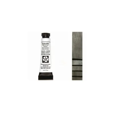
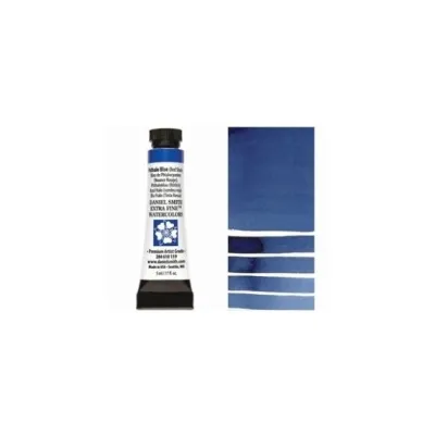
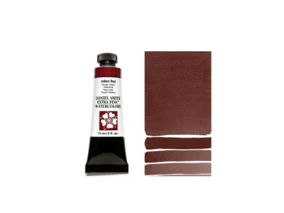
Prices are valid at publication and may change. Please refer to the product page for the latest price.
When selecting your first tubes, always check the pigment codes printed on the labels, such as PY151 (Pigment Yellow 151) or PB29 (Pigment Blue 29). Single-pigment colors are the gold standard for beginners because they mix cleanly and predictably. Multi-pigment paints, while convenient for quick painting, limit your ability to mix custom shades without creating dull, grayed-out results. Reading these labels ensures you know exactly what is going onto your watercolor paper, allowing you to make informed decisions about color behavior.
The Split-Primary Foundation: Six Colors to Mix Almost Anything
The split-primary system is the absolute best foundation for any watercolor palette. Instead of the traditional three-color primary system (yellow, red, and blue), a split-primary palette uses a warm and a cool version of each primary color. This solves the common problem of muddy secondary colors. For example, mixing a warm red with a cool blue often results in a dull, brownish purple because the warm red contains yellow undertones that neutralize the blue. By having both a warm and a cool option for each primary, you can mix incredibly vibrant purples, greens, and oranges.

Warm & Cool Yellows
- Cool Yellow (Hansa Yellow Light – PY3): This is a highly transparent, high-tinting, cool yellow with a slight green undertone. It is non-staining, making it easy to lift or soften on your paper. When mixed with cool blues, it produces exceptionally clean, vibrant tropical greens.
- Warm Yellow (New Gamboge – PY150/PO48): This is a warm, golden yellow that is semi-transparent and highly luminous. It is perfect for painting warm sunlight, glowing highlights, or mixing rich, fiery oranges when combined with a warm red.
Warm & Cool Reds
- Cool Red (Quinacridone Rose – PV19): A highly transparent, staining, beautiful cool pinkish-red. Because it lacks yellow undertones, mixing Quinacridone Rose with French Ultramarine produces the most vibrant, clean purples and violets imaginable.
- Warm Red (Pyrrol Scarlet – PR255): An intense, semi-opaque warm red with strong orange undertones. It has incredible tinting strength and is essential for mixing brilliant, clean oranges, warm skin tones, and high-contrast focal points in your paintings.
Warm & Cool Blues
- Cool Blue (Phthalo Blue Green Shade – PB15:3): This is a highly transparent, strongly staining, chemical-based blue. It is incredibly powerful, meaning a tiny speck on your brush can easily dominate a mixture. It is excellent for mixing intense, tropical turquoise, bright teals, and deep, dark shadows.
- Warm Blue (French Ultramarine – PB29): A classic, warm, reddish-blue that is semi-transparent and highly granulating. It is a staple for painting natural skies, ocean depths, and mixing beautiful, granulating neutral grays and shadows.
To see the versatility of these six colors, perform a simple mixing exercise on a sheet of 300 gsm 100% cotton watercolor paper. Mix Hansa Yellow Light with Phthalo Blue to observe a vivid, almost neon green, then mix New Gamboge with French Ultramarine to see a natural, earthy olive green. This simple trial demonstrates how a six-color split-primary foundation allows you to paint almost any subject with ease.
Essential Earth Tones for Natural Shadows and Textures
While you can theoretically mix earth tones from your primary colors, doing so consumes a lot of paint and can be difficult to replicate consistently. Adding a few dedicated earth tones to your palette provides low-chroma, natural colors that ground your paintings, making them essential for realistic landscapes, botanical details, and portraiture without relying on flat black paint.
- Burnt Sienna (PR101): This is arguably the most versatile earth tone in watercolor. It is a warm, highly transparent, rich reddish-brown. When mixed in roughly equal parts with French Ultramarine, it creates a gorgeous range of granulating neutral grays, deep charcoals, and rich, velvety blacks. This dynamic mixture is far more lively and atmospheric than any pre-mixed black paint from a tube.
- Yellow Ochre (PY43): A semi-opaque, warm, earthy yellow with gentle granulation. It perfectly mimics the natural color of sand, sunlit stone, and dried grass. It is invaluable for warming up cool greens to make them look organic rather than artificial, reflecting the natural, dusty tones of tropical landscapes during the dry season.
- Raw Umber (PBr7): A cool, neutral, deep brown. Unlike Burnt Sienna, Raw Umber lacks red undertones, making it the perfect choice for deep shadows, tree bark, and quick monochromatic value sketches. It cools down mixtures without shifting their color temperature toward purple or orange.
When using earth tones, it is highly beneficial to test them for granulation. Daniel Smith’s earth pigments are famous for their beautiful sedimentation, where heavy pigment particles settle physically into the microscopic valleys of cold-pressed or rough watercolor paper. To verify this effect, paint a juicy, wet wash of Burnt Sienna mixed with French Ultramarine on your paper and let it dry naturally without a hair dryer. You will observe the pigments separating beautifully, creating an organic, tactile texture that is perfect for rocks, soil, and weathered surfaces.
Expanding Your Palette by Painting Subject
Once you have mastered the core nine colors (the six split primaries plus three earth tones), you can strategically expand your palette by adding one or two specialty colors. Only purchase these colors when your core palette cannot easily achieve the specific texture, transparency, or vibrance required for your favorite subject matter.
Botanicals and Florals
Botanical painting requires luminous, highly transparent colors that allow you to layer multiple thin washes (glazing) without losing clarity or creating a muddy surface.
- Quinacridone Gold (PO48, PY150): This is a legendary Daniel Smith color. It is a highly transparent, glowing golden-yellow that transitions from a rich amber in mass tone to a brilliant yellow in washes. It is perfect for glazing flower petals and adding a sun-drenched glow to leaves.
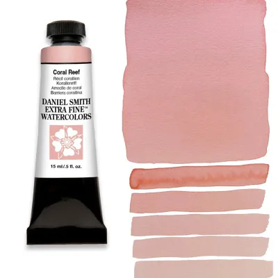
- Quinacridone Coral (PR209): A vibrant, transparent, staining pinkish-coral. It beautifully captures the intense, luminous hues of tropical flowers like hibiscus, bougainvillea, and plumeria.
For botanical work, prioritize clean, non-granulating greens. While you can mix greens using your primary yellows and blues, having a tube of a clean, transparent green like Phthalo Green (Blue Shade) (PG7) can save time, provided you always mix it with a touch of red or earth tone to keep it looking natural.
Landscapes and Seascapes
Landscape artists benefit greatly from colors that enhance natural textures, atmospheric depth, and organic sedimentation.
- Cerulean Blue, Chromium (PB36): A heavily granulating, semi-opaque, cool sky blue. It settles beautifully on the paper, perfectly mimicking the texture of distant mountains, misty horizons, or shallow coastal waters.
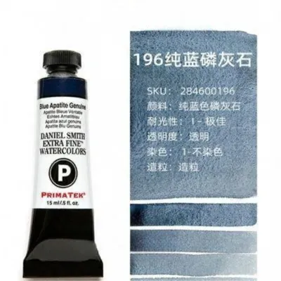
- Primatek Mineral Colors (e.g., Jadeite Genuine): Daniel Smith's Primatek line is made from actual semi-precious minerals. Jadeite Genuine, for example, creates a rich, deep forest green with mesmerizing dark undertones that settle into the paper's texture, mimicking wet river rocks or dense tropical forest canopies.
Using these mineral-based paints allows you to harness gravity and water to create realistic, self-texturing landscapes that synthetic pigments cannot easily replicate.
Urban Sketching and Architecture
Urban sketchers require speed, high contrast, and rapid drying times to capture quick, on-location scenes.
- Neutral Tint (PBk6, PV19, PB15) or Payne's Gray (PB29, PBk9, PR101): These allow for immediate, high-contrast values. Instead of spending time mixing a shadow tone, you can quickly lay down a wash of Neutral Tint to define architectural shadows, cast shadows under jeepneys, or stormy tropical clouds. Neutral Tint is specifically formulated to darken other colors without changing their hue.
- Transparent Pyrrol Orange (PO71): A fiery, completely transparent orange. It is perfect for adding sudden, vibrant pops of warm light to building facades, rust textures, or streetlights in quick sketches.
Smart Purchasing: Dot Cards, Tube Sizes, and Avoiding Waste
Building a professional watercolor palette can represent a significant financial investment, with individual Daniel Smith tubes generally costing between ₱800 and ₱1,500 depending on their pigment series (Series 1 to 4). To avoid wasting money on colors you might not enjoy, use smart purchasing strategies.
First, consider purchasing a Daniel Smith watercolor dot card. These cards feature small dabs of actual dry watercolor paint on high-quality watercolor paper. By wetting your brush and activating each dot, you can test the paint’s exact transparency, granulation, tinting strength, and color shift on your own paper before committing to a full tube. This is an incredibly cost-effective way to try out expensive Primatek or unique Quinacridone colors.
Second, choose your tube sizes wisely. Daniel Smith paints are primarily sold in 5ml and 15ml tubes. For beginners, starting with 5ml tubes is highly recommended. Because of the exceptionally high pigment concentration, a 5ml tube of professional-grade watercolor lasts a surprisingly long time. Reserve 15ml tubes only for your absolute workhorse colors—such as French Ultramarine or Burnt Sienna—which you will use in almost every painting.
Third, avoid large, pre-assembled beginner sets. Many commercial sets contain colors you may rarely use, such as white (which is rarely used in traditional transparent watercolor) or black. Buying individual tubes allows you to customize your palette to your specific needs, ensuring every peso spent goes toward a pigment you actually use. Finally, always purchase from authorized art supply retailers in the Philippines to ensure product authenticity, proper pigment labeling, and fresh stock that has not been subjected to extreme heat during improper storage.
Frequently Asked Questions (FAQ)
Do I need to buy Daniel Smith dot cards before getting tubes?
While not strictly mandatory, purchasing a dot card is highly recommended for beginners. It is a low-risk, cost-effective way to physically test how expensive or unique pigments react with your specific watercolor paper and water ratio before investing in full-sized tubes. It helps you identify which colors you genuinely enjoy using and which ones you can do without.
Are Daniel Smith watercolors lightfast?
Daniel Smith formulates the vast majority of their watercolors with excellent lightfastness in mind to ensure your artwork does not fade over time. However, you should always check the specific ASTM lightfastness rating printed on the individual tube label (rated from I for Excellent to IV for Fugitive). Some vibrant organic pigments naturally have lower lightfastness than mineral-based pigments, so verifying the label is essential for archival work.
How many colors should a beginner watercolor palette have?
A beginner watercolor palette should ideally have a strict limit of 6 to 10 colors, consisting of the six split primaries and two to four essential earth tones. Keeping your palette small forces you to learn the mechanics of color mixing, which naturally results in more harmonious paintings, faster skill development, and significantly less financial waste.

Community discussion
Share your experience or ask a question. Comments are reviewed before publication.