
Creating a visually stunning scrapbook page is more than just sticking down your favorite memories; it is an art of composition. When you arrange washi tape and stickers, you build a visual narrative that guides the viewer’s eye naturally across the page. By mastering a few simple layout principles, you can transform a simple collection of photos and paper scraps into a balanced, professional-looking keepsake. The key lies in understanding how different elements interact, from their physical textures to their visual weight, ensuring your designs remain clean and engaging.
Planning Your Scrapbook Page Layout
Every successful scrapbook page begins with a clear plan. Before reaching for your scissors or peeling off any adhesive backings, you must establish the foundation of your layout. Start by identifying the primary focal point of your page. This is almost always your main photograph, though it can also be a significant journaling block or a central piece of memorabilia. Everything else you place on the page should serve to highlight, not compete with, this central element.
Once your focal point is set, select a cohesive color palette and theme that complements your photos. For instance, if you are documenting a beach trip or a family gathering in a lush garden, choose earthy greens, warm sandy tones, or vibrant tropical blues. Having a defined color scheme prevents your page from looking chaotic.
Products mentioned in this guide
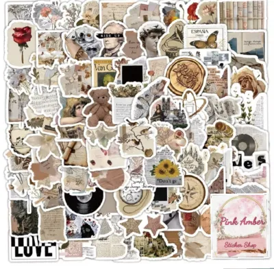
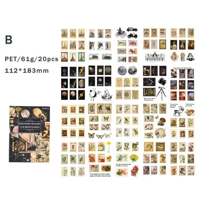
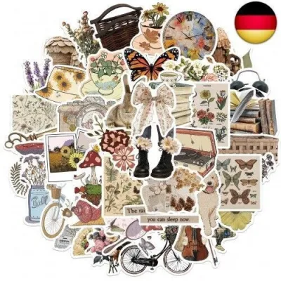
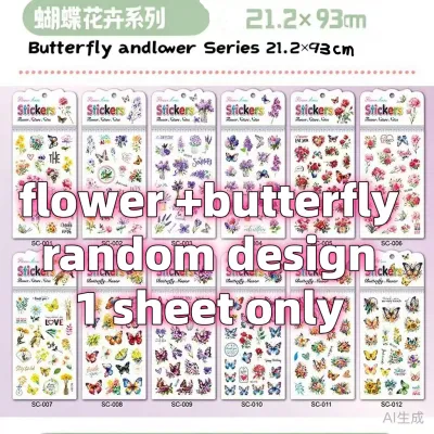
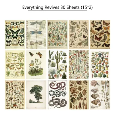
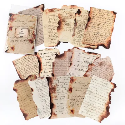
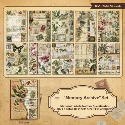
Prices are valid at publication and may change. Please refer to the product page for the latest price.
The most critical step in the planning phase is dry-fitting your elements. Lay out your photos, background papers, washi tapes, and stickers on the page without sticking them down. This allows you to experiment with different arrangements, test the visual balance, and make adjustments easily. In warm and humid climates, paper can sometimes warp slightly when handled repeatedly, so dry-fitting ensures you only apply adhesive once you are completely satisfied with the design.
Step-by-Step Techniques for Placing Washi Tape
Washi tape is one of the most versatile tools pang design sa scrapbook, offering both functional and decorative benefits. To create clean, structured layouts, you can use washi tape to build straight borders and geometric frames. Aligning your tape along a grid mat or using a clear acrylic ruler helps you achieve perfectly straight lines. You can frame a photo by placing thin strips of tape along its edges, which instantly anchors the image to the page and gives it a polished, framed look.

The way you tear or cut your washi tape also dramatically changes the aesthetic of your layout. Tearing the tape by hand creates a soft, textured, and rustic edge that works beautifully for vintage, travel, or organic themes. If you prefer a modern, clean, and minimalist style, use a pair of sharp scissors or a craft knife to cut precise, straight edges. Both techniques can be used on the same page to create contrast and interest.
Do not hesitate to layer multiple strips of tape to build custom patterns or wider borders. You can overlap a solid-colored tape with a thin, patterned lace tape to create a unique, multi-dimensional border. When layering, start with the widest or darkest tape at the bottom and stack narrower, lighter tapes on top.
Before committing to your placement, always check the adhesive compatibility of your washi tape with your specific scrapbook paper. While washi tape is generally known for being low-tack and repositionable, some high-quality or textured papers can still tear if the tape is pressed down too firmly and then pulled up. Testing a small piece of tape on a hidden corner of your paper will save you from accidental tears and ruined layouts.
Step-by-Step Techniques for Arranging Stickers
Stickers add personality and detail to your scrapbook, but placing them randomly can quickly clutter your design. To distribute your stickers evenly and create a pleasing flow, rely on classic design principles like the rule of thirds or visual triangles. By placing stickers in groups of three across the page—such as one cluster near the top left, one near the main photo, and one at the bottom right—you create an invisible triangle that guides the reader’s eye across the entire layout.
When working with stickers of varying sizes, always anchor your large statement stickers near your main focal point. A large floral die-cut or a bold quote sticker should sit close to your photograph, acting as a visual anchor. If large stickers are placed too far from the main elements, they can appear to float aimlessly on the page, distracting from the overall story.
Smaller stickers, such as tiny stars, hearts, or small label stickers, are perfect for grouping together to create secondary focal points or to fill negative space organically. Instead of scattering tiny stickers all over the page, cluster them close to your larger elements or use them to accent your journaling. This keeps the layout looking intentional and tidy.
Keep in mind that sticker adhesives can behave differently depending on the paper surface. Smooth, matte papers offer excellent grip, while heavily textured, glittered, or coated papers might cause stickers to lift over time, especially in humid environments. Always press your stickers down firmly, smoothing them from the center outward, and verify their adhesion before closing your album.
Combining Washi Tape and Stickers for Balanced Designs
The real magic happens when you combine washi tape and stickers to create depth and texture. One of the easiest ways to integrate both materials is by using washi tape as a background or a “mat” behind your stickers. If you have a die-cut sticker that blends too much into your background paper, run a strip of contrasting washi tape underneath it first. This simple layer provides a visual break, making your sticker stand out beautifully.
You can also use washi tape to create interactive, functional elements on your page. For example, try making tape hinges by placing a strip of tape along the top edge of a photo or a journaling card, allowing it to flip up and reveal hidden photos or private writing underneath. You can also fold a small piece of washi tape over the edge of a tag to create a custom pull-tab or flag, adding a playful, tactile element to your scrapbook.
Achieving balance is all about pairing contrasting patterns and weights. If you are using a bold, highly patterned washi tape, pair it with simple, subtle stickers to avoid overwhelming the eyes. Conversely, if your stickers are bright, colorful, and detailed, use neutral or solid-colored washi tapes to ground them.
While layering is excellent for adding depth, be mindful of the physical bulk you are adding to your page. Overlapping thick cardstock stickers, dimensional foam dots, and multiple layers of tape can make your page excessively thick. Over time, this extra bulk can put pressure on your scrapbook’s binding, making it difficult to close the album flat or causing the pages to warp. Keep your layers relatively flat, especially if you plan to fill a large album.
Common Layout Mistakes and How to Avoid Them
As you design, it is easy to fall into common layout traps that can disrupt the visual flow of your scrapbook. One frequent mistake is symmetrical stiffness, where elements are placed perfectly centered or lined up too rigidly. While symmetry has its place, it can often look static and uninspiring. Instead, aim for asymmetrical balance by placing a photo slightly off-center and balancing its weight with a cluster of stickers and tape on the opposite side.
Another common issue is the “floating” effect, where photos, journaling blocks, and stickers seem to drift aimlessly on the page without any connection. You can easily fix this by grounding your elements. Use a strip of washi tape along the bottom of a photo to act as a shelf, or overlap a sticker slightly with the edge of your photo to tie them together visually.
Visual clutter is another hurdle for many scrapbookers. It is tempting to use every beautiful sticker and tape in your collection, but a crowded page leaves no room for the eyes to rest. Prevent clutter by establishing clear boundaries and leaving at least 20% to 30% of your page as negative space. This empty space is not wasted; it is a powerful design tool that makes your photos and decorations stand out even more.
Lastly, always step back and look at your page from a distance. If you notice any elements competing with your main photo or journaling area, do not hesitate to adjust or remove them. Your decorations should always serve to enhance your memories, not overshadow them.
Frequently Asked Questions (FAQ)
How do I remove washi tape without tearing my scrapbook paper?
To remove washi tape safely without damaging your scrapbook paper, peel it back slowly at a very low angle, almost flat against the page, rather than pulling it straight up. If the tape has bonded strongly due to heat or time, you can use a low-heat setting on a craft heat tool or a hairdryer for a few seconds to soften the adhesive before peeling. Always test the surface strength of your paper beforehand, especially when working with delicate or fibrous papers.
Can I use regular stickers on top of washi tape?
Yes, you can use regular stickers on top of washi tape, but you should first assess the texture of the tape’s surface. Matte paper-based washi tapes provide an excellent grip for most sticker adhesives, while glossy, foiled, or plastic-textured tapes may require extra pressure. When applying the sticker, press down firmly and smooth out any air bubbles to ensure full contact. Keep in mind that long-term adhesion can vary depending on the specific adhesive formulations of both the tape and the sticker.

Community discussion
Share your experience or ask a question. Comments are reviewed before publication.