
Selecting the right Christmas cards with envelopes for handwritten calligraphy requires balancing paper absorbency, surface texture, and envelope opacity. Because calligraphy inks are wetter and more pigmented than standard ballpoint inks, standard greeting cards often cause feathering, bleeding, or warping. To ensure your holiday greetings look crisp and elegant, you must look for cardstock that specifically supports wet media, paired with envelopes that can withstand the sharp tines of a calligraphy nib. Taking the time to evaluate these materials ensures your handwritten messages remain legible and beautiful throughout their journey.
Understanding Paper Weight and Texture for Calligraphy
Paper weight is one of the most critical specifications to check when shopping for holiday stationery. Cardstock weight is typically measured in grams per square meter (gsm) or pounds (lb). For calligraphy, standard copy paper or cheap greeting cards (often around 100 to 150 gsm) are far too thin to handle the volume of ink delivered by a dip pen or brush pen.
You should look for cardstock that is at least 250 gsm, though 300 gsm or higher is ideal for heavy ink applications or decorative watercolor washes. Heavier paper resists buckling and warping when wet ink is applied, ensuring the card remains flat and presentable. When paper is too thin, the moisture from the ink penetrates the fibers too quickly, causing the card to curl as it dries.
Products mentioned in this guide
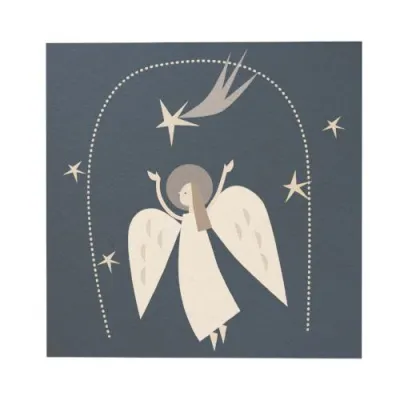
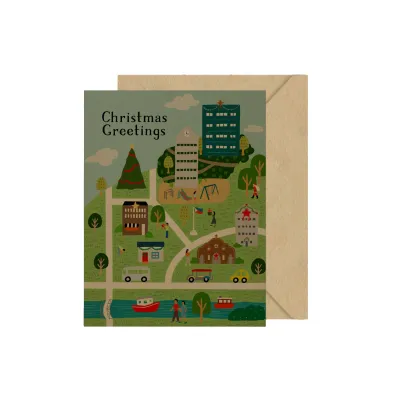
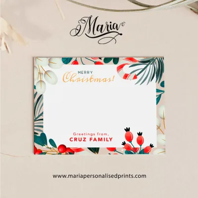
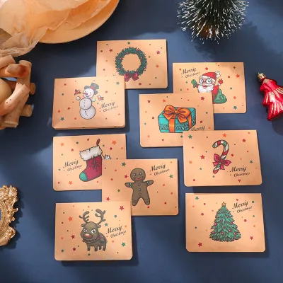
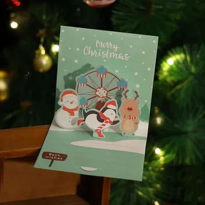
Prices are valid at publication and may change. Please refer to the product page for the latest price.
Texture plays an equally vital role in how your pen moves across the page. Hot-pressed paper has a smooth, satiny finish created by passing the paper through hot rollers during manufacturing. This smooth surface is excellent for pointed pen calligraphy, such as Copperplate or Spencerian, because the fine metal nib can glide effortlessly without catching on paper fibers.
Cold-pressed paper, on the other hand, retains a textured, slightly bumpy surface. While beautiful for a rustic or artistic look, this texture can cause flexible pointed nibs to catch, splatter ink, or create jagged lines. If you prefer using brush pens or broad-edge nibs for modern or Gothic calligraphy, a mild cold-pressed texture can offer pleasant feedback and control, but highly textured papers should generally be avoided for delicate script.
You must also verify if the paper has been treated with sizing. Sizing is an internal or external starch-like coating that controls how quickly the paper absorbs liquid. Unsized paper acts like a sponge, causing ink to spread outward in fuzzy branches (feathering). High-quality calligraphy cardstock features external sizing that keeps the ink sitting on top of the paper, preserving sharp, clean hairlines. Since manufacturers do not always list sizing details, checking user reviews or testing a single card is the most reliable way to verify this feature.
Evaluating Envelope Quality and Addressing
The envelope is the first thing your recipient sees, and it must serve as a reliable canvas for your calligraphic addressing. Many standard card sets include thin, low-density envelopes that allow the card’s design or the internal message to show through. To prevent this, look for envelopes with a paper weight of at least 120 gsm. High-opacity envelopes protect the privacy of your message and provide a more substantial, premium feel in the hand.

Just like the cards, envelope paper must have a surface finish that accommodates calligraphy ink. Many cheap envelopes are made from highly absorbent, fibrous paper that causes ink to pool or feather instantly. When addressing envelopes, a smooth, calendered finish allows your nib to glide without snagging. If you plan to use white or metallic gouache for dark-colored envelopes, the paper must be sturdy enough to hold the thicker, water-based pigment without warping or peeling.
The style of the envelope flap also affects your workflow and the safety of your calligraphy. Traditional gummed flaps require moisture to seal. In humid tropical environments, such as the Philippines, moisture-activated glue can sometimes stick prematurely in storage or become messy during sealing, risking water damage to your finished calligraphy.
Peel-and-seal flaps feature a protective strip covering a self-adhesive backing, which eliminates the need for water and reduces the risk of smudging your work. Clasp envelopes are generally too industrial for elegant holiday cards, making peel-and-seal the most practical and secure option for delicate hand-lettering. Choosing the right flap style ensures that your hard work is not ruined at the very last step of the mailing process.
Checking Ink Compatibility and Drying Time
Not all inks behave the same way on every paper surface. Fountain pen inks are generally dye-based and highly fluid, which makes them prone to feathering on standard cardstock unless the paper is specifically designed for fountain pens. Dip pen inks, such as iron gall, acrylic, or pigment-based drawing inks, are thicker and contain binders that help them sit on top of the paper.
If you are using a brush pen, the water-based ink requires a smooth, non-abrasive surface to prevent the delicate felt or synthetic brush tips from fraying. Rough paper can quickly wear down brush tips, ruining your ability to create clean, thin upstrokes. Matching your pen type to the paper’s surface finish is essential for maintaining your tools and achieving clean lettering.
Drying time is a critical factor that varies based on paper absorbency and local climate conditions. In high-humidity regions, ink takes significantly longer to dry. If you are writing dozens of Christmas cards, a slow-drying ink on a highly sized, non-porous paper can lead to accidental smudging when stacking or folding the cards.
You must plan your workspace to allow cards to air-dry completely before they are touched or inserted into envelopes. Setting up a drying rack or laying the cards out flat on a clean surface is a simple way to prevent smudges. Avoid stacking cards too quickly, as even dry-looking ink can transfer under pressure.
To avoid ruining an entire batch of expensive stationery, establish a simple at-home testing protocol. Always purchase a set that includes at least one extra card and envelope, or use a small, inconspicuous corner of a card to test your tools. Write a few sample strokes using different nibs, brush pens, and inks. Observe how long the ink takes to dry, check the back of the paper for bleed-through, and hold the paper up to the light to inspect for any micro-feathering. This quick trial ensures your materials are fully compatible before you begin your formal writing.
Sizing, Folding, and Layout Considerations
The physical format of your Christmas card dictates how you should plan your calligraphic layout. Flat cards (often called postcard style) offer a modern, clean aesthetic and are excellent for short, impactful messages or single-word designs like “Joy” or “Peace.” Single-fold cards are the traditional choice, providing a classic opening experience and protecting your handwritten message inside.
Gatefold cards, which open from the center, offer a dramatic presentation but require careful layout planning to ensure your writing does not cross the fold lines awkwardly. When selecting a card, pay close attention to the balance between pre-printed holiday designs and blank writing space. Calligraphy requires generous margins and breathing room, especially if you plan to add elegant flourishes, ascenders, or descenders.
Ensure the card has a dedicated, unprinted area that is large enough to accommodate your message without forcing you to crowd your letters. If the card features a dark or busy background pattern, you may need to use opaque inks like white, gold, or silver gouache to ensure legibility. Always measure the available writing area beforehand to plan your letter height and line spacing.
Finally, verify that the card dimensions align correctly with standard envelope sizes. A card that is too tight for its envelope can be difficult to insert without bending the corners or rubbing against the delicate, dried calligraphy. Conversely, a card that is too loose will slide around inside, increasing the risk of ink transfer or friction damage during transit. Standard sizes like A7 (5.25 x 7.25 inches for the envelope, fitting a 5 x 7 inch card) are widely available and offer a balanced canvas for both the message and the envelope address.
Building Your Shortlist: What to Verify Before Buying
When shopping for Christmas cards on online marketplaces or at local stationery boutiques, a systematic verification process will save you time and resources. If possible, look for sellers that offer sample packs or single-card purchases. Ordering a small sample allows you to perform your ink tests without committing to a bulk order of fifty or a hundred cards that might not suit your specific calligraphy style.
If sample packs are not available, leverage the power of online reviews on ecommerce platforms. Filter the reviews using keywords such as “ink,” “bleed,” “feathering,” “fountain pen,” or “thickness.” Other stationery enthusiasts often leave detailed feedback about how the paper handles different writing instruments. Pay attention to complaints about thin envelopes or cards arriving with bent corners, as these issues can compromise the final presentation of your holiday greetings.
Additionally, review the seller’s return policies and bulk order conditions. Since paper batches can occasionally vary in sizing and quality, knowing you can return unused, unaltered packs provides peace of mind. If you are planning a large mailing list, look for bulk packages that offer consistent paper quality across the entire set, ensuring that your last card looks just as pristine and professional as your first.
Finally, consider the storage conditions of the cards before they reach you. If you are purchasing from a local shop, inspect the packaging for any signs of moisture damage or warping, which can affect how the paper absorbs ink. Taking these extra steps during the selection process ensures that your holiday calligraphy project is a rewarding and stress-free experience.
Frequently Asked Questions (FAQ)
Can I use regular fountain pen ink on standard Christmas cards?
Standard Christmas cards often feature a glossy or highly coated surface designed for printed graphics, which resists water-based fountain pen inks and causes them to pool, smear, or take hours to dry. Conversely, uncoated standard cards may be too fibrous, causing fluid fountain pen ink to feather and bleed through the paper. If you wish to use a fountain pen, look for cards specifically labeled as fountain pen friendly, or switch to a drier, pigment-based calligraphy ink applied with a dip pen for crisp results.
What is the best envelope flap style for calligraphy?
Peel-and-seal envelope flaps are highly recommended for calligraphy. Traditional gummed flaps require moisture to activate the adhesive, which can introduce water near your freshly dried ink and cause accidental smudging. Furthermore, in humid tropical climates, gummed flaps can absorb moisture from the air and seal prematurely in storage. Peel-and-seal flaps use a dry adhesive protected by a paper strip, allowing you to seal the envelope cleanly and securely without risking any damage to your hand-addressed calligraphy.
Community discussion
Share your experience or ask a question. Comments are reviewed before publication.