
Starting your hand-lettering journey can feel overwhelming when your hand struggles to draw the straight lines or consistent curves you see in professional designs. A high-quality lettering template serves as a physical guide to bridge the gap between unsteady freehand attempts and precise, muscle-memory-driven strokes. By using these structured guides, you can focus on mastering pen pressure, ink flow, and basic letterforms without the frustration of constantly misjudging spacing or slant angles.
Choosing the right lettering template involves understanding your specific goals, whether you want to master structured block letters, elegant script, or modern brush calligraphy. The ideal beginner set should offer clear visibility, durable construction that resists ink smudging, and a layout that matches your preferred writing tools. Investing in a reliable template set allows you to build confidence rapidly, turning repetitive practice sessions into a rewarding creative habit.
Why Beginners Benefit from Lettering Templates
Developing consistent hand-lettering requires a deep familiarity with the invisible lines that govern typography. For a beginner, keeping letters aligned on a blank page is incredibly challenging, often resulting in words that drift upward or shrink as they progress. Lettering templates provide immediate physical boundaries for the baseline, x-height, cap height, and ascender or descender lines. Tracing these guides teaches your hand exactly how far to extend a stroke and where to terminate a curve, establishing a reliable visual standard.
Products mentioned in this guide
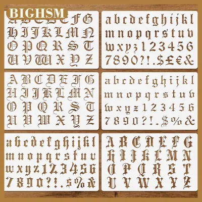
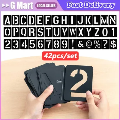
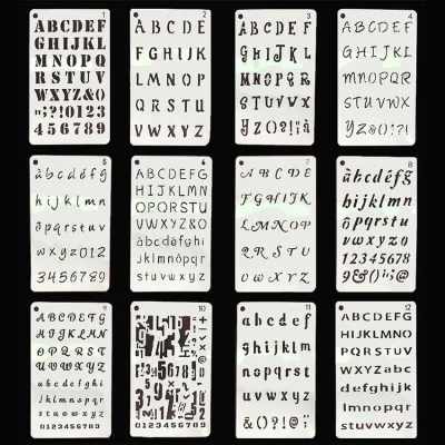
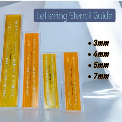

Prices are valid at publication and may change. Please refer to the product page for the latest price.
Using a template also significantly reduces the cognitive load associated with early practice. When you do not have to worry about whether your next letter will fit into the remaining space or if your vertical strokes are perfectly parallel, you can dedicate your full attention to pen control. This isolation of skills is crucial for beginners who are still learning how to manage the flow of ink and the flexibility of different nibs. It transforms a complex, multi-variable task into a series of manageable, repeatable movements.
Over time, this structured tracing transitions naturally into muscle memory. Your hand becomes accustomed to the physical distance required for balanced spacing and the precise angles needed for consistent slants. As you gain confidence, the template shifts from a constant physical crutch to a reference tool used for initial layout sketching. Eventually, you will find yourself drawing baseline guides freehand, relying on the spatial awareness you developed while tracing the physical edges of your template.
Core Criteria for Evaluating Beginner Template Sets
When shopping for your first lettering template set on local stationery sites or online marketplaces, physical construction is just as important as the font style. The thickness and flexibility of the material play a direct role in how clean your final letters look. If a template is too thin, liquid ink can easily seep underneath the edges through capillary action, causing unsightly smudges on your paper. Look for templates with a slight elevation or a raised bevel edge, which lifts the plastic slightly off the page and prevents ink from bleeding.

Clarity and precision of the etched or printed guide lines are equally vital for accurate tracing. Transparent or tinted acrylic and plastic templates are generally superior to opaque options because they allow you to see the previous letters you have drawn. This visibility is essential for adjusting your horizontal spacing, known as kerning, as you move the template across the page. Ensure that any printed grid lines or measurement markings are crisp and durable enough to withstand repeated rubbing from your fingers and pens.
A versatile beginner set should offer a balanced variety of characters to keep your practice engaging. Look for packages that include complete uppercase and lowercase alphabets, numbers, and basic punctuation marks. Some of the most helpful beginner sets also feature structural flourishes, such as banners, arrows, and decorative borders, which help you practice layout composition. Having these elements in a single set allows you to experiment with complete designs rather than just isolated letters.
Finally, pay close attention to the edge finishing and corner rounding of the template. Rough or sharp edges can catch the fine tips of your pens, damaging delicate felt nibs or causing your pencil to jump during a stroke. Smooth, laser-cut edges ensure that your writing instrument glides effortlessly along the guide. Additionally, rounded outer corners prevent the template from snagging on your paper or scratching your hands during long, focused practice sessions in a warm, humid environment where paper can become slightly soft.
Matching Template Formats to Your Practice Goals
Different lettering styles require distinct structural supports, meaning the template format you choose should align with your specific aesthetic goals. If you are drawn to elegant, traditional scripts like copperplate or italic calligraphy, maintaining a consistent slant is your primary challenge. Slant boards and angle guides, which feature pre-calculated diagonal lines (often angled between 52 and 55 degrees), are indispensable for this style. They train your hand to maintain a uniform slope across every single letter, preventing your writing from looking disorganized.
For those focusing on modern block lettering, sans-serif styles, or structured layouts, grid and dot-grid overlays are highly effective. These templates do not dictate the exact shape of the letters; instead, they provide a precise matrix of bounding boxes and proportion guides. By using a grid overlay, you can easily calculate the width of individual letters, ensuring that wider letters like \”M\” or \”W\” are appropriately proportioned compared to narrower ones like \”I\” or \”L\”. This format is excellent for transition-stage beginners who want to design their own letterforms while keeping their overall layout perfectly square.
If you prefer a highly guided experience, full-alphabet stencils are the most straightforward option. These allow you to trace the exact contours of pre-designed letters directly onto your page. While highly restrictive, they are excellent for absolute beginners who need to build basic hand-eye coordination. Alternatively, individual letter-shape tracing guides offer a middle ground, providing modular curves and stems that you combine to build letters. This modular approach teaches you the anatomy of typography, helping you understand how different strokes connect to form cohesive characters.
Checking Tool and Paper Compatibility
A common source of frustration for beginners is purchasing a beautiful lettering template only to find that it ruins their favorite pens or paper. Before committing to a set, verify that the physical thickness of the template matches the writing instruments you plan to use. Fine-liners with metal-clad tips, technical pens, and hard-lead drafting pencils work beautifully with almost all plastic templates because their rigid tips can easily follow the vertical walls of the cutouts. Flexible brush pens and broad-tipped markers, however, can easily get caught or frayed if the template openings are too narrow or sharp.
Paper selection is equally critical, especially in tropical climates where ambient humidity can affect how paper fibers absorb ink. Standard, lightweight printer paper is often too porous and thin for serious lettering practice. When you trace along a plastic edge on thin paper, the ink tends to pool and feather, spreading outward and ruining your clean lines. To prevent this, pair your templates with smooth, heavy-weight paper, such as marker paper, bristol board, or high-quality mixed-media sheets with a weight of at least 100 gsm.
To keep your work clean and precise, you must also secure the template during use. Even a millimeter of slippage can distort a letter and disrupt your spacing. Using low-tack paper tape or drafting tape is an excellent way to temporarily anchor the template to your page without tearing the paper fibers when you peel it off. Alternatively, placing small, flat paperweights on the corners of the template can keep it perfectly still, allowing you to focus entirely on your pen strokes without needing to grip the plastic tightly with your non-dominant hand.
Structuring a Hand-Lettering Practice Routine
Owning the right tools is only half the battle; real improvement comes from how you integrate those tools into a consistent practice routine. Begin each session with five to ten minutes of basic stroke drills using your grid guides. Practice drawing straight vertical lines, consistent loops, and smooth curves. These warm-ups build the fundamental muscle memory required for letterforms and help you gauge the flow of your ink and the friction of your paper before you begin working on actual layouts.
Once warmed up, progress to tracing full words and phrases rather than repeating single letters indefinitely. Tracing complete words forces you to confront the spatial relationships between different letter combinations. Pay close attention to the negative space inside and between the letters, adjusting your template position to maintain visual balance. If you are using a full-alphabet stencil, practice sliding the template smoothly along a straightedge ruler to keep your baseline perfectly level across the entire phrase.
The ultimate goal of using templates is to transition to freehand lettering, which requires a deliberate strategy of gradual independence. After completing a page of traced letters, challenge yourself to replicate the same words freehand on the line directly below. This immediate comparison allows you to identify where your hand naturally drifts or loses consistency. By alternating between guided tracing and freehand attempts, you train your brain to recognize structural errors and build the confidence needed to design beautiful layouts entirely on your own.
Frequently Asked Questions (FAQ)
Can I use regular printer paper with plastic lettering templates?
While you can use regular printer paper for quick pencil sketches, it is not recommended for ink-based lettering practice. Standard printer paper is highly absorbent and thin, which causes liquid inks from fine-liners, brush pens, and markers to bleed and feather rapidly under the edges of a plastic template. This absorption can also lead to smudging as you slide the template across the page. For the best results, use smooth, bleed-resistant paper with a weight of 100 gsm or higher, which keeps your ink lines sharp and prevents bleed-through.
How do I clean ink residue off my plastic templates without damaging them?
To clean your plastic templates safely, wash them gently with lukewarm water and a few drops of mild dish soap. Avoid using harsh chemical solvents, alcohol-based cleaners, or abrasive scrubbing pads, as these can permanently cloud, warp, or scratch the clear plastic and erase any printed guide lines. Gently wipe the template with a soft microfiber cloth to remove ink buildup, and lay it flat on a clean towel to air dry completely. Store your templates flat in a cool, dry place away from direct sunlight to prevent warping, especially in warm, humid climates.

Community discussion
Share your experience or ask a question. Comments are reviewed before publication.