
Personalizing a portfolio is an effective way to express your creative identity or organize your academic and professional materials. However, selecting the right sticker for a portfolio requires more than just picking a favorite design. The ideal choice depends on the portfolio’s cover material, its intended use, and your long-term aesthetic goals. In tropical environments like the Philippines, high humidity and warm temperatures can also affect adhesive stability, making moisture-resistant materials like vinyl or PET highly desirable for long-term durability. By matching the sticker’s finish, size, and adhesive type to your specific binder or folder, you can create a personalized cover that looks intentional, polished, and professional.
Understanding Your Portfolio's Purpose and Aesthetic
Before browsing online marketplaces or local stationery shops, define the primary objective of your portfolio. An academic or corporate portfolio, such as one used for architecture reviews, job interviews, or business proposals, requires a highly disciplined visual approach. For these formal applications, minimalist and subtle accents—such as clean geometric shapes, monochrome color schemes, or simple border lines—work best. These understated designs frame your work rather than distracting from it. Conversely, a personal or creative portfolio, such as an art compilation, a design lookbook, or a creative writing journal, can accommodate expressive, layered layouts, colorful illustrations, and mixed-media sticker arrangements.
The physical characteristics of your portfolio cover should dictate your sticker choices. Take note of the base color, texture, and any existing patterns on the cover. A dark, textured plastic binder will interact differently with stickers than a smooth, light-colored kraft paper folder. If your cover has a strong texture, thin paper stickers may struggle to adhere smoothly, whereas thicker vinyl stickers can bridge the textured gaps. Additionally, consider the color contrast; dark covers can swallow up deep-toned stickers, while light-colored stickers might look washed out on a white or cream background.
Products mentioned in this guide

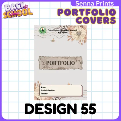
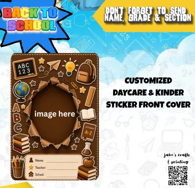

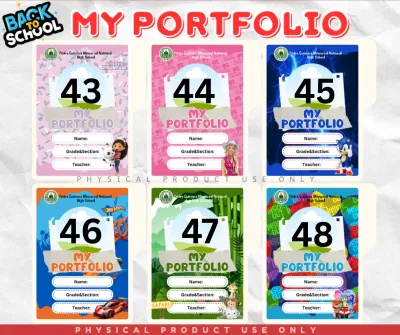
Prices are valid at publication and may change. Please refer to the product page for the latest price.
To prevent a cluttered or disjointed appearance, establish a unified theme or color palette before making any purchases. Limit your selection to two or three coordinating colors that complement the base cover. For instance, if you are decorating a navy blue binder, a palette of gold, white, and soft gray stickers creates a cohesive, sophisticated look. Planning this theme in advance ensures that every sticker you apply feels like an intentional part of the overall design rather than an afterthought.
Matching Sticker Finishes to Portfolio Materials
The finish of your stickers plays a critical role in how they integrate with your portfolio’s cover material. Matte and transparent finishes are excellent for creating a subtle, integrated look. Matte stickers have a non-reflective surface that blends seamlessly with paper, cardstock, or matte-finished plastic covers, giving the impression of printed graphics. Transparent stickers, typically made from polyethylene terephthalate (PET), allow the underlying color and texture of the portfolio cover to show through. This transparency eliminates the harsh white borders often found on standard stickers, making them ideal for patterned or dark covers, provided the sticker ink is opaque enough to remain visible.

For high-contrast, eye-catching accents, glossy and holographic finishes are the preferred choices. Glossy stickers reflect light sharply, making colors appear more vibrant and saturated. They work exceptionally well on smooth, solid-color surfaces like polished plastic, laminated cardstock, or acrylic covers. Holographic finishes introduce a dynamic, color-shifting element that catches the light as the portfolio is moved. While highly engaging, holographic stickers should be used sparingly as focal points or border details to avoid overwhelming the viewer, especially in professional settings.
Rather than assuming all stickers offer universal durability, always check the manufacturer labels or seller descriptions for material composition. Vinyl stickers are highly durable, flexible, and water-resistant, making them excellent for portfolios that are frequently carried in backpacks or exposed to the humid tropical climate of the Philippines. Paper-based stickers, including delicate washi paper, are much more sensitive to moisture, oil from hands, and physical wear. These are best reserved for internal pages or portfolios that remain safely stored on a shelf.
Before committing to a full design, always perform an adhesive and visual test on a small, inconspicuous area of your portfolio, such as the inside back cover. This trial allows you to verify how well the sticker adheres to the specific cover material and whether the finish looks as expected under different lighting conditions. It also helps you observe if the sticker can be removed without leaving a permanent mark or tearing the surface.
Choosing the Right Sticker Sizes and Layouts
Achieving a balanced composition requires a thoughtful mix of sticker sizes. Relying solely on medium-sized stickers can make your portfolio cover look uniform and uninspired. Instead, select one or two large statement stickers to serve as your primary focal points. These larger designs draw the eye first and establish the theme of your portfolio. You can then surround them with smaller die-cut stickers, such as tiny geometric shapes, stars, or thin border strips, to create a sense of movement and guide the viewer’s gaze across the cover.
To avoid permanent mistakes, plan your layout on a separate surface before peeling off any sticker backings. Lay your portfolio flat on a desk and arrange the stickers with their backings still intact. You can also take a photo of your portfolio cover and use a digital mockup tool or a basic drawing app on your phone to experiment with different arrangements. This step allows you to adjust the spacing, test different angles, and ensure that the overall composition feels balanced before making any permanent commitments.
When planning your layout, pay close attention to the portfolio’s physical mechanics. Avoid placing stickers too close to the spine, hinges, rings, opening clasps, or outer edges. If a sticker wraps around a sharp edge or sits on a high-friction area where your hands constantly grip the binder, the edges will quickly lift, collect dust, and peel away. Leave at least a five-millimeter clearance from any moving parts or edges to ensure the stickers remain securely attached during daily use.
Preserving adequate negative space is essential for maintaining an organized, professional appearance. Negative space—the empty area surrounding your stickers—gives the design room to breathe and prevents the cover from looking chaotic. A good rule of thumb is to leave at least 60% to 70% of the portfolio cover blank. This contrast highlights your selected stickers and ensures that your personalization enhances, rather than detracts from, the professional presentation of your work.
Evaluating Sticker Adhesives for Safe Application and Removal
Understanding the properties of different sticker adhesives is crucial for protecting your portfolio cover from long-term damage. Adhesives generally fall into three categories: permanent, removable, and repositionable. Permanent adhesives form a strong, lasting bond that is highly resistant to peeling, making them ideal for durable vinyl stickers on plastic covers. However, they are difficult to remove and can tear paper or leave heavy residue. Removable adhesives allow you to peel the sticker off cleanly, while repositionable adhesives (often found on high-quality washi tape) let you adjust the placement multiple times during application without losing stickiness.
If your portfolio holds sensitive documents, original artwork, or photographs, look for “acid-free” or “archival-safe” labels on sticker packaging. Standard adhesives often contain acidic compounds that can migrate through the cover material over time. This acid migration can cause the portfolio cover to discolor and can even damage the contents inside, leading to yellowing, brittleness, or fading of your valuable work.
In the warm and humid climate of the Philippines, sticker adhesives are particularly susceptible to degradation. Over time, high humidity can cause cheap adhesives to break down, leading to yellowing, stiffening, or lifting edges. If you notice the edges of your stickers starting to curl or feel sticky to the touch, it may be time to carefully remove or replace them before the adhesive melts into a stubborn, greasy residue that permanently stains the cover.
If your portfolio cover is made of delicate, high-value materials such as genuine leather, suede, velvet, or specialty fabrics, standard stickers should be avoided entirely. The adhesives can permanently stain the fibers, clog the pores of the leather, or strip away the top grain upon removal. Before applying any adhesive to a premium cover, stop and consult the portfolio manufacturer’s care instructions. In these cases, it is safer to use decorative slipcovers, hanging tags, or to focus your decoration on the internal divider pages instead.
Building Your Portfolio Sticker Shortlist
To find the perfect stickers for your project, build a conditional checklist that matches your specific portfolio requirements. Start by verifying the physical dimensions of your portfolio cover and comparing them against the sizes of the stickers you are considering. A sticker sheet that looks small on a screen might be much larger than expected in person, so always use a ruler to visualize the scale on your actual binder.
Compare your sticker options based on theme consistency, material compatibility, and intended use cases rather than relying on generic popularity or online trends. If your portfolio is a heavy-duty binder that travels with you to school or the office daily, prioritize water-resistant vinyl or PET stickers. If it is a delicate keepsake journal that stays on your desk, soft washi paper stickers with light adhesives may be more appropriate.
When shopping on online marketplaces, read the seller descriptions carefully to identify the exact materials used. Look for specific terms like PVC, PET, or washi paper rather than vague descriptions like “plastic” or “paper.” This technical clarity helps you predict how the sticker will handle moisture, friction, and light exposure over time.
Finally, start with a small test batch before purchasing large quantities of stickers, especially if you are preparing multiple portfolios for a presentation or class. Buying a single sheet or a small sample pack allows you to evaluate the real-world color accuracy, print sharpness, and adhesive strength on your specific cover material. This step ensures you are satisfied with the quality before investing your budget in a larger set.
Frequently Asked Questions (FAQ)
Can I use standard paper stickers on a laminated portfolio cover?
Standard paper stickers generally do not perform well on laminated or non-porous portfolio covers over the long term. Because laminated surfaces are exceptionally smooth and slick, paper stickers struggle to form a secure bond and are highly prone to peeling at the corners, especially when exposed to friction or humidity. Additionally, paper stickers lack a protective top layer, meaning they can easily tear, smudge, or degrade from the natural oils on your hands. If you must use paper designs, consider applying a clear, self-adhesive laminate sheet or a transparent vinyl overlay over the top of the stickers to seal the edges and protect them from wear.
How do I safely remove sticker residue from my portfolio?
To remove stubborn adhesive residue without damaging your portfolio, always start with the gentlest mechanical methods. Try peeling the sticker slowly at a sharp, 180-degree angle, or use a soft plastic scraper—such as an old credit card—to lift the edges. If a sticky residue remains, test a tiny drop of mild soapy water on a hidden corner of the portfolio first to ensure it does not discolor the surface. Avoid using harsh chemical solvents, acetone, heat guns, or abrasive scrubbing pads, particularly on leather, faux leather, or printed paper covers, as these can melt the plastic, strip the finish, or leave permanent stains.
Are transparent stickers better for professional portfolios?
Transparent stickers are highly effective for professional portfolios because they lack the distracting white borders found on standard die-cut stickers. This allows the design to blend seamlessly into the background, creating a clean, integrated look that resembles custom printing. However, their visibility depends heavily on the contrast between the sticker ink and your portfolio cover. On dark or highly textured covers, transparent stickers without a white ink backing layer can become virtually invisible. They are best suited for light-colored, smooth surfaces where the printed details can stand out clearly.
Community discussion
Share your experience or ask a question. Comments are reviewed before publication.