
Finding the perfect birthday card to showcase your hand-lettered calligraphy can be a surprisingly difficult task. While a beautifully designed card sets the stage for your message, the wrong paper can turn your elegant script into a blurry, bleeding disappointment. The best birthday cards for handwritten calligraphy feature heavy, well-sized paper with a smooth finish that keeps ink crisp and prevents feathering. Whether you are browsing local stationery boutiques or searching online for a premium happy birthday sach (a term often used for folded greeting card books and premium card sets), understanding the physical properties of paper will save you from ruined cards and wasted effort.
Why Standard Greeting Cards Often Fail at Calligraphy
When you pick up a mass-produced birthday card from a local supermarket or bookstore, you are usually holding paper designed for commercial digital printing, not wet ink. These standard cards often fail immediately when met with a fountain pen, dip pen, or brush marker. The failure typically presents itself in three distinct, frustrating ways: bleeding, feathering, and show-through.
Bleeding occurs when the paper absorbs the ink too rapidly and deeply, causing the liquid to saturate the fibers until it pools or leaks straight through to the opposite side of the card. Feathering is a more subtle but equally destructive issue; as you write, the ink creeps outward from your strokes along the individual paper fibers, turning sharp, elegant hairlines into fuzzy, spider-web-like shapes. Show-through, or ghosting, happens when the ink does not physically break through the paper, but the sheet is so thin or translucent that your writing is clearly visible from the back, ruining the clean look of a folded card.
Products mentioned in this guide
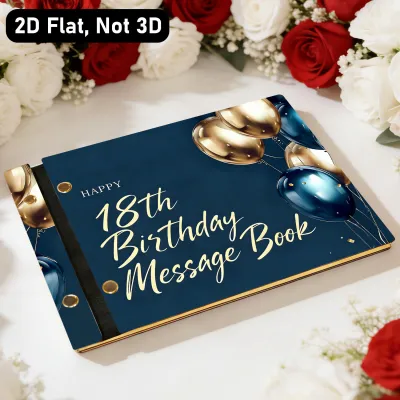
Prices are valid at publication and may change. Please refer to the product page for the latest price.
Most commercial cards are manufactured using lightweight cardstock that lacks the necessary chemical treatments to handle liquid inks. In the paper industry, these treatments are known as sizing. Without proper sizing, the paper acts like a sponge or a piece of facial tissue, drawing the moisture out of your pen as soon as the tip makes contact. Ruining a carefully planned, hand-lettered birthday message because of incompatible paper is highly discouraging, which is why verifying the technical specifications of your greeting cards before you begin writing is an essential step.
Core Paper Specifications for a Happy Birthday Sach or Card
To make an informed decision when purchasing cards, you must look past generic marketing terms like “premium,” “luxury,” or “heavyweight.” These labels are subjective and rarely guarantee that the paper can handle wet calligraphy ink. Instead, you should focus on two primary technical specifications: paper weight and surface treatment.

Paper Weight and Thickness
Paper weight is typically measured in grams per square meter (GSM) or pounds (lbs). For handwritten calligraphy, the weight of the cardstock provides the physical barrier necessary to prevent show-through and give the card a sturdy, high-quality feel. When selecting a card, aim for a weight of at least 250 GSM, though 300 GSM or higher is ideal for heavy ink applications.
However, it is vital to understand that paper weight and thickness are not automatic guarantees of ink resistance. A thick cardstock can still feather terribly if the fibers are loosely packed or if the paper lacks internal sizing. Weight primarily prevents the ink from showing through to the other side and ensures the card can stand upright on a shelf without bowing under the weight of the ink or embellishments. When shopping, always check the product description for a specific GSM rating rather than relying on visual thickness alone.
Surface Texture and Sizing
The texture of the paper, often determined by how it was pressed during manufacturing, directly impacts how your pen glides across the surface. Smooth finishes, often referred to as hot-pressed or satin surfaces, are highly favored by calligraphers because they allow for incredibly sharp hairlines, precise control, and rapid nib movement. In contrast, textured finishes, such as cold-pressed or laid paper, have visible ridges that can catch sharp metal nibs, cause ink splatters, and wear down delicate brush pen tips, though they do offer a rustic, tactile aesthetic.
Beyond texture, the presence of sizing is the single most critical factor in controlling ink absorption. Sizing refers to starches or chemicals added to the paper pulp (internal sizing) or applied to the surface of the finished sheet (external sizing) to reduce its porosity. Sizing slows down the absorption of liquid, keeping the ink on top of the paper fibers where it can dry slowly and maintain its sharp edges. When evaluating cards, look for descriptions containing terms like “sized for wet media,” “fountain pen friendly,” “ink-resistant,” or “suitable for mixed media.”
Matching Card Paper to Your Calligraphy Tools
Different calligraphy tools interact with paper in unique ways. A card that works beautifully for a gel pen might fail spectacularly under the heavy flow of a dip pen. To find the perfect match, you must consider the specific tool and ink you plan to use.
Fountain Pens and High-Flow Inks
Fountain pens lay down a continuous, wet line of water-based ink, making them highly sensitive to paper quality. To prevent feathering and bleeding, fountain pen calligraphy requires a hard, smooth surface with robust sizing. If the paper is too absorbent, the ink will spread instantly, destroying the contrast between your thick downstrokes and thin upstrokes.
Avoid using cards made from highly textured, unsized cotton or recycled papers with fountain pens, as these materials will draw the ink out too quickly. Instead, look for cards specifically marketed as fountain pen friendly, or those made from renowned paper stocks. A hard, smooth finish ensures that the ink sits on the surface, allowing the true color, shading, and sheen of your fountain pen ink to shine through.
Brush Pens and Markers
Brush pens are incredibly popular for modern calligraphy, but they present two distinct challenges: high ink volume and physical wear on the pen tips. Water-based brush pens behave similarly to fountain pens, requiring well-sized paper to prevent feathering. Alcohol-based markers, on the other hand, are highly prone to bleeding through almost any standard paper because the alcohol solvent penetrates fibers rapidly.
If you plan to use alcohol-based markers for your card designs, you must verify if the cardstock has a specialized bleed-proof barrier, or place a protective slip sheet behind the writing surface to protect the rest of the card. Additionally, the abrasive nature of rough paper can quickly fray the delicate felt or nylon tips of your brush pens. To preserve your tools, always choose cards with an ultra-smooth, coated, or satin finish.
Dip Pens, Gel Pens, and Fineliners
Dip pens offer unmatched flexibility because they can use a wide variety of specialized inks, including thick acrylics, metallics, and gouache. However, the sharp metal nibs of dip pens can easily snag on textured papers, picking up loose fibers that clog the feed and cause ink blots. For dip pen calligraphy, a smooth, dense paper surface is essential to ensure clean upstrokes and downstrokes without physical resistance.
Gel pens and fineliners lay down less liquid ink than fountain pens or dip pens, making them much more forgiving on a wider variety of cardstocks. However, because gel ink is thicker and sits on top of the paper, it requires a longer drying time. On very smooth or non-porous surfaces, gel pens and fineliners are highly susceptible to smudging if your hand brushes against the wet ink. When using these tools, ensure you allow sufficient time for the ink to set completely before folding or handling the card.
How to Test a Happy Birthday Card Before Writing
Before you commit your final, carefully practiced design to a new birthday card, performing a quick, non-destructive test is highly recommended. This step ensures that your specific ink and pen combination will behave as expected, saving you from the frustration of a ruined card.
Start by selecting an inconspicuous area of the card, such as the inside back cover, the inner crease, or the back flap of the envelope if it is made of the same paper stock. Using your chosen pen and ink, draw a small dot or a single thick stroke. Alternatively, you can place a tiny drop of clean water on the surface using a fine brush to observe how the paper handles moisture.
Watch the edges of the ink dot closely as it dries. If the edges remain sharp and perfectly circular, the paper has excellent sizing and will handle your calligraphy beautifully. If you see tiny, hair-like lines creeping outward from the dot, the paper is feathering and may not be suitable for fine detail work. Next, flip the paper over to check the reverse side. If you can see the color of the ink clearly (show-through) or if the ink has physically penetrated the sheet (bleeding), you will need to adjust your ink flow or switch to a different card.
During this test, use a timer or keep an eye on the clock to see how long the ink takes to dry completely. In warm, humid environments, such as during the rainy season in the Philippines, drying times can be significantly longer than expected. If the test reveals severe feathering or bleeding, do not force the liquid ink; instead, repurpose the card for dry media like colored pencils, or use a printed insert for your text.
Practical Tips for Flawless Calligraphy on Greeting Cards
Writing calligraphy on a finished greeting card requires a slightly different approach than practicing on a pad of paper. Because you are working on a high-stakes, single-use item, small adjustments to your technique can make a significant difference in the final result.
One of the most common causes of ink resistance on greeting cards is the transfer of natural oils from your skin. As you hold the card in place, your hand deposits microscopic oils onto the paper surface, creating invisible barriers that repel water-based inks and cause skipping. To prevent this, always place a clean guard sheet—such as a piece of scrap paper or a paper towel—under your writing hand. This simple barrier keeps the card pristine and ensures consistent ink flow.
Managing environmental factors is also crucial, particularly in tropical climates where high humidity can delay drying times. If you are writing in a humid room, the ink will remain wet on the surface of the card for much longer, increasing the risk of accidental smudges. Work slowly, and allow each section of your lettering to dry completely before moving your hand or turning the card. If you encounter a heavy pool of ink or a minor mistake, do not wipe it, as this will smear the pigment across the page; instead, gently touch the edge of the wet ink with a clean piece of blotter paper or a paper towel to lift the excess liquid.
Once your calligraphy is complete, store the card flat and completely uncovered in a dry, cool space. Avoid folding the card or placing it inside its envelope until the ink has fully cured, which can take several hours depending on the ink thickness and humidity. Taking these precautions ensures your hand-lettered birthday greeting remains sharp, vibrant, and professional.
Frequently Asked Questions (FAQ)
Can I use glossy or coated birthday cards for calligraphy?
Glossy or heavily coated cards are generally unsuitable for traditional liquid calligraphy inks. The slick, non-porous surface of these cards repels water-based inks, causing the liquid to bead up, pool, and smudge easily rather than binding with the paper fibers. If you must write on a glossy card, avoid fountain pens and dip pens; instead, use specialized acrylic paint markers, oil-based paint pens, or permanent gel pens designed to adhere to non-porous surfaces, and allow extended drying time.
What is the minimum paper weight for fountain pen ink on greeting cards?
While there is no absolute universal minimum weight, a cardstock of at least 200 to 250 GSM is highly recommended to prevent show-through. However, paper sizing is far more important than weight alone. A lighter, 170 GSM paper with high-quality sizing will handle fountain pen ink beautifully without feathering, whereas a heavy, 350 GSM unsized watercolor paper may cause the ink to spread and feather instantly. Always prioritize ink-resistant sizing over thickness.
Community discussion
Share your experience or ask a question. Comments are reviewed before publication.