
The tactile elegance of a handwritten calling card leaves a lasting impression, especially for social events, business networking, and personal introductions. However, writing calligraphy on small cardstock presents unique challenges that standard printing papers do not face. The ideal calling card paper for handwritten calligraphy is a medium-to-heavyweight cardstock (typically 250 to 300 gsm) that features a smooth, matte, or uncoated finish and robust internal sizing. This specific combination prevents ink from feathering or bleeding through the paper fibers, while allowing the delicate metal nib of a calligraphy pen to glide smoothly without catching.
In a tropical climate where high humidity can affect how paper absorbs moisture, selecting the right cardstock becomes even more critical. Excess moisture in the air can cause otherwise stable papers to behave like sponges, accelerating ink spread and ruining fine lines. Understanding the physical properties of paper and how they interact with liquid inks is the first step toward achieving clean, professional calligraphy strokes on your custom cards.
Understand How Paper Properties Affect Calligraphy Ink
Paper sizing is the most critical factor in determining how well a sheet handles liquid calligraphy ink. Sizing refers to the chemical treatment applied to paper fibers during manufacturing to regulate liquid absorption. Internal sizing is mixed directly into the paper pulp before the sheets are formed, while surface sizing is applied to the dried paper surface. Together, these treatments prevent the paper from acting like a paper towel. Without adequate sizing, liquid ink will rapidly soak into the paper, spreading outward along the fibers in a process known as feathering.
Products mentioned in this guide
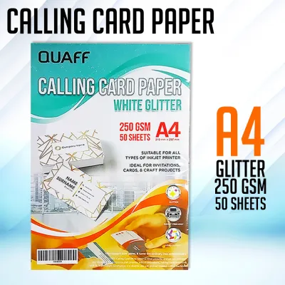
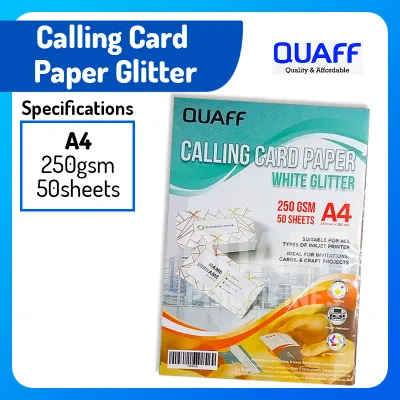
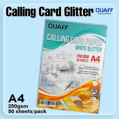

Prices are valid at publication and may change. Please refer to the product page for the latest price.
Feathering and bleeding are the two primary obstacles to clean calligraphy. Feathering manifests as fuzzy, spider-web-like edges along your strokes, destroying the sharp contrast between thick downstrokes and thin hairlines. Bleeding occurs when the ink penetrates completely through the card, making the reverse side unusable. For double-sided calling cards, excellent bleed resistance is non-negotiable.
Many manufacturers label their products as “calligraphy-friendly” or “premium,” but these terms are unregulated marketing descriptions rather than technical standards. A paper that works well with a felt-tip brush pen may fail completely when subjected to the sharp point and wet ink of a dip pen. Consequently, these labels require physical verification with your specific pen and ink combination rather than blind trust.
Match Paper Weight and Thickness to Your Pen and Ink
Paper weight is measured in grams per square meter (gsm), which indicates the density and thickness of the cardstock. Lightweight cardstock (150 to 200 gsm) is easy to cut and feed through standard home printers, but it often lacks the structural integrity needed for wet calligraphy inks. When subjected to heavy ink flow, lightweight papers tend to buckle, warp, or allow the ink to bleed through to the back.

Medium cardstock (200 to 270 gsm) offers a practical balance of sturdiness and flexibility. It is thick enough to feel substantial in the hand and can handle moderate ink volumes from pointed pens or fine brush markers. However, if you plan to use highly fluid inks, broad-edge nibs, or decorative color washes, heavyweight cardstock is the preferred choice.
Heavyweight cardstock (300 gsm and above) provides a rigid, luxurious feel that immediately elevates a calling card. This thickness can withstand heavy ink deposits and wet washes without warping or showing shadow lines on the reverse side. When sourcing materials, always check the product specifications for the exact gsm rating rather than relying on generic descriptions like “thick” or “heavy,” as these terms vary widely between paper mills.
Evaluate Paper Texture and Finish for Clean Strokes
Texture and surface finish dictate how a pen nib moves across the cardstock. Smooth finishes, such as hot-pressed, satin, or ultra-smooth cardstock, are ideal for pointed pen calligraphy styles like Copperplate or Spencerian. The smooth surface allows the sharp metal nib to glide effortlessly in all directions without catching on paper fibers, which is essential for creating clean, unbroken hairlines.
Textured finishes, including cold-pressed, linen, felt, or handmade deckle-edge papers, offer a rustic and organic aesthetic. However, these textured surfaces present significant resistance to sharp nibs. The valleys and ridges of the paper can catch the tip of a pointed pen, causing ink splatters and ragged lines. Textured cardstock is generally better suited for broad-edge calligraphy, brush pens, or dry media where the texture enhances the visual character of the lettering.
Coated and glossy finishes, such as those found on photo papers or UV-coated business cards, should be avoided for traditional liquid calligraphy. These coatings prevent liquid ink from penetrating the paper surface, causing the ink to pool, bead up, or smudge. Furthermore, in humid environments, coated papers can suffer from extremely prolonged drying times. For traditional liquid inks, prioritize matte, uncoated, or lightly calendered finishes that allow the ink to bind securely with the paper fibers.
How to Test Calling Card Paper Before Buying in Bulk
To avoid wasting resources, always test a small sample of cardstock before purchasing a large quantity. Many specialty paper merchants and online stationery suppliers offer sample packs or single sheets for a nominal price, often ranging from ₱50 to ₱150. This small upfront investment allows you to verify the paper’s performance under your local environmental conditions.
Begin your test by preparing the exact tools you plan to use for the final calling cards, including your chosen nib, pen holder, and ink. Write a series of test strokes on the sample sheet, incorporating fine hairlines, heavy downstrokes, and quick curves. Observe how the ink behaves immediately upon contact with the paper. If the ink maintains its sharp edges without spreading, the paper has adequate surface sizing.
Next, monitor the drying speed of the ink. In humid tropical conditions, ink naturally takes longer to dry, but a compatible paper should allow the ink to set within a reasonable timeframe without pooling or smearing. Once the ink is completely dry, inspect the reverse side of the cardstock. Check for ghosting, actual bleed-through, or any structural warping. A successful test sheet will remain perfectly flat, with clean, crisp lettering on the front and no visible ink shadow on the back.
Common Mistakes to Avoid When Selecting Calligraphy Cards
One of the most common mistakes is assuming that all “100% cotton” or handmade papers are automatically suitable for calligraphy. While cotton paper offers a luxurious texture and premium feel, many handmade varieties are unsized or only lightly sized. Without proper sizing, these papers act like blotting paper, absorbing ink instantly and causing severe feathering. Always verify that cotton cardstock has been sized for wet media before purchasing.
Another frequent error is ignoring the compatibility between your ink and the paper. Highly fluid inks, such as fountain pen inks or thin dye-based inks, require exceptionally well-sized, smooth paper to prevent bleeding. Conversely, thicker inks like sumi, acrylic calligraphy ink, or mixed gouache are more forgiving and can perform well on slightly more absorbent surfaces. Matching the viscosity of your ink to the absorption rate of your paper is key to a successful result.
Finally, calligraphers often make the mistake of skipping the sample testing phase when ordering custom-cut calling cards. A paper stock that performs beautifully with a brush pen may fail completely when subjected to a sharp pointed nib. Testing a single sheet first ensures that your final bulk order of calling cards will be fully compatible with your writing style and tools.
Frequently Asked Questions (FAQ)
Can I use standard printer paper for practicing calligraphy on calling cards?
Standard printer paper, which typically ranges from 70 to 80 gsm, is too thin and lacks the necessary sizing to handle wet calligraphy inks. If you attempt to write calligraphy on standard printer paper, the ink will bleed, feather, and warp the sheet almost instantly. You should use standard printer paper only for initial layout drafting, pencil sketching, or spacing practice. Once you are ready to practice with ink, transition to a highly sized practice pad or layout paper before executing your final work on the actual calling card cardstock.
Does the color of the calling card affect calligraphy ink visibility?
Yes, the color of the cardstock directly impacts the legibility and contrast of your calligraphy. Dark cardstocks, such as navy blue, black, or deep forest green, will absorb standard dark calligraphy inks, making your writing invisible. When working with dark cards, you must use highly opaque inks, such as metallic gold, silver, white gouache, or specialized gel pens. For traditional dark inks like black sumi or walnut ink, stick to white, cream, ivory, or soft pastel shades to ensure your handwritten calligraphy remains crisp and highly legible.
Community discussion
Share your experience or ask a question. Comments are reviewed before publication.