
Choosing the right calling card style requires balancing personal expression with the social expectations of your specific gathering. Unlike a rigid corporate business card, a personal calling card serves as a graceful extension of your identity, designed to leave a memorable impression during social introductions, family milestones, and festive celebrations. In the Philippines, where warm hospitality and face-to-face connections are highly valued, exchanging a beautifully crafted card adds a touch of intentionality to every encounter. Navigating this choice involves aligning the physical card’s paper weight, texture, typography, and layout with the tone of the event.
To make an informed selection, you must consider how the card will be handled and stored. The local tropical climate introduces unique challenges, as high humidity can quickly soften flimsy paper or cause certain inks to smudge. By understanding how different materials and design elements perform under these conditions, you can select a card that remains pristine and elegant from the moment it leaves your hand.
Define the Purpose and Tone of Your Occasion
Before selecting a design, you must define the primary purpose and overall tone of the occasion. Social events generally fall into distinct categories, ranging from highly formal life milestones to casual, spontaneous gatherings. A card intended for a formal wedding or a debut requires a completely different aesthetic approach than one used for casual networking at a local community market or a creative workshop.
Products mentioned in this guide
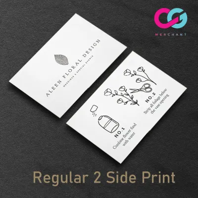
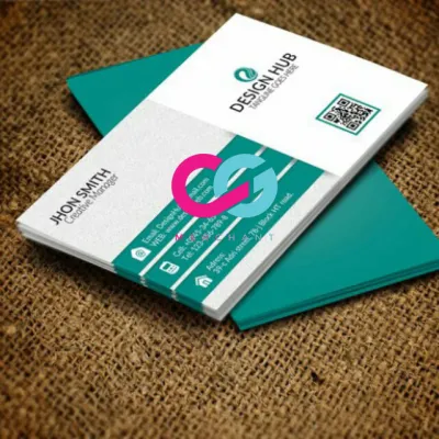
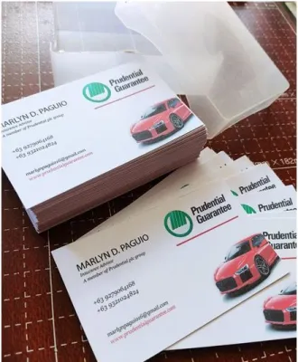


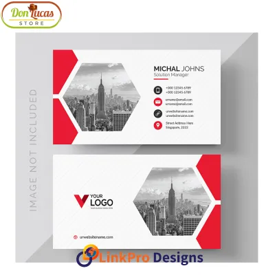
Prices are valid at publication and may change. Please refer to the product page for the latest price.
Identifying the expectations of your recipients helps establish the appropriate level of restraint or creativity. Formal occasions demand classic elegance, where the focus remains on clean typography and generous white space. Conversely, seasonal greetings and casual visits allow for more playful colors, illustrative motifs, and modern layouts. Establishing this baseline early prevents the mismatch of handing a highly decorated, casual card to a recipient at a traditional, formal ceremony.
Match Calling Card Styles to Specific Events
Aligning your card’s visual weight and layout with specific social scenarios ensures your introduction feels natural and respectful. Different events call for distinct design languages that communicate your message before the recipient even reads the text.

Formal Milestones and Ceremonies
For significant life milestones such as weddings, debuts, baptisms, and milestone anniversaries, your calling card should reflect the permanence and solemnity of the occasion. Prioritize traditional layouts that place your full name and formal titles in the center, using elegant serif typography or classic copperplate script. Conservative color palettes, such as warm ivory, soft cream, or delicate ecru, convey a sense of timeless respect. Traditional printing methods like letterpress or engraving are ideal here, as they physically press the ink into the paper, creating a tactile depth that digital printing cannot replicate. Ensure the design leaves ample breathing room around the text, allowing the quality of the paper and the elegance of the typeface to stand out.
Seasonal and Holiday Greetings
The festive seasons in the Philippines, particularly the long Christmas holidays, offer a wonderful opportunity to share warm wishes through personalized cards. When designing for these occasions, you can incorporate thematic motifs such as subtle foliage, stars, or festive borders without losing your personal elegance. Balance these decorative elements with highly readable text for your main greeting, ensuring the card does not feel cluttered. Opt for vibrant yet sophisticated color palettes, such as deep forest green, rich burgundy, or warm gold accents. Selecting a folded card format or a design with a clean, unprinted back provides the perfect canvas for writing a short, heartfelt handwritten note to family and friends.
Casual Social and Everyday Networking
For informal gatherings, weekend pop-ups, and casual community events, your calling card should feel modern, approachable, and highly functional. Minimalist layouts featuring contemporary sans-serif fonts work exceptionally well in these settings, keeping the focus on quick, clear communication. Instead of formal titles, prioritize your primary contact details, such as a personal email address or social media handles, omitting any corporate clutter. Because these cards are often exchanged quickly and slipped into pockets or bags, select durable finishes that can withstand frequent handling. A heavy matte cardstock with a light protective coating helps prevent edge fraying and fingerprint smudges during lively social interactions.
Select Materials, Finishes, and Sizing
The physical specifications of your calling card dictate its tactile appeal and durability, making material selection a critical step. In humid tropical environments, paper behavior changes significantly; thin, low-grade papers absorb moisture rapidly, leading to warping and a limp feel. To ensure your card retains its structural integrity, opt for a sturdy paper weight of at least 300 gsm (grams per square meter).
The texture of the paper establishes the card’s sensory character. Cotton paper is highly prized for its luxurious, soft feel and exceptional thickness, making it the premier choice for deep letterpress impressions. Linen paper, with its subtle cross-hatch pattern, offers a classic, textile-like texture that resists visible fingerprints and adds a traditional touch. For a clean, contemporary look, a smooth matte cardstock provides an excellent surface for sharp digital printing and vibrant color reproduction.
Sizing and format also influence how your card is received and stored. The standard personal calling card dimension is typically 3.5 by 2 inches, which fits perfectly into standard wallets and cardholders. However, opting for a custom square format (such as 2.5 by 2.5 inches) or a folded card can set your presentation apart. Folded formats are particularly useful if you wish to include a longer personal message or a printed family monogram on the front while keeping contact details neatly tucked inside.
To elevate formal cards, consider premium print finishes that catch the light beautifully. Foil stamping applies a thin metallic layer—such as gold, silver, or rose gold—to specific design elements, adding a luxurious gleam. Embossing raises the paper fibers to create a blind, inkless texture, which is perfect for family crests or minimalist borders. When combining these finishes, ensure they do not compromise the readability of your contact details; fine, delicate fonts can sometimes become difficult to read when heavily foiled or deeply embossed.
Incorporate Handwritten and Calligraphy Details
Adding handwritten elements to your calling card transforms a mass-produced item into a deeply personal keepsake. Planning your card design with intentional blank space allows you to write the recipient’s name, a brief thank-you note, or a temporary contact number by hand. This gesture shows a high level of care and respect, especially during formal social visits.
If you enjoy calligraphy, using a pointed pen or a fine brush to write names on the card or its accompanying envelope elevates the presentation. However, you must verify the compatibility of your ink and paper combination. In humid conditions, highly absorbent papers like unsized cotton can cause ink to feather or bleed, turning sharp calligraphy lines into fuzzy edges. Conversely, highly coated, glossy papers may cause ink to pool and take hours to dry, leading to accidental smudges. Perform an observable trial by testing your chosen ink on a sample card to check for bleed resistance and drying speed before committing to a large batch.
Pairing your card with a matching envelope completes the presentation. Select a complementary envelope style and color that matches the card’s paper stock. For formal occasions, adding a wax seal to the envelope flap provides a stunning, traditional finish. When using wax seals in warm climates, select a high-quality, flexible sealing wax rather than traditional brittle wax, as flexible formulas are less likely to crack during transit or soften excessively in the heat.
Maximize Versatility Across Multiple Occasions
If you frequently attend a mix of formal, semi-formal, and casual events, designing a highly versatile master card is a practical and cost-effective strategy. A versatile card relies on a neutral color palette—such as warm gray, soft taupe, or classic ivory—and a clean, timeless layout that does not tie you to a specific season or theme.
You can easily adapt this neutral base to suit different levels of formality using interchangeable accessories. For a formal gathering, slide the card into a premium, heavy-paper envelope secured with a custom wax seal or a delicate vellum belly band. For a casual weekend gathering, you can hand the card out directly, perhaps using a custom ink stamp on the back to add a playful social media icon or a seasonal greeting.
The key to a successful versatile card is prioritizing high-quality blank space on the reverse side. Leaving the back of the card completely unprinted gives you the flexibility to customize its purpose on the spot. You can write a specific phone number, a warm holiday greeting, or a quick note reminding the recipient of where you met, ensuring the card remains highly relevant to every unique encounter.
Frequently Asked Questions (FAQ)
What is the difference between a personal calling card and a standard business card?
A personal calling card focuses entirely on social etiquette and personal connection, omitting corporate branding, job titles, and business logos. It typically features only your name and basic personal contact details, such as an email address or social handle, whereas a business card is designed to promote a professional role and company.
Can I use one versatile design for both casual gatherings and formal events?
Yes, by starting with a high-quality, neutral base card made of premium cardstock. You can elevate the card for formal events by placing it inside a matching envelope with a wax seal, or keep it casual for everyday networking by handing it out directly with a handwritten note on the back.
How should I handle addressing envelopes for formal calling cards?
Use high-quality black or blue ink that resists smudging, and write out the recipient’s full name and formal titles clearly. For a highly polished look, you can use hand-calligraphy or a neat cursive script, ensuring the ink is completely dry before inserting the card to prevent transfer.
Community discussion
Share your experience or ask a question. Comments are reviewed before publication.