
Choosing the perfect paper design for your first scrapbook page can feel like stepping into an overwhelming sea of colors, patterns, and textures. With thousands of options available at local craft stores and online marketplaces, it is easy to get stuck in decision paralysis. The secret to a beautiful, cohesive layout is simple: start with your focal point—usually a single photo or cherished memento—and build a limited color palette around it. By selecting one dominant “hero” pattern and supporting it with two quiet, coordinating papers, you can create a stunning backdrop that highlights your memories without cluttering the page.
Define Your Page Theme and Focal Point
To design a successful scrapbook page, you must first identify your anchor. This anchor is your focal point, which is typically a photograph, a ticket stub from a memorable concert, or a handwritten note. Before you even touch a sheet of patterned paper, place your focal point on a clean workspace. Ask yourself what story this item tells. A photo of a family picnic in a sunny park calls for a bright, cheerful theme, while a vintage black-and-white family portrait demands a more muted, classic approach.
Once you establish the theme, look closely at the colors within your focal point. If your photo features a bright yellow raincoat against a gray sky, those two colors should form the basis of your palette. Select three primary colors from your anchor: one dominant color that matches the overall mood, one supporting color, and one high-contrast accent color. Limiting your palette to three colors instantly narrows down your paper choices and prevents your layout from looking chaotic.
Products mentioned in this guide
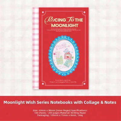
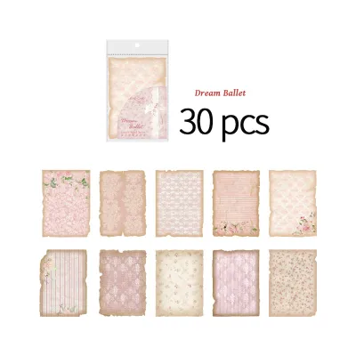
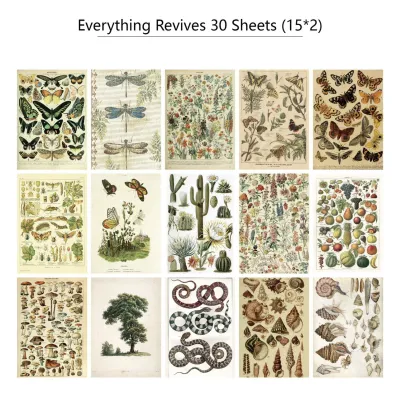
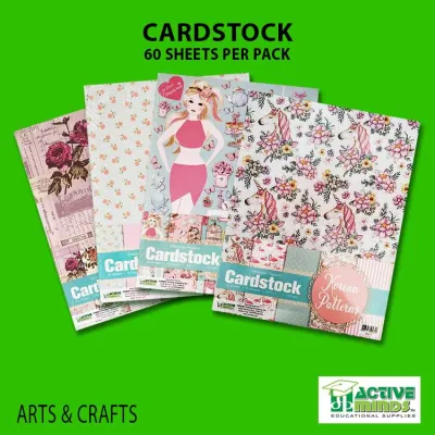
![ENWEI 16 Pcs [Hollow Mesh Series] Lovely Journal Material Paper Multiple Materials Deco Paper Scrapbooking Sticker Scrapbook Kit](https://img.lazcdn.com/g/p/9ce4acc63b20d805edc518051425c8cb.jpg_400x400q80.jpg_.webp)
![ENWEI 100 Pcs [Beautiful Stop Motion Series] Vintage Journal Material Paper Writable Deco Paper Scrapbooking Sticker Scrapbook Kit](https://img.lazcdn.com/g/p/f07b75d862d649fad9da4e7c51f8465c.jpg_400x400q80.jpg_.webp)
Prices are valid at publication and may change. Please refer to the product page for the latest price.
Consider the emotional tone of your memory as well. Warm colors like terracotta, mustard, and soft cream evoke feelings of comfort, nostalgia, and warmth. Cool colors like slate blue, forest green, and crisp white feel calm, modern, and serene. By matching the color temperature of your paper to the emotional tone of your photo, you create a harmonious visual narrative that guides the viewer’s eye naturally across the page.
Understand Scrapbook Paper Basics
Before purchasing materials, it is essential to understand the physical properties of scrapbook paper. Scrapbook paper generally falls into two main categories: solid cardstock and patterned paper. Cardstock is a thick, heavyweight paper that serves as the structural foundation of your layout. It is typically sold in standard sizes like 12×12 inches or 8.5×11 inches. Patterned paper is thinner and decorative, designed to add visual interest, themes, and layers to your page.

Pattern scale is another critical factor to consider. Patterns are designed in large, medium, and small scales, each serving a distinct visual purpose. Large-scale patterns, such as bold tropical monstera leaves or wide geometric stripes, make a strong statement and are best used as background bases or large blocks. Medium-scale patterns, like classic polka dots or gingham, add movement and work well for matting photos. Small-scale patterns, such as tiny floral prints or micro-dots, read almost like solid colors from a distance and are perfect for layering without causing visual fatigue.
You must also evaluate the paper’s texture and finish, as these properties affect how your writing tools and adhesives perform. Smooth matte paper is highly versatile, allowing gel pens, metallic markers, and calligraphy inks to glide effortlessly without skipping. Textured paper, such as linen-finish cardstock, adds depth but can cause fine-tip pens to bleed or skip. In humid tropical climates, glossy finishes can slow down the drying speed of water-based inks, leading to accidental smudges. Always perform a quick trial on a scrap piece of your chosen paper to verify ink drying times and bleed resistance before writing your final journal entries.
Step-by-Step Framework for Selecting Paper Designs
Building a cohesive paper collection for a single layout does not require professional design skills. Start by selecting your “hero” pattern. This is the single patterned sheet that perfectly encapsulates your theme—for example, a vibrant tropical floral print for a beach holiday layout. The hero pattern will dictate the rest of your choices, as you will pull your secondary and tertiary colors directly from its design.
Next, select your supporting papers using the “rule of three” for pattern mixing. To achieve visual harmony, combine one large-scale pattern (your hero paper), one medium- or small-scale pattern, and one solid or subtly textured cardstock. For instance, if your hero paper has a large floral print, pair it with a subtle green-and-white striped paper (medium scale) and a solid cream cardstock. This combination provides contrast while keeping the patterns from competing for attention.
Solid cardstock plays a vital role in giving the eyes a place to rest, preventing a fully patterned layout from becoming visually exhausting. Use your solid paper to “mat” your photos—cutting a slightly larger square of solid cardstock to place behind your photo—which physically separates the image from the patterned background.
Finally, balance your busy patterned areas with quiet negative space. If you use a highly detailed hero pattern on the bottom half of your page, keep the top half relatively simple with a light, solid background. This intentional distribution of visual weight ensures that your layout feels balanced, structured, and professional, rather than cluttered and disorganized.
Common Beginner Mistakes to Avoid
One of the most common pitfalls for beginners is overcrowding the page with too many competing, large-scale patterns. When a layout features three different bold, busy prints, the viewer’s eye does not know where to land, and the photos get completely lost in the noise. Keep your bold patterns limited to one per layout, and let the other papers play a supporting role.
Another frequent mistake is ignoring the contrast needed for journaling blocks and photo borders. Writing your memories directly onto a patterned background often results in unreadable text, especially if the ink color matches a shade in the pattern. Always create a dedicated journaling block using a light-colored, smooth cardstock piece, and frame your photos with contrasting borders to make them pop against the background.
Lastly, avoid relying solely on random, uncoordinated single sheets of paper. While buying individual sheets is fun, matching their undertones can be incredibly challenging for a beginner. A warm, cream-based floral pattern will look jarring next to a stark, blue-toned white cardstock. To prevent this, consider starting with pre-designed paper pads or collections from a single manufacturer. These collections are professionally curated to ensure that all patterns, colors, and undertones coordinate flawlessly, saving you time and frustration.
How to Test Your Paper Combination Before Gluing
The golden rule of scrapbooking is to never apply glue until you are completely satisfied with the layout. “Dry-fitting” is the process of arranging all your paper layers, photos, journaling blocks, and embellishments on your base page without any adhesive. This step allows you to experiment with different placements, crop papers to size, and swap out elements without damaging your materials.
Once you have arranged your dry-fit layout, take a step back and look at it from a distance of about two meters. Alternatively, take a quick photo of the layout with your smartphone and view it on your screen. This shift in perspective makes it much easier to evaluate the overall visual balance. You will instantly notice if one side of the page feels too heavy, if a pattern is overpowering your photo, or if you need to add a solid border to create more contrast.
Additionally, check your layout under natural light. Indoor fluorescent or LED lighting can significantly alter how colors interact, sometimes making complementary shades look dull or mismatched. Move your workspace near a window during the day to verify that the colors and undertones harmonize beautifully. Once everything looks balanced and cohesive in natural light, you can confidently begin gluing your pieces down, starting from the bottom background layer and working your way up to the top embellishments.
Frequently Asked Questions (FAQ)
Can I mix different brands of scrapbook paper on one page?
Yes, you can absolutely mix different brands of scrapbook paper on a single layout. The key to success is matching the color undertones across the different sheets. Ensure that all your chosen papers share either warm undertones (such as cream, olive, and terracotta) or cool undertones (such as bright white, navy, and mint). Additionally, balance the pattern scales so that a bold print from one brand does not clash with a bold print from another. Using a neutral solid cardstock as a buffer between the different brands is an excellent way to unify the page and create a seamless transition.
What paper weight is best for a scrapbook base page?
For your foundational base page, you should use a sturdy cardstock with a weight of at least 80 lb (approximately 216 gsm) or higher. A heavy base page is essential to support the weight of multiple paper layers, photos, memorabilia, and embellishments without sagging or tearing. In humid tropical climates like the Philippines, lighter papers (such as 65 lb or 176 gsm) are highly susceptible to warping when exposed to wet adhesives or ambient moisture. Always check the manufacturer’s product specifications on the packaging to ensure the paper is acid-free and lignin-free, which prevents your precious photos from yellowing and deteriorating over time.
Community discussion
Share your experience or ask a question. Comments are reviewed before publication.