
Choosing the right paper with design is the foundation of any successful scrapbooking project. The perfect patterned sheet does not merely sit behind your photos; it frames your memories, sets the emotional tone of the layout, and ensures your preservation efforts last for decades. In tropical climates like the Philippines, where high relative humidity can accelerate paper degradation and warp fragile fibers, selecting high-quality, purpose-specific paper is essential. To make a confident decision, you must balance three core design pillars: the physical weight of the paper, the scale of its printed patterns, and the harmony of its color palette. By aligning these elements with your specific journaling style and photo sizes, you can transform a simple collection of memories into a durable, visually stunning heirloom.
Understand Paper Weight and Thickness for Different Layout Elements
The structural integrity of your scrapbook page depends entirely on paper weight, which is typically measured in grams per square meter (GSM) or pounds (lb). If you use a paper that is too thin as your layout base, the weight of your photos, embellishments, and adhesives will cause the page to sag, wrinkle, or tear. Conversely, using extremely thick cardstock for tiny folded accents or delicate die-cuts makes your layout bulky and difficult to fit into standard protector sleeves. Understanding how these weight classes function allows you to assign the right material to its proper role.
For foundational bases, look for heavy cardstock ranging from 80lb to 110lb (approximately 216 to 300 GSM). This heavy-duty paper provides the necessary rigidity to support multiple layers of patterned paper, heavy photo prints, and dimensional embellishments like wooden shapes, ribbons, or thick stickers. When shopping in local craft stores or online marketplaces in the Philippines, checking these specifications is crucial, as thin, unrated papers will quickly warp under the moisture of standard liquid glues.
Products mentioned in this guide
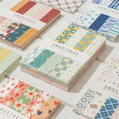
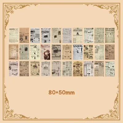
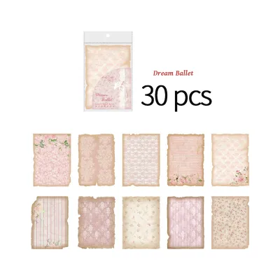
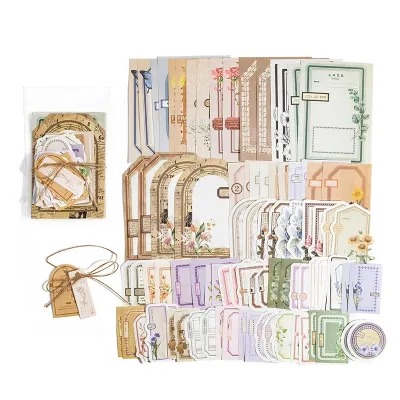
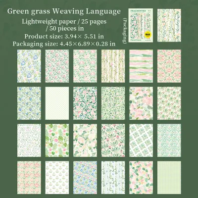
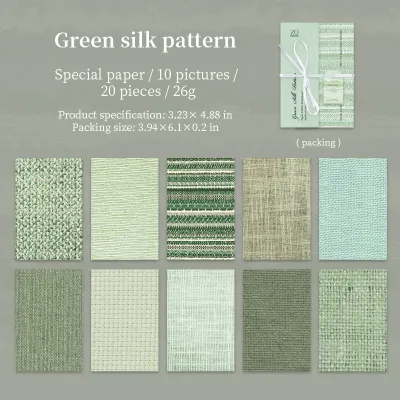
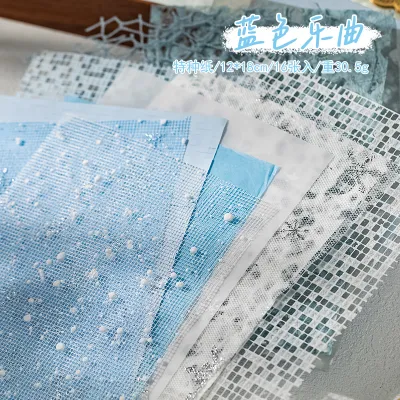
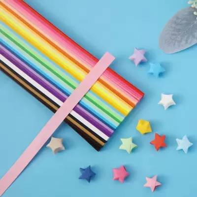
Prices are valid at publication and may change. Please refer to the product page for the latest price.
Layering papers and decorative elements generally require medium-weight patterned papers, often categorized as text weight or light cardstock, ranging from 65lb to 80lb (approximately 176 to 216 GSM). This weight is sturdy enough to hold its shape when cut into intricate borders or photo mats, yet thin enough to keep your scrapbook pages relatively flat. Using medium-weight paper for photo mats creates a distinct border around your pictures, lifting them visually from the background without adding unnecessary bulk to your album.
For delicate accents, paper piecing, and intricate die-cuts, lighter papers under 65lb (below 160 GSM) are highly effective. These papers are easy to feed through manual die-cutting machines or punch out with hand punches without jamming the metal blades. However, because these papers are thin, they are highly sensitive to wet adhesives. When working with light paper, swap out liquid white glue for double-sided tape runners or dry adhesive dots to prevent unsightly buckling and slow drying times caused by local humidity.
Match Pattern Scale to Your Photos and Journaling Style
Selecting a paper with design requires careful attention to the physical scale of the print relative to your photos. A beautiful pattern can easily overpower your photographs if the motifs are too large or too busy, drawing the viewer’s eye away from the subject of your page. To maintain visual balance, you must categorize your patterned papers into large, medium, and small scales, assigning each to a specific zone on your layout.

Large-scale patterns feature expansive motifs, such as oversized floral arrangements, bold geometric lines, or wide scenic illustrations. These designs are best utilized as background foundations where large portions of the paper will remain exposed, or on dedicated title pages that feature only one or two small photos. If you plan to use a large-scale pattern on a highly detailed page, consider using it on only one side of a two-page spread to give the eyes a place to rest.
Medium-scale patterns, which typically feature repeating designs spaced an inch or two apart, are the workhorses of scrapbooking. They are ideal for creating photo mats, decorative borders, and layered paper strips. Because the pattern repeat is moderate, it easily frames standard 4R (4×6 inches) or 3R (3.5×5 inches) photos without competing with the subjects in the pictures. When choosing a medium-scale print, look for designs that offer a subtle contrast to the colors in your photos to make the images pop.
Small-scale or micro patterns consist of tiny, dense designs such as mini polka dots, fine stripes, or delicate gingham. These papers are incredibly versatile because, from a distance, they read almost like solid colors while still adding texture and depth. Micro patterns are the perfect choice for journaling cards, small accent tags, and busy layouts that accommodate multiple photos. Because the design is so compact, you can write directly over light-colored micro patterns with archival gel pens without sacrificing the legibility of your handwritten notes.
When shopping online, evaluating pattern scale can be challenging without a physical reference. To avoid purchasing a print that is larger or smaller than expected, look closely at the product images for a ruler guide or a mock-up showing the paper alongside standard objects. You can also estimate the scale by checking the “design repeat” specification in the product description. Comparing this measurement to your intended photo sizes ensures that your chosen paper will frame, rather than swallow, your treasured memories.
Build a Cohesive Color Palette for Your Scrapbook Pages
A harmonious color palette binds your photos, papers, and embellishments into a single, unified story. Without a deliberate color strategy, a layout can quickly look chaotic and disorganized, especially when mixing different patterned papers. The most reliable way to build a cohesive palette is to draw inspiration directly from your “hero” photograph—the main picture that captures the essence of the story you want to tell.
Begin by identifying the dominant color in your hero photo, along with one or two secondary accent colors. For example, if you are scrapbooking a family outing at a beach in Batangas, your dominant colors might be the soft blues of the ocean and the warm sand tones of the shore. Use these exact shades to guide your selection of paper with design. Choosing a background paper that mirrors the secondary colors in your photo creates an immediate visual connection, making the photo feel integrated into the page rather than pasted on top of it.
To prevent your layout from becoming visually overwhelming, balance your designed papers with solid, neutral cardstock. Neutrals like kraft, cream, soft gray, and crisp white act as visual buffers, separating busy patterns and giving the viewer’s eyes a place to rest. A good rule of thumb is to use a neutral cardstock for your photo mats or as a wide border around your entire layout. This technique creates a clean, professional finish that highlights your photography.
Readability is another critical factor when building your palette, particularly in journaling areas. If you plan to write your thoughts directly onto a patterned background, ensure there is high contrast between your ink and the paper. Dark black or brown archival ink stands out beautifully against light pastel or cream patterns, whereas writing on dark or highly saturated prints often results in illegible text. If you must use a dark patterned paper, layer a light-colored journaling card or a strip of vellum over the pattern before writing.
When working on a multi-page themed album, such as a travel log or a wedding book, maintaining a consistent color palette is key to visual continuity. However, you do not want every single page to look identical. To achieve variety while maintaining cohesion, select a curated paper collection or “paper pad” from a single manufacturer. These collections are professionally designed to coordinate, allowing you to mix and match different patterns and colors across pages while ensuring the overall album feels unified.
Step-by-Step Guide to Selecting Paper with Designs for a New Layout
Planning your paper selection before making any cuts or purchases saves time, reduces material waste, and ensures a stress-free creative process. By following a structured selection sequence, you can systematically build a beautiful layout from the base up.
Step 1: Define the Theme and Select Your Photos Start by choosing the photographs you want to feature and identifying the core story of your layout. Determine if the mood is playful, nostalgic, elegant, or energetic. Lay your photos out on your workspace and observe their dominant colors, lighting, and subjects, as these elements will dictate your subsequent paper choices.
Step 2: Choose Your Foundational Base Select a sturdy cardstock or heavy-duty patterned paper to serve as your background canvas. If you plan to use wet mixed-media techniques, heavy stamping, or thick embellishments, opt for a thick 80lb to 110lb cardstock. For standard photo layouts, a slightly lighter base is acceptable, provided it can support the weight of your layers without bending.
Step 3: Pick the Primary Designed Paper Select your main focal paper, which will feature the most prominent pattern on your page. This paper should directly reflect the theme and mood of your layout. For instance, a soft floral pattern might anchor a heritage family page, while a bright geometric print suits a birthday celebration. Place this paper next to your photos to ensure the design does not clash with or distract from the images.
Step 4: Select Supporting and Blender Papers Choose two or three secondary papers to complement your primary design. These should include low-contrast “blender” prints, small-scale patterns, or coordinating solid cardstocks. Use these supporting papers for photo matting, borders, and small layered blocks to create depth and separation between your photos and the primary background.
Step 5: Test and Mock Up the Layout Before applying any adhesive, dry-fit your elements by overlapping your paper sheets, photos, and embellishments on your base. If you are shopping online, you can create a digital mockup by saving product images and arranging them in a basic photo editing application. Take a quick photo of your physical dry-fit layout with your phone; this allows you to evaluate the composition objectively and serves as a reference guide when you begin gluing the pieces down.
Common Mistakes to Avoid When Buying Designed Paper
Investing in scrapbooking supplies can quickly become expensive, with single sheets of paper with design ranging from ₱15 to ₱40, and coordinated paper pads costing anywhere from ₱300 to ₱1,200. To get the most value out of your budget and ensure your completed albums stand the test of time, avoid these common purchasing and design pitfalls.
One frequent mistake is buying loose, uncoordinated sheets of paper from various brands without a specific project in mind. While individual sheets may look beautiful in the store, matching them later can be incredibly difficult. Instead, invest in curated paper collections or paper pads. These coordinated packs guarantee that every sheet works harmoniously with the others, saving you the frustration of trying to match mismatched tones later on.
Another overlooked opportunity is failing to inspect the reverse side of double-sided papers. Many crafters focus solely on the front design, forgetting that the back often features versatile, low-contrast patterns or solid colors that are perfect for layering. Utilizing both sides of a double-sided sheet not only stretches your budget but also ensures instant color coordination, as manufacturers design both sides to complement one another perfectly.
Additionally, avoid choosing papers that clash with the dominant tones or lighting of your photographs. A common culprit is pairing cool-toned, outdoor photos (such as a cloudy day at a mountain resort in Baguio) with warm, neon-colored tropical papers. The mismatch in color temperature can make your photos look muddy or washed out. Always hold your photos up to the paper under natural light to verify that the tones complement rather than fight each other.
Finally, never overlook archival safety. Standard printer paper, wrapping paper, and cheap construction paper contain acid and lignin, which naturally break down over time. In the warm, humid climate of the Philippines, this chemical breakdown occurs even faster, leading to yellowed pages, brittle paper, and ruined photographs. Always verify that your scrapbooking paper is explicitly labeled as “acid-free” and “lignin-free” to ensure your memories remain pristine for future generations.
Frequently Asked Questions (FAQ)
What is the difference between scrapbook paper and cardstock?
Cardstock is a thick, heavy-weight paper (typically 65lb to 110lb or higher) that is usually solid-colored and textured. It provides the structural foundation for your layouts, photo mats, and card bases. Scrapbook paper, on the other hand, is generally lighter (often text weight, around 65lb or less) and features printed designs, patterns, or illustrations. While cardstock provides the physical strength and structure, designed scrapbook paper provides the decorative themes and visual interest.
Can I use regular printed paper for scrapbooking?
Using standard printer paper or wrapping paper is not recommended for long-term scrapbooking projects. Regular paper is highly acidic and contains lignin, which will cause your photos to discolor, fade, and deteriorate over time. Additionally, standard printer paper is very thin and prone to tearing or warping when exposed to adhesives. For memory keeping, always choose specialized, archival-quality paper that is certified acid-free and lignin-free to protect your photographs.
Community discussion
Share your experience or ask a question. Comments are reviewed before publication.