
Quick Guide to Choosing the Right Postcard
Selecting the right postcard is more than just picking an attractive image; it is about aligning the physical card, design, and message space with your recipient and the occasion. To make a lasting impression, you must balance the formality of the event, your relationship with the recipient, and the amount of text you plan to write. A well-chosen card acts as a tangible keepsake, bridging the gap between a simple greeting and a thoughtful gift. By matching the visual aesthetics with the emotional tone of your message, you ensure your postcard feels intentional and personal.
Key Factors When Selecting a Postcard
Physical dimensions play a critical role in how your postcard is received and handled. Standard postcard sizes, typically around 4×6 inches, are highly practical for standard mailing rates and fit easily into standard postal sorting systems. If you intend for the recipient to frame or display the card on a desk, slightly larger formats like 5×7 inches offer a more substantial presence, though they may require additional postage.

The layout of the card dictates how much room you have to express your thoughts. Image-heavy designs with large illustrations or photographs on the front are excellent for quick, visual greetings where a short sentence or two on the back is sufficient. Conversely, text-heavy formats or cards with minimalist front designs leave more blank space, making them ideal for detailed personal updates or expressive hand-lettering.
Products mentioned in this guide
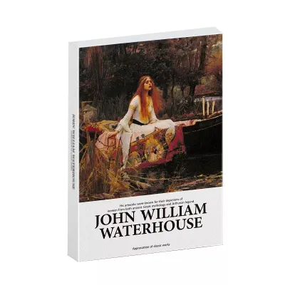
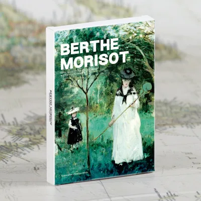
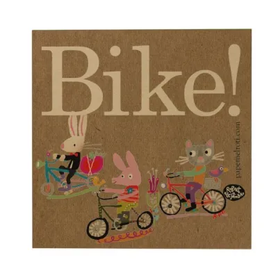
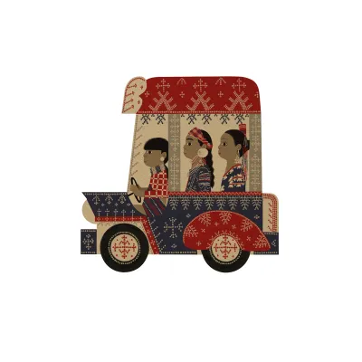
Prices are valid at publication and may change. Please refer to the product page for the latest price.
Typography and visual tone establish the immediate mood before the recipient even reads your words. Playful, hand-drawn lettering works wonderfully for casual notes and close friends, conveying warmth and spontaneity. For formal occasions or professional contacts, elegant serif fonts or clean, minimalist layouts project a sophisticated and respectful tone.
Matching Postcard Styles to Specific Occasions
Every occasion carries its own set of expectations, and your postcard choice should reflect the spirit of the event. Aligning visual motifs and color palettes with the specific milestone helps your message resonate more deeply while respecting traditional norms.
Birthdays and Personal Milestones
Celebrating a personal milestone calls for designs that feel energetic and celebratory. For close friends and immediate family members, look for postcards featuring vibrant color palettes, whimsical illustrations, or humorous graphics that reflect their unique personality. These playful designs invite a relaxed, joyful tone and pair beautifully with casual, warm-hearted messages.
When honoring formal milestones, such as a golden wedding anniversary or a major career achievement, transition to more refined aesthetics. Elegant, minimalist layouts, classic botanical prints, or cards with subtle foil-stamped accents convey a sense of prestige and respect. These sophisticated styles are particularly suited for older relatives or professional mentors who appreciate classic design.
Regardless of the design, ensure the back of the card offers sufficient writing space if you plan to write a heartfelt, detailed message. Crowded layouts with large pre-printed text blocks or decorative borders on the back can restrict your handwriting, forcing you to cram your words or shorten your sentiments.
Thank-You Notes and Professional Appreciation
Expressing gratitude in a professional or academic setting requires a careful balance of warmth and decorum. Opt for clean, understated designs printed on high-quality, heavy cardstock to project professionalism. Neutral color schemes, simple geometric patterns, or classic monogram designs show appreciation without appearing overly casual or familiar.
For personal favors, hospitality, or casual thank-you notes, warm and illustrative styles are highly appropriate. Nature-themed postcards, soft watercolor illustrations, or floral motifs evoke a sense of comfort and genuine appreciation. These designs feel approachable and reflect the personal nature of the favor you are acknowledging.
The writing area on a thank-you postcard must be prominent and uncluttered. Because the primary purpose of the card is to deliver a clear message of gratitude, avoid cards with busy background patterns on the writing side. A clean, matte white or cream surface ensures your handwriting remains highly legible and easy to read.
Travel Greetings and Souvenirs
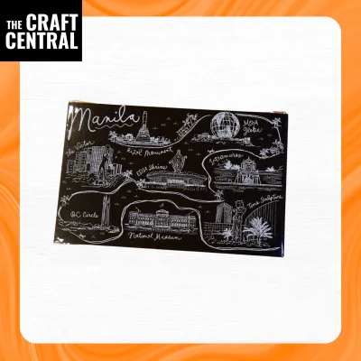
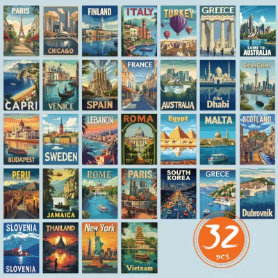
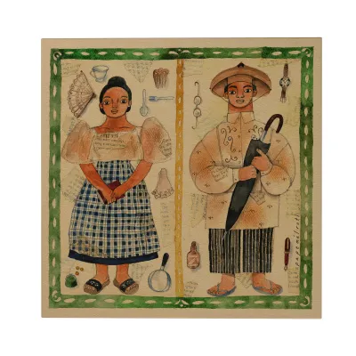
Travel postcards serve as physical snapshots of your journey, making the choice of imagery highly significant. Photographic postcards featuring iconic landmarks or sweeping landscapes are classic choices that immediately transport the recipient to your destination. Illustrated postcards, on the other hand, offer an artistic, vintage charm that appeals to collectors and those who appreciate unique design aesthetics.
Because travel postcards often endure long transit times and varied handling, paper durability is paramount. Look for thick, rigid cardstock that resists bending, tearing, and corner creasing. A protective laminate or UV coating on the front image helps shield the card from moisture and scuffing during its journey through international and local mail systems.
Balancing the front image with the back layout is essential for sharing your travel stories. Ensure the back of the card is divided clearly, leaving ample space on the left for your personal anecdotes and travel impressions, while keeping the right side clean for the recipient’s address and postage stamps.
Holiday Messages and Seasonal Greetings
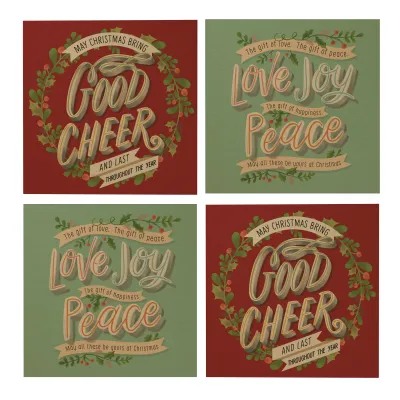
Seasonal greetings allow you to connect with a wide circle of friends, family, and associates. Traditional holiday motifs, such as classic festive foliage or warm winter scenes, evoke nostalgia and comfort for close loved ones. For a modern touch, abstract seasonal designs using contemporary color palettes offer a fresh, stylish alternative.
When sending greetings to a diverse social or professional circle, inclusive and secular designs are highly recommended. Opt for neutral themes like “Season’s Greetings” or elegant winter landscapes that focus on warmth, peace, and hope. This ensures your message is received with joy by everyone, regardless of their personal beliefs or cultural backgrounds.
If you plan to send greetings to a large group, coordinating multi-piece postcard sets is a highly efficient strategy. Purchasing themed assortments allows you to maintain a consistent aesthetic across all your mailings while saving time. It also ensures you have a cohesive set of cards ready to write and dispatch during busy holiday seasons.
Evaluating Paper Quality and Finishes
The tactile feel of a postcard is just as important as its visual design, especially in humid tropical climates where paper can easily lose its rigidity. When selecting postcards, pay close attention to paper weight, which is typically measured in grams per square meter (gsm). For a sturdy card that resists bending during transit, look for a minimum weight of 300 gsm. Thinner papers are prone to warping, especially when exposed to atmospheric moisture or heavy ink applications.
Surface finishes directly impact both the visual appeal of the card and its writeability. Glossy finishes make photographic colors pop with high contrast and vibrancy, but they are notoriously difficult to write on, often causing ink to bead up or smear. Matte finishes offer a smooth, non-reflective surface that handles most pens well, while completely uncoated paper provides the best absorption for fountain pens, brush pens, and calligraphy inks.
Examine the edge quality and cutting precision of the postcards before purchasing. Clean, sharp edges without fraying or paper fibers sticking out indicate high manufacturing standards. If you are planning to use wet mediums like calligraphy ink or watercolor markers, test a small corner first to check for feathering, which occurs when ink bleeds along the paper fibers.
Tips for Writing and Mailing Your Postcards
Achieving beautiful, smudge-free handwriting on your postcard depends heavily on matching your pen ink to the paper finish. For uncoated or matte cards, water-based gel pens, fine liners, and calligraphy brush pens work beautifully, allowing for expressive lettering and deep color saturation. If you are writing on a semi-gloss or coated surface, oil-based ballpoint pens or specialized permanent multi-surface markers are necessary to prevent the ink from smearing.
Organizing your layout before putting pen to paper prevents crowded text and ensures your card meets postal standards. Keep your message strictly on the left half of the card, leaving the right half entirely clear for the recipient’s address and postage stamps. If you are practicing hand-lettering or calligraphy, lightly sketch your guidelines with a soft pencil first, then gently erase them once your ink is completely dry.
Before dispatching your cards, verify the current postage requirements and address formatting rules with the local postal service in the Philippines. Standard domestic postcards generally require less postage than letters, but international destinations will require specific stamp values. Ensure the recipient’s address is written clearly in block letters, including the correct ZIP code, to guarantee smooth sorting and delivery through the postal system.
Frequently Asked Questions (FAQ)
Can I use a standard photo print as a postcard?
Yes, you can mail a standard photo print, but you must ensure it meets specific physical requirements. Standard photographic paper is often too flexible and thin, which makes it susceptible to creasing or tearing in automated postal sorting machines. To mail a photo safely, mount it onto a rigid piece of cardstock using a dry adhesive. Additionally, the back of the photo print must have a non-glossy, uncoated surface so that the address can be written clearly and postage stamps can adhere securely without sliding off.
How do I prevent my handwriting from smudging on glossy postcards?
Writing on glossy surfaces requires specific tools and patience to avoid smudging. Avoid water-based gel pens, fountain pens, or traditional calligraphy inks, as they cannot penetrate the glossy coating and will remain wet indefinitely. Instead, use quick-drying permanent markers, oil-based ballpoint pens, or specialized multi-surface drawing pens. Once you finish writing, allow the card to sit undisturbed for several minutes to let the ink cure completely before stacking, handling, or dropping it into a mailbox.
Community discussion
Share your experience or ask a question. Comments are reviewed before publication.