
When searching for the best transparent paints for watercolor, acrylic, and oil mediums, artists quickly discover that “transparency” is not a universal standard but a complex optical property that varies by binder, pigment, and application. Because market availability, specific product formulations, and individual artistic needs constantly shift, a static list of recommended brands cannot replace a reliable selection framework. This guide provides the essential criteria, label-reading skills, and verification steps you need to identify, evaluate, and source high-quality transparent paints for your specific medium in the Philippines, ensuring your purchasing decisions are based on verifiable product data rather than marketing claims.
By understanding how light interacts with different binders and pigments, you can make informed investments in your art supplies. This systematic approach helps you avoid the common pitfalls of muddy layers, chalky finishes, and unstable paint films. Armed with the right technical knowledge, you can confidently navigate local art shops and online catalogs to find the exact tools required for your creative vision.
How Transparency Works in Watercolor, Acrylic, and Oil
Optical transparency in painting refers to the ability of light to pass through a dry paint layer, strike the underlying substrate—such as white watercolor paper or a primed canvas—and reflect back to the viewer’s eye with minimal scattering. When a paint is truly transparent, it acts like a sheet of colored glass. If the paint is opaque, the pigment particles scatter and reflect the light directly from the surface of the paint layer, completely obscuring whatever lies beneath. Translucency falls between these two states, allowing some light to pass through while scattering the rest, which creates a soft, semi-opaque effect.
Products mentioned in this guide
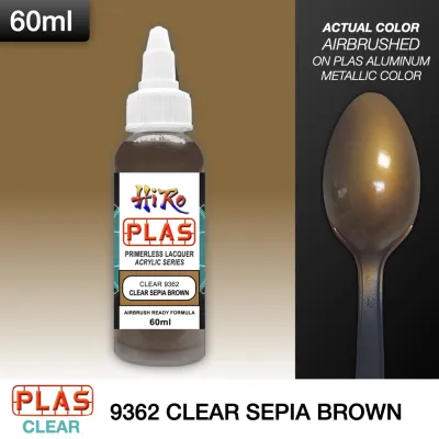
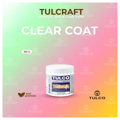
Prices are valid at publication and may change. Please refer to the product page for the latest price.
The refractive index of the binder plays a critical role in determining the final transparency of the dried paint film. The refractive index measures how much a medium bends light. Gum arabic, the traditional binder for watercolor, has a refractive index that closely matches both paper fibers and many natural pigments, allowing for exceptional clarity when applied in thin washes. Acrylic polymer emulsions, on the other hand, are water-based and appear milky white when wet, but dry to a clear, flexible plastic film. This transition requires artists to anticipate how the paint’s appearance will change as it dries.
Linseed, safflower, and walnut oils used in oil painting have relatively high refractive indices. These oils closely match the refractive indices of many organic pigments, resulting in deep, rich, and highly luminous glazes that are characteristic of classical oil paintings. Understanding these optical differences allows artists to utilize transparent paints for specific techniques.
Optical color mixing is one of the primary applications, where layering a transparent blue over a dry yellow layer produces a vibrant, glowing green that cannot be replicated by physically mixing the two pigments on a palette. Deep glazing involves applying multiple thin, transparent layers to build up rich shadows and complex skin tones, adding a sense of three-dimensional depth. Using transparent paints also prevents muddying underlying layers, ensuring that even complex, multi-layered compositions retain their luminosity and clarity.
How to Read Paint Labels for Transparency and Pigment Data
To bypass subjective marketing terms like “intense” or “glowing,” artists must learn to read the standardized symbols and data printed directly on paint tubes. Most professional and student-grade paint manufacturers use a standardized system of geometric symbols to indicate transparency. A hollow square or circle typically represents a fully transparent paint, while a diagonal line through the shape indicates semi-transparent. A half-filled shape denotes semi-opaque, and a solid black shape indicates a fully opaque paint.

While these symbols are highly reliable, minor variations exist between brands. Verifying the symbol key on the manufacturer’s official color chart is always a prudent first step. Beyond the visual symbols, the Colour Index (CI) name is the most accurate tool for verifying a paint’s composition and inherent transparency. The Colour Index name consists of letters and numbers, such as PY150 (Pigment Yellow 150) or PV19 (Pigment Violet 19), which identify the exact chemical pigment used in the formulation.
By researching these pigment codes, artists can determine whether a paint is made from a single pigment or a blend. Single-pigment paints are highly preferred for transparent glazing because they contain fewer particle types, reducing the risk of light scattering and muddying when layered. Multi-pigment paints, even those labeled as transparent, often behave more like semi-opaque mixtures due to the interaction of different pigment particles.
In addition to pigment codes, artists should look for quality standards such as ASTM D4302 for oil paints, ASTM D5098 for acrylics, or ASTM D5067 for watercolors. These labels confirm that the product meets rigorous professional standards for pigment purity, lightfastness, and binder quality. A high-quality binder ensures that the pigment particles remain evenly dispersed within the paint film, which is essential for maintaining a consistent, transparent layer. Cheaply manufactured paints often skimp on binder quality or use low-grade synthetic alternatives, resulting in uneven washes and poor film integrity.
Finally, physical paint tubes should always be cross-referenced with the manufacturer’s official digital or printed color charts. These charts are often hand-painted or printed with high-precision inks, providing a more accurate representation of the paint’s transparency, undertone, and mass tone than the small label on a tube. Many manufacturers also publish detailed pigment information sheets online, which list the exact lightfastness, staining properties, and transparency ratings of each color in their lineup, serving as an invaluable resource before making a purchase.
What to Check When Choosing Transparent Paints by Medium
Selecting the right transparent paint requires adjusting your evaluation criteria based on the specific drying mechanisms and binder behaviors of each medium. What works perfectly as a transparent glaze in watercolor may behave entirely differently when formulated as an acrylic or oil paint.
Evaluating Watercolor Transparency
When evaluating watercolors for transparent glazing, the primary distinction lies between artist-grade and student-grade formulations. Artist-grade watercolors utilize high-quality gum arabic and a high concentration of finely milled pigments, resulting in a paint film that remains clear and luminous even after multiple wet-on-dry layers. In contrast, student-grade watercolors often contain excess fillers, such as chalk or barium sulfate, and chemical extenders. These additives are used to stretch the expensive pigment, but they scatter light and create a chalky, semi-opaque film that quickly muddies your washes when layered.
Another critical factor is the relationship between pigment granulation and transparency. Granulating pigments, such as ultramarine blue or genuine viridian, have larger, heavier particles that settle into the valleys of textured watercolor paper. While these pigments can be highly transparent, their physical texture can create a speckled, uneven appearance that may disrupt the smooth, glass-like effect of a traditional glaze. Artists must decide whether this textural quality enhances or detracts from their desired outcome. Additionally, it is important to verify that the transparency ratings remain consistent between tube and pan formats within the same professional line, as some pan formulations contain extra humectants to prevent cracking, which can subtly alter the paint’s behavior.
Evaluating Acrylic Transparency
Working with transparent acrylics requires artists to account for the unique drying behavior of acrylic polymer emulsions. When wet, the acrylic binder has a milky, semi-opaque appearance due to the water suspended in the polymer. As the water evaporates, the polymer particles coalesce into a completely clear, transparent film. This means that wet transparent acrylic paint will always look lighter and more opaque on the palette than it does once fully dried. Artists must learn to anticipate this value shift and practice color matching with dried swatches.
To achieve the best results, look for specific product lines formulated for glazing, such as fluid acrylics, high-flow acrylics, or dedicated glazing colors. These lines are engineered with highly dispersed transparent pigments suspended in clear, non-yellowing binders, allowing for smooth, even applications without the need for heavy dilution. If you need to extend a standard heavy-body acrylic paint to create a glaze, avoid using excessive water, which can over-dilute the polymer binder and lead to poor adhesion, cracking, or a fragile paint film. Instead, mix the paint with a dedicated acrylic glazing medium or gloss medium, which maintains the structural integrity of the polymer while increasing transparency.
Evaluating Oil Paint Transparency
For classical oil glazing techniques, selecting the right transparent oil paint depends heavily on identifying naturally transparent pigment families. Synthetic organic pigments, such as quinacridones, phthalocyanines, and diarylide yellows, offer exceptional transparency and high tinting strength. Traditional earth tones, such as raw sienna, burnt sienna, and transparent red or yellow iron oxides, also provide beautiful, warm transparency that is ideal for portraiture and landscape painting.
The type of oil used as a vehicle also influences the long-term clarity and yellowing resistance of your transparent layers. Cold-pressed linseed oil is the industry standard for its strength and durability, but it has a natural tendency to yellow over time, which can alter the appearance of cool-toned transparent glazes like blues and greens. Safflower, walnut, and poppy seed oils are excellent alternatives for light or cool colors because they yellow significantly less, though they dry more slowly and form a slightly softer paint film. Finally, check the pigment-to-oil ratio of the paint; a high-quality transparent oil paint should have a smooth, buttery consistency that is neither overly stiff nor excessively oily, ensuring that thin glazes dry evenly without wrinkling or compromising the paint film’s structural integrity.
Where and How to Buy Authentic Transparent Paints in the Philippines
Sourcing authentic, high-quality transparent paints in the Philippines requires a careful approach to choosing retailers and inspecting products. While general online marketplaces offer convenience, purchasing fine art supplies from established local art supply retailers and specialized independent shops is highly recommended. Authorized dealers maintain direct relationships with manufacturers, ensuring that the products are genuine and have been stored under appropriate conditions. Buying from unauthorized sellers on general e-commerce platforms carries a high risk of receiving counterfeit goods, expired stock, or paints that have been subjected to extreme temperatures during transit.
The tropical climate of the Philippines, characterized by high humidity and elevated temperatures, presents unique challenges for paint storage and preservation. When purchasing imported paints, always inspect the tubes for signs of climate-related degradation. For oil paints, check for excessive oil separation, where a large amount of clear binder leaks out of the tube before any pigment appears; while minor separation is normal, severe separation indicates poor storage and can make the paint difficult to use. Watercolors should be inspected for any signs of mold growth, which can occur if the tubes or pans were stored in damp, unventilated warehouses. Acrylic emulsions are sensitive to extreme heat, which can cause the polymer to clump, curdle, or separate permanently, rendering the paint unusable.
To ensure you are getting the best value for your investment, calculate the cost-effectiveness of the paint by comparing the price per milliliter (in ₱) against the pigment concentration. While professional-grade transparent paints carry a higher upfront price in ₱, their high pigment load means you need to use only a tiny fraction of the paint to achieve a vibrant, luminous glaze. In contrast, cheap student-grade paints are heavily diluted with fillers, requiring you to apply multiple thick layers that ultimately cost more in ₱ and compromise the transparency of your work. Investing in a smaller selection of high-quality, single-pigment transparent paints is almost always more cost-effective than buying a large set of low-grade colors.
Before finalizing your purchase, verify the return and exchange policies of your local supplier. Reputable art supply shops in the Philippines should offer clear return policies for manufacturing defects, such as completely dried-out tubes, hardened acrylics, or severely separated binders that cannot be reconstituted. Keeping your receipts and purchasing from retailers with physical storefronts or dedicated customer service channels provides an extra layer of security, ensuring that your investment in professional-grade transparent paints is fully protected.
Frequently Asked Questions (FAQ)
Can I make an opaque paint transparent by adding water or medium?
Adding water or medium to an opaque paint does not make it truly transparent; instead, it merely reduces its tinting strength and coverage, creating a translucent wash. Opaque paints contain large, light-scattering pigment particles (such as titanium dioxide or cadmium compounds) that physically block light from passing through. When you dilute these paints, those opaque particles are still present on the surface, scattering light and creating a cloudy, chalky appearance when layered over other colors. To achieve a clean, luminous glaze, you must start with a paint formulated with inherently transparent pigments. Furthermore, over-diluting watercolors or acrylics with excessive water to force transparency can break down the binder, leading to poor adhesion, chalky drying, and compromised archival stability.
Do transparent paints fade faster than opaque ones?
There is no direct correlation between a paint’s optical transparency and its lightfastness or archival permanence. A paint’s resistance to fading is determined entirely by the chemical composition of the specific pigment used, not by whether it is transparent or opaque. For example, transparent Phthalocyanine Blue (PB15) and Quinacridone Magenta (PR122) are highly lightfast and durable, while some opaque pigments can fade rapidly when exposed to light. To ensure your transparent glazes will not fade over time, always check the manufacturer’s lightfastness rating printed on the tube, looking for standard designations such as ASTM I (Excellent) or ASTM II (Very Good), or a high rating on the Blue Wool Scale.

Community discussion
Share your experience or ask a question. Comments are reviewed before publication.