
Designing your first scrapbook page can feel overwhelming when you are staring at a blank sheet of paper and a pile of loose photos. The secret to a successful layout lies in understanding that a great design for scrapbook pages is not about complex artistic talent; it is about organizing your memories so they tell a clear, beautiful story. By breaking the process down into manageable steps—from selecting a central theme to arranging elements with basic design principles—you can create a polished, professional-looking layout without any prior design experience.
Taking a systematic approach allows you to experiment freely before committing any element to glue. This guide will walk you through the essential tools, structural layouts, and simple design rules that will help you transform your photos and memorabilia into a cohesive visual narrative.
Gather Your Basic Tools and Define Your Page Theme
Before diving into the design process, you must gather the right tools and define the core story of your page. Having your materials ready prevents interruptions and helps you maintain a consistent aesthetic throughout your creative session. For a beginner, the essential toolkit is straightforward and does not require a large financial investment.
Products mentioned in this guide
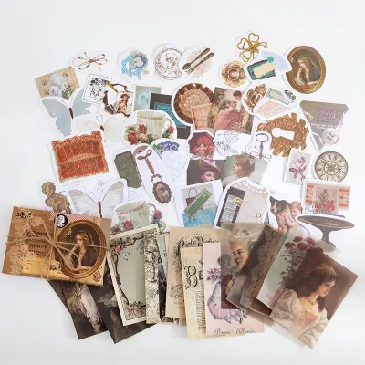
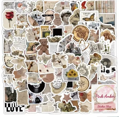
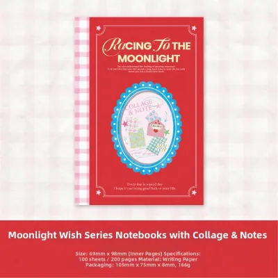
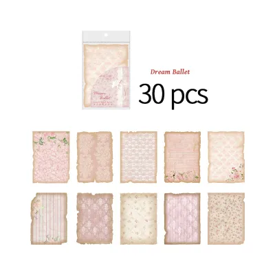
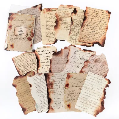
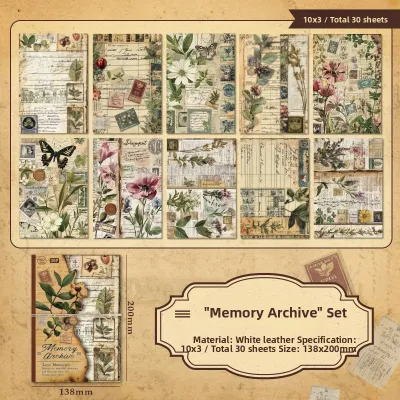
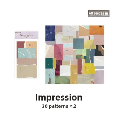
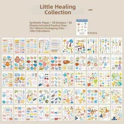
Prices are valid at publication and may change. Please refer to the product page for the latest price.
To start, you will need the following basic items:
- A base paper: A sturdy sheet of cardstock (ideally 200 to 300 GSM) to support the weight of your photos and embellishments.
- A paper trimmer or scissors: A rotary paper trimmer ensures perfectly straight, clean edges, while precision scissors are ideal for detailed cutting.
- Acid-free adhesives: Double-sided tape runners, acid-free glue sticks, or foam tape.
- Printed photos: High-quality prints that represent the core memory you want to preserve.
- Journaling pens: Archival-quality, fade-resistant pigment ink pens that will not bleed through your paper.
In tropical climates like the Philippines, high humidity can cause standard school glues to warp paper or lose their adhesive grip over time. Opting for archival-grade, acid-free adhesives is crucial to prevent your photos from yellowing and to ensure your layouts remain intact for years. A basic starter pack of acid-free cardstock and adhesive runners typically costs between ₱200 and ₱500 at local specialty craft stores or online marketplaces.
Once your tools are ready, define the “story” of your page. Instead of trying to fit an entire vacation or a year’s worth of events onto a single sheet, focus on a specific moment. This could be a sunny afternoon at a beach in Batangas, a festive family salu-salo, or a quiet weekend morning at home. Choosing a single theme makes it much easier to select a cohesive color palette. For instance, a beach trip naturally calls for warm sandy tones, ocean blues, and soft whites, while a festive family dinner might pair well with vibrant, warm colors.
Finally, select your base paper size and verify that your photos will fit comfortably within those dimensions. If you are working with a standard photo size like 4×6 inches, consider how many prints can realistically fit on your page without crowding out your background paper and embellishments. If necessary, crop your photos slightly to focus on the key subjects, keeping the most important details intact.
Establish a Focal Point and Sketch Your Layout
Every successful scrapbook page needs a focal point—a central element that immediately draws the viewer’s eye. Without a clear focal point, a layout can feel chaotic, leaving the viewer unsure of where to look first. In most scrapbooking designs, the focal point is your primary photo. This should be the image that best captures the emotion or essence of the event, and it is typically larger, brighter, or more prominently framed than the supporting elements.

To plan your page without the risk of making permanent mistakes, practice the “dry fit” method. This involves arranging your photos, paper scraps, and embellishments loosely on your base sheet without applying any glue. This step gives you the freedom to move items around, test different angles, and visualize the final product. You can also use a pencil to very lightly sketch layout zones on your base paper to map out where your photos, titles, and text blocks will sit.
As a beginner, you do not need to invent a layout from scratch. You can rely on three classic, time-tested structural layouts that naturally guide the viewer’s eye across the page:
- The Grid Layout: This structure uses clean horizontal and vertical lines to organize elements into neat blocks. It is highly effective for displaying multiple photos of the same size, creating a balanced, modern, and orderly appearance.
- The Diagonal Flow: In this arrangement, you place your elements along an imaginary diagonal line running from the top-left corner to the bottom-right corner. This structure creates a sense of movement, guiding the reader's eyes naturally across your photos and journaling.
- The Triangular Arrangement: By placing three visual clusters—such as a photo, a title block, and a small group of embellishments—in a triangular pattern, you create a balanced composition that keeps the viewer's gaze circulating within the center of the page.
Keep your initial sketches and dry fits highly flexible. As you begin placing physical items on the page, you may find that a photo looks better on the left than on the right, or that a decorative cardstock scrap works better as a background mat. Allow your design to evolve naturally during this planning phase.
Arrange Elements Using Simple Design Principles
To achieve a balanced and visually appealing layout, you can apply a few basic design principles that professional artists use. You do not need formal design training to master these concepts; they can be easily implemented with a few simple adjustments to how you position your items.
First, consider the rule of thirds. Imagine your scrapbook page is divided into a 3×3 grid by two horizontal and two vertical lines. Instead of placing your focal photo directly in the dead center of the page, try positioning it at one of the four intersection points where these imaginary lines meet. This off-center placement creates a more dynamic, engaging composition that feels sophisticated yet balanced.
Next, pay attention to visual weight. Different elements on your page carry different visual “weights” based on their size, color intensity, and texture. A large, dark-colored photo or a highly detailed pattern feels heavy, while a small, light-colored cardstock scrap or a delicate line of text feels light. To prevent your page from looking lopsided, balance a heavy element on one side with a cluster of smaller, lighter elements on the opposite side. For example, if your main photo sits on the bottom-right, place your page title and a small cluster of embellishments on the top-left to restore visual equilibrium.
When adding decorative elements like stickers, die-cuts, or stamps, use the rule of odds. For reasons that psychologists and designers often highlight, the human brain finds odd-numbered groupings more visually appealing and natural than even-numbered ones. Group your embellishments in clusters of three or five. A single sticker can look lost, and two can look like they are competing, but a cluster of three items—such as a small paper flower, a button, and a written date label—creates a cohesive, satisfying unit.
Finally, do not underestimate the power of white space, which is also referred to as breathing room. It is a common mistake to feel the need to fill every square inch of your background paper with decorations. Leaving open, unembellished areas around your photos and clusters allows the viewer’s eyes to rest. This breathing room prevents your layout from feeling cluttered and ensures that your focal point remains the undisputed star of the page.
Build Layers, Apply Adhesives, and Add Journaling
Once you are satisfied with your dry-fit arrangement, you can begin building physical depth and permanently assembling your page. Layering is a simple technique that transforms a flat, two-dimensional layout into a rich, tactile piece of art. You can easily create layers by sliding coordinating paper scraps slightly underneath your photos, or by creating a “mat” around your images. To mat a photo, simply cut a piece of contrasting cardstock slightly larger than your photo (leaving a 1/8-inch border on all sides) and glue your photo directly on top of it before placing it on the base page.
To take your layering a step further, use dimensional adhesives like foam tape or adhesive foam dots. By placing foam tape behind your main photo or a key embellishment, you lift it slightly off the page, casting a subtle, natural shadow that instantly draws attention.
When it is time to glue everything down, matching the right adhesive to your materials is essential for a clean, durable finish:
- Double-sided tape runners: These are perfect for flat paper layers and photos because they apply a thin, dry line of adhesive that will not warp your paper.
- Acid-free glue sticks: Best for light paper scraps and temporary positioning, though they may lose grip over time in high-humidity environments.
- Liquid craft glue: Use this sparingly for heavier embellishments like wooden shapes, buttons, or thick ribbons. Be sure to choose a quick-drying, clear-drying formula to avoid visible residue.
- Foam dots: Ideal for creating 3D depth under lightweight paper die-cuts or titles.
When using sharp tools like paper trimmers or craft knives to prepare your layers, always work on a dedicated cutting mat to protect your tabletop, and keep blades retracted when not in use. If you are crafting with children, ensure they use age-appropriate safety scissors and non-toxic, child-safe glues.
No scrapbook page is truly complete without journaling. Your photos tell what happened, but your words explain why it mattered. Plan and reserve a dedicated space for your text during your initial sketch phase so it does not feel like an afterthought. Your journaling can include dates, names, locations, a short anecdote, or even a meaningful quote.
If you lack confidence in your handwriting, there are simple ways to incorporate clean, beautiful text. You can write your words on a separate piece of lined paper or a grid-patterned journaling card, trim it, and glue it onto your layout. This approach is much less intimidating than writing directly on your background paper because if you make a mistake, you can simply grab a fresh card and start over. Always perform a quick stroke test with your journaling pen on a scrap piece of your chosen cardstock to verify its drying speed and bleed resistance before writing on your final layout.
Evaluate Your Layout and Avoid Common Beginner Mistakes
Before you apply the final drops of glue to your carefully planned layout, take a moment to evaluate your work. A great way to assess your composition is by performing the squint test. Step back from your desk, look at your page, and squint your eyes until the details become blurry. This simple trick allows you to see the overall balance of light, dark, and color blocks without getting distracted by the specific images or text. If one area of the page looks solid black or completely empty, you can easily adjust your elements to balance the layout.
Next, check your alignments and margins. Ensure that your photos are straight—unless you have intentionally tilted them for a playful look—and verify that no critical elements, such as names or faces, are placed too close to the edges of the page. If you plan to place your page in a plastic protector or a bound album, keep all important photos and embellishments at least half an inch away from the edges to ensure they do not get cut off or hidden by the binding.
As you finalize your design, keep these common beginner pitfalls in mind so you can avoid them:
- Overcrowding: Resist the urge to use every sticker in your sticker pack. If a layout feels too busy, remove a few minor embellishments to give your photos room to breathe.
- Competing Colors: Limit your color palette to three or four coordinating colors. Using too many bright, contrasting colors can distract from your photos.
- Forgetting the Story: Ensure your decorations match the mood of your photos. For example, a serene, quiet portrait might look out of place surrounded by neon birthday balloons.
Finally, step away from your crafting table for five to ten minutes. When you return with fresh eyes, you will immediately notice if something looks slightly off-center or if an area needs an extra touch of color. Once everything looks perfect, confidently secure your elements, slide your completed page into a protective sleeve, and enjoy the beautiful memory you have successfully preserved.
Frequently Asked Questions (FAQ)
What is the standard size for a scrapbook page layout?
The most popular and widely available standard size for scrapbooking is 12×12 inches (approximately 30.5×30.5 centimeters). This square format offers ample space for displaying multiple photos, a prominent title, and detailed journaling blocks. Because of its popularity, you will find the widest selection of patterned papers, page protectors, and album binders in this size.
If a 12×12 page feels too intimidating, there are other common sizes available. The 8.5×11-inch size (standard letter size) is an excellent option because it easily fits into standard binders and allows you to print background papers directly from a home printer. For quick, highly focused projects, a 6×8-inch mini-album size is incredibly manageable and perfect for documenting a single weekend trip or a specific holiday.
How do I fix a scrapbook layout that looks too cluttered?
If your layout is starting to look cluttered, the easiest fix is to simplify by subtraction. Remove one or two minor photos or non-essential stickers. If you have several small photos scattered across the page, try consolidating them into a single, neat grid block rather than spreading them out evenly, which can create visual chaos.
Another effective solution is to introduce a solid, neutral cardstock mat behind your main photos. Placing a clean border of white, cream, or black cardstock around your images physically separates them from a busy patterned background paper, giving the viewer’s eyes a calm place to rest. Finally, ensure that your embellishments are grouped tightly in clusters rather than floating individually across the page, as clustered elements naturally look organized and intentional.
Community discussion
Share your experience or ask a question. Comments are reviewed before publication.