
Pairing dimensional 3D stickers with flat washi tapes and paper stickers is an excellent way to transform flat journal pages into dynamic, tactile works of art. The secret to a successful layout lies in building a clear visual hierarchy, starting with wide background elements and finishing with raised focal points. By layering your materials from thinnest to thickest, you create a sense of depth that draws the eye across the page without making your journal impossible to close.
In tropical climates like the Philippines, high humidity can affect how adhesives cure and hold over time. Understanding how to prep your pages, choose compatible paper weights, and balance your layouts ensures your creative spreads remain intact for years to come. Whether you are documenting daily reflections or scrapbooking memories, mastering these layering techniques will elevate your stationery layouts.
Understanding the Roles of Each Element in a Layered Layout
Before peeling the backing off any sticker, it helps to understand the specific visual and structural role each element plays on your page. Think of your journal page as a miniature stage where different stationery items act as the background scenery, the supporting cast, and the main stars.
Products mentioned in this guide
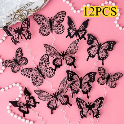
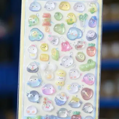
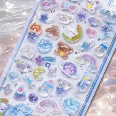
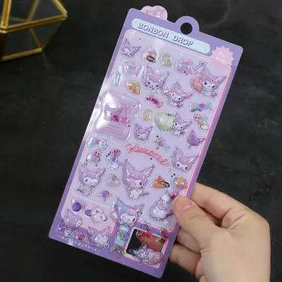
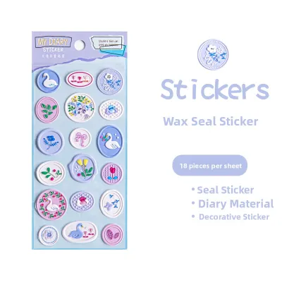
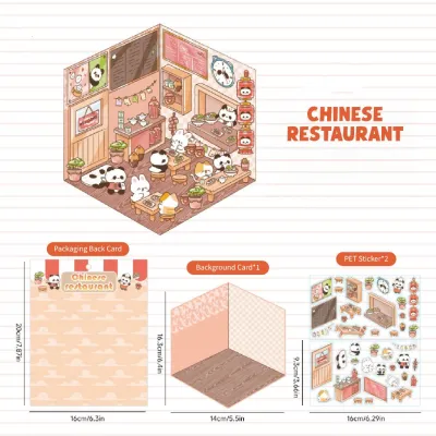
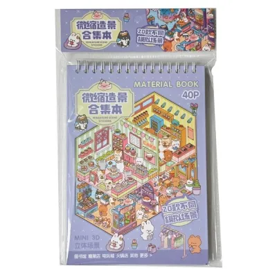
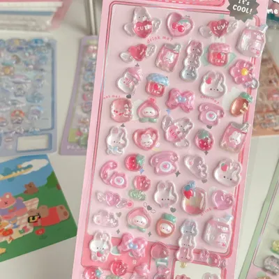
Prices are valid at publication and may change. Please refer to the product page for the latest price.
Washi tape serves as the structural foundation or background framing tool. Because it is thin, slightly translucent, and easy to reposition, washi tape is perfect for anchoring your design, creating borders, or blocking out sections of the page. It establishes the color palette and overall mood of the spread without adding physical bulk.
Flat stickers function as secondary details, texture builders, and transitional elements. These can include paper stickers, clear PET stickers, or die-cut designs that sit flush against the page. They bridge the gap between the background washi tape and the foreground, adding intricate patterns, botanical illustrations, or small icons that support the central theme.
A 3D sticker acts as the primary focal point that creates immediate physical depth. Whether made of puffy epoxy, layered cardstock, or foam-backed plastic, these dimensional pieces naturally draw the eye and cast subtle shadows on the page. Because they command so much visual attention, they should be used selectively to avoid overwhelming the layout.
Before committing to a heavily layered design, always check your journal’s paper thickness and binding capacity. Standard notebook paper (around 80 GSM) may sag or tear under the weight of heavy 3D elements, whereas thicker mixed-media or bullet journal paper (120 GSM to 160 GSM) provides a sturdy canvas. Additionally, ring-bound or traveler’s notebook styles accommodate dimensional expansion much better than tight, thread-bound hardcovers.
Step-by-Step Strategies for Combining 3D and Flat Elements
Creating a balanced, dimensional layout requires a systematic approach to layering. If you apply your thickest elements too early, you will find it incredibly difficult to tuck flat stickers or write text around them. Working from the bottom up ensures every layer remains visible and serves a clear purpose.

The logical sequence of application is crucial: start with your background washes, add your flat decorative elements, write your journal entries, and place your 3D stickers last. This sequence prevents you from accidentally covering up your main focal points or struggling to write on an uneven, bumpy surface.
You can use flat elements to create a visual path that leads directly to your 3D sticker. By angling washi tape strips or cascading flat floral stickers toward the center of your layout, you guide the reader’s eye naturally toward the dimensional highlight of the page.
Building the Base with Washi Tape and Flat Stickers
To begin your layout, focus on establishing a grounded background using your thinnest materials. You can tear the edges of your washi tape by hand for a textured look, or use scissors for clean, geometric borders and grids. Overlapping different widths of tape—such as a wide grid pattern paired with a slim solid color—adds instant depth before you even introduce stickers.
Once your tape is down, place your flat stickers to fill negative space and build out the theme. Position these flat elements so they slightly overlap the edges of the washi tape, which visually glues the different components together. Keep these secondary details clustered in specific areas, such as the corners or along the margins, so they do not compete with the space reserved for your main subject.
In warm, humid environments, adhesive behavior can change significantly. It is wise to check the adhesive strength of your tapes and flat stickers on a small corner of your journal paper first. Some low-tack washi tapes may curl at the edges when exposed to moisture in the air, while certain paper stickers might bleed or lose their stickiness, requiring a quick swipe of a dry glue stick to secure them.
Positioning 3D Stickers as Focal Points
With your background set, you can now introduce your 3D sticker to anchor the entire design. To maximize its visual impact, consider using the rule of thirds—placing the dimensional sticker slightly off-center rather than dead in the middle—to create a more dynamic and pleasing composition. Alternatively, a strong central alignment works beautifully for symmetrical, minimalist layouts.
Ensure there is adequate clearance and breathing room around the 3D sticker. Because these elements are raised, they need empty space around them so their edges can cast natural shadows on the flat layers beneath. If you crowd flat stickers too close to a puffy or foam sticker, you lose the dramatic contrast between the flat and dimensional surfaces.
Finally, verify that the 3D sticker’s adhesive backing is fully compatible with the textured layers underneath. If you are placing a heavy 3D sticker directly on top of slick PET tape or textured washi, the factory adhesive might lift over time. Press down firmly on the center and edges of the sticker for several seconds to ensure a secure bond, or consider adding a tiny drop of heavy-duty craft adhesive if the backing feels insecure.
Visual Balance and Spacing Techniques for Dimensional Pages
Achieving visual balance on a dimensional journal page is all about managing weight, both visual and physical. A single 3D sticker carries a lot of visual weight because of its thickness, texture, and shadow. If you place a large, puffy sticker on one side of a two-page spread, the opposite page can end up looking empty or unfinished.
To counter this, use negative space strategically to let your dimensional elements breathe. Leaving clean, unadorned areas of paper around your main clusters prevents the layout from looking cluttered or chaotic. This empty space acts as a visual resting point, making the layered sections stand out even more.
You can balance a large 3D sticker by placing a cluster of smaller flat stickers, a bold strip of washi tape, or a block of handwritten text on the opposite side of the spread. This diagonal balance keeps the eye moving across the entire layout rather than getting stuck on a single heavy point. For instance, if your premium puffy sticker sits in the bottom-right corner, balance it with a striking washi tape border in the top-left.
Always keep an eye on the overall thickness of your pages as you build your journal. Stacking multiple 3D stickers in the exact same spot page after page will quickly create a bulky, uneven lump. This unevenness not only makes it difficult to write on subsequent pages but can also put immense pressure on the journal’s spine, eventually cracking the binding or tearing the cover.
Common Layering Mistakes and How to Avoid Them
One of the most common mistakes in dimensional journaling is overcrowding the page with too many competing 3D elements. When you have five or six puffy stickers scattered across a single spread, they fight for attention, and the page loses its sense of direction. Limit yourself to one or two 3D focal points per spread, keeping the rest of the elements flat.
Another frequent issue is using incompatible adhesives that cause paper warping or leave sticky residue. Liquid school glues often contain too much water, which can wrinkle thin journal pages and fail to support the weight of heavy plastic or epoxy stickers. If you need to reinforce a sticker, opt for double-sided tape runners or acid-free glue sticks designed specifically for paper crafts.
Placing thick 3D stickers too close to the journal’s center binding is a recipe for closing difficulties. When a thick element sits near the gutter, it acts as a wedge, forcing the book to stay propped open and straining the threads. Keep your dimensional stickers at least an inch away from the center seam, placing them closer to the outer edges of the page instead.
To save yourself from frustration, get into the habit of performing a dry run before peeling off any adhesive backings. Arrange your washi tape, flat stickers, and 3D elements on a scrap piece of paper or directly on your page without sticking them down. Take a quick photo with your phone to reference the layout, test how the layers sit together, and make any necessary adjustments before making the design permanent.
Frequently Asked Questions (FAQ)
Can I use regular glue instead of the adhesive backing on 3D stickers?
While it might be tempting to use standard liquid school glue to reinforce a lifting 3D sticker, doing so can easily ruin your page. Liquid glues carry a high water content that causes standard journal paper to buckle, wrinkle, and warp. Furthermore, standard school glue often lacks the shear strength required to hold up heavier plastic, wood, or epoxy dimensional elements over time, leading to peeling. If the sticker’s original foam adhesive pad is failing, it is much safer to use a high-tack double-sided tape runner or a dedicated acid-free craft glue gel. Always check the manufacturer’s instructions on the sticker packaging, as some materials react poorly to solvent-based adhesives.
How do I store a journal with thick 3D sticker layers without damaging the spine?
To protect your journal’s binding from the strain of thick, layered pages, store the book flat on a desk or shelf rather than upright. Storing a bulky journal vertically can cause the pages to sag and pull away from the spine under their own weight. Using a wide elastic journal band or a built-in closure strap helps distribute pressure evenly across the entire book, compressing the pages gently. Finally, plan your layouts so that your 3D stickers are distributed across different areas of the book—such as the top of one page, the middle of another, and the bottom of the next—rather than stacking them in the exact same spot on consecutive pages.

Community discussion
Share your experience or ask a question. Comments are reviewed before publication.