
Choosing the right technical pen nib size requires matching the physical line width to your specific task while accounting for paper texture, drawing speed, and environmental factors. Whether you are drafting architectural schematics, inking intricate comic panels, or rendering hand-drawn typography, selecting the correct nib ensures clean, consistent lines without scratching the paper or causing ink to pool. By understanding how different line weights establish visual hierarchy, you can build a versatile toolkit that elevates your work.
Quick Guide to Technical Pen Nib Sizes
Technical pens use a precise metal collar and an internal wire to regulate ink flow, producing highly consistent line widths. These pens are categorized by metric sizes, typically ranging from an ultra-fine 0.05mm up to a bold 1.0mm or larger. For quick reference, ultra-fine nibs (0.05mm to 0.2mm) are ideal for intricate detailing, fine hatching, and small-scale annotations. Medium nibs (0.3mm to 0.5mm) serve as the workhorses for general writing, sketching, and standard outlines. Broad nibs (0.7mm to 1.0mm and above) are best suited for bold borders, filling solid areas, and heavy display lettering.
It is important to note that the nominal size printed on the pen barrel indicates the external diameter of the metal tube, not necessarily the exact line width left on the page. Factors such as ink viscosity, paper absorbency, and drawing speed will always cause slight variations in the final line. Understanding this distinction prevents frustration when transitioning between different brands or paper types.
Products mentioned in this guide
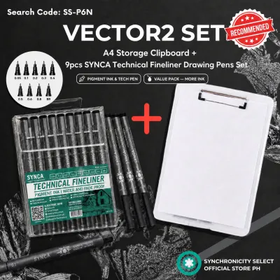
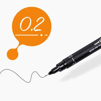
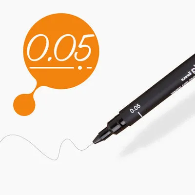
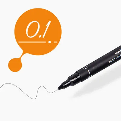
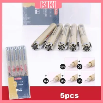
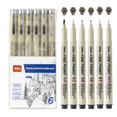
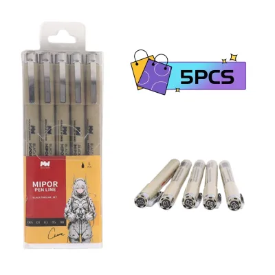
Prices are valid at publication and may change. Please refer to the product page for the latest price.
Understanding Nib Sizing and Line Width Variables
When selecting a technical pen, you will encounter two primary sizing systems: the International Organization for Standardization (ISO) standards and proprietary brand sizing. ISO-standardized pens use a color-coded system and specific metric increments (such as 0.13mm, 0.18mm, 0.25mm, 0.35mm, 0.50mm, and 0.70mm) designed to scale perfectly when drawings are enlarged or reduced. Proprietary sizing, on the other hand, often uses simplified decimal labels (like 0.1mm, 0.3mm, or 0.5mm) or arbitrary numbering systems. If your work requires strict compliance with engineering or architectural drafting standards, verify that your pens conform to ISO specifications.

Beyond the label on the pen, your physical drawing technique plays a significant role in how ink is deposited. Holding a technical pen at a low angle can restrict ink flow and cause the metal sleeve to scrape against the paper fibers. To achieve the intended line width, hold the pen nearly perpendicular to the drawing surface, ideally at an angle between 80 and 90 degrees.
Drawing speed and applied pressure also alter the final line thickness. Moving the pen too quickly can result in faint, skipping lines because the ink does not have sufficient time to flow through capillary action. Conversely, pausing or moving too slowly allows ink to pool, creating a line that is noticeably wider than the nominal nib size. Because technical pens rely on a delicate internal weight and gravity rather than physical pressure, applying downward force will not make the line bolder; instead, it risks bending the ultra-fine metal tube or damaging the internal wire. Always consult the manufacturer’s specification sheets to understand the exact tolerances and recommended operating conditions for your specific pen model.
Matching Nib Sizes to Your Specific Tasks
The key to professional-looking drawings and illustrations lies in establishing a clear line weight hierarchy. By using a deliberate variety of line thicknesses, you can guide the viewer’s eye, define spatial depth, and separate different types of information. Let us explore how to apply these principles across different creative and technical disciplines.
Architectural Drafting and Technical Drawing
In architectural and engineering drawings, line weights are strictly regulated to ensure that plans remain legible when copied or digitized.
- Ultra-fine nibs (0.13mm to 0.25mm): Indispensable for drawing construction lines, grid lines, material hatching patterns, and dimension lines. These thin lines keep the drawing clean and prevent dense areas, like wall cavities or tight structural details, from turning into solid black blobs.
- Medium to broad nibs (0.50mm to 0.80mm): Used for primary structural elements, outlines, and section cuts where a wall is sliced through. These bolder lines immediately stand out, allowing anyone reading the blueprint to distinguish solid structures from open spaces or secondary fixtures.
- Broadest nibs (1.0mm or larger): Typically reserved for borders and title blocks to frame the drawing professionally.
Before starting any project, always check the specific drafting standards or project briefs provided by your client or institution to ensure your line weight variations comply with their requirements.
Line Art, Illustration, and Comic Inking
For illustrators and comic artists, varying your line weights is the primary method for creating a sense of depth, light, and three-dimensional form.
- Fine nibs (0.05mm to 0.2mm): Perfect for rendering intricate textures, facial features, hair strands, and distant background elements. Using thin lines for objects in the distance naturally pushes them backward in the visual plane, mimicking atmospheric perspective.
- Broader nibs (0.5mm to 0.8mm): Used to bring subjects into the foreground or emphasize a strong shadow. Applying a thick outline—often called a "holding line"—around your main character or focal point separates them from the background and makes the image pop.
By combining multiple nib sizes within a single illustration, you can establish a clear visual hierarchy and convey form and volume without relying on complex shading or color gradients.
Lettering, Calligraphy, and Hand-Drawn Typography
When working with hand-drawn typography, your choice of nib size directly impacts both the legibility and the aesthetic weight of the text.
- Fine nibs (0.3mm to 0.5mm): Highly recommended for small body text, detailed annotations, or clean architectural lettering. These sizes provide enough thickness to remain highly readable while ensuring that the counters—the enclosed negative spaces inside letters like "o", "e", and "a"—do not fill with ink.
- Broader nibs (0.8mm to 1.2mm): Allow you to create strong, impactful letterforms for headers, decorative drop caps, and bold display lettering.
When executing tight curves or intersecting strokes, it is crucial to test the ink flow of your chosen pen. Broader nibs deposit a larger volume of ink, which can pool or blob at the intersections of letters if you write too slowly or if the ink takes too long to dry. Practicing consistent stroke speed will help maintain clean, sharp edges throughout your lettering work.
Factoring in Paper Texture and Ink Compatibility
The performance of a technical pen is heavily dependent on the paper surface you choose. Rough or highly textured papers, such as cold-press watercolor paper or coarse sketchbooks, are generally unsuitable for fine technical pens. The delicate, needle-like tips of ultra-fine nibs (0.1mm and below) can easily catch on the paper fibers, causing the pen to skip, scratch, or clog as loose fibers accumulate inside the metal tube. For these pens, smooth surfaces like vellum, bristol board, or high-quality drafting film are ideal.
Conversely, highly absorbent papers can cause significant issues when using broader nibs. Because broad nibs deposit a generous amount of ink, porous paper will pull the ink outward from the line, a phenomenon known as feathering. This results in fuzzy, blurry edges rather than the crisp, sharp lines technical pens are designed to produce. Absorbent paper also increases the risk of bleed-through, where ink seeps through to the back of the page or ruins the sheet underneath.
Environmental factors also play a critical role, particularly in tropical climates like the Philippines. High relative humidity can make paper fibers more absorbent as they draw moisture from the air, which can exacerbate feathering and significantly prolong ink drying times. To avoid ruining hours of work, always conduct a physical swatch test on a scrap piece of your exact paper stock under your typical working conditions. Draw a series of intersecting lines, grids, and solid blocks to observe how the ink behaves, how quickly it dries, and whether the nib glides smoothly across the surface.
Building a Starter Set and Testing Your Nibs
If you are new to technical pens, purchasing an entire range of sizes can be overwhelming and unnecessarily expensive. Instead, start by building a foundational multi-pen set that covers the three essential ranges: fine, medium, and broad. A practical starter combination might include a 0.1mm or 0.2mm pen for fine details, a 0.3mm or 0.5mm pen for general work, and a 0.8mm pen for bold outlines and borders. This selection allows you to complete most drafting, illustration, or lettering projects while staying within a reasonable budget of ₱500 to ₱1,500 for a basic set.
Once you have your pens, create a personal reference chart on your preferred drawing paper. Draw a straight line with each pen, labeling it with the corresponding nib size, and write a short sample sentence. This chart serves as an invaluable visual guide, showing you exactly how each line weight looks on your specific paper, making it much easier to plan your line hierarchies for future projects.
Maintaining your technical pens is essential for preserving consistent ink flow and preventing costly clogs. Because technical pen inks are often highly pigmented and water-resistant, they can dry quickly inside the narrow metal sleeve if left uncapped. Establish a routine of capping your pens immediately when not in use, and store them horizontally to keep the ink evenly distributed. If you are using refillable technical pens, flush them thoroughly with distilled water or specialized pen cleaning solution if you plan to store them unused for more than a few weeks.
Frequently Asked Questions (FAQ)
Can I use technical pens on standard printer paper?
Standard printer or copy paper is generally not recommended for finished technical pen work. Because copy paper is highly porous and untreated, it quickly absorbs ink, leading to severe feathering, fuzzy lines, and bleed-through, especially with medium and broad nibs. Additionally, the loose fibers of cheap printer paper can easily clog ultra-fine nibs, causing them to scratch or stop flowing. If you must use printer paper for quick drafts, always test your pens on a scrap piece first and use a light touch to minimize ink deposition.
Why is my fine nib scratching the paper or skipping?
A scratching or skipping fine nib is usually caused by dried ink clogs, paper fibers trapped in the tip, or a bent metal sleeve. Because ultra-fine nibs have incredibly narrow passages, even a tiny speck of dried ink can block the internal weight. Try gently wiping the tip with a damp, lint-free cloth, or holding the pen at a steeper angle (closer to 90 degrees) while reducing downward pressure. If the skipping persists, the pen may require a thorough cleaning with specialized pen flush, or the delicate metal tube may have sustained physical damage and need replacement.
Community discussion
Share your experience or ask a question. Comments are reviewed before publication.