
Pairing a Gear 5 Luffy sticker with washi tape requires balancing the vibrant, high-energy design of the “Sun God Nika” form with complementary background elements that do not compete for attention. Because Gear 5 features a distinct palette of stark whites, ethereal purples, soft pinks, and golden yellow accents, your choice of washi tape should serve as a frame rather than a distraction. By planning your layout, selecting low-tack tapes with cloud or celestial motifs, and layering your materials from background to foreground, you can create a cohesive One Piece journal spread that captures the whimsical, legendary energy of Luffy’s awakening.
Planning Your One Piece Journal Spread Layout
Before peeling off any adhesive backing, you must establish a clear visual hierarchy. The Gear 5 Luffy sticker is your undisputed focal point. Because these stickers often feature dynamic poses, flowing clouds, or bold action lines, they require breathing room. Measure your sticker’s dimensions first. A large 3-inch vinyl sticker will dominate a standard A5 journal page, leaving less room for heavy tape patterns, whereas smaller 1-inch die-cut stickers can be grouped or framed more closely.
Allocate generous negative space around the sticker to prevent the page from feeling claustrophobic. In tropical climates where high humidity can cause paper to expand or warp slightly, leaving open areas of bare paper helps maintain the structural integrity of your journal page.
Products mentioned in this guide
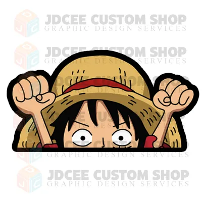

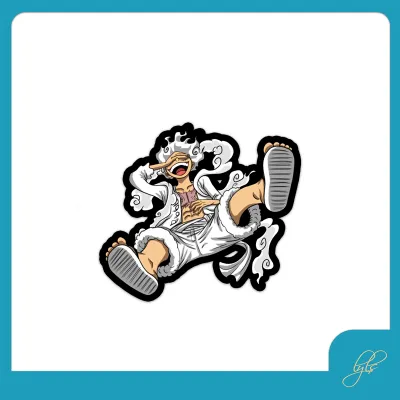
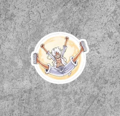



Prices are valid at publication and may change. Please refer to the product page for the latest price.
Design a cohesive color palette inspired directly by Luffy’s Gear 5 form. The primary colors should be stark white and light gray to match his hair and clothes, complemented by pastel purples, soft pinks, and bright yellow or gold accents representing his joyful aura and lightning attacks.
Always sketch a rough layout on a piece of scrap paper or a blank grid sheet before committing to the final page. You can place your backing-on stickers and unrolled tape strips loosely on the page to test the visual weight. This step ensures that your planned tape placements guide the reader’s eye toward Luffy rather than pulling attention away to the margins.
Choosing Complementary Washi Tapes
Selecting the right washi tape patterns is crucial for enhancing your sticker’s impact. Look for tapes featuring subtle textures, minimalist grid patterns, or stylized cloud and smoke designs that mimic the legendary cloud scarf surrounding Gear 5 Luffy. Neutral tones like off-white, cream, and light gray provide an excellent base, while metallic gold or holographic foil tapes can be used sparingly to highlight the divine, sun-god aspect of the character.

You must verify the tape’s width and material compatibility with your specific journal paper. Standard washi tapes range from 5mm to 30mm in width. Wide tapes are ideal for creating solid borders or background blocks, while ultra-thin tapes work best for delicate framing or dividing sections of text.
Pay close attention to the paper weight of your notebook, typically measured in grams per square meter (gsm). If you are using a standard 80 gsm to 100 gsm journal, heavy layering of thick, highly saturated, or plastic-coated tapes can cause the paper to sag or buckle. For highly layered spreads, a sturdier 120 gsm to 160 gsm paper is recommended to prevent bleed-through and ghosting from accompanying ink pens.
Evaluate the adhesive strength and opacity of your washi tapes. Authentic Japanese washi paper is naturally semi-translucent, allowing background grids or text to peek through subtly. Opt for low-tack, repositionable adhesives. These are particularly forgiving during the layout phase, allowing you to reposition elements without tearing delicate notebook fibers, which is especially important in the humid climate of the Philippines, where paper fibers can soften and become more susceptible to damage.
Layering and Application Techniques
Achieving a professional, clean finish relies entirely on the sequence of your application. Always lay down your background washi tape layers first. If you want a tape pattern to appear behind Luffy, apply it directly to the page, smooth it down, and then place the Gear 5 sticker on top. This creates a natural depth of field, making the sticker pop forward as a three-dimensional element.
Experiment with different edge-finishing techniques to add texture to your spread. Tearing washi tape by hand produces a soft, feathered edge that beautifully complements the organic, cloud-like aesthetic of Gear 5. For a cleaner, more modern look, use a pair of precision craft scissors or a plastic tape dispenser to cut sharp, straight lines. You can also fold the tape over the edge of the page to create a durable, decorative tab.
To ensure proper adhesion and prevent peeling over time, use a clean, flat tool like a plastic bone folder, a ruler, or even the edge of an old plastic card to smooth out the tape and sticker. Start from the center of the sticker and push outward to expel any trapped air bubbles. This is particularly important when applying vinyl stickers over textured or dotted grid paper, as tiny air pockets can collect moisture in humid environments, eventually weakening the adhesive.
Common Pairing Mistakes to Avoid
One of the most frequent mistakes in themed journaling is overcrowding the page with competing, high-contrast patterns. While it might be tempting to use bright red, black, and yellow tapes to represent the classic One Piece aesthetic, these intense colors can easily overwhelm the delicate white and pastel tones of Gear 5 Luffy. Keep your high-contrast elements minimal and localized.
To prevent irreversible page damage, never apply a high-tack tape or sticker without testing it first. Some budget-friendly decorative tapes, often priced under ₱50 on online marketplaces, use aggressive acrylic adhesives that can permanently bond to and tear thin paper. Always test a small strip of tape on a hidden back page of your journal to observe how cleanly it peels off before using it on your main spread.
Be mindful of the visual flow created by the directionality of your tape patterns. If your washi tape features repeating motifs, such as waves, clouds, or text, ensure they run parallel to the page edges or point toward your focal sticker. Misaligned patterns can create visual chaos, distracting the eye and disrupting the cohesive, celebratory feel of your Gear 5 tribute.
Frequently Asked Questions (FAQ)
Can I apply washi tape directly over the Gear 5 Luffy sticker?
Yes, but you must consider the tape’s opacity and adhesive strength. Because classic washi tape is semi-translucent, placing a light-colored tape over a dark portion of a vinyl sticker will result in the sticker’s design showing through, which can look messy. Additionally, peeling high-tack tape off a paper-backed sticker can tear the sticker’s surface. If you want to frame the sticker, let the tape overlap only the blank outer border of the die-cut sticker rather than covering Luffy’s face or body.
What journal paper weight is best for layering stickers and washi tape?
For spreads involving multiple layers of washi tape, heavy vinyl stickers, and ink drawings, a paper weight of at least 120 gsm to 160 gsm is ideal. This thickness provides the structural rigidity needed to support the weight of adhesives without warping or buckling. If you are working in a lighter notebook, such as an 80 gsm or 90 gsm journal, limit your layering to a single layer of low-tack tape and avoid heavy vinyl stickers, opting instead for thin paper stickers to protect your pages.

Community discussion
Share your experience or ask a question. Comments are reviewed before publication.