
Pairing miniature scene stickers with washi tape is an art of balance, transforming a flat journal page into a cohesive, three-dimensional narrative. To achieve a harmonious spread, you must treat your miniature scene stickers as the primary focal points while using washi tape as a supporting design element that frames, grounds, and connects these scenes. In tropical climates like the Philippines, where high humidity can affect adhesive behavior and paper tension, selecting the right material combinations and layout techniques ensures your creative spreads remain intact and visually striking over time.
By understanding how these two mediums interact, you can design layouts that feel intentional rather than cluttered. The key lies in managing visual weight, coordinating color palettes, and mastering layering sequences that build depth without overwhelming your paper.
Understanding the Visual Roles of Stickers and Tape
Every successful journal spread relies on a clear hierarchy of elements. Miniature scene stickers, with their intricate details and self-contained illustrations, naturally act as the focal points or narrative anchors of your layout. Because these stickers depict tiny, detailed worlds—such as a cozy cafe corner, a rain-slicked street, or a miniature garden—they immediately draw the reader’s eye and establish the theme of the page.
Products mentioned in this guide
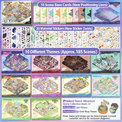
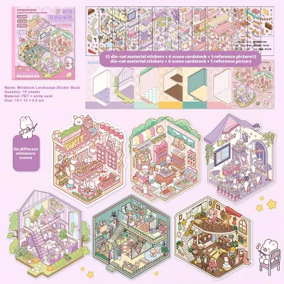
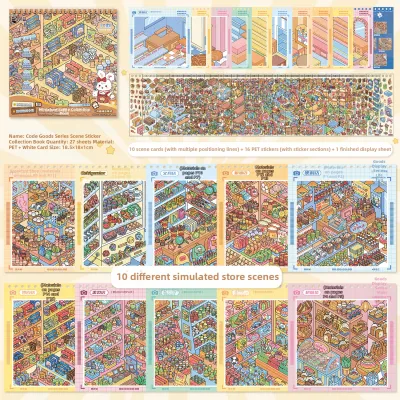
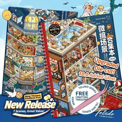
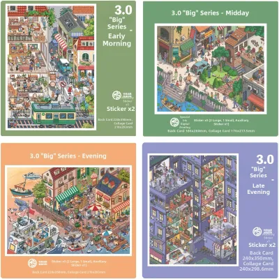
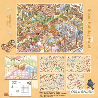
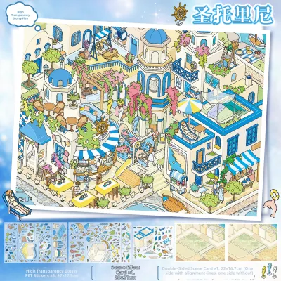
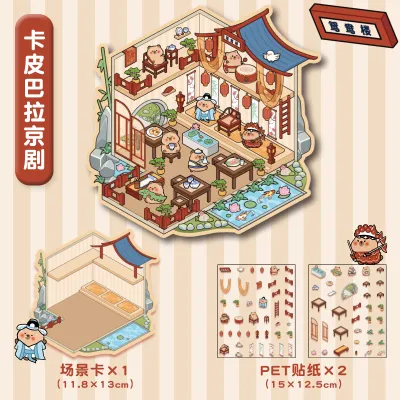
Prices are valid at publication and may change. Please refer to the product page for the latest price.
Washi tape, on the other hand, serves a supportive, structural role. Instead of competing with your stickers for attention, tape functions as background builders, borders, or transitional elements that guide the eye across the page. A simple strip of tape can represent a sky, a road, or a decorative shelf, bridging the gap between the stark white of the journal page and the detailed sticker art.
Before committing to a layout, always check your paper weight and adhesive compatibility. In humid environments, lightweight papers can warp or cockle if paired with heavy, high-tack stickers or wet adhesives. Conversely, some low-tack washi tapes may lift at the corners when exposed to moisture in the air. Testing how your specific stickers and tapes adhere to your journal paper beforehand prevents frustrating lifting or page warping later.
Core Layout Techniques for Harmonious Spreads
Creating a balanced journal spread requires a thoughtful approach to composition. Visual weight refers to how much an element attracts the eye; highly detailed, colorful miniature scene stickers possess significant visual weight, while simple, solid-colored washi tapes have much less. To achieve harmony, you must balance these elements so they complement rather than fight each other.

Negative space, or the empty areas of your page, is your most valuable tool in preventing a cluttered layout. Leaving open areas around your miniature scenes allows the eyes to rest and highlights the beauty of your stationery. Instead of filling every square inch of your notebook, use negative space to give your stickers and tape room to breathe.
Framing and Grounding Methods
One of the most common mistakes in journaling is letting miniature scene stickers “float” aimlessly on the page, which can make the layout feel disconnected. You can easily solve this by using solid or subtly patterned washi tape to create grounded horizons or bases. Placing a thin strip of wood-grain, concrete-textured, or solid neutral tape directly beneath a sticker instantly anchors it, giving the miniature scene a physical surface to sit on.
You can also build simple geometric or organic frames around your central stickers to direct the viewer’s focus. Framing does not have to mean enclosing the sticker entirely; even a simple L-shaped border made of thin washi tape in opposite corners can beautifully define the scene. This technique works exceptionally well on blank or dot-grid pages, creating a structured window for your miniature art.
When selecting tape for framing, always test its opacity on your journal page. Highly translucent tapes may allow dark grid lines or underlying handwriting to show through, which can clutter the clean look of your frame. If you prefer a seamless, opaque border, opt for paper-backed tapes or those with solid white bases that completely mask the page patterns underneath.
Layering for Visual Depth
Building visual depth on a flat sheet of paper requires a systematic layering process. To create a realistic three-dimensional effect, always apply your background tape layers first. Wide, semi-translucent tapes featuring sky patterns, distant mountains, or soft watercolor washes make excellent backdrops, establishing the environment and setting the mood for your spread.
Once your background is secure, position your miniature scene stickers as the mid-ground or foreground elements. Placing the stickers directly over the background tape creates an instant sense of distance and scale. For instance, a sticker of a small house placed over a soft blue watercolor tape strip immediately looks like a home nestled under a wide sky.
To integrate your stickers seamlessly into the background, use translucent or torn-edge tape overlays sparingly. Tearing the edges of a thin, neutral washi tape and overlapping it slightly across the bottom of your sticker softens the harsh plastic or paper edges of the sticker. This technique blends the sticker into the page, making it look like a hand-painted illustration rather than a separate adhesive cutout.
Color and Theme Coordination Strategies
A cohesive spread relies heavily on a unified color palette and thematic consistency. When selecting your materials, match the tape finish and color saturation with the specific art style of your miniature stickers. For example, matte, pastel-toned stickers pair beautifully with soft, uncoated paper tapes, while vibrant, glossy stickers are best complemented by tapes with similar high-saturation finishes or metallic foil accents.
Applying basic color wheel principles can elevate your layouts from simple collages to professional-looking designs. For a calm, harmonious feel, choose analogous tape shades—colors that sit next to each other on the color wheel, such as soft greens and blues to accompany a forest-themed sticker. If you want your miniature scene to pop, select a complementary tape color, using a warm terracotta tape to contrast against a cool blue sticker scene.
Always verify the pattern scale and print alignment when mixing heavily patterned tape with highly detailed miniature scenes. If your sticker features a tiny, intricate cafe scene, pairing it with a wide tape covered in large, high-contrast floral patterns will create visual chaos. Instead, opt for micro-patterns, simple grids, or solid colors that support the sticker’s details without competing for dominance.
Because stationery manufacturing standards vary widely, rely on visual observation and scrap paper testing rather than assuming brand cross-compatibility. A tape labeled “warm gray” from one brand may have cool blue undertones that clash with the yellow-toned cream paper of your journal or the warm tones of your stickers. Keeping a dedicated swatch book or testing combinations on a scrap piece of paper before sticking them down is the safest way to ensure color harmony.
Practical Workflow: Building Your Spread Step-by-Step
Assembling a journal spread is a tactile, rewarding process that benefits from a structured workflow. Before peeling off any adhesive backings, plan your composition using light pencil guidelines, small sticky notes, or even a quick digital photo mockup on your phone. Laying out your stickers and tape rolls on the page blank allows you to experiment with different placements and spacing without risking damage to your paper.
Once you are satisfied with the layout, begin by applying the background and structural tape layers first. Lay down your wide background washes, horizon lines, or framing elements, ensuring you burnish the edges smoothly with a bone folder, a plastic card, or the back of your fingernail. Proper burnishing is especially important in humid tropical climates, as it seals the adhesive against the paper and prevents air bubbles or lifting.
Next, position and adhere your miniature scene stickers as the final focal elements. Carefully peel the backing and lower the sticker onto your prepared background, checking its alignment against your pencil marks or grid lines. Press firmly from the center outward to eliminate trapped air and ensure a strong bond with both the paper and any underlying tape layers.
To finish the spread, add subtle tape accents, shadows, or highlights to integrate the stickers into the surrounding layout. You can use tiny torn scraps of neutral tape to mimic shadows beneath a grounded scene, or place small, minimalist tape shapes (like tiny dots or stars) around the frame to draw the eye across the page. Erase any visible pencil guidelines gently to reveal your clean, cohesive masterpiece.
Common Pairing Mistakes and How to Avoid Them
Even experienced journalers run into design and material challenges when combining stickers and tape. One of the most common mistakes is overwhelming detailed miniature scenes with high-contrast, neon, or overly busy tape patterns. When the background tape is louder than the focal sticker, the eye does not know where to focus, resulting in visual fatigue; keep your supporting tapes simple to let your miniature scenes shine.
Adhesive failures and paper damage are also common, particularly when working with delicate papers or high-tack adhesives. Prevent adhesive residue or paper tearing by testing the tackiness of your tape and the strength of your sticker backing on a scrap piece of paper first. Whether you are using budget-friendly ₱50 tape rolls or premium imported sheets, if a tape feels too sticky and risks tearing your page during adjustments, press it against your clean hand or clothing once or twice to reduce its tack before applying it to your journal.
It is easy to get carried away during the creative process, but you must recognize when a spread is over-layered. If your page begins to feel heavy, stiff, or visually chaotic, it is time to stop and restore visual breathing room by omitting planned elements. A successful spread does not require using every sticker on the sheet; restraint often yields the most elegant results.
Finally, if you are mixing unknown adhesive types—such as vinyl sticker backings, synthetic glue tapes, and traditional rice paper washi tapes—pay attention to how they interact over time. If you notice unexpected chemical reactions, such as the sticker edges curling, colors bleeding, or the paper degrading, stop and consult the manufacturer guidelines for your specific stationery products to find compatible alternatives.
Frequently Asked Questions (FAQ)
Can I layer washi tape directly over miniature scene stickers?
Yes, you can layer washi tape over stickers, but you must consider the tape’s opacity and adhesive strength. Highly translucent washi tapes can create beautiful misty or filtered effects when placed over a sticker, but opaque or heavily patterned tapes will obscure the intricate details of your miniature scene. Always test the combination on duplicate or scrap stickers first to ensure the tape’s adhesive does not lift the sticker’s ink or damage its protective top coating when applied.
How do I remove repositioned stickers without tearing the journal page?
To remove a misplaced sticker safely, use a gentle peeling technique, pulling the sticker back slowly at a flat, 180-degree angle rather than pulling straight up. If the adhesive is stubborn or has bonded firmly to the paper, applying low heat from a hair dryer on its lowest setting for a few seconds can help soften the glue, making it easier to lift. Stop immediately if you see the paper surface showing signs of delamination or tearing, as some permanent sticker adhesives cannot be removed without causing damage.

Community discussion
Share your experience or ask a question. Comments are reviewed before publication.