
Coloring a monochrome coloring book or grayscale page requires a shift in how you approach light and shadow. Instead of starting with a blank white canvas where you must invent every shadow, a grayscale page provides a pre-printed roadmap of values.
To achieve realistic shading, you must layer translucent colors over these existing grays, allowing the underlying values to show through and do the heavy lifting of establishing depth.
By selecting the right mediums, understanding how to read the pre-printed values, and applying color in gradual, transparent layers, you can transform flat monochrome prints into vibrant, three-dimensional artworks that retain their natural highlights and deep shadows.
Products mentioned in this guide
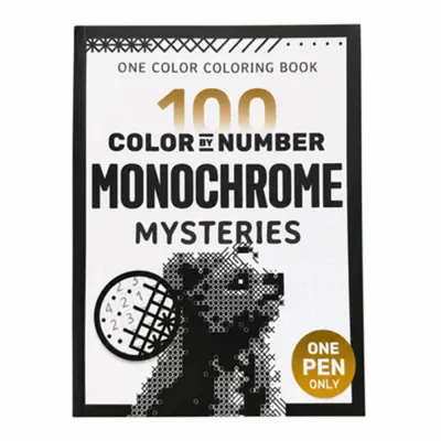
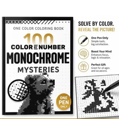

Prices are valid at publication and may change. Please refer to the product page for the latest price.
Essential Tools and Materials for Grayscale Coloring
Selecting the right coloring mediums is the first step to successfully working with pre-printed grayscale values. Colored pencils are highly recommended for beginners and advanced artists alike because of their control and translucency.
Wax-based colored pencils are soft, creamy, and blend effortlessly, making them excellent for smooth transitions. However, they can quickly build up a thick, slick layer that resists further color.
Oil-based colored pencils are slightly harder and hold a sharper point. This allows you to apply multiple thin, glaze-like layers without sealing the paper’s texture too quickly.
Markers can also be used, but they require careful selection. Alcohol-based markers provide vibrant, streak-free washes, but their ink is highly fluid and can easily bleed through standard coloring book pages, potentially obscuring the printed grayscale lines.
Water-based markers or brush pens are less prone to bleeding but can easily pill the paper if you apply too many layers. If you choose to use markers, they are best utilized as a quick, light base layer that you can later shade over with colored pencils.
Blending tools are essential for smoothing out transitions and eliminating harsh pencil strokes. Paper blending stumps, also known as tortillons, work by physically rubbing the pigment into the paper’s valleys.
Colorless blender pencils use a clear binder to burnish and blend the colors together without adding new pigment. For a painterly finish, solvents like odorless mineral spirits can dissolve the binders in colored pencils, but they must be used sparingly.
In humid tropical climates, solvents and wet mediums take longer to dry, and the excess moisture can weaken the paper fibers.
Before starting any project, you must check the paper weight and texture compatibility of your coloring book. Standard coloring books often use lightweight paper (around 70 to 90 gsm) that is highly susceptible to warping, pilling, or bleeding when exposed to wet media or heavy solvents.
For the best results, look for books printed on medium to heavyweight paper (120 gsm or higher) with a noticeable tooth or texture. Always perform a quick patch test on an inconspicuous area or a blank test page at the back of the book to observe how the paper reacts to your chosen pencils, markers, or blending agents.
Understanding Light, Shadow, and Grayscale Values
Grayscale coloring books do not require you to invent shadows from scratch, but you must still identify the implied light source to make your color choices logical. Look closely at the page before applying any color to locate the brightest white areas; these indicate where the light source is coming from.

The darkest gray and black areas represent the core shadows and cast shadows, while the medium grays represent the mid-tones where the local color of the object is most visible. Mapping these zones in your mind helps you maintain a consistent sense of three-dimensional form.
Preserving the lightest grayscale areas is the secret to maintaining natural highlights and realistic depth. When you color over pure white or very light gray sections, use your lightest colors and the gentlest pressure.
If you cover these areas with heavy, saturated pigment, you lose the luminous quality of the highlight, making the object look flat or muddy. Think of these light areas as delicate zones where the paper’s natural brightness must shine through your translucent color layers.
You must also adjust your color saturation and pressure based on the underlying gray value. Dark gray areas already contain a lot of black ink, which naturally desaturates any color placed over them.
If you apply a bright, highly saturated color with heavy pressure over a dark gray shadow, you will end up with an unnatural, chalky appearance. Instead, use lighter pressure and deeper, cooler tones (like blues, purples, or dark browns) over the pre-printed shadows to enhance the depth without fighting the underlying gray.
Step-by-Step Coloring Techniques for Depth and Realism
Begin by applying a light, even base layer of color across the entire section you are working on. This is often called laying down the local hue.
Use a very light touch—almost letting the weight of the pencil do the work—to deposit a thin layer of pigment. This base layer should be transparent enough that every detail of the underlying grayscale print remains perfectly visible.
Avoid using heavy, opaque colors at this stage, as they will mask the guide values you need for the next steps.
Once your base layer is established, build depth through a process known as glazing. Glazing involves layering different transparent colors on top of one another to create rich, complex hues.
For example, layering a transparent yellow over a blue base can create a vibrant, realistic green that has more depth than a single green pencil could provide.
As you glaze, gradually increase your pencil pressure in the mid-tone and shadow areas, following the pre-printed grayscale values. Use circular or directional strokes that match the form of the object, such as curving strokes for a round apple or straight strokes for a flat surface.
To eliminate harsh pencil strokes and create smooth transitions, use your blending tools strategically. If you are using colored pencils, a colorless blender can be worked in small, circular motions to merge the pigment particles together.
Be careful not to burnish (press so hard that the paper becomes shiny and slick) too early, as this prevents you from adding more layers.
If you prefer a softer, painterly look, lightly dip a blending stump into a tiny amount of solvent and sweep it across the transitions, working from light areas to dark areas to avoid dragging dark pigment into your highlights.
The final step to achieving realistic depth is enhancing the contrast. Look closely at your page to see if the colors have flattened the original values.
If the shadows look washed out, selectively deepen them using dark, complementary colors rather than just black. For example, use a deep indigo or dark violet to enrich shadows on green foliage.
Conversely, bring back lost highlights by using a kneaded eraser to gently lift excess pigment, or apply a white gel pen, acrylic paint pen, or highly opaque white colored pencil to the absolute brightest spots where the light hits directly.
Common Mistakes and How to Avoid Them
One of the most common mistakes is pressing too hard too early in the coloring process. Applying heavy pressure flattens the texture of the paper, a state known as sealing the tooth.
Once the tooth is sealed, the paper can no longer hold any more pigment, leaving you with a flat, shiny surface that cannot be shaded further.
In the humid climate of the Philippines, heavy wax buildup can also lead to a white, cloudy film called wax bloom appearing on your page over time. Keep your pencil pressure light and build up your layers slowly.
Another frequent error is creating muddy, dull colors by overworking the paper or using dirty blending tools. If you use a blending stump that still has dark blue pigment on it to blend a bright yellow highlight, you will instantly ruin the clean color.
Always clean your blending stumps by rubbing them against fine sandpaper or a scrap piece of paper before switching colors.
Additionally, overworking the paper with too many layers or excessive solvent can break down the paper fibers, causing the surface to pill and tear.
It is easy to get caught up in the details and lose sight of the overall image. Periodically stop, step back, and reassess your progress.
If you notice that your colored layers have completely obscured the original grayscale contrast, your image will lose its three-dimensional illusion.
If this happens, do not try to force more color on top; instead, use a kneaded eraser to gently tap and lift some of the pigment, restoring the balance between the light and dark values.
Finishing and Protecting Your Colored Pages
Once your masterpiece is complete, you must take steps to preserve it from smudging and environmental damage. Start by gently removing any excess pigment dust or graphite crumbs left behind by your pencils.
Avoid using your bare hand to sweep the dust away, as the natural oils on your skin can smudge the pigment and leave greasy marks on the paper. Instead, use a clean, soft-bristled makeup brush or a drafting brush to sweep the page clean, or gently dab the area with a clean kneaded eraser.
To prevent the colors from transferring or experiencing wax bloom, you can apply a protective spray fixative. However, fixatives can sometimes react unpredictably with certain inks, markers, or paper types, causing colors to bleed or the paper to yellow.
Always verify the compatibility of your fixative by spraying a test scrap of the same paper or a small, colored test patch at the back of the book first. Apply the spray in a well-ventilated area, holding the can at the manufacturer’s recommended distance, and let it dry completely.
Proper storage is crucial, especially in humid environments where pages can easily stick together. Store your finished coloring pages flat in a dry place, away from direct sunlight.
To prevent smudging and pigment transfer between pages, place a sheet of glassine paper or acid-free parchment paper between each page.
If you keep your pages inside a coloring book, inserting these protective sheets will keep your artwork pristine and prevent the colored pigments from staining the opposite pages.
Frequently Asked Questions (FAQ)
Can I use watercolors or wet media on a standard monochrome coloring book?
Standard monochrome coloring books are typically printed on wood-pulp paper that is not designed to handle water. If you apply watercolors, gouache, or heavy water-based markers, the paper will likely warp, buckle, or bleed through to the other side, potentially ruining the illustrations on the reverse page.
If you want to use wet media, check the paper weight first; it should ideally be at least 150 gsm or specifically labeled as watercolor-friendly. If you still want to proceed on standard paper, use an absolute minimum amount of water, apply a light coat of clear gesso first to prime the paper, and test your technique on a blank page or margin beforehand.
How do I fix a mistake if I color outside the grayscale lines or use the wrong shade?
Fixing mistakes on a grayscale page requires a gentle touch to avoid erasing the pre-printed black and gray ink lines. For colored pencils, do not use a standard pink rubber eraser, which can smudge the pigment and tear the paper fibers.
Instead, use a kneaded eraser to press and lift the pigment away, or use a specialized plastic eraser for precision. For stubborn wax-based pigments, you can gently press a piece of low-tack artist’s tape onto the mistake and peel it off to lift the top layers of color.
Avoid aggressive rubbing, as this will wear down the paper’s texture and can erase the underlying grayscale print, leaving a blank white patch that is difficult to blend back in.
Community discussion
Share your experience or ask a question. Comments are reviewed before publication.