
In an era dominated by instant messaging and fleeting digital notifications, the act of writing a physical love letter remains one of the most powerful ways to express romantic devotion. A tangible card serves as a permanent anchor for your memories, a keepsake that your partner can hold, revisit, and cherish for years to come. In the Philippines, selecting the ideal card involves navigating a diverse market filled with local artisan creations, imported stationery, and various design aesthetics.
Choosing the right love letter card is not merely about finding an attractive cover design. It requires a thoughtful balance between visual aesthetics, paper quality, and writing instrument compatibility to ensure your message is preserved beautifully. By understanding the available card styles, matching them to your relationship milestone, and verifying technical details like paper weight and ink drying times, you can create a deeply personal gift that perfectly conveys your feelings.
Understanding Popular Love Letter Card Styles
Navigating the visual landscape of love letter cards reveals several distinct design categories, each carrying its own emotional tone and aesthetic language. Rather than viewing these styles as rigid, mutually exclusive boxes, think of them as a flexible framework to help you identify what will resonate most with your partner.
Products mentioned in this guide
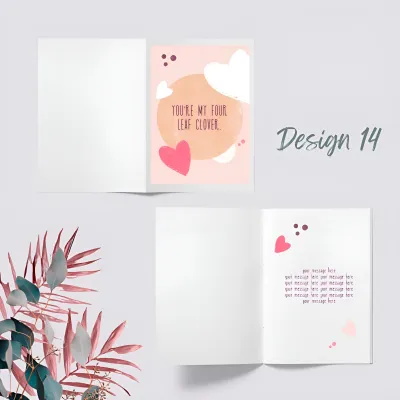
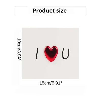
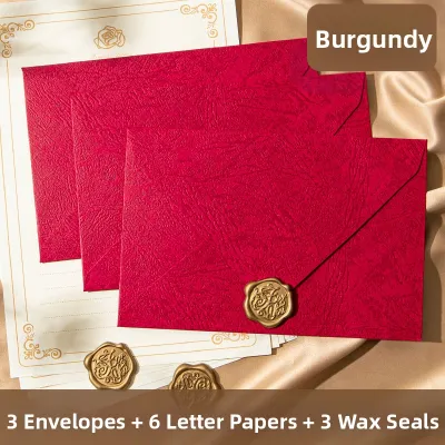
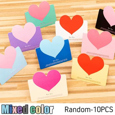
Prices are valid at publication and may change. Please refer to the product page for the latest price.
Minimalist Designs Minimalist cards prioritize clean lines, generous negative space, and subtle typography. Often featuring a single elegant word or a tiny, understated icon on the cover, these designs place the ultimate focus on your handwritten words inside. They convey a modern, sophisticated, and sincere tone, making them ideal for writers who want their personal message to do the heavy lifting without visual distraction.
Vintage and Retro Aesthetics Vintage-inspired cards often utilize warm cream or tea-stained paper tones, deckled or torn edges, and classic botanical illustrations or antique scrollwork. Some designs incorporate nostalgic elements like faux wax seals or typewriter-style fonts. This aesthetic evokes a sense of timelessness, history, and enduring devotion, suggesting that your love is classic and built to last.
Illustrated and Whimsical Styles Characterized by hand-drawn characters, playful color palettes, and lighthearted romantic puns, illustrated cards offer a joyful and approachable vibe. In the local market, many independent Filipino designers create whimsical illustrations featuring culturally resonant themes, such as sharing a warm bowl of champorado or navigating the busy streets together. These cards are perfect for bringing a smile to your partner’s face and celebrating the fun, everyday moments of your relationship.
Pop-Up and 3D Interactive Cards Pop-up cards are masterpieces of paper engineering that unfold into intricate three-dimensional scenes when opened. From delicate floral bouquets to elaborate heart structures, these cards offer high visual impact and double as beautiful display pieces for a desk or bedside table. They carry a sense of wonder and effort, showing your partner that you wanted to present them with something truly extraordinary.
Hand-Lettered and Calligraphy Styles Focusing heavily on artistic typography, these cards feature flowing script, elegant brush lettering, and often metallic foil accents like gold or rose gold. The emphasis here is on the beauty of the written word itself, blending the boundary between stationery and fine art. This style communicates elegance, luxury, and high-quality craftsmanship, making the card feel like a bespoke work of art before you even open it.
How to Match the Card Style to Your Message
Selecting the right card requires aligning its physical design with the stage of your relationship and the specific length and tone of your written message. A mismatch can sometimes dilute the impact of your words, while a harmonious pairing enhances the entire emotional experience.

Aligning with Relationship Milestones For early-stage romances or the initial courtship phase, keeping things light and sweet is key. A cheerful, illustrated card with a witty pun or a simple minimalist design keeps the pressure low while still showing thoughtful intent. On the other hand, major milestones like long-term anniversaries, marriage proposals, or navigating long-distance challenges demand cards with more visual gravity, such as elegant vintage, gold-foiled calligraphy, or premium heavy-weight minimalist designs.
Matching Visual Weight to Message Length Before purchasing, consider how much you actually intend to write. If you have pages of thoughts, memories, and promises to share, choose a larger card format (such as 5×7 inches) with a completely blank interior and no decorative borders that might crowd your script. Ensure the card is designed to fold completely flat so your hand can move comfortably across the page. Conversely, if you prefer to write a single, highly potent sentence, a smaller, compact card format prevents your writing from looking lost in a vast sea of white space.
Checking the Interior Finish Always inspect the inside of the card to ensure it is uncoated and matte. Glossy or highly coated interior surfaces restrict your writing tools, causing most gel, rollerball, and fountain pen inks to bead up, smear, or refuse to dry. A clean, uncoated matte interior provides the necessary tooth for your pen to glide smoothly and absorb the ink cleanly, accommodating your natural handwriting size and style without frustration.
Evaluating Paper Quality and Material for Handwriting
The physical feel of a card in your partner’s hands instantly communicates its quality before they even read a single word. Assessing the material specifications ensures your card feels premium and stands up to the writing process.
Understanding Paper Weight (GSM) Paper thickness is measured in GSM, or Grams per Square Meter. Standard printer paper typically ranges from 70 to 80 GSM, which is far too thin for a high-quality card. For a love letter card that feels substantial and durable, look for cardstock that is at least 250 GSM, with 300 to 350 GSM being the gold standard for premium stationery. High-GSM paper feels luxurious to the touch, resists bending or creasing, and prevents heavy inks from bleeding through to the back of the card.
The Impact of Tropical Humidity In the tropical climate of the Philippines, relative humidity can be exceptionally high, especially during the rainy season. High humidity softens paper fibers, making thin or low-quality cardstock limp, wavy, or prone to excessive ink feathering. Opting for thick, high-density cardstock ensures the card retains its crisp, structural integrity and pristine flat shape, regardless of the weather.
Paper Textures and Pen Interaction Different paper finishes interact uniquely with different writing instruments. Smooth, hot-pressed, or satin finishes offer minimal friction, making them excellent for fine-tip gel pens, rollerballs, and precise calligraphy nibs. Textured papers, such as linen, cotton, or cold-pressed cardstock, provide a highly tactile, luxurious feel but require careful pen selection. Highly textured or fibrous papers can cause wet fountain pen inks to feather or catch on the nib, meaning they are often best paired with dry gel pens, high-quality ballpoints, or brush markers.
The Envelope and Presentation Checklist An exceptional card experience includes a high-quality envelope. When evaluating your options, use this practical checklist to ensure the presentation is flawless:
- Envelope Weight: Ensure the envelope is made from paper that is at least 100 to 120 GSM so it does not feel flimsy or expose the card's contents through semi-transparent paper.
- Interior Lining: Premium envelopes often feature a contrasting colored or patterned inner lining, which adds an elegant pop of style and prevents show-through.
- Sealability: Check if the envelope uses traditional moisture-activated gum, a convenient peel-and-stick adhesive strip, or if it is completely unglued, which is ideal if you plan to seal it elegantly with a custom wax seal.
Where to Buy Love Letter Cards in the Philippines
Finding the perfect love letter card in the local market involves exploring various retail avenues, from large commercial stores to independent artisan communities.
Physical Specialty Stationery Stores Visiting major national bookstores and specialty stationery boutiques located in premier malls across Metro Manila, Cebu, and Davao allows you to physically touch the cardstock. This hands-on experience is invaluable for verifying paper weight, texture, and envelope thickness before spending your money. These stores typically carry a reliable selection of imported premium brands, structured pop-up cards, and clean minimalist designs.
Local Artisan Markets and Independent Creators For truly unique, small-batch, and culturally resonant designs, seek out local craft fairs, artisan pop-ups, and independent design studios. Filipino artists frequently produce gorgeous, hand-printed, or letterpressed cards that incorporate local imagery, foliage, and heartfelt Tagalog sentiments. Supporting these independent creators ensures you get a highly distinctive card that your partner is unlikely to have seen anywhere else.
E-Commerce Platforms and Online Marketplaces Online shopping offers unparalleled convenience and access to a vast array of global and local designs, but it requires extra consumer vigilance. Because you cannot physically touch the paper before buying, you must take specific steps to verify quality:
- Read Customer Reviews: Look closely at buyer photos and text reviews, specifically searching for feedback regarding the actual thickness of the cardstock and whether it arrived in good condition.
- Verify Seller Ratings: Purchase from highly rated sellers who specialize in stationery or paper crafts rather than general novelty shops.
- Check Shipping Protections: Delicate paper items, especially intricate pop-up cards, are easily bent or creased during transit. Ensure the seller packages the card with rigid cardboard backing, a stiff cardboard box, or thick bubble wrap to protect it from rough handling and wet weather.
- Factor in Delivery Times: If you are ordering from an independent creator who hand-makes cards to order, or if the item is shipping from a distant province, ensure you place your order at least one to two weeks in advance of your special date.
Choosing the Right Pen and Ink for Your Cardstock
Even the most beautiful card can be ruined by a pen that skips, bleeds, or smudges across the page. Matching your writing tool to your specific paper type is the final, crucial step in creating a flawless love letter.
Matching Pens to Paper Finishes If you have chosen a smooth, heavy, uncoated cardstock, fountain pens with fine or medium nibs can create an incredibly elegant, classic look. However, if the paper is highly fibrous or textured, a high-quality gel pen or a fine-tip rollerball is a much safer choice, as they glide over uneven surfaces without catching. For hand-lettering and decorative borders, brush markers with flexible nylon tips work beautifully on smooth cardstock but should be avoided on rough, abrasive papers to prevent the delicate tips from fraying.
Crucial Ink Properties to Look For Because the humid Philippine climate can slow down ink drying times, selecting the right ink formulation is essential to avoid disastrous hand smudges. Look for these key properties in your writing instruments:
- Quick-Drying: Gel pens and rollerballs featuring quick-drying liquid gel ink are highly recommended, especially for left-handed writers whose hands drag across the written line.
- Archival and Pigment-Based: Unlike standard dye-based inks that can fade when exposed to sunlight or moisture over time, pigment-based archival inks bond permanently with the paper fibers, ensuring your words remain crisp and dark for decades.
- Water-Resistance: Opting for water-resistant or waterproof inks protects your heartfelt letter from accidental water spills, high humidity, or tears of joy.
The Compatibility Test Before you begin writing your final message on the card, always perform a discreet test run. Use the back of the envelope flap, the very bottom edge of the inner fold, or an included scrap piece of matching paper to write a few words. Observe how quickly the ink dries, check if the lines feather or spread out, and look at the reverse side of the paper to ensure there is absolutely no ink bleed-through. This simple, two-minute check guarantees a clean, stress-free writing experience.
Frequently Asked Questions (FAQ)
How do I prevent ink from smudging on glossy or coated card surfaces?
Glossy or coated card finishes have a non-porous surface barrier that prevents water-based inks from absorbing into the paper fibers. To write on these surfaces without smudging, avoid fountain pens, standard gel pens, and liquid rollerballs. Instead, use a quick-drying, oil-based ballpoint pen or a permanent pigment-based fine liner. Once you finish writing, leave the card completely open in a flat, well-ventilated space for several hours to allow the ink to cure fully before folding it or putting it in the envelope.
What is the standard size for a greeting card that fits a regular love letter?
The most common standard sizes for love letter cards are A6 (approximately 4.5 by 6.25 inches) and 5×7 inches (often referred to as A7). An A6 card is ideal for concise, sweet, and direct messages, providing just enough space for a paragraph or two of heartfelt text. If you plan to write a longer, multi-paragraph letter detailing cherished memories and future promises, choose a 5×7 inch card, which offers ample physical space for comfortable, natural handwriting without crowding.
Can I use calligraphy markers on standard cardstock without bleeding?
Whether calligraphy markers will bleed depends on the marker’s ink volume and the cardstock’s weight. Standard cardstock below 200 GSM is highly susceptible to bleeding and feathering under juicy water-based or alcohol-based calligraphy markers. To ensure clean, sharp lines, use cardstock that is at least 250 GSM, and choose water-based pigment markers rather than alcohol-based ones. As a safety precaution, always place a clean sheet of heavy scrap paper or a protective blotter sheet directly underneath the page you are writing on to protect the rest of the card.
Community discussion
Share your experience or ask a question. Comments are reviewed before publication.