
Selecting the ideal Yasen transparent sticker design depends entirely on matching the sticker’s visual weight with your journal’s layout structure and paper type. For vintage and collage styles, organic botanical prints offer soft, buildable layers that blend seamlessly into the page. Minimalist and functional planners benefit most from structured geometric patterns and clear icon sheets, which define spaces without adding visual clutter. Because transparent stickers allow the underlying page texture, grid lines, and handwriting to show through, choosing the right design requires understanding how clear films interact with different paper colors and ink types.
Identifying Your Core Journaling Aesthetic
Before selecting any sticker collection, you must define the primary visual framework of your journal. Journaling styles generally fall into four main categories: minimalist, vintage, collage-heavy, and functional planning. Each style treats negative space differently, which directly dictates how a transparent sticker will function on the page. In a minimalist layout, negative space is active and intentional; a sticker must be sparse and clean to avoid disrupting the quiet balance of the page. Conversely, vintage and collage-heavy styles treat the page as a canvas for dense layering, where stickers overlap with paper scraps, stamps, and ephemera to create a sense of history and depth.
For functional planners, stickers serve a practical purpose rather than a purely decorative one. In these layouts, stickers act as structural elements—such as headers, trackers, or index tabs—that organize information. The role of a transparent sticker in a functional setup is to highlight or categorize text without blocking the underlying grid lines or pre-printed calendar dates. Understanding whether your journal is a creative outlet, a productivity tool, or a memory-keeping scrapbook helps you determine if your stickers should act as bold focal points or subtle background textures.
Products mentioned in this guide
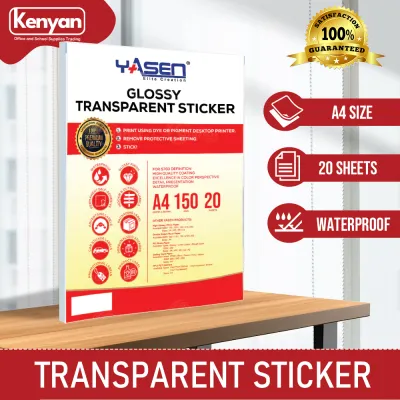
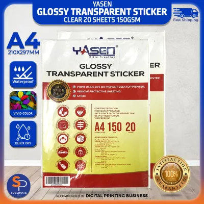
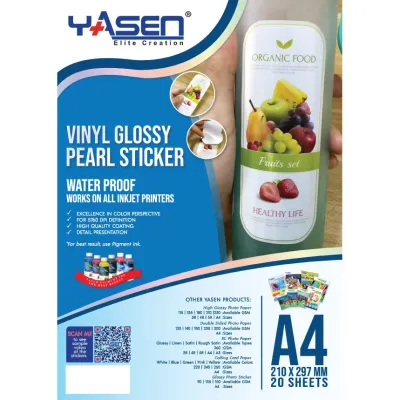
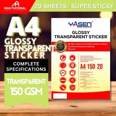
Prices are valid at publication and may change. Please refer to the product page for the latest price.
Additionally, consider the color palette of your typical spreads. Vintage journals often rely on warm, muted tones like sepia, olive, and cream, which require stickers with warm undertones or high transparency to blend into the paper. Modern minimalist layouts often favor high-contrast black-and-white or cool pastel schemes, where crisp, sharp-edged geometric stickers perform best. By analyzing your layout habits, you can avoid purchasing designs that clash with your established aesthetic or crowd your writing space.
Matching Transparent Sticker Designs to Specific Styles
Transparent stickers are typically printed on clear polyethylene terephthalate (PET) or thin matte vinyl films. These materials allow light to pass through the unprinted areas, making the sticker appear as if it is painted directly onto the page. However, the transparency of the film also affects how the printed ink colors appear once applied. On white paper, colors remain vibrant and true to the sheet; on cream, kraft, or dark-colored papers, the sticker colors will shift and absorb the background tone, which can dramatically alter the final look of your layout.

Floral and Botanical Designs for Vintage and Nature Journals
Floral and botanical designs are among the most popular choices for vintage and nature-themed journals because they mimic the look of pressed flowers without the bulk or fragility of real specimens. Yasen’s botanical collections often feature delicate ferns, eucalyptus leaves, and watercolor-style blossoms. When applied to the page, the translucent edges of these designs blend into the paper fibers, creating a soft-focus effect that looks highly integrated. This makes them excellent for layering behind handwritten passages or alongside torn kraft paper and faux-postage stamps.
These organic shapes work exceptionally well on cream-colored or slightly textured papers, such as those found in classic traveler’s notebooks. Because botanical designs naturally feature irregular, flowing lines, they soften the rigid structure of grid or dot-grid pages. You can use long vine stickers to frame a page border or cluster small flower petals in the corners of your weekly spreads to add a touch of color without occupying valuable writing space.
However, there are practical limitations to keep in mind when using highly detailed botanical prints. When intricate floral designs are scaled down to fit small planner grids, the fine lines and subtle color gradations can become muddy or difficult to distinguish. If you use a compact journal format, look for botanical designs with bold outlines or simplified color blocks. This ensures the design remains recognizable and does not turn into an indistinct smudge on your page.
Geometric and Minimalist Patterns for Clean Layouts
For writers who prefer clean lines and structured layouts, geometric and minimalist transparent stickers offer a way to add visual interest without introducing chaos. These designs typically include simple grids, dots, thin borders, frames, and abstract shapes like semi-circles or arches. Because the background of the sticker is completely clear, these geometric elements can be placed directly over your handwriting or grid lines, framing your notes without obscuring them.
Using transparent borders and dividers is an efficient way to organize a single page into multiple functional zones. For example, a thin, clear grid sticker can separate a daily task list from a reflection section without the heavy visual weight of a solid washi tape border. The clear film allows the natural color of the page to flow continuously, maintaining the open, airy feel that is central to minimalist design.
When selecting geometric patterns, it is crucial to avoid overly dense or high-contrast prints if you plan to write near or over them. A thick, solid black geometric shape will block out any underlying text and can make the page look cluttered. Instead, opt for fine-line designs, hollow frames, or pastel-toned abstract shapes. These provide a subtle wash of color and structure while keeping your handwriting perfectly legible.
Text and Functional Icons for Productivity Planners
Productivity-focused journaling relies heavily on quick scanning and clear organization, making text and functional icon stickers incredibly useful. These sheets often feature clear checkboxes, weather icons, habit trackers, arrows, and daily headers. Because these stickers are transparent, they integrate seamlessly into pre-printed planners or custom bullet journal layouts, allowing the original grid lines or calendar numbers to remain visible beneath the icon.
For daily logging, transparent checkboxes and priority stars can be placed directly alongside your tasks. This keeps your layout uniform and neat, especially if you find hand-drawn icons inconsistent. The clear background ensures that your page looks cohesive, as if the icons were printed directly onto the planner page during manufacturing.
The primary challenge with functional transparent stickers is contrast. Light-colored text or pastel icons can easily disappear when applied to off-white, cream, or yellowed paper. Conversely, dark black text stickers might look too harsh on delicate pastel layouts. To mitigate this, match the ink color of the sticker to the dominant tone of your journal pages. For standard white or bright cream pages, medium-grey or dark-toned text stickers offer the best balance of readability and aesthetic integration.
Practical Checks Before Buying Transparent Stickers
Before purchasing a new set of transparent stickers, performing a few practical checks will ensure they perform well in your specific journal. First, verify the physical dimensions of the stickers and the overall sheet size. Compare these measurements against your journal’s grid or dot spacing, which is commonly 5mm or 4mm. A sticker that is even slightly too large for your grid can disrupt your alignment and force you to alter your writing layout.
Second, consider the adhesive type and how it interacts with your local climate. In warm, humid tropical environments, adhesive formulas can behave differently than in dry climates. High humidity can cause some sticker adhesives to become gummy, slide on the page, or leave a sticky residue along the edges over time. Look for high-quality acrylic-based adhesives that specify a clean, permanent bond, and store your sticker sheets in a cool, dry place inside a protective sleeve to prevent the edges from curling or attracting dust.
Finally, examine the printing finish of the sticker sheet. Transparent stickers generally come in either a glossy or a matte finish. Glossy finishes offer high color vibrancy and sharp details, but they reflect light easily, which can cause glare when reading under bright desk lamps. Matte finishes have a satin, non-reflective surface that blends more naturally with paper, but the colors may appear slightly softer. Your choice of finish should also align with your preferred writing instruments; glossy films are highly non-porous and will repel water-based inks, while some matte films can accept certain pigment-based pens if given proper drying time.
Application and Layering Techniques for Transparent Stickers
Achieving a flawless, bubble-free application with transparent stickers requires a deliberate technique. Because the film is clear, any trapped air bubbles, dust particles, or fingerprints on the adhesive side will be highly visible once the sticker is pressed onto the page. To prevent this, always wash and dry your hands thoroughly before handling the stickers, or use a pair of fine-tipped stationery tweezers to lift and position the designs.
Before committing to a layout, always test a small, unused portion of the sticker sheet on a back page or a scrap piece of the same journal paper. This trial allows you to observe how the adhesive reacts with the paper fibers—specifically checking if it causes thin paper to warp, or if it smudges any underlying ink. When applying the sticker, start from one edge and slowly smooth it down using a clean finger or a plastic scraping tool to push out any air pockets as you go.
Layering is where transparent stickers truly shine. You can create beautiful, multi-dimensional spreads by layering clear botanical designs over solid washi tapes, mild highlighter swatches, or handwritten text. Because the sticker is translucent, the colors beneath will show through, creating custom shades and a sense of depth. If you need to trim a sticker to fit a specific corner or overlap, use a sharp craft knife and a metal ruler on a cutting mat, taking care to apply light pressure so you do not cut through the underlying journal page.
Frequently Asked Questions (FAQ)
Do transparent stickers show white borders when cut out?
Unlike paper stickers, high-quality transparent stickers do not have a white paper backing, meaning the border around the printed design is completely clear. However, depending on whether the sheet is kiss-cut (pre-cut shapes on a backing sheet) or die-cut (individually cut pieces), you may still see a slight reflective edge where the clear plastic film ends. If this clear border is too wide or catches the light awkwardly, you can use sharp craft scissors to trim the excess clear film closer to the printed design before peeling it off the backing.
Can I write over transparent stickers with gel pens?
Writing over transparent stickers depends entirely on the sticker’s surface finish and the type of ink you use. Standard water-based gel pens and fountain pens rely on porous paper to absorb the liquid ink; because transparent stickers are made of non-porous plastic (PET), these inks will pool on the surface and smudge instantly. If you need to write directly on a transparent sticker, use a permanent pigment-based fine liner, a ballpoint pen, or a multi-surface marker, and allow it to dry completely for several minutes before touching the page.

Community discussion
Share your experience or ask a question. Comments are reviewed before publication.