
Choosing between a pastel orange and a neon orange highlighter depends on whether you prioritize high-impact visibility or long-term reading comfort. Neon orange commands immediate attention, making it excellent for urgent exam dates or critical formulas, while pastel orange offers a soft, muted tone that integrates smoothly into aesthetic, low-stress study layouts. Both shades serve distinct purposes in a student’s toolkit, but their performance varies significantly depending on your study environment, paper choice, and writing instruments.
To build an effective study system, you must evaluate how these two vibrant options interact with your eyes, your notes, and your physical stationery. Selecting the wrong shade can lead to visual fatigue during late-night review sessions or cause frustrating ink smudges on your carefully written pages. By understanding the practical differences in contrast, eye strain, color-coding utility, and ink behavior, you can choose the ideal orange highlighter to keep your study notes organized, readable, and visually appealing.
Readability and Contrast on Different Papers
The primary job of any highlighter is to make specific text stand out from the surrounding page, but the way neon and pastel orange achieve this contrast is fundamentally different. Neon orange highlighters rely on highly saturated, fluorescent pigments that create a stark, high-contrast background behind your text. When layered over standard black gel pen ink or dark blue ballpoint ink, neon orange makes the text pop dramatically, ensuring your eyes are drawn directly to those words during a quick skim.
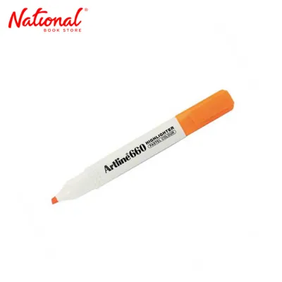
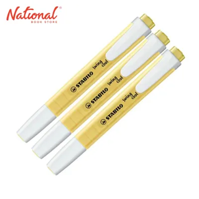
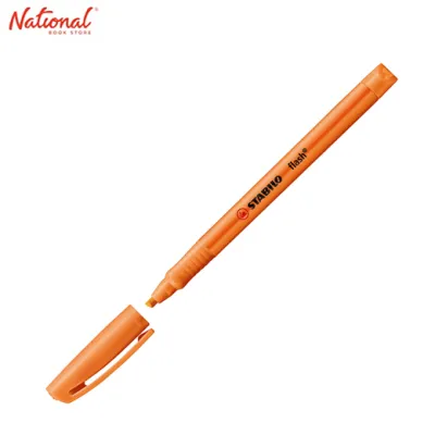
Products mentioned in this guide

![Stabilo Boss High Lighter Stabilo Highlighter Original Fluorescent Pen Pink Green Blue Yellow Violet Orange Water Based Odorless Highlighters [Future Industries]](https://img.lazcdn.com/g/p/77eac6552d0e20828cdb32b945ce7524.jpg_400x400q80.jpg_.webp)
![Highlighter High Lighter Faber Castell Brand: Sold per piece Choice of Color: Pink Green Blue Yellow Violet or Orange [Future Industries]](https://img.lazcdn.com/g/p/9bc57b0b8056b1297e3b0a5110efce15.jpg_400x400q80.jpg_.webp)
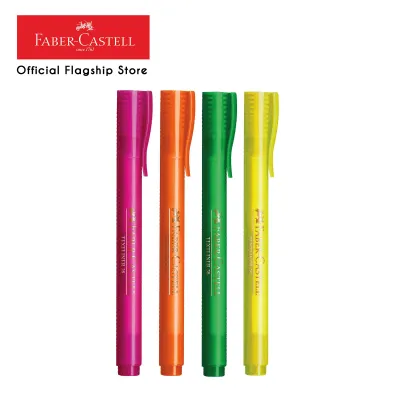
Prices are valid at publication and may change. Please refer to the product page for the latest price.
Pastel orange highlighters, on the other hand, utilize a more muted, desaturated pigment formula that often contains a higher ratio of white or light-colored base binders. While this creates a beautiful, trendy aesthetic, it can sometimes lower the contrast between your text and the paper. If you frequently study from faint pencil notes, light gray printed handouts, or fine-tipped 0.38mm gel pens, a pastel orange shade can occasionally obscure or muddy the delicate lines rather than enhancing them.
To ensure your text remains perfectly legible, it is highly recommended to perform a quick, observable contrast test before highlighting an entire chapter. Write a sample word using your preferred study pen on a margin or a spare sheet of the same paper, allow the ink to dry completely, and apply a single stroke of your orange highlighter. Observe the result under your typical study lighting: if the ink appears blurry, faded, or difficult to read from an arm’s length away, you may need to adjust your pen choice or switch to a higher-contrast highlighter shade.
Eye Strain and Long Study Sessions
Extended study sessions require visual endurance, and the brightness of your stationery plays a surprisingly large role in how quickly your eyes tire. Neon orange highlighters contain fluorescent compounds that absorb ultraviolet light and re-emit it as visible light, making them appear incredibly bright. Under the harsh fluorescent bulbs of a university library or the direct sunlight of a coffee shop window, this intense fluorescence can create a distracting glare on white paper, leading to rapid eye strain and headaches during hours of reading.

Pastel orange highlighters offer a much gentler alternative for your eyes by absorbing and reflecting light in a soft, non-disruptive manner. Because pastel tones lack the intense saturation of neon, they allow you to highlight entire paragraphs or large blocks of text without creating a visually overwhelming page. This makes pastel orange highly suitable for subjects that require deep reading and comprehension, such as literature, history, or law, where you need to mark key concepts without turning your textbook into a flashing neon sign.
Your study environment should also dictate your color choice to protect your vision. If you typically study in a dimly lit room with a focused desk lamp, the concentrated light hitting a neon orange highlight can create a harsh contrast that tires your eyes within minutes. In contrast, if you study in a brightly lit classroom or outdoors, a pastel orange shade will remain soft and legible without bouncing blinding glare back into your eyes, allowing you to maintain focus for longer periods.
Color-Coding and Aesthetic Organization
An organized notebook is a powerful study tool, and color-coding helps your brain categorize information quickly. Within a multi-color highlighting system, neon orange naturally functions as an urgent, high-priority marker. Because of its intense visibility, it is best reserved for “exam-critical” information, immediate action items, formulas you constantly forget, or crucial deadlines. Using neon orange sparingly ensures that when you flip through your notebook, the absolute most important details demand your attention instantly.
Pastel orange excels in creating a cohesive, low-stress aesthetic that encourages calm, focused learning. It pairs beautifully with other muted stationery items, such as sage green, dusty blue, or warm gray, allowing you to build a minimalist layout that feels organized rather than chaotic. This softer approach is ideal for students who find highly saturated colors visually cluttered or stressful, helping to transform a dense page of notes into an inviting, readable summary.
Regardless of whether you prefer neon or pastel, the key to an effective color-coding system is restraint. Limiting your palette to three or four distinct colors prevents your pages from becoming a confusing rainbow that defeats the cognitive purpose of highlighting. If you choose to incorporate orange, assign it a specific, unchanging meaning—such as using pastel orange solely for supporting examples or neon orange exclusively for vocabulary definitions—to train your brain to recognize and process the information instantly.
Ink Behavior and Paper Compatibility
The success of your highlighting also depends heavily on how the ink interacts with your paper, especially in tropical climates like the Philippines where high humidity can slow down drying times. Standard school notebooks and cheap copy paper often have loose, uncoated fibers that easily absorb water-based highlighter inks. This can lead to feathering, where the ink spreads sideways along the paper fibers, or bleed-through, where the wet ink seeps completely through to the other side of the page, ruining the notes on the reverse.
To prevent these issues, you should perform a simple, step-by-step swatch test on your specific notebook or textbook paper. Find an inconspicuous area, such as the very back page, and draw a solid, two-inch stroke of your orange highlighter. Let it dry for a few seconds, then flip the page to check for “ghosting” (where you can see the shadow of the color through the paper) or actual bleed-through (where wet ink has physically penetrated the sheet).
If you are working with thin paper, such as bible pages or lightweight 70 gsm handouts, look for highlighters that specify quick-dry, pigment-based, or low-bleed ink formulations on their product labels. Coated textbook pages present the opposite challenge: they resist ink absorption, which prevents bleed-through but significantly increases drying time. On coated surfaces, a wet neon or pastel ink can easily smudge if you close your notebook too quickly or run your hand over the page, making quick-drying formulas essential for clean notes.
How to Choose the Right Orange Highlighter for Your Notes
To finalize your choice, consider your specific study habits, materials, and visual preferences using this simple decision framework.
Choose Neon Orange if:
- You need to flag highly urgent information, such as exam dates, formulas, or single keywords that must stand out instantly during a rapid skim.
- You primarily study from high-quality, thick paper that can handle wet ink without bleeding.
- You prefer high-contrast, high-impact visual cues and do not suffer from eye strain under bright lights.
Choose Pastel Orange if:
- You highlight large blocks of text, full sentences, or entire paragraphs.
- You study for long, uninterrupted hours and want to minimize visual fatigue and glare.
- You prefer a clean, minimalist, and aesthetically pleasing notebook layout that coordinates with other muted stationery.
Verify first if:
- You are left-handed, as you will need to check the drying speed of the highlighter ink to prevent smudging as your hand moves across the page.
- You use thin, lightweight paper (under 80 gsm), which requires a dry-swatch test to ensure the ink does not bleed through and ruin your notes.
- You have visual sensitivities, in which case testing the highlighter under your actual study lamps is crucial to avoid glare.
Ultimately, the choice between neon and pastel orange comes down to balancing immediate visibility with long-term reading comfort. There is no universal winner; instead, the best highlighter is the one that matches your unique study environment, paper compatibility, and cognitive organizing style.
Frequently Asked Questions (FAQ)
Can I use both pastel and neon orange highlighters in the same notebook?
Yes, you can absolutely combine both pastel and neon orange highlighters in the same notebook, provided you assign distinct, non-overlapping meanings to each shade. For example, you might use the bright neon orange strictly for urgent action items, exam dates, or critical formulas that require immediate attention, while reserving the softer pastel orange for general key terms, supporting details, or subheadings. This dual-shade approach allows you to maintain a clear visual hierarchy without introducing too many distracting colors to your page. However, be careful not to use them interchangeably or add too many similar shades of orange, as this can easily create visual clutter and defeat the cognitive purpose of your color-coding system.
Community discussion
Share your experience or ask a question. Comments are reviewed before publication.