
Expressing gratitude is a timeless gesture, but the impact of your message relies heavily on its presentation. Choosing the right thank you card style is about balancing the design, tone, and material with your relationship to the recipient and the occasion. A mismatch—such as sending a neon, cartoonish card to a corporate client or a stiff, formal card to a close friend—can dilute the sincerity of your message. By aligning the visual aesthetic with the context of your gratitude, you ensure your appreciation is received exactly as intended.
Quick Guide: Matching Card Formality to the Relationship
To select the perfect thank you card, start by evaluating two primary axes: the social distance between you and the recipient, and the significance of the event. High-stakes milestones and professional favors demand structured, understated designs that respect boundaries. Conversely, personal favors and intimate relationships welcome vibrant colors, custom illustrations, and relaxed language.
Consider these four primary design categories to guide your choice:
Products mentioned in this guide
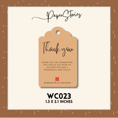
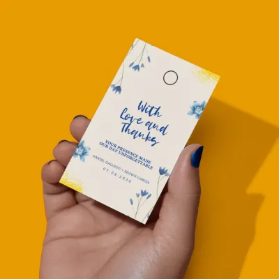

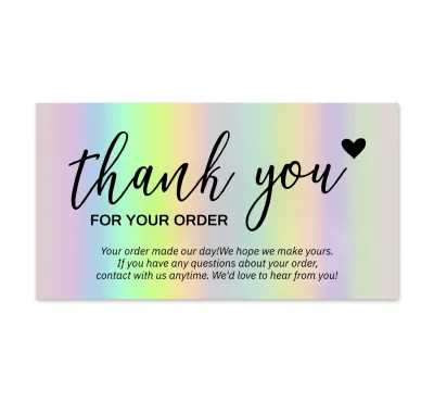
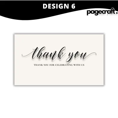
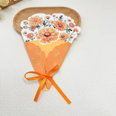
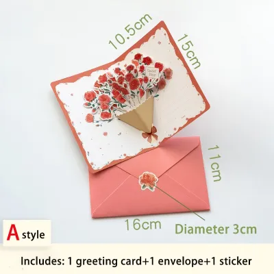
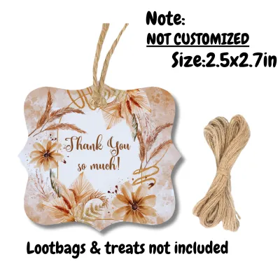
Prices are valid at publication and may change. Please refer to the product page for the latest price.
- Formal: Minimalist layouts, neutral colors, and premium cardstock for professional contacts and corporate milestones.
- Casual: Warm, conversational designs featuring custom illustrations or photos, perfect for close friends and family.
- Elegant: Delicate motifs, watercolor illustrations, and textured paper for teachers, mentors, and life-changing helpers.
- Playful: Bold color palettes, interactive elements, and humorous graphics for kids, teens, and close peers.
Formal Thank You Card Styles for Professional Contacts and Milestones
When expressing gratitude in high-stakes environments, the design of your stationery speaks before the recipient reads a single word. Formal thank you cards rely on classic design principles, premium materials, and structured layouts to convey respect and professionalism. In these scenarios, adhering to traditional etiquette ensures your message is taken seriously and leaves a lasting, positive impression.

Professional Contacts (Bosses, Clients, Interviewers)
Navigating workplace gratitude requires a careful balance of appreciation and professional boundaries. For bosses, clients, corporate partners, or job interviewers, choose a thank you card that features a clean, minimalist design. Opt for thick cardstock in neutral tones such as navy blue, charcoal gray, off-white, or cream. Subtle geometric patterns, thin borders, or a simple embossed lettering in a classic serif or clean sans-serif typeface are excellent choices.
Keep the written message concise, respectful, and focused on the specific professional action or opportunity. Avoid overly emotional language, personal anecdotes, or casual slang that could blur professional lines. In the Philippines, where workplace relationships often value a blend of warmth and deep respect, a polished, understated card shows that you value the professional connection without overstepping.
Traditional Milestones (Weddings, Showers, and Formal Galas)
Major life events like weddings, baby showers, debut parties, and formal anniversary galas call for thank you cards that match the grandeur of the celebration. Traditional etiquette suggests aligning your thank you card style with the original event invitation theme to maintain aesthetic continuity. This cohesive approach demonstrates thoughtfulness and attention to detail, which guests highly appreciate.
Look for elegant layouts featuring delicate gold or silver foil stamping, debossed lettering, or classic floral motifs. While the design can be ornate, the layout must remain highly structured and legible. If you are sending hundreds of cards after a large wedding, a beautifully designed card with a pre-printed thank-you message on the front is perfectly acceptable, provided you leave ample space inside for a personalized handwritten note to each guest.
Casual and Warm Thank You Card Styles for Friends and Family
When thanking those closest to you, rigid structures and formal language can feel distant or cold. Casual thank you cards focus on warmth, intimacy, and shared experiences. Here, the primary goal is to make the recipient feel cherished and connected, allowing you to use more expressive designs and conversational language.
Close Family and Friends
For your inner circle, the best thank you cards are those that reflect your unique relationship and shared history. Photo cards featuring a memorable moment from a shared trip, family gathering, or celebration are highly popular and often kept as keepsakes. You can also opt for vibrant color palettes, modern calligraphy, or handwritten-style typography that feels personal and relaxed.
The tone of your message can be highly conversational, affectionate, and even humorous. Custom illustrations of shared interests, such as travel, coffee, or beloved pets, add a delightful touch. Because these recipients know you well, the card should feel like an extension of your natural speaking voice, celebrating the bond you share.
Neighbors and Everyday Helpers
Expressing gratitude to neighbors, delivery riders, or local community helpers requires a style that is warm and polite without being overly intimate. For these everyday favors—such as watching your house while you are away or helping with a heavy delivery—choose cheerful, universally appealing designs. Botanical prints, simple typographic layouts, and soft pastel patterns work beautifully.
Keep the message friendly, helpful, and appropriately bounded. Acknowledge the specific favor with sincere appreciation, but avoid highly personal jokes or, conversely, stiff corporate language. A simple, bright card accompanied by a small token of appreciation, like a local treat, strikes the perfect balance of community warmth and respect.
Thoughtful and Elegant Styles for Teachers, Mentors, and Caregivers
Educators, mentors, and healthcare providers occupy a unique space in our lives, deserving deep respect combined with genuine personal warmth. A generic corporate card feels too detached, while a highly casual card may lack the proper level of deference. To thank these vital individuals, seek out thoughtful, elegant designs that emphasize sincerity and quiet appreciation.
Nature-inspired motifs, soft watercolor illustrations, and high-quality textured papers—such as felt-finish or linen cardstock—are ideal for this category. These design elements convey a sense of calm, care, and deliberate effort. The layout should prioritize generous blank space, allowing you to write a detailed, heartfelt handwritten note detailing how their guidance or care made a tangible difference in your life.
When writing to a teacher or mentor, focus on specific lessons, patience, or moments of encouragement. For caregivers or medical professionals, express how their compassion provided comfort during a challenging time. Because these professionals often keep thank you notes as reminders of why they chose their demanding paths, the physical quality of the card and the depth of your message will be deeply treasured.
Playful and Fun Styles for Kids, Teens, and Close Peers
Traditional stationery can feel stuffy or unengaging to younger generations or close peers with whom you share a highly energetic relationship. For kids, teenagers, and close friends, lean into playful, high-energy designs that capture attention and spark joy. The goal here is to make the act of receiving and reading the card an entertaining experience.
Look for cards featuring bold, saturated colors, quirky cartoon illustrations, pop-culture references, or interactive elements like pop-up designs, scratch-offs, and custom die-cut shapes. The language on the card can incorporate humor, lighthearted slang, and playful typography.
When writing your message, keep it brief, lively, and authentic to your relationship. Avoid formal pleasantries that feel unnatural. Instead, focus on shared jokes or the excitement of the gift or favor. By matching the card’s energy to the recipient’s youthful spirit, you ensure your gratitude feels genuine, modern, and fun.
Physical Features to Check Before Buying or Ordering
Selecting the right visual style is only half the battle; the physical execution of the card dictates how premium it feels and how well it performs when you sit down to write. In the tropical, high-humidity climate of the Philippines, certain stationery characteristics require extra attention to ensure your cards do not warp, smudge, or degrade.
- Paper Weight and Thickness: Look for cardstock with a weight of at least 250 to 300 GSM (grams per square meter). Thicker paper feels substantial in the hand and resists warping in humid conditions.
- Ink Bleed and Feathering: High-quality, dense paper fibers prevent ink from bleeding through to the other side or feathering outward. If you plan to use a fountain pen or a wet gel pen, verify that the cardstock has a smooth, sized surface designed to handle liquid inks.
- Interior Layout: Decide between a completely blank interior, which offers maximum space for personalized letters, and cards with pre-printed greetings. For quick notes, a small card format is ideal so the page does not look empty.
- Envelope Quality: A flimsy envelope can ruin the presentation of a beautiful card. Ensure the envelope matches the card's paper weight and has a secure adhesive seal that performs well in humid climates.
- Pen Compatibility: Glossy or heavily coated cardstocks can cause gel and ballpoint pens to skip or smudge. For a foolproof writing experience, choose matte, uncoated, or slightly textured paper finishes that absorb ink quickly.
Frequently Asked Questions (FAQ)
Is it better to handwrite a thank you card or print the message?
Handwriting is almost always the superior choice for personal, elegant, and casual thank you cards because the physical effort of writing directly reflects the sincerity of your gratitude. For high-volume events like corporate campaigns or large weddings with hundreds of guests, printing the main body of the message is acceptable to save time. However, to maintain a genuine connection, you should always sign the card by hand and add at least one entirely handwritten, personalized sentence referencing the specific gift or favor.
Community discussion
Share your experience or ask a question. Comments are reviewed before publication.