
To find a birthday money envelope suitable for handwritten calligraphy, you must prioritize paper weight, surface texture, and dimensions. In the humid tropical climate of the Philippines, paper behaves differently than in dry environments. High humidity can soften paper fibers, making ink absorption more unpredictable and increasing the risk of feathering. Selecting the right envelope ensures your personalized birthday greetings remain crisp, elegant, and free from unsightly smudges.
By focusing on specific material characteristics and layout dimensions, you can confidently choose an envelope that showcases your lettering beautifully. Whether you are using a brush pen, a dip pen, or a fountain pen, understanding how paper interacts with ink is the key to a flawless presentation.
Paper Weight and Thickness: Preventing Bleed-Through
Paper weight is one of the most critical factors when selecting a birthday money envelope for calligraphy. Calligraphy inks are typically wetter and more saturated than standard ballpoint pen inks. If the paper is too thin, the ink will easily bleed through to the inside of the envelope, potentially staining the cash gift inside.
Products mentioned in this guide
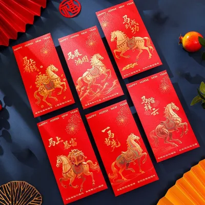
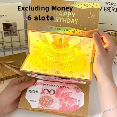
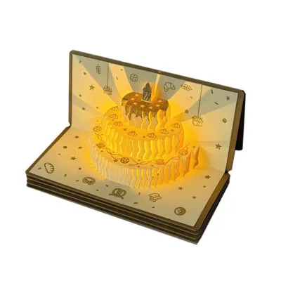
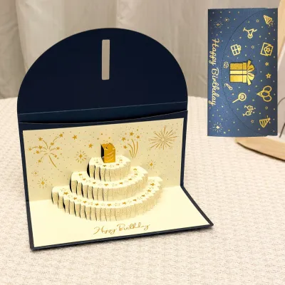
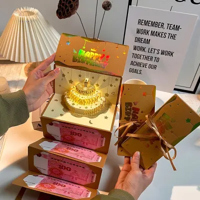
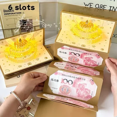
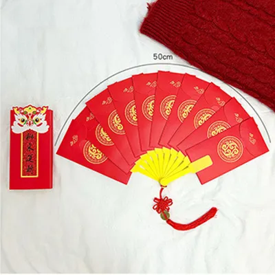
Prices are valid at publication and may change. Please refer to the product page for the latest price.
When browsing for envelopes, look for paper weight indicators on the packaging, usually measured in grams per square meter (GSM). While there is no single universal number that guarantees success, envelopes made from paper weighing 120 GSM or higher generally provide the density needed to handle wet inks. If the GSM is not listed on the product description, you can perform a simple light-transmission test. Hold the envelope up to a bright light; if you can easily see your hand through the paper, it is likely too thin for heavy ink applications.
Thin papers also carry a high risk of warping or wrinkling, a phenomenon known as cockling. When high-moisture inks, such as brush or dip pen fluids, are applied to thin materials, the water causes the paper fibers to expand unevenly. As the paper dries, it buckles, leaving you with a distorted envelope that looks unprofessional. Choosing a thicker, sturdier paper ensures the envelope remains perfectly flat after the ink dries.
Surface Texture and Finish: Ensuring Smooth Ink Flow
The surface texture of your birthday money envelope directly impacts how your pen glides across the paper and how the ink settles. Different calligraphy tools require different surface finishes to perform optimally.

For fine metal nibs, such as those used in pointed pen calligraphy, a smooth, satin, or matte finish is ideal. These smooth surfaces allow the sharp metal tip to glide effortlessly without catching on paper fibers. Conversely, heavily textured papers, such as handmade cotton or deeply embossed cardstocks, can snag your nib, causing ink splatters and uneven line weights. While textured papers offer a beautiful, rustic aesthetic, they are better suited for brush pens or monoline markers rather than delicate dip pens.
You must also be cautious of heavy gloss or waterproof coatings. Many commercial birthday money envelopes feature shiny, laminated, or metallic finishes designed to look festive. However, these non-porous coatings prevent liquid ink from penetrating the paper. Instead of drying, the ink will pool, bead up, or smear at the slightest touch. When shopping on an online marketplace, check the product descriptions for terms like “uncoated,” “matte,” or “calligraphy-friendly.” If you plan to make a bulk purchase for multiple celebrations, it is always wise to buy a small sample pack first to verify the finish.
Size and Layout: Accommodating Bills and Lettering
Beyond paper quality, the physical dimensions and layout of the birthday money envelope must accommodate both your cash gift and your artistic lettering.
In the Philippines, standard banknotes—such as the ₱100, ₱500, and ₱1000 bills—measure approximately 160 mm in length and 66 mm in width. To present your gift elegantly without folding the bills, look for long-format envelopes that measure at least 165 mm to 170 mm in length. If you choose smaller, square envelopes, you will need to fold the bills in half or thirds, which increases the thickness of the envelope and can make writing on it more difficult if you attempt to do so after assembly.
The front layout of the envelope also requires careful evaluation. Many birthday envelopes come with pre-printed designs, gold foil borders, or floral illustrations. Ensure these decorative elements do not crowd the central writing area. You need ample blank space to execute complex calligraphy strokes, ascenders, and descenders without overlapping with the printed designs.
Finally, pay attention to the closure mechanism, such as tuck flaps or pre-applied adhesive seals. These features can create uneven bumps underneath the paper surface. To avoid writing over these bumps, always complete your calligraphy on the flat, empty envelope before inserting the money or sealing the flap.
Testing and Verifying Your Envelope Choice
Before committing your final, carefully planned design to the envelope, it is essential to conduct a practical verification test. This step ensures your specific ink, pen, and paper combination work harmoniously.
To perform a “hidden area test,” open the envelope flap and find a small, inconspicuous spot on the inside of the flap or the inner back panel. Write a few test strokes using the exact ink and pen you plan to use for the final piece. Observe how the ink behaves immediately upon contact with the paper. Watch for edge crispness; if the ink begins to spread outward like tiny spiderwebs, the paper is feathering, indicating it is too absorbent or lacks proper sizing.
Once the test strokes are completely dry, check the reverse side of the paper. Look for shadowing, where the ink is visible through the paper, or actual bleed-through, where the ink has penetrated entirely. If you notice significant shadowing or feathering, you can adjust your approach. Try switching to a thicker, more viscous ink, or use a drier writing instrument like a felt-tip brush pen instead of a wet dip pen. If these adjustments do not work, it is best to switch to a different envelope type with better paper-ink compatibility.
Frequently Asked Questions (FAQ)
Can I use standard glossy envelopes for calligraphy?
Standard glossy envelopes are generally not recommended for traditional liquid ink calligraphy because the glossy coating resists water-based inks, leading to pooling and smearing. If you must use a glossy envelope, avoid fountain pens and dip pens. Instead, opt for permanent pigment-based markers, acrylic-based paint pens, or oil-based markers. These specialized pens are designed to adhere to non-porous surfaces, though they will require a longer drying time to prevent smudging.
What type of pen works best on textured money envelopes?
For textured money envelopes, flexible brush pens with synthetic felt tips or medium-to-broad fountain pens work best. These tips can glide over minor surface irregularities without snagging. Avoid using sharp, pointed dip pen nibs on textured paper, as the fine metal tips will easily catch on the fibers, causing ink splatters and damaging both the paper and your nib.

Community discussion
Share your experience or ask a question. Comments are reviewed before publication.