
Selecting the right postcard design in the Philippines requires balancing visual appeal with practical writing conditions. A suitable card matches the emotional tone of your message, provides a surface that resists tropical humidity, and leaves enough blank space for your handwriting. Whether you are sending warm birthday wishes, expressing professional gratitude, or sharing festive holiday cheer, your choice of design and material directly influences how your message is received.
Matching Postcard Styles to Specific Occasions
Aligning the visual theme of a postcard with the occasion ensures your message feels intentional and sincere. Different milestones demand distinct design languages, from energetic illustrations to quiet, minimalist layouts. By matching color palettes, typography, and illustration styles to the specific event, you create an immediate emotional connection before the recipient even reads your handwritten note.
Birthday Celebrations
Birthdays are highly personal milestones, meaning the postcard design should reflect the recipient’s unique personality rather than a generic age category. For a close friend who loves the outdoors, look for vibrant botanical illustrations or tropical landscape designs. For someone with a minimalist aesthetic, a card featuring elegant, modern typography with subtle gold foil accents can feel incredibly sophisticated.
Products mentioned in this guide
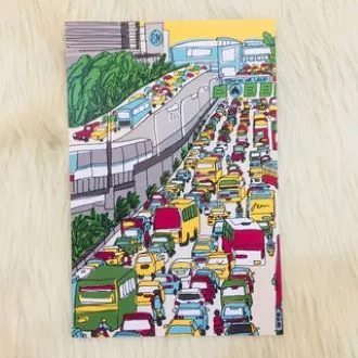
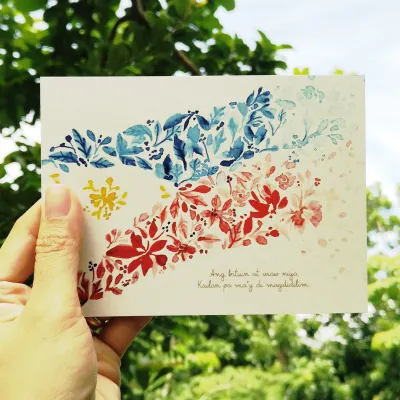
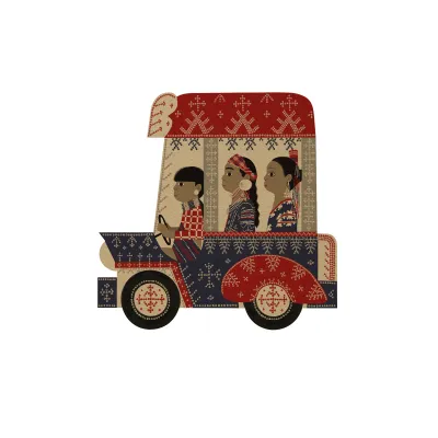
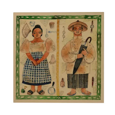
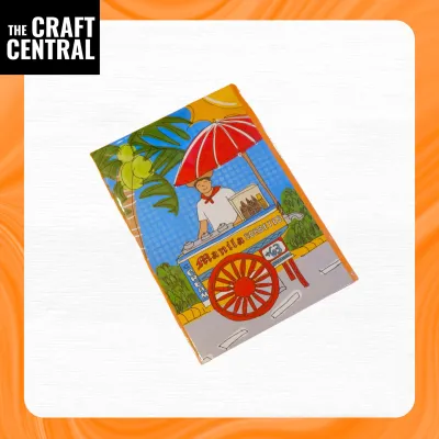
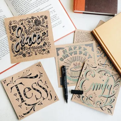
Prices are valid at publication and may change. Please refer to the product page for the latest price.
Always evaluate the layout to ensure the design does not crowd the writing area. While a fully illustrated front is standard, some postcards feature decorative borders on the back that can restrict your writing space. Opt for designs that relegate heavy illustrations to the front cover, leaving a clean, unlined, or lightly dotted back. This layout provides ample room to write a meaningful message, share a shared memory, or even add a small hand-drawn doodle.
Thank You Notes and Professional Gratitude
Expressing gratitude in a professional or formal context requires a careful balance of warmth and restraint. When thanking a mentor, colleague, or business partner, avoid overly casual graphics, loud neon color schemes, or humorous illustrations. Instead, look for clean, elegant designs featuring muted earth tones, classic navy, or soft pastels.
Minimalist designs with simple geometric patterns or elegant line art convey respect and sincerity without distracting from your message. The typography should be clean and legible, favoring classic serif or simple sans-serif fonts over whimsical, hard-to-read scripts. By choosing an understated design, you ensure that the focus remains entirely on your genuine words of appreciation, maintaining a professional boundary while still delivering a personal touch.
Major Holidays and Festive Seasons
The holiday season in the Philippines is famously long and vibrant, making festive postcards a wonderful way to connect with loved ones near and far. When selecting holiday designs, look for motifs that capture the warmth of the season, such as glowing lanterns, festive tablescapes, or cozy family gatherings. Rich, warm color palettes featuring deep reds, forest greens, and shimmering golds naturally evoke the festive spirit.
If you plan to send bulk greetings to a diverse group of acquaintances, colleagues, and friends, versatile and inclusive designs are highly practical. Opt for elegant winter foliage, starry night skies, or simple “Season’s Greetings” typography. These designs carry universal appeal, allowing you to share holiday cheer widely while remaining respectful of different personal traditions and preferences.
Incorporating Local Filipino Elements into Your Design
Choosing postcards that feature authentic local elements adds a deeply personal and culturally rich dimension to your mail. Look for designs that showcase the natural beauty of the Philippines, such as illustrations of native flora like the fragrant sampaguita, lush anahaw leaves, or the iconic yellow mango. Geographically themed cards featuring hand-drawn maps or artistic renderings of local landmarks also make excellent keepsakes, especially for recipients living abroad.

Linguistic touches can make a postcard feel instantly warmer and more familiar. Cards that incorporate local languages or dialects—such as a simple “Salamat” for thank you, “Maligayang Bati” for birthdays, or regional expressions in Bisaya or Ilocano—create an immediate sense of connection. When selecting these cards, verify that the text is spelled correctly and used in the proper grammatical context to maintain sincerity.
It is equally important to evaluate how cultural motifs are represented. Seek out designs created by local independent artists who portray traditional patterns, indigenous textiles, and daily life with accuracy and respect. Avoid mass-produced designs that rely on outdated or cartoonish stereotypes. Choosing thoughtful, artist-driven representations ensures your postcard celebrates local culture in a genuine, dignified manner.
Selecting Paper Quality and Finishes for Handwritten Messages
The physical feel of a postcard is just as important as its visual design, especially when you plan to write your message by hand. In the humid tropical climate of the Philippines, paper can easily absorb moisture from the air, which affects how ink behaves on the surface. To ensure your writing remains crisp and legible, look for heavy cardstock with a paper weight of at least 300 GSM (grams per square meter). This thickness provides a premium, sturdy feel and prevents the card from bending or tearing during transit.
The surface finish of the paper determines its compatibility with different writing instruments. Uncoated, matte, or slightly textured paper is highly recommended if you plan to use fountain pens, gel pens, or brush markers. These porous surfaces allow water-based inks to dry quickly, minimizing the risk of smudging. If you enjoy calligraphy, look for smooth, high-density paper that resists feathering—the tendency of ink to spread along the paper fibers—and prevents bleed-through to the illustrated side.
Before writing your final message, always perform an observable trial on a small, inconspicuous corner of the card or on a scrap piece of the same paper. Write a few test strokes using your chosen pen to check the drying speed, smoothness, and ink absorption. If you notice the ink spreading or taking more than a few seconds to dry, consider switching to a quick-drying gel pen or a fine-point permanent marker to ensure your message stays pristine.
Practical Tips for Mailing and Delivering Postcards Locally
To ensure your postcard reaches its destination safely and promptly within the Philippines, you must meet specific physical and logistical requirements. Standard postcards should generally fall within the dimensions of 105 mm by 148 mm (A6 size) up to 120 mm by 170 mm. Cards that are unusually large, heavy, or oddly shaped may require additional postage or need to be sent inside an envelope to qualify for standard mailing rates.
Proper address formatting is crucial for preventing delivery delays. Write the recipient’s full name, complete street address, barangay, city or municipality, province, and the correct ZIP code clearly on the right-hand side of the card. Use a waterproof or highly water-resistant pen for the address block, as mail carriers often have to transport items through sudden tropical downpours.
Affix your postage stamp securely in the top-right corner of the postcard. Local postage stamps can be purchased at your nearest post office branch, with standard domestic rates usually costing under ₱25. Because high humidity can weaken the self-adhesive backing on some stamps, consider applying a tiny dab of paper glue or using a clear piece of tape over the stamp edges to ensure it remains firmly attached throughout its journey.
Frequently Asked Questions (FAQ)
Can I use the same postcard design for both personal and professional thank you notes?
While it is highly convenient to use a single design, using an overly casual or humorous postcard in a professional setting carries the risk of appearing unprofessional. To safely bridge both contexts, select neutral, minimalist designs. Look for postcards featuring elegant, simple typography, muted color palettes, or clean geometric patterns. These sophisticated styles feel warm and personal to friends, yet remain respectful and polished when sent to colleagues, mentors, or business contacts.
What is the best pen to use on glossy postcards?
Glossy postcards have a non-porous coating that prevents water-based inks from absorbing, which easily leads to smearing and smudging. The most reliable option is to check pen labels for quick-drying, oil-based, or permanent ink properties. Fine-point permanent markers or specialized multi-surface pens work exceptionally well on glossy finishes. Always allow the ink to dry completely for several minutes before stacking or mailing the card to ensure your handwriting remains completely intact.

Community discussion
Share your experience or ask a question. Comments are reviewed before publication.