
Choosing the right material and font style for a customized ribbon with a name requires balancing visual appeal with technical print compatibility. The ideal combination ensures that the personalized text remains sharp and legible while the ribbon fabric complements the overall presentation. By matching the physical properties of the fabric to the printing method and selecting a font that scales well on narrow widths, you can create a memorable decorative element that elevates any gift or event.
Understand Your Occasion and Ribbon Purpose
Before selecting fabrics or typography, define the overall tone and functional demands of your event. A formal gathering, such as a milestone wedding anniversary or a high-end corporate launch, calls for materials and lettering styles that project sophistication. Conversely, casual celebrations like birthdays, baby showers, or seasonal family gatherings allow for more playful textures and relaxed, modern fonts. Aligning the ribbon’s style with the event’s formality ensures the final product feels integrated rather than out of place.
Environmental conditions also play a significant role in how your customized ribbon performs. In tropical climates with high humidity, such as during the rainy season in the Philippines, certain materials and inks can react differently than they would in dry, air-conditioned indoor spaces. Outdoor venues, such as garden receptions or beachside celebrations, expose ribbons to moisture, wind, and heat. Selecting a durable material and a stable printing method prevents the personalized names from smudging, fading, or losing their structure during the event.
Products mentioned in this guide
Prices are valid at publication and may change. Please refer to the product page for the latest price.
Finally, consider the primary function of the ribbon. If the ribbon is purely decorative, such as a loose drape around a floral arrangement, a delicate and lightweight fabric works beautifully. If the ribbon must serve a structural purpose, such as securing a heavy gift box, binding a thick corporate hamper, or holding a tight bow, you need a sturdier weave that resists tearing and holds its shape under tension. For ribbons intended as long-term keepsakes, prioritizing print durability and fabric longevity is essential.
Compare Ribbon Materials for Name Printing
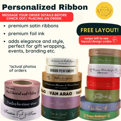
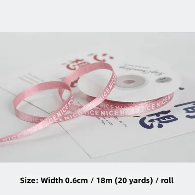
Satin is a highly popular choice for personalized ribbons due to its smooth, reflective surface and luxurious drape. This fabric features a tight weave that provides an excellent canvas for detailed printing, allowing fine lines and small letters to stand out clearly. However, the glossy finish of single-sided or double-sided satin requires careful ink selection. Some standard inks may smudge on the slick surface, so it is important to verify that the supplier uses quick-drying or heat-set inks. You can choose between a high-gloss finish for maximum shine or a matte satin for a more understated, contemporary look.

Organza offers a sheer, lightweight, and translucent texture that adds an airy, delicate touch to gift wrapping and party favors. Because organza is semi-transparent, printing names on it presents unique legibility challenges. Fine or thin font styles can easily get lost against the see-through background, especially when the ribbon is placed against patterned wrapping paper or dark packaging. To ensure the customized name remains readable, pair organza ribbons with bolder, thicker font styles and high-contrast inks that stand out against the sheer weave.
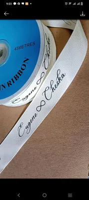
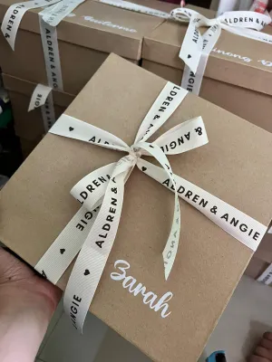
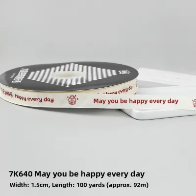
Grosgrain is characterized by its distinct ribbed texture and heavy, durable weave. This matte-finish ribbon is highly slip-resistant, making it the practical choice for tying secure, structural bows that will not come undone easily. The textured ridges of grosgrain add a rustic or classic charm, but they can also affect print clarity. Fine lines and intricate script fonts may appear slightly distorted or broken as the ink settles over the physical ridges of the fabric. For grosgrain, bold block fonts or simplified sans-serif designs yield the cleanest and most legible results.
To avoid disappointment, always ask the printing supplier for fabric swatches or request to view their physical print gallery. Seeing how different inks and foils behave on actual satin, organza, and grosgrain helps you evaluate the texture and ink absorption firsthand. This step is particularly helpful when ordering in bulk, as it allows you to feel the weight of the fabric and inspect the crispness of the printed names under different lighting conditions before finalizing your order.
Select the Best Font Style for Readability and Aesthetics
Script and calligraphy fonts are classic choices for romantic, elegant, or formal occasions. These styles mimic hand-drawn lettering, adding a personal and sophisticated touch to wedding favors, bridal shower gifts, or formal gala giveaways. However, highly decorative scripts often feature intricate loops, long ascenders, and delicate flourishes that can easily bleed together when printed on narrow fabric. When choosing a script font, ensure the letters are spaced adequately and that the loops do not overlap, which can render the personalized name illegible at smaller ribbon widths.
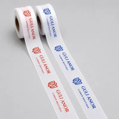
Sans-serif and modern fonts offer clean lines, geometric shapes, and a contemporary aesthetic. These fonts lack the small decorative strokes, or serifs, at the ends of the characters, making them exceptionally clear and easy to read from a distance. Sans-serif typography is highly recommended for corporate branding, minimalist gift packaging, or when printing longer names and messages on narrow ribbons. Because of their uniform line weight, modern fonts maintain their legibility even when scaled down to fit thin ribbon widths.
Serif fonts provide a traditional, structured, and academic feel that suits formal anniversaries, graduation gifts, or heritage brand packaging. The small feet at the ends of the letter strokes guide the eye along the text, offering a classic look that balances elegance with high readability. When opting for a serif font, select a style with moderate contrast between the thick and thin strokes. Extremely thin serifs can sometimes fail to print clearly on textured ribbon surfaces, resulting in broken letters or uneven ink coverage.
Regardless of the font family you choose, you must evaluate the font size relative to the physical width of the ribbon. Standard customized ribbons range from narrow widths to much wider options. To maintain a balanced and professional appearance, ensure there is adequate breathing room at the top and bottom margins of the ribbon. If the text is too large and touches the edges of the fabric, it risks being cut off during the printing process or looking cramped and unappealing.
Match Colors and Finishes for Maximum Contrast
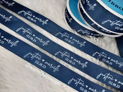
Achieving high contrast between the ribbon fabric and the printed text is the most effective way to ensure the personalized name is immediately readable. As a general rule, pair dark-colored ribbons, such as navy blue, forest green, or deep burgundy, with light-colored inks or metallic foils. Conversely, light-colored ribbons, like cream, pastel pink, or soft mint, pair best with dark charcoal, black, or rich jewel-toned inks. This contrast prevents the text from blending into the background fabric, keeping the customization sharp and visible.
When deciding on the printing finish, you will generally choose between standard ink printing and metallic foil stamping. Standard ink printing flatly colors the fabric, offering a wide range of color matching options and a clean, matte finish that is highly durable. Metallic foil stamping, on the other hand, applies a thin layer of shiny foil—typically gold, silver, or rose gold—onto the ribbon using heat and pressure. While foil stamping adds a premium, reflective shine that catches the light beautifully, it may have limited color options and can sometimes crack if the ribbon is bent or tied into extremely tight knots.
Avoid low-contrast combinations, such as printing light gray text on a white ribbon or pastel pink text on a lavender background, unless you are intentionally aiming for a subtle, tone-on-tone aesthetic. While a low-contrast design can look incredibly modern and minimalist, it significantly reduces readability. If the primary goal of your customized ribbon is to showcase a name or a brand clearly, stick to high-contrast pairings that ensure the lettering stands out under various lighting conditions.
Verify Specifications and Order a Test Sample
Before placing your final order, double-check all physical specifications to ensure the customized ribbon meets your expectations. Confirm that the selected ribbon width can comfortably accommodate your chosen font size, line spacing, and any additional graphic elements, such as small icons or borders. Keep in mind that longer names or phrases require more horizontal space, which may affect how often the personalized text repeats along the length of the ribbon.
Review the supplier’s specific design guidelines, including character limits, digital proofing processes, and minimum order quantities. Most professional printers will provide a digital proof showing how your chosen font and name will look on a simulated ribbon layout. Take the time to review this proof carefully, checking for spelling accuracy, spacing issues, and overall alignment. If you are planning a large order for a major event, ask the supplier about their production lead times to ensure the ribbons arrive well in advance.
Whenever possible, order a physical test sample or a pre-production proof before committing to a bulk run. While digital proofs are excellent for verifying layout and spelling, they cannot replicate the physical hand-feel of the fabric, the true color accuracy under natural light, or the actual crispness of the print. Testing a physical sample allows you to tie a trial bow, check for ink smudging under local humidity, and ensure the ribbon’s texture and weight perfectly match your packaging or decor.
Frequently Asked Questions (FAQ)
Can I use multiple font styles on a single customized ribbon with name?
Yes, you can combine multiple font styles on a single ribbon to establish a clear visual hierarchy. For example, pairing an elegant script font for the personalized name with a clean, simple sans-serif font for a date or a short message creates a balanced and sophisticated layout. However, to prevent the design from looking cluttered or disorganized, limit your selection to no more than two distinct font families. Additionally, check with your supplier beforehand, as some printing setups may have technical limitations or charge extra fees for processing multiple fonts on a single run.
How do I care for and store personalized ribbons after the event?
To preserve the quality of your customized ribbons as keepsakes, store them in a cool, dry place away from direct sunlight, which can fade the fabric and degrade the printed ink over time. Instead of folding the ribbons—which creates stubborn, permanent creases—roll them gently around a cardboard spool or tube, especially if the material is stiff or has wired edges. If the ribbons gather dust or light soil, perform spot cleaning only using a damp, soft cloth. Avoid machine washing, dry cleaning, or using harsh chemical detergents, as these processes will likely peel or dissolve the personalized print.

Community discussion
Share your experience or ask a question. Comments are reviewed before publication.