
Choosing a sticker book that matches your journaling style requires looking beyond appealing designs to evaluate how the stickers physically and visually integrate with your pages. The right sticker book acts as a cohesive extension of your creative voice, offering a curated selection of themes, color palettes, and materials that complement your existing stationery. By aligning your sticker choices with your layout habits, you can elevate your journal spreads without cluttering your workspace or wasting unused sheets.
Identify Your Core Journaling Aesthetic
Before browsing online marketplaces, take a close look at your completed journal pages to identify recurring visual patterns. You might notice a preference for clean, structured lines with plenty of empty space, or perhaps your pages lean toward dense, overlapping collages filled with textures. Recognizing these habits helps you understand whether you need small, subtle accent stickers or large, bold focal pieces that anchor an entire layout.
These patterns generally align with a few dominant journaling aesthetics, each requiring a different style of sticker book. Minimalist journalers often prefer simple geometric shapes, functional icons, and muted tones that organize information without distracting the eye. If you enjoy a cute or kawaii aesthetic, you will likely gravitate toward pastel characters, playful food illustrations, and bright, cheerful doodles. Vintage enthusiasts typically look for retro typography, sepia-toned ephemera, and botanical illustrations, while travel-themed documenters seek out maps, stamps, and ticket stub designs.
Products mentioned in this guide
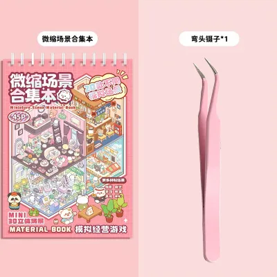
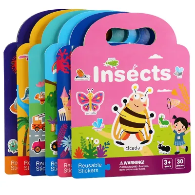
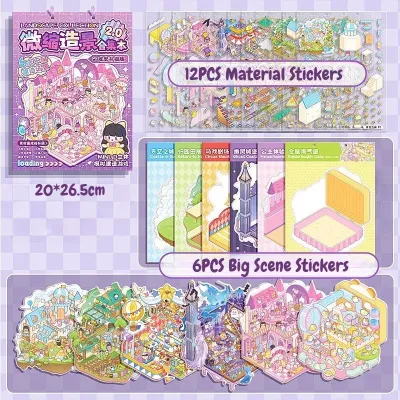
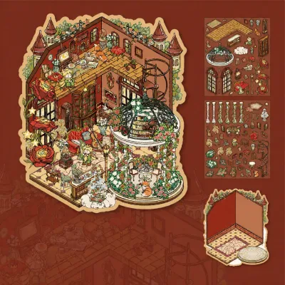
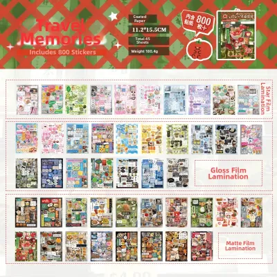
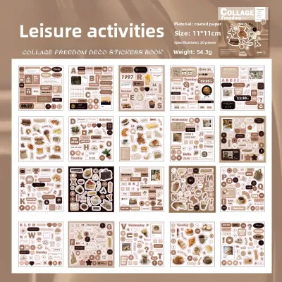
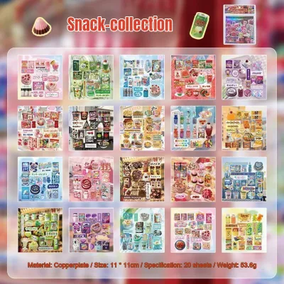
Prices are valid at publication and may change. Please refer to the product page for the latest price.
Your color habits and use of negative space also dictate which sticker books will work best. If your spreads rely on high-contrast layouts, you will need vibrant stickers that stand out against the page. If you prefer a softer look, look for books featuring cohesive, low-contrast color families that blend into the background. Paying attention to how much blank paper you prefer to leave exposed will prevent you from buying oversized stickers that overwhelm your preferred layout size.
Match Sticker Themes and Color Palettes to Your Style
To maintain visual cohesion across your journal, map specific sticker themes directly to your established aesthetic. A botanical-themed sticker book featuring delicate ferns and pressed flowers pairs naturally with a vintage or academic style, whereas bold, retro typography fits a mid-century or grunge layout. Mixing unrelated themes on a single page can quickly make a spread look chaotic rather than curated, so choosing books with a singular, focused theme is often the most straightforward path for beginners.

Color consistency is equally important when integrating new stickers with your existing stationery collection. Consider the ink colors of your favorite gel pens, the shades of your mild highlighters, and the patterns of your go-to washi tapes. A sticker book with a warm, earthy color story will clash with cool-toned pastel markers, while neon stickers can easily overpower delicate fountain pen inks. Selecting a book with a curated color palette ensures that every element on the page feels intentional and harmonious.
You can avoid visual clutter by opting for sticker books that offer pre-curated color stories or themed chapters rather than random, high-contrast assortments. Many modern sticker books are organized by color family or specific sub-themes, allowing you to flip to a single section and find everything you need for a unified spread. This organization saves time during your journaling sessions and prevents the frustration of owning a book where only a fraction of the designs match your style.
Evaluate Sticker Types and Materials for Your Layouts
The physical format of the stickers determines how easily you can layer them and how they interact with your journal pages. Kiss-cut sticker sheets, where the stickers are pre-cut on a backing sheet, are highly convenient for quick peeling and keeping your collection organized within a single book. Die-cut stickers, which are cut entirely through the backing paper, offer individual flexibility but can be more difficult to store. Clear or transparent stickers are excellent for layering over handwritten text or watercolor washes, as they allow the underlying layers to show through without harsh white borders.
Material finishes play a significant role in both the visual texture of your journal and the usability of the stickers. Matte paper stickers offer a soft, organic look and are highly compatible with most writing instruments, allowing you to write dates or notes directly on top of them with gel pens or fine liners. Glossy vinyl stickers provide vibrant colors and durability, but they resist water-based inks and can create unwanted glare under overhead lighting. Transparent polyethylene terephthalate (PET) stickers are waterproof and incredibly thin, making them highly suitable for seamless blending, though they require permanent markers if you wish to write on them.
In tropical climates where high humidity is common, paper selection and backing quality require extra attention. High humidity can cause thin backing papers to curl or make the adhesive overly gummy, leading to peeling issues. Look for sticker books that use sturdy, moisture-resistant backing sheets and high-quality adhesives that will not degrade or lift from your journal pages over time. Additionally, check the sizing of the stickers relative to your journal’s grid or dot spacing to ensure they fit comfortably within your standard daily columns.
Build a Practical Sticker Book Shortlist
When you are ready to purchase, establish a realistic budget and compare the long-term value of different sticker book formats. A large, multi-theme variety book might seem cost-effective, but if you only use a small percentage of the designs, a highly focused, single-aesthetic collection is a better investment. In the Philippines, sticker books can range from budget-friendly local options around ₱150 to premium imported collector editions exceeding ₱800, so balancing variety against actual usability is key to getting the most value for your money.
Always verify the technical specifications of the sticker book before committing to a purchase. Look for product descriptions that explicitly state the paper weight, adhesive type, and whether the materials are acid-free. Acid-free stickers are important for archival safety, ensuring that the adhesive will not yellow your journal pages or damage your photographs over years of storage. If you plan to use fountain pens or heavy markers nearby, choosing stickers with bleed-resistant paper backings will protect the reverse side of your journal pages.
If you are hesitant to invest in a thick, expensive sticker book, plan a trial purchase first. Many creators and stationery brands offer smaller sampler books or single themed sheets that allow you to test the adhesive strength, paper texture, and color accuracy in person. This trial run lets you observe how the stickers perform in your local climate and how well they bond with your specific journal paper before you commit to a larger, permanent collection.
Frequently Asked Questions (FAQ)
What is the difference between a sticker book and loose sticker sheets?
A sticker book binds multiple sheets together into a single, cohesive volume, offering superior portability and keeping your collection organized without the risk of losing individual pieces. Loose sticker sheets provide more flexibility for sorting and can be stored in pocket organizers, but they are easier to misplace or damage. While sticker books are often more cost-effective per sticker, peeling designs close to the bound spine can sometimes be more challenging than working with a flat, loose sheet.
How can I test if a sticker book's colors match my journal before buying?
To verify color compatibility when shopping online, compare the digital swatches provided by the seller against your physical pen and washi tape collection under natural light. Because screen calibrations vary, always check user-uploaded photos in the review sections of online marketplaces to see how the colors look in real-world lighting. These customer photos also help you verify print alignment, paper texture, and whether the physical colors are as vibrant or muted as advertised.

Community discussion
Share your experience or ask a question. Comments are reviewed before publication.