
Finding the right letter sticker design is essential for creating cohesive, visually appealing journal spreads. Rather than buying random typography sheets, matching the font style, weight, and finish to your specific journal aesthetic ensures your headers and accents enhance your layouts. This guide helps you identify your core theme, evaluate typography pairings, and select the right materials before making a purchase.
Identifying Your Core Journal Aesthetic
Before browsing online marketplaces for new stationery sheets, take a close look at your current journaling habits. Your dominant color schemes, layout density, and page backgrounds dictate what kind of typography will look natural. If your pages are filled with dense daily logs, heavy headers will crowd the text; if you prefer spacious weekly spreads, bold stickers can act as grounding visual anchors.
Determine whether your letter stickers need to serve a highly functional purpose or a purely decorative one. Functional stickers, such as those used for dates, days of the week, or tracker headers, require high legibility and clean lines. Decorative stickers, which might spell out monthly themes or inspirational quotes, can prioritize artistic flair, intricate details, or unique textures over instant readability.
Products mentioned in this guide
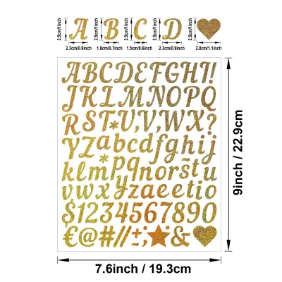
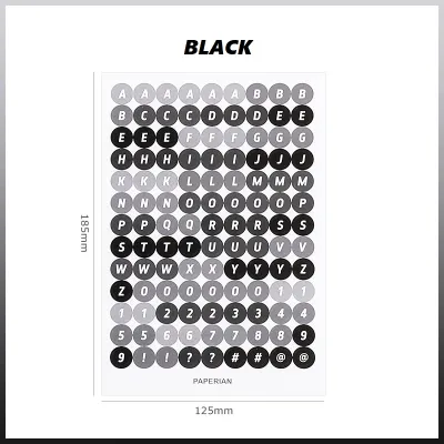
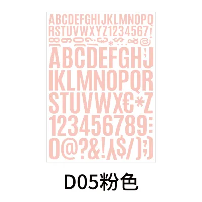
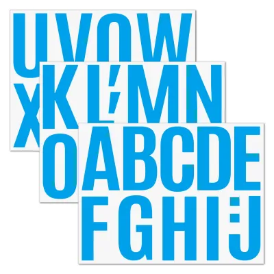
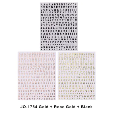
Prices are valid at publication and may change. Please refer to the product page for the latest price.
Analyze the visual gaps in your current layouts to see where typography can solve design problems. A blank corner can be transformed with a subtle, low-contrast background word, while a chaotic page can be organized using structured, high-contrast block letters. Understanding these needs prevents impulse purchases that end up unused in your drawer.
Matching Letter Sticker Styles to Journal Themes
Typography is a powerful design tool that instantly communicates a specific mood through its weight, spacing, and edge treatment. Thick, rounded letters convey playfulness and energy, while thin, sharp lines suggest order, sophistication, or quiet reflection. By understanding how these visual cues operate, you can build a targeted shopping list that matches your creative vision.

Let’s explore how different letter sticker designs align with the most popular journaling aesthetics, helping you choose the perfect sheets for your personal style.
Minimalist and Clean Planners
Minimalist journaling relies on negative space, clean lines, and a highly organized structure to bring peace of mind. To maintain this clutter-free environment, look for sans-serif letter stickers, thin block fonts, or delicate, lowercase handwritten styles. These designs provide necessary structure without drawing excessive attention away from your written plans.
Color choice and finish are critical when keeping things simple. Opt for neutral color palettes, such as matte black, soft gray, or muted beige, which blend seamlessly with standard white or cream journal pages. Matte finishes are highly recommended here, as glossy surfaces reflect light and create distracting glare on an otherwise quiet, understated page.
In clean planners, letter stickers should be used with restraint, primarily serving as functional headers, index markers, or date indicators. Instead of creating large, decorative titles, use small-scale letters to label your daily columns or habit trackers. This disciplined approach ensures your planner remains a tool for focus rather than a source of visual noise.
Vintage and Retro Journals
Vintage and retro journaling styles celebrate history, nostalgia, and the tactile beauty of aged paper. To complement layouts filled with tea-stained ephemera, old book pages, and dried flowers, select serif, typewriter, or ornate script fonts. These classic typography styles evoke a literary, timeless feel that feels right at home in a memory keeper or creative diary.
When evaluating color options, look for muted tones, sepia, warm brown, forest green, or distressed edges that mimic the natural aging process of paper. Avoid bright white backings, which will stand out harshly against cream or kraft paper backgrounds. Instead, seek out stickers printed on cream paper or transparent matte backings that melt into the page.
Material selection is just as important as the font itself when building a retro aesthetic. Steer clear of modern, highly glossy, holographic, or neon materials, as these synthetic finishes instantly break the historical illusion. Matte paper, vellum, or textured stickers are much better suited for maintaining a cohesive, old-world atmosphere.
Cute, Kawaii, and Colorful Spreads
Kawaii and colorful journaling is all about energy, joy, and playful self-expression. For these bright, illustration-heavy pages, choose bold bubble letters, chunky block fonts, and bouncy, hand-drawn styles. These expressive designs match the whimsical energy of character stickers, colorful washi tapes, and hand-drawn doodles.
This aesthetic is the perfect playground for experimenting with eye-catching finishes and vibrant color palettes. Look for pastel assortments, neon gradients, or holographic and glitter finishes that catch the light when you turn the page. These dynamic materials add a three-dimensional quality to your spreads, making your titles pop off the paper.
To prevent your colorful pages from becoming overwhelming, balance these highly decorative, chunky letters with simpler background elements. If you are using a large, holographic bubble-letter title, keep the surrounding text clean and use neutral washi tape borders. This contrast allows your playful headers to shine as intentional focal points rather than contributing to visual clutter.
Dark Academia and Moody Themes
Dark academia and moody journaling aesthetics draw inspiration from classic literature, gothic architecture, and shadow-rich color palettes. To match this sophisticated, intellectual vibe, opt for elegant calligraphy, traditional serif fonts, or gothic-inspired typography. These styles add a sense of drama and gravity to your personal reflections and study logs.
Your color palette should favor deep, rich tones that evoke cozy libraries and candlelit desks. Look for letter stickers in burgundy, forest green, navy blue, charcoal, or subtle metallic gold and silver. Metallic accents, in particular, catch the light beautifully against darker backgrounds, adding a touch of antique luxury to your pages.
Because moody layouts often utilize dark kraft paper, black cardstock, or heavily inked backgrounds, sticker opacity is a crucial factor. Verify that the stickers you choose are highly opaque or printed on solid black or white backings. Transparent stickers will disappear when placed on dark paper, so solid, high-contrast lettering is essential for readability.
Evaluating Sticker Materials and Finishes
The material of your letter stickers affects not only how they look on the page but also how they interact with other elements in your journal. Matte paper stickers are the most versatile, offering a non-reflective surface that blends naturally with standard journal pages. Glossy stickers provide vibrant colors and sharp details, but their reflective sheen can sometimes clash with matte paper backgrounds.
Clear or transparent plastic stickers are excellent for layering over watercolor washes, patterned papers, or washi tape without hiding the design underneath. Vellum stickers offer a semi-translucent, frosted appearance that softens the text, making them ideal for subtle background accents or delicate vintage layouts. Understanding these material properties allows you to layer your stationery elements like a professional designer.
Adhesive strength and backing quality are particularly important in warm, humid climates like the Philippines. High humidity can cause cheap sticker adhesives to degrade, leading to peeling edges or curling sheets over time. Look for stickers with reliable, pressure-sensitive adhesives, and ensure your journal pages are completely dry and free of oil before application to guarantee a long-lasting bond.
Finally, consider the weight and thickness of the sticker material. Thick vinyl stickers can add significant bulk to your journal, causing the book to swell and making it difficult to write on subsequent pages. If you prefer a flat, comfortable writing surface, prioritize thin paper, vellum, or lightweight clear stickers that lay completely flat without creating awkward bumps.
Building a Versatile Letter Sticker Collection
Building a functional stationery collection requires a strategic approach to avoid accumulating sheets of letters you will never use. Start by investing in a core set of neutral, versatile fonts in basic alphabets, focusing on black, white, and soft brown tones. These workhorse stickers will serve as your daily and weekly headers, ensuring you always have the letters you need for routine planning.
Once your basics are covered, allocate a portion of your budget for specialized, highly decorative, or themed sets. These might include metallic gold calligraphy, colorful bubble letters, or distressed typewriter fonts reserved for monthly cover pages, milestone trackers, or special memory spreads. Keeping these decorative sheets separate helps preserve them for moments when they will make the most impact.
Before purchasing any letter sticker sheet on an online marketplace, carefully check the layout of the characters. Ensure the sheet contains a practical ratio of uppercase to lowercase letters, along with plenty of vowels and common consonants. A sheet that includes numbers and basic punctuation marks is highly valuable, as it allows you to complete dates and lists without needing to mix and match different sets.
Frequently Asked Questions (FAQ)
Can I write on letter stickers with my own pens?
Whether you can write on a letter sticker depends entirely on its material and coating. Matte, uncoated paper stickers are highly receptive to almost all writing instruments, including gel pens, fineliners, ballpoints, and water-based markers, without any risk of smudging. These surfaces absorb ink quickly, allowing you to customize your letters or add small details easily.
Conversely, glossy, vinyl, or clear plastic stickers have non-porous surfaces that do not absorb liquid inks. Writing on these materials with standard gel pens or fineliners will result in immediate smearing, pooling, or rubbing off. If you must write on a glossy or plastic surface, use a permanent, oil-based marker and allow it to dry completely.
To avoid ruining a completed journal layout, always perform a quick smudge test. Take an unused corner of the sticker sheet, write a small dot with your preferred pen, and wait a few seconds before gently rubbing it with your finger to check for ink stability.
How do I store letter sticker sheets to prevent curling?
Proper storage is essential for maintaining the flat shape and adhesive quality of your sticker sheets. Keep your sheets stored flat inside rigid folders, plastic sleeves, or dedicated sticker books rather than letting them loose in a drawer. Keeping them under light, even pressure helps prevent the edges from lifting or curling over time.
Environmental factors play a major role in sticker preservation, especially in tropical regions. Avoid storing your stationery in direct sunlight, near open windows, or in areas with high humidity, as heat and moisture can dry out the adhesive and cause the backing paper to warp. Keep your storage boxes in a cool, dry, and shaded part of your room.
Always check any storage recommendations provided by the manufacturer, particularly for delicate materials like vellum or clear acetate. These materials are highly sensitive to temperature fluctuations and humidity, making flat, protective storage even more critical to prevent warping.
What is the best way to remove letter stickers without tearing the page?
If you make a mistake or need to reposition a letter, removing the sticker requires patience and a gentle touch. Use a pair of fine-tipped tweezers, a dedicated sticker lifting tool, or a clean fingernail to slowly lift one corner of the sticker. Peel the sticker back slowly at a very low angle, keeping it almost parallel to the page to minimize upward tension on the paper fibers.
For stubborn adhesives that refuse to budge, applying a small amount of low heat can help soften the glue. Hold a hairdryer on its lowest, coolest setting a few inches away from the page for a few seconds, then attempt to peel the sticker again. Exercise extreme caution when using heat, especially on thin, delicate, or coated journal papers.
Pay close attention to the paper surface as you peel. If you notice any lifting of the paper fibers, pilling, or tearing, stop the removal process immediately. In some cases, it is safer to cover the mistake with a decorative scrap of paper, a piece of washi tape, or another sticker rather than risking a permanent tear in your journal page.

Community discussion
Share your experience or ask a question. Comments are reviewed before publication.