
Selecting the perfect birthday card is more than a simple errand; it is an intentional act of communication that bridges visual design and written emotion. The most appropriate birthday card style is one that directly matches the recipient’s relationship with you, their age, and their personal sense of humor. A mismatch—such as giving a highly formal card to a playful childhood friend, or an edgy, sarcastic card to a respected older relative—can create a subtle emotional disconnect.
To make the right choice, you must evaluate how a card’s visual elements, paper texture, and interior message tone align with your recipient. By understanding the core design archetypes available in the stationery market, you can confidently select a card that resonates deeply. Whether you are celebrating a parent, a close friend, or a partner, matching the card style to the relationship ensures your birthday wishes are received with genuine warmth.
Understanding Core Birthday Card Styles and Tones
The stationery market offers a diverse array of greeting cards, each designed to project a specific emotional tone. Understanding these core style archetypes is the first step in narrowing down your options. By recognizing how visual design elements signal a card’s voice, you can quickly identify which cards are appropriate for different social contexts.
Products mentioned in this guide
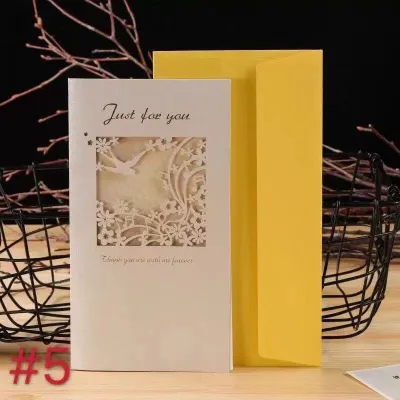
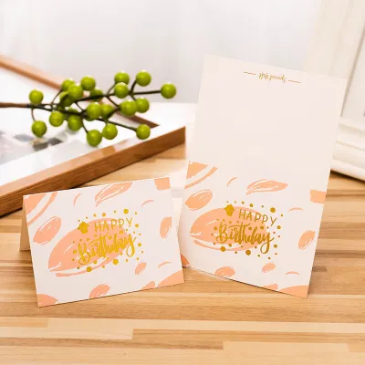
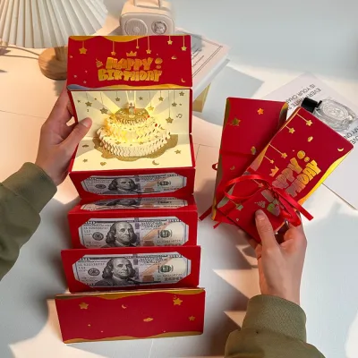
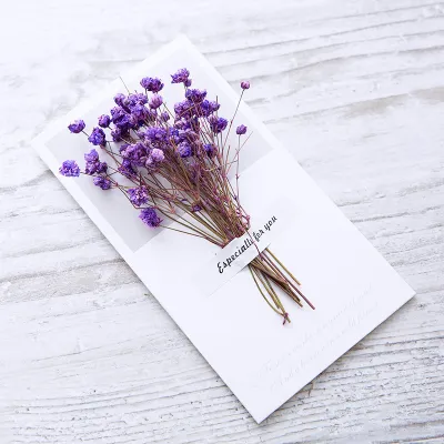
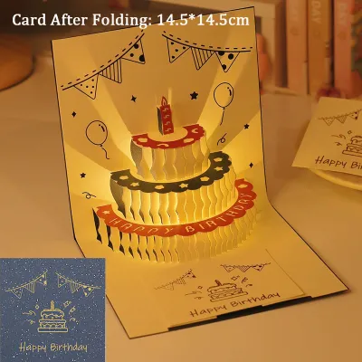
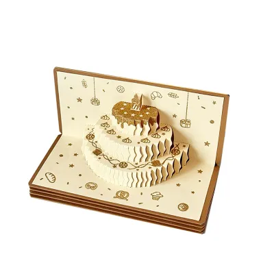
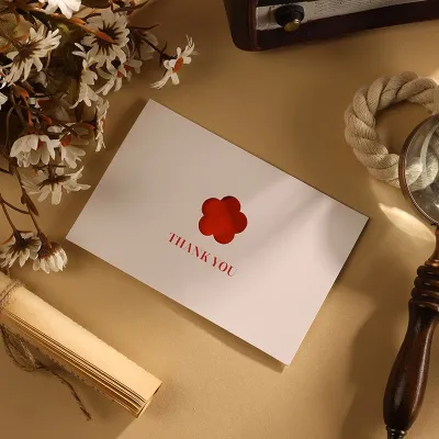
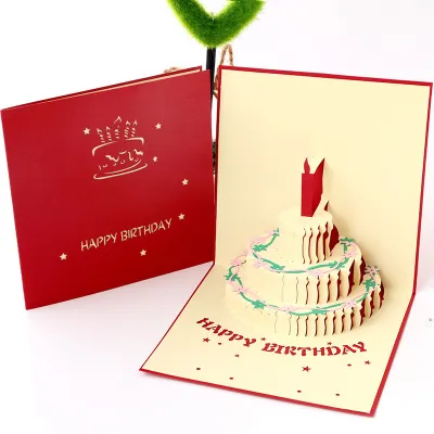
Prices are valid at publication and may change. Please refer to the product page for the latest price.
- Sentimental Cards: These cards prioritize deep emotion, gratitude, and reflection. They often feature elegant typography, soft pastel or watercolor illustrations, and classic floral motifs. The cover text typically includes poetic or heartfelt language, signaling a sincere and meaningful message inside.
- Humorous Cards: Designed to amuse, these cards rely on witty text, funny illustrations, or playful puns. They can range from lighthearted self-deprecation to sharp, sarcastic jokes. Visually, they often use bright, bold color palettes and casual, hand-drawn illustration styles.
- Formal Cards: Best suited for professional settings or distant acquaintances, formal cards maintain a respectful and polite distance. They feature clean, traditional layouts, serif typography, and understated designs such as simple geometric patterns or elegant foil accents.
- Minimalist Cards: Characterized by generous negative space, simple line art, and clean sans-serif fonts, minimalist cards are modern and sophisticated. They focus on a single, clear message and are highly versatile, making them suitable for design-conscious recipients of any relationship level.
- Playful Cards: These cards are cheerful, energetic, and whimsical. They often incorporate interactive elements, bright primary colors, and cute, cartoonish illustrations. They are excellent for conveying excitement and joy without the pressure of deep emotional reflection.
Before opening a card, its cover design has already communicated a specific mood. A card featuring delicate gold foil lettering on thick, textured cardstock immediately suggests a milestone or a highly respectful greeting. Conversely, a card with a quirky die-cut shape and vibrant neon ink signals a casual, fun-loving interaction. Evaluating these visual cues ensures the card’s external aesthetic matches the internal sentiment you intend to write.
Selecting Sentimental and Classic Birthday Cards for Parents and Family
When choosing a birthday card for parents, grandparents, or extended family members, the primary goal is often to express gratitude, respect, and enduring affection. Family relationships carry a shared history, making sentimental and classic card styles highly appropriate. These designs acknowledge the recipient’s role in your life while maintaining a warm, respectful tone.

Classic floral patterns, watercolor landscapes, and elegant botanical illustrations are excellent visual choices for family cards. These motifs carry a timeless appeal that translates well across generations. Opting for traditional folding formats and premium cardstock—such as a heavy linen-textured paper—conveys a sense of effort and respect. In the Philippines, where family bonds are deeply cherished, presenting a high-quality card demonstrates that you have taken the time to select something worthy of their guidance and love.
The interior message should complement this classic aesthetic by focusing on appreciation and shared memories. When writing to a parent or older relative, consider these approaches:
- Acknowledge their support: Express gratitude for their presence, wisdom, and the sacrifices they have made.
- Reference shared history: Briefly mention a fond family memory or a tradition that highlights your bond.
- Keep it respectful: Avoid overly casual slang or edgy humor that might be misunderstood or feel dismissive of their parental role.
If your family dynamic is naturally lighthearted, a playful card with a gentle, affectionate joke is perfectly acceptable. However, it is usually best to pair any humor with a sincere handwritten note inside. Balancing a lighthearted cover with a warm, appreciative message ensures the card feels both personal and respectful of their position in your life.
Matching Humorous and Playful Cards to Your Friendships
Friendships offer a wide spectrum of dynamics, from casual acquaintances to lifelong best friends. Because of this variety, matching the card’s tone to the specific level of intimacy in your friendship is crucial. A humorous or highly playful card can strengthen a close bond, but the same card might feel awkward or inappropriate when given to a casual peer.
For close friends, humorous cards featuring inside jokes, pop-culture references, or quirky illustrations are often the most memorable. These cards celebrate the unique, shared language of your friendship. You can also experiment with unconventional card formats, such as interactive pop-up cards, die-cut shapes, or designs with bold, conversational cover text. These playful structures mirror the energetic and fun nature of a close friendship.
When selecting a humorous card, it is important to understand the recipient’s personal humor boundaries. To ensure your card is received as intended, consider these guidelines:
- Assess the intimacy level: Reserve highly sarcastic or edgy humor for friends who know you well enough to understand the intent behind the joke.
- Keep casual friendships safe: For casual friends or acquaintances, opt for lighthearted, cheerful designs with general, positive well-wishes rather than highly specific or sharp humor.
- Extend the joke naturally: If the cover features a joke, use your handwritten message to extend the humor or transition into a warm, brief expression of appreciation.
By aligning the card’s humor with the actual closeness of your relationship, you avoid the risk of a joke falling flat. A well-chosen funny card shows that you understand your friend’s personality, making their birthday celebration feel personal and joyful.
Choosing Romantic and Personalized Birthday Cards for Partners
A birthday card for a spouse or romantic partner should reflect intimacy, deep personal connection, and thoughtfulness. This is an opportunity to move away from generic, mass-produced designs and select something that feels unique to your relationship. The card should act as a keepsake, capturing a specific moment in your shared journey.
Design choices for partners often lean toward romantic, deeply sentimental, or highly personalized styles. Look for cards with premium finishes that elevate the physical experience of receiving the card, such as blind embossing, delicate gold foil stamping, or hand-painted watercolor details. Intimate and muted color palettes—such as deep burgundies, soft terracottas, or elegant navy blues—often project a mature, romantic tone. For partners who appreciate unique stationery, consider sourcing handmade or artisan-crafted cards from local makers, which showcase a high level of care and consideration.
The interior message of a partner’s card should be deeply personal and forward-looking. Rather than writing a standard “Happy Birthday,” use the space to reflect on your connection:
- Celebrate milestones: Acknowledge a significant event you experienced together over the past year.
- Express future commitment: Write about your excitement for the future and the plans you are building together.
- Detail specific appreciation: Mention small, daily actions that make you grateful for their presence in your life.
If your partner prefers a less sentimental approach, a minimalist card with a single, powerful line of text can be incredibly romantic. The key is personalization; the card should feel as though it could only have been written by you, for them, reinforcing the unique bond you share.
Evaluating Paper Quality, Finishes, and the Handwritten Message
Once you have selected the appropriate style and tone, the final step is to evaluate the physical attributes of the card itself. The tactile quality of a card significantly influences how it is received. Furthermore, ensuring your writing instruments are compatible with the card’s paper stock prevents frustrating smudges and preserves your handwritten message.
Paper weight is measured in grams per square meter (GSM). High-quality greeting cards typically range from 250 GSM to 350 GSM or higher, providing a sturdy, premium feel that stands upright easily when displayed on a desk or shelf. The texture of the paper also plays a role in the card’s presentation:
- Matte Paper: Offers a clean, non-reflective surface that is highly versatile and easy to write on.
- Linen Paper: Features a crosshatch texture that mimics woven fabric, adding a classic, sophisticated feel.
- Glossy Paper: Highly reflective and vibrant, ideal for photo cards, but requires careful pen selection.
- Recycled Cotton: Soft, thick, and highly textured, perfect for artisan or minimalist designs.
Ink compatibility is a critical consideration, especially in the tropical, high-humidity climate of the Philippines. High humidity can significantly extend the drying time of wet inks. Avoid using fountain pens or wet gel pens on highly coated or glossy card interiors, as the ink will struggle to absorb and is highly prone to smudging or feathering. For glossy surfaces, a standard ballpoint pen or a quick-drying permanent marker is the safest choice. For matte, linen, or cotton papers, you have more freedom to use gel pens or felt-tip markers, but always allow the ink to dry completely before folding the card and placing it in its envelope.
Additionally, always verify that the card dimensions match the provided envelope. Standard card sizes, such as A2 (4.25 x 5.5 inches) or A7 (5 x 7 inches), should slide easily into their matching envelopes without requiring you to trim the edges or force the paper, which can crease the card stock.
To ensure your handwritten message matches the quality of your chosen card, use this simple three-step writing framework:
- The Warm Opening: Begin with an affectionate greeting that reflects your relationship (e.g., "To my dearest friend," or "Happy Birthday, Ma!").
- The Personal Connection: Share a specific compliment, a shared memory from the past year, or an expression of gratitude.
- The Sincere Wish: Conclude with a warm, forward-looking wish for the year ahead, followed by a meaningful sign-off.
Frequently Asked Questions (FAQ)
What is the best birthday card style for a coworker or boss?
For professional relationships, it is best to choose a minimalist, professional, or mildly lighthearted card. Avoid designs that feature overly sentimental, romantic, or edgy humor, as these can easily cross professional boundaries. Opt for clean typography, simple geometric patterns, or neutral colors. Keep the interior message brief, polite, and focused on wishing them a successful and happy year ahead.
Should I choose a handmade card or a store-bought one?
The choice between a handmade card and a store-bought card depends on your relationship with the recipient and the effort you wish to convey. Handmade or artisan-crafted cards are highly personal and show a great deal of thoughtfulness, making them ideal for close family members, partners, or friends who appreciate crafts and unique stationery. On the other hand, high-quality store-bought cards with premium commercial finishes, such as gold foil stamping or precise die-cuts, are excellent for formal relationships, professional settings, or when you need a highly polished, classic design.

Community discussion
Share your experience or ask a question. Comments are reviewed before publication.