
Choosing the perfect sticker scene style for your journal layout is more than just picking pretty designs; it is about finding a visual language that matches your personal creative rhythm and page structure. A sticker scene—a pre-designed, cohesive background or thematic sticker set—serves as the visual anchor of your spread, setting the mood before you even put pen to paper. By aligning this choice with your aesthetic, you avoid the common pitfall of buying beautiful sheets that ultimately clash with your journaling style.
Diagnose Your Personal Journaling Aesthetic
To find your style, look at the visual themes you naturally gravitate toward in your daily life. Your journaling aesthetic is an extension of your personal taste, and identifying it is the first step toward creating cohesive, satisfying spreads.
- Minimalist: Clean lines, muted tones, and ample negative space. It feels calm, structured, and highly intentional.
- Vintage: Sepia tones, nostalgic ephemera, lace textures, and distressed edges. It evokes a sense of history, warm memory-keeping, and classic literature.
- Kawaii: Pastel palettes, adorable characters, playful motifs, and bubbly shapes that bring instant cheer to the page.
- Botanical: Pressed leaves, detailed florals, earthy tones, and organic shapes that bring the outdoors inside.
- Dark Academia/Gothic: Moody color palettes, classical art pieces, architectural sketches, and deep, dramatic tones.
To uncover your preference, ask yourself these diagnostic questions: What colors fill your wardrobe or living space? Do you feel inspired by a clean, structured desk, or do you thrive in a cozy, cluttered creative space? If you prefer order, minimalist or functional styles will suit you. If you love texture and rich layers, vintage or botanical styles are your match.
Products mentioned in this guide
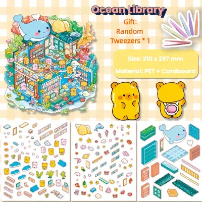
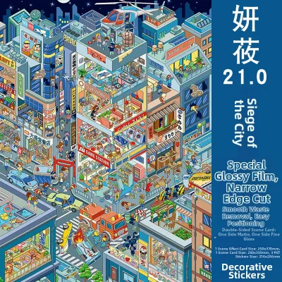
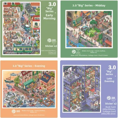
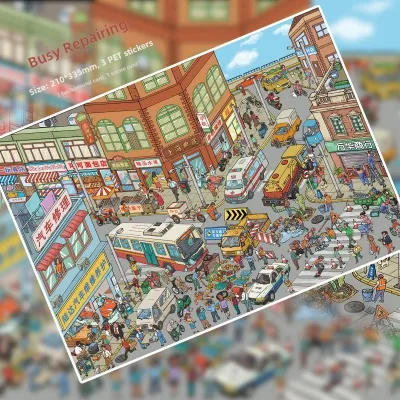
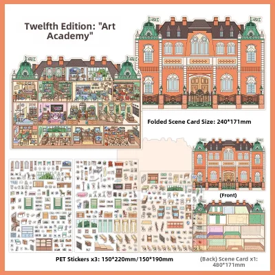
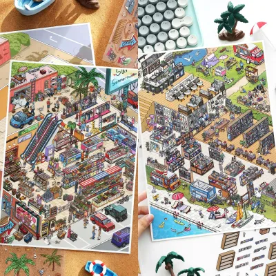
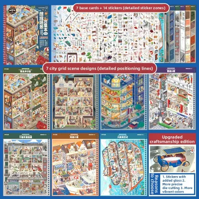
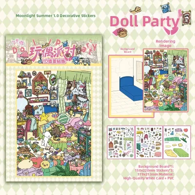
Prices are valid at publication and may change. Please refer to the product page for the latest price.
Establishing this aesthetic baseline saves you money and storage space. In the local stationery community, it is easy to get swept up in buying beautiful sheets from online marketplaces or local craft fairs, only to realize they do not match your journal’s paper color or layout. Knowing your aesthetic keeps your collection curated, functional, and ready to use.
Evaluate Your Layout and Space Preferences
An aesthetic is only as good as its practical application on the page. Your sticker scene choice must respect how you physically write, organize, and design your layouts.

If you prefer white-space heavy layouts, your pages need room to breathe. Look for smaller, delicate, or highly transparent sticker scenes. Clear PET (polyethylene terephthalate) or thin washi stickers are excellent here because they blend seamlessly into the paper fibers without creating thick, distracting edges.
For dense collages and maximalist spreads, you need elements that can hold their own. Large, highly detailed, and opaque paper sticker scenes work best. These allow you to overlap multiple items, build physical texture, and fill the canvas completely without the underlying page showing through.
If your style is functional and grid-based—such as bullet journals with habit trackers, weekly spreads, or budget logs—you require modular sticker scenes. Look for designs that can be easily cropped with a precision pen knife, scaled down, or used as borders. This ensures your decorative elements frame your plans rather than obscuring your writing grid.
Before purchasing, flip through your past journal pages. Note how much space you actually leave for writing versus decorating. This quick audit tells you whether you need flexible, transparent accents or bold, full-page focal points.
Match Sticker Scene Styles to Your Journal Profile
Once you understand your aesthetic and layout preferences, you can easily match them to specific sticker scene styles and application techniques.
Minimalist and Functional Layouts
For clean, organized journals, the goal is to enhance rather than distract. Choose sticker scenes featuring subtle botanical line art, simple geometric shapes, abstract gradients, or muted solid-color blocks. These elements add visual interest without cluttering your daily tasks.
Apply these scenes strategically. Instead of placing a large scene in the center of the page, use them as corner accents, bottom borders, or soft background washes. A single, delicate branch or a muted wash of color at the edge of a weekly spread provides a polished look while keeping your writing area clear.
Pay close attention to adhesive types. For functional journals, low-tack adhesives (like those found on washi-style sticker sheets) are ideal. They allow you to reposition the sticker if your layout needs adjustment, preventing torn pages when plans change.
Vintage and Botanical Collages
If your journal feels like a treasure chest of memories, lean into detailed floral scenes, antique paper textures, old-world maps, and muted earthy tones. These designs add immediate depth and a tactile quality to your pages.
To build a rich collage, use these sticker scenes as your foundational background layers. Do not be afraid to tear the edges of paper-based stickers instead of cutting them cleanly. Tearing exposes the paper fibers, mimicking aged ephemera and making the sticker look integrated into the page.
Opt for matte paper finishes, which blend beautifully with standard journal pages. You can elevate these layouts by choosing scenes that feature subtle metallic or gold foil accents. The contrast between the flat, rustic paper and the gleaming foil creates a stunning, multi-dimensional effect.
Kawaii and Maximalist Spreads
For those who love vibrant, high-energy layouts, choose character-driven, whimsical, or highly saturated sticker scenes. Think pastel dreamscapes, cute animal cafes, or bold fantasy illustrations that turn your page into a mini-storyboard.
These large, opaque sticker scenes are incredibly practical. If you make a mistake while writing, spill ink, or dislike a layout, a bold, opaque sticker scene can instantly cover the error. This saves you from tearing out pages and provides an instant focal point for a new design.
To prevent visual fatigue on these busy pages, balance bright, detailed scenes with solid-color block stickers or simple grid tape. This creates a visual “landing pad” for the eyes, ensuring your cute characters stand out rather than getting lost in a chaotic sea of patterns.
Techniques for Mixing and Layering Sticker Scenes
Creating a cohesive spread using different sticker scenes requires a basic understanding of layering, material compatibility, and pen testing. Without a plan, mixing styles can quickly look chaotic rather than curated.
First, coordinate your color palette. When mixing different sticker sheets, ensure they share at least one or two anchor colors. For example, if you are blending a botanical scene with a vintage map scene, a shared warm beige or olive green tone will instantly tie the two distinct styles together.
Next, introduce contrast through materials and finishes. Layering a matte paper sticker over a semi-translucent washi tape scene creates beautiful tactile depth. You can add a final pop of interest by placing a glossy or holographic die-cut sticker on top. This variation in light reflection prevents the layout from looking flat.
When choosing sticker scenes, consider your writing tools. Matte paper stickers accept most gel pens and fountain pen inks smoothly, whereas glossy or PET plastic sticker scenes require permanent markers or specialized pigment liners to prevent smudging and ensure fast drying times. Always perform a quick ink test on a scrap piece or the edge of the sticker sheet to verify drying speed and bleed resistance.
Establish a clear visual hierarchy. Use subtle, low-contrast, or transparent sticker scenes for your background layers. Save your high-contrast, highly detailed, or opaque die-cut stickers for the foreground. This mimics natural depth, drawing the reader’s eye to the main focal points first.
Finally, consider the physical environment and paper compatibility. In humid tropical climates like the Philippines, paper is naturally more prone to absorbing moisture, which can cause pages to warp when heavy adhesives are applied. Always check your journal’s paper weight and the sticker’s adhesive strength. If you are layering multiple stickers, apply light, even pressure from the center outward to prevent air bubbles and lifting edges.
Frequently Asked Questions (FAQ)
Can I mix different sticker scene styles in one journal spread?
Yes, mixing different styles can look incredibly artistic if you use a unifying element. To do this successfully, stick to a consistent color palette or a shared thematic concept. For instance, you can easily blend a vintage botanical background with a minimalist black-and-white line-art sticker in the foreground. Keeping the line weights or tone values similar ensures the contrasting styles look intentional rather than messy.
What paper weight is best for layering multiple sticker scenes?
When layering multiple sticker scenes, check your journal’s paper weight, measured in GSM (grams per square meter). A heavier paper weight of 120 GSM or above is ideal because it has the structural integrity to handle multiple layers of adhesive without warping, bleeding, or ghosting. If your journal has thinner paper (such as standard 80 GSM pages), stick to lightweight, single-layer washi stickers or highly transparent PET stickers to prevent the pages from buckling under the weight of the adhesive.

Community discussion
Share your experience or ask a question. Comments are reviewed before publication.