
Selecting a ribbon with print requires matching the pattern’s visual weight, color palette, and material texture to the specific tone of your event. A beautifully wrapped gift relies on a harmonious relationship between the wrapping paper and the ribbon, ensuring the decorative accents enhance rather than distract from the presentation. By understanding how different patterns communicate formality, celebration, or professionalism, you can transform a simple package into a thoughtful, cohesive statement.
In tropical climates like the Philippines, where high humidity can affect paper and fabric stiffness, choosing the right ribbon material is just as critical as selecting the pattern itself. Whether you are preparing a delicate wedding token or a robust corporate gift box, verifying how the print interacts with the base fabric ensures your presentation remains pristine from the moment it is wrapped to the final handover.
Evaluating Ribbon Materials and Print Clarity
The base material of your ribbon dictates how clearly a printed pattern will display and how well the ribbon holds its shape. Satin, grosgrain, and organza are the most common options, each offering distinct visual textures and print capabilities. Satin provides a smooth, glossy surface that reflects light beautifully, making it an excellent canvas for fine, high-contrast prints, though its slippery texture requires careful tying to prevent knots from slipping.
Products mentioned in this guide
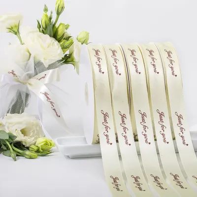
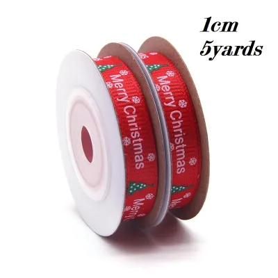
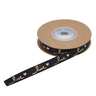
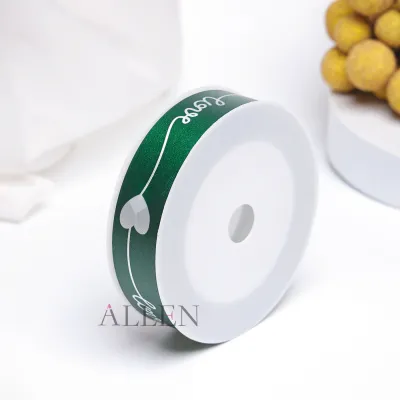
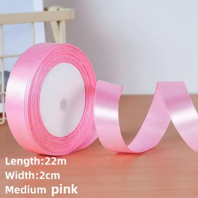
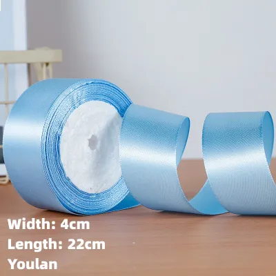
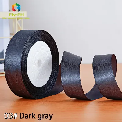
Prices are valid at publication and may change. Please refer to the product page for the latest price.
Grosgrain features a ribbed texture that adds structural integrity and a matte finish to your gift wrapping. Because of its ridged weave, very fine or intricate prints may appear slightly textured or broken up, so bold, geometric, or blocky patterns generally work best on this material. Grosgrain is highly durable and holds structured bows exceptionally well, making it ideal for heavier gift boxes or packages that will be handled frequently.
Organza is a sheer, lightweight fabric that offers a delicate, translucent appearance. Printed patterns on organza often look soft and ethereal because the background is semi-transparent, allowing the wrapping paper underneath to show through. When selecting organza, look for simple, high-contrast prints, as busy or low-contrast designs can easily get lost against patterned wrapping paper.
Before purchasing, check the product labels for material composition and specific handling instructions. Some synthetic blends handle humidity better without drooping, while others might require low-heat ironing to remove creases before wrapping. Verifying these specifications ensures your printed ribbon maintains its structural appeal and crisp pattern definition throughout the gifting process.
Selecting Subtle Prints for Formal and Elegant Events
Formal occasions such as weddings, milestone anniversaries, and upscale galas demand a refined aesthetic where the ribbon complements the gift without competing for attention. For these events, subtle and understated prints are the standard. Patterns like delicate pinstripes, micro-polka dots, or tonal damasks offer a sophisticated touch that whispers elegance rather than shouting for attention.

Color coordination is vital when designing for formal settings. Opt for neutral bases like cream, champagne, soft gray, or classic white, paired with prints in a slightly darker shade of the same color family for a tonal effect. Subtle metallic accents, such as fine gold or silver foil borders, add a touch of luxury without looking gaudy, provided the metallic elements are thin and clean.
Avoid overly bright, cartoonish, or highly cluttered motifs for formal gifts. Large, multi-colored prints or whimsical illustrations can instantly lower the perceived value of an elegant gift and clash with high-quality wrapping paper. Instead, focus on geometric simplicity or classic, historical patterns that have long been associated with high-end presentation.
When wrapping for a formal event, consider the overall texture of the package. A smooth, matte wrapping paper paired with a satin ribbon featuring a delicate, single-color print creates a balanced contrast. This approach ensures that the recipient appreciates the craftsmanship of the packaging, setting a respectful and celebratory tone before the gift is even opened.
Choosing Vibrant and Thematic Patterns for Celebrations
Casual celebrations, birthdays, baby showers, and festive holidays offer the perfect opportunity to experiment with lively, theme-specific printed ribbons. These events thrive on energy and joy, allowing you to select bold motifs that directly reflect the occasion. Florals, bright geometric shapes, and seasonal symbols like stars or balloons instantly signal a festive atmosphere.
To prevent the presentation from looking chaotic, balance the color saturation of your printed ribbon with your wrapping paper. If your wrapping paper features a busy, multi-colored design, choose a ribbon with a simpler, two-tone print that pulls one key color from the paper. Conversely, if you are using plain, solid-colored wrapping paper, a highly vibrant, multi-colored printed ribbon can serve as the primary visual highlight of the package.
Establishing a clear visual hierarchy is essential when mixing multiple patterned elements on a single gift. If both the paper and the ribbon are patterned, ensure their scales differ significantly. For example, pair a large-scale floral wrapping paper with a small-scale, repeating geometric print on the ribbon, or vice versa. This contrast prevents the patterns from blending into a confusing visual blur.
For children’s birthdays or baby showers, playful prints featuring animals, whimsical characters, or soft pastel stripes add a charming touch. When wrapping gifts in warm, humid environments, ensure that any ink used on the ribbon is fully cured and smudge-resistant, especially if the package might be held by excited, warm hands during the celebration.
Navigating Professional and Corporate Gifting Standards
Corporate gifting requires a careful balance between brand representation and professional restraint. Whether you are preparing client appreciation gifts, executive tokens, or employee recognition packages, the printed ribbon should convey respect, quality, and attention to detail. Conservative patterns such as diagonal stripes, subtle plaids, or clean houndstooth designs are excellent choices that remain neutral yet polished.
Many businesses choose to incorporate brand colors or custom logo prints into their ribbon designs. When opting for custom logo ribbons, ensure the logo is scaled appropriately; a repeating logo that is too large can look aggressive and overly commercial, whereas a small, neatly spaced print looks bespoke and elegant. Satin or high-quality grosgrain ribbons in deep navy, forest green, burgundy, or charcoal gray provide an excellent, professional backdrop for corporate branding.
Set clear boundaries against using overly casual, humorous, or highly personal designs in a business context. Whimsical holiday prints or loud, neon patterns can undermine the professional tone of the exchange. The goal is to make the recipient feel valued through a presentation that reflects the high standards of your professional relationship.
Additionally, check the quality of the custom print to ensure there is no bleeding or misalignment in the logo. A poorly printed corporate ribbon can inadvertently signal a lack of care. Inspecting a sample batch before committing to a large order is a practical step to guarantee that your business’s visual identity is represented accurately and professionally.
Practical Techniques for Tying and Displaying Printed Ribbons
The way you tie and arrange your printed ribbon directly affects how well the pattern is displayed. Certain knots and bows can twist the fabric, hiding the printed side or distorting the design. For single-sided printed ribbons, where the pattern is only on one side, classic flat bows or simple band wraps are ideal because they allow you to keep the printed side facing outward at all times.
Multi-loop knots and elaborate pom-pom bows can look spectacular, but they often twist the ribbon repeatedly, exposing the unprinted underside and cluttering the pattern. If you prefer a complex bow style, verify that your ribbon is double-sided or choose a pattern that remains legible even when partially folded. Alternatively, use a simple, clean knot and let the printed tails hang flat along the box to showcase the design.
Proportion is another critical factor to consider. The width of your printed ribbon should match the scale of your gift box. A wide ribbon with a large print will overwhelm a small jewelry box, while a thin, delicate ribbon with a tiny print will get lost on a large shipping or apparel box. As a general guideline, choose ribbon widths that cover roughly one-fifth to one-third of the box’s top surface area.
To minimize severe creasing or folding directly over key pattern elements, handle the ribbon gently during the tying process. Avoid pulling the knots excessively tight, which can pinch and distort the print. If the ribbon has been stored on a tight spool, gently run it over the edge of a clean table or use a low-heat iron—if permitted by the manufacturer’s care label—to flatten it before wrapping, ensuring a smooth, professional finish.
Frequently Asked Questions (FAQ)
Can I use the same printed ribbon for both indoor and outdoor events?
Using the same printed ribbon for both environments depends heavily on the material and print durability. For outdoor events, especially in humid or sunny tropical climates, check the manufacturer’s specifications for water resistance and UV protection to prevent the ink from bleeding or fading. Standard indoor ribbons, particularly those with delicate foil prints or water-soluble inks, can degrade quickly when exposed to direct sunlight, wind, or unexpected moisture, so it is best to reserve delicate fabrics for indoor settings.
How do I prevent the printed pattern from fading over time?
To preserve the color and clarity of your printed ribbons, store them in a cool, dry, and dark place away from direct sunlight and extreme heat. Exposure to UV rays is a primary cause of ink fading and fabric discoloration. Keep your ribbons on their original spools or gently rolled in airtight plastic containers to protect them from dust and humidity, and always follow any specific care and cleaning instructions provided on the product label.

Community discussion
Share your experience or ask a question. Comments are reviewed before publication.