
Achieving a professional, retail-grade gift presentation relies on a deliberate visual relationship between the gift box and its ribbon. When these two elements are mismatched, even a premium gift can look unpolished. To coordinate them successfully, you must balance visual weights, pair contrasting textures, and apply structured color theory. By selecting ribbons that either complement or contrast with the box’s finish—and ensuring the materials can withstand environmental factors like tropical humidity—you can transform a simple package into a memorable, tactile experience.
Core Principles for Pairing Ribbons and Gift Boxes
Texture contrast is the secret to professional gift wrapping. Pairing a smooth, high-gloss satin ribbon with a rough, textured paper box creates a satisfying sensory contrast. Conversely, wrapping a glossy, highly reflective box with a textured grosgrain or matte cotton ribbon grounds the package, preventing it from looking overly slick or cheap. This contrast adds physical and visual depth, ensuring the gift does not look flat under retail or household lighting.
Color coordination follows three main frameworks. A monochromatic approach uses different shades of the same color family (such as a navy box with a sky blue ribbon) to project understated elegance. A complementary scheme pairs opposite colors on the color wheel (like forest green with a warm copper ribbon) for high-impact, vibrant energy. Finally, neutral anchoring pairs a bright, popping ribbon color with a neutral box (like kraft brown, charcoal, or cream), allowing one element to stand out without overwhelming the eyes.
Products mentioned in this guide
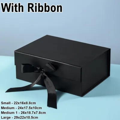
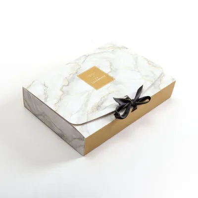
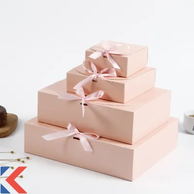
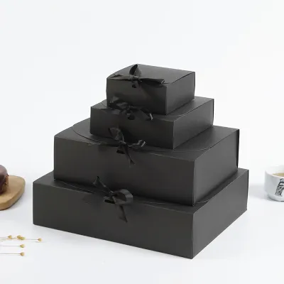
Prices are valid at publication and may change. Please refer to the product page for the latest price.
Proportion rules dictate that ribbon width must scale with the gift box dimensions. For small jewelry-sized boxes under 10 centimeters, a delicate ribbon of 6mm to 9mm maintains elegance without burying the box. Medium boxes benefit from ribbons measuring 25mm to 38mm. Large, heavy boxes or apparel hampers require wide, substantial ribbons of 50mm or more to look balanced and structurally secure. Always verify the physical scale before cutting your spool.
In the tropical climate of the Philippines, high humidity can quickly compromise wrapping materials. Natural fibers like untreated paper ribbons or cheap jute can absorb moisture from the air, causing them to sag, lose their crispness, or warp. Furthermore, high humidity can weaken standard craft glues, causing ribbons to slip. Opting for high-quality polyester satins, wire-edged synthetics, or securing the design with moisture-resistant double-sided adhesive dots ensures the presentation remains pristine from the moment it is wrapped until it is opened.
Recommended Ribbon and Box Combinations by Surface Finish
Matte and Textured Paper Boxes
Matte paper and textured cardstock absorb light rather than reflecting it, giving them a soft, organic, and premium feel. To elevate this understated surface, wrap it with a high-sheen ribbon such as double-faced polyester satin or genuine silk. The light-reflective quality of the ribbon cuts across the flat plane of the matte box, instantly drawing the eye and highlighting the package’s shape.

Alternatively, if you prefer a highly structured and tactile aesthetic, pair textured paper boxes with grosgrain ribbon. Grosgrain features distinct horizontal ridges that run along its length, offering a crisp, ribbed texture. This texture complements the subtle grain of premium textured paper without competing for attention. It is particularly effective for geometric boxes or sharp-edged packages where clean lines are paramount.
When choosing colors for matte surfaces, lean toward rich jewel tones—such as deep emerald, sapphire, or plum—or stark black and white. Because the matte box does not reflect light, these deep, saturated ribbon colors provide a sharp, clean border that defines the box’s edges, making the entire gift look highly tailored and deliberate. Expect to pay around ₱80 to ₱200 for a quality roll of double-faced satin ribbon on local online marketplaces.
Glossy and Metallic Finish Boxes
Glossy and metallic boxes are inherently eye-catching, reflecting light from every angle. To prevent the presentation from looking chaotic or visually overwhelming, you must balance this intense shine with light-absorbing, matte-finish ribbons. Materials like velvet, heavy cotton, or faux suede work beautifully here. They absorb light, creating a visual anchor that grounds the high-shine surface of the box.
A common mistake is pairing high-gloss plastic or metallic ribbons with a metallic box. This creates a harsh, cheap glare where the ribbon and box blend together in a confusing wash of reflection. The lack of contrast makes it difficult to appreciate the shape of the bow or the box itself, resulting in a cluttered look.
Velvet is especially effective for metallic finishes. The deep, plush pile of velvet absorbs light while offering a soft, luxurious touch that contrasts beautifully with the cold, hard feel of metallic paper or tin. This combination is highly favored for premium gifts, cosmetics, and luxury keepsakes, as it appeals to both sight and touch.
Kraft and Natural Fiber Boxes
Kraft paper and unbleached fiber boxes are celebrated for their rustic, eco-friendly, and artisanal charm. To maintain this organic aesthetic, pair them with natural, earthy textures. Burlap, jute twine, or raw-edge cotton ribbons are excellent choices. These materials echo the unrefined, tactile nature of the kraft paper, resulting in a cohesive, grounded look.
To prevent a natural package from looking too plain or washed out, introduce deep, rich colors. Forest green, burgundy, navy blue, or terracotta ribbons create a classic, sophisticated contrast against the warm, earthy brown background of kraft paper. These colors elevate the humble cardboard box into a thoughtful, high-end presentation suitable for artisanal foods, handmade crafts, or personal gifts.
If you want to add a subtle touch of elegance without abandoning the rustic theme, try layering. Wrap the box first with a wide strip of natural burlap, and then tie a thin, gold wire-edged ribbon or a delicate metallic twine directly over it. This introduces a tiny hint of sparkle that catches the light beautifully, making the rustic theme feel polished and festive.
Coordinating Colors for Specific Gifting Themes
Corporate and formal gifts require a restrained, high-contrast color palette that communicates professionalism, reliability, and premium quality. Avoid overly bright or trendy colors unless they align perfectly with a specific brand identity. Instead, rely on classic, authoritative pairings. A deep navy blue box wrapped with a crisp silver satin ribbon, or a matte black box secured with a gold grosgrain ribbon, instantly conveys a sense of high value and prestige. Keep the lines clean and the bows perfectly centered.
For birthdays, weddings, or seasonal holidays, the presentation should evoke excitement, warmth, and joy. This is the perfect opportunity to experiment with bolder, complementary color schemes. Consider pairing a vibrant teal box with a coral or peach ribbon, or a deep plum box with a warm mustard yellow ribbon. If you are wrapping for traditional holidays, use classic festive hues like deep crimson and gold, but ensure the shades are distinct—such as a matte forest green box with a metallic copper ribbon—so the colors do not muddy each other or look generic.
The minimalist approach relies on subtlety, clean lines, and texture rather than dramatic color contrasts. To achieve this modern aesthetic, use a tone-on-tone (monochromatic) color scheme. For example, pair a soft blush pink box with a slightly darker dusty rose satin ribbon, or a light gray box with a charcoal cotton ribbon. Because the colors are closely related, the visual interest comes entirely from the difference in texture between the box and the ribbon. This creates a calm, sophisticated, and highly contemporary look.
Always keep the recipient’s personal preferences or the brand’s corporate colors in mind. If you are wrapping a corporate gift, the ribbon should complement the company’s primary or secondary brand colors without clashing with the box. For personal gifts, selecting a color palette that reflects the recipient’s favorite shades shows an extra layer of thoughtfulness and care.
Layering Techniques and Secure Styling Methods
Layering multiple ribbons is an excellent way to add depth, complexity, and a custom, designer look to your gift boxes. The golden rule of layering is “wide base, narrow top.” Begin by wrapping the box with a wide, solid-colored ribbon (such as a 50mm neutral grosgrain) to act as the foundation. Then, lay a narrower, contrasting ribbon (such as a 15mm metallic or patterned satin ribbon) directly over the center of the base ribbon. Secure them together at the back, and tie them into a single, cohesive bow on top. This technique creates a beautiful framed effect that makes the packaging look professionally styled.
Different ribbon materials behave differently when tied, so you must match your tying technique to the material’s physical properties. Stiff, ribbed grosgrain ribbon holds structured, sharp, and upright bows exceptionally well, making it ideal for clean, modern designs. Fluid, lightweight satin or silk is better suited for elegant, flowing loops that drape gracefully over the sides of the box. Heavy velvet ribbon, however, can become incredibly bulky and messy when tied into complex bows; instead, keep velvet to simple, thick, flat knots with neatly angled tails for a clean, luxurious finish.
One of the most frustrating aspects of gift wrapping is ribbon slippage, especially on glossy, laminated, or metallic gift boxes. To prevent the ribbon from sliding out of place during transport, use discreet, double-sided adhesive dots or specialty wrapping tape. Place a small dot of adhesive on the bottom of the box where the ribbon crosses, and another directly under the bow on top. Avoid using liquid craft glues, hot glue, or school glues; these contain water or heat that can warp the paper box, seep through the ribbon fibers, and leave unsightly, stiff stains.
For beginners, wire-edged ribbons are highly recommended. These ribbons feature thin, flexible wires woven into the edges, allowing you to easily bend, shape, and fluff the loops of your bow. They hold their form securely, preventing the bow from flattening or sagging when the box is stacked or moved, which is especially helpful when dealing with larger gifts or transit in humid environments.
Common Pairing Mistakes and How to Fix Them
Using a heavily patterned ribbon on a loudly printed gift box is a recipe for visual chaos. The two patterns compete for attention, making the package look messy and stressful to look at. To fix this, always pair a patterned box with a solid-colored ribbon. Choose a ribbon color that picks up one of the secondary or accent colors from the box’s print. This ties the entire presentation together, creating a unified and balanced look.
Using a ribbon that is too wide for a small box can overwhelm the package, leaving no room to appreciate the box itself or the gift’s shape. Conversely, a tiny, thin ribbon on a massive box looks cheap and structurally weak. Always match the ribbon scale to the box size. If you have a small jewelry box, stick to narrow, delicate ribbons. If you have a large box, go bold with a wide, substantial ribbon that matches the physical weight of the package.
Smooth ribbons like double-faced satin have very little friction, causing them to slide off smooth, glossy boxes easily. If you do not want to use adhesives, fix this by switching to a ribbon with natural grip, such as grosgrain, cotton, or a textured linen blend. These materials have raised fibers or ridges that cling to the box’s surface, keeping your bow perfectly centered without the need for tape.
A truly polished gift presentation does not stop at the exterior. The ribbon color and style should harmonize with what the recipient sees when they open the box. Ensure the ribbon color does not clash with the tissue paper, shredded paper filler, or the box’s interior lining. For example, if you use a navy blue ribbon on the outside of a white box, consider using navy blue tissue paper or a matching blue insert inside to create a seamless, professional unboxing experience.

Community discussion
Share your experience or ask a question. Comments are reviewed before publication.