
The secret to a beautifully wrapped gift lies in creating a deliberate contrast between your gift wrapper paper and the ribbon. By balancing color temperatures, contrasting surface textures, and scaling the size of your bows to match the dimensions of your box, you can elevate any simple present into a stunning, professional-looking package. Whether you are preparing a gift for a tropical wedding, a local housewarming, or a festive holiday gathering, understanding how these elements interact ensures your presentation looks intentional and polished.
Core Rules for Matching Ribbon Colors and Textures
To create a visually appealing gift, you must first understand how colors interact on a package. Basic color theory offers two primary paths: complementary contrast and analogous coordination. Complementary matching pairs colors from opposite sides of the color wheel, such as a deep forest green paper with a rich red ribbon. This approach creates high visual energy and makes the gift stand out immediately, which is perfect for festive celebrations and birthdays.
Analogous coordination, on the other hand, uses colors that sit next to each other on the color wheel. For example, pairing a soft sage green paper with a pale yellow or teal ribbon creates a soothing, harmonious look. This style works exceptionally well for elegant occasions like weddings or formal corporate gifts. When using analogous colors, try to vary the lightness or darkness of the shades so the ribbon does not completely merge with the paper.
Products mentioned in this guide
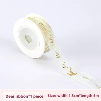
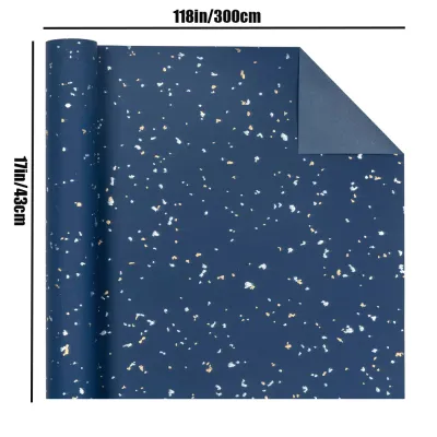
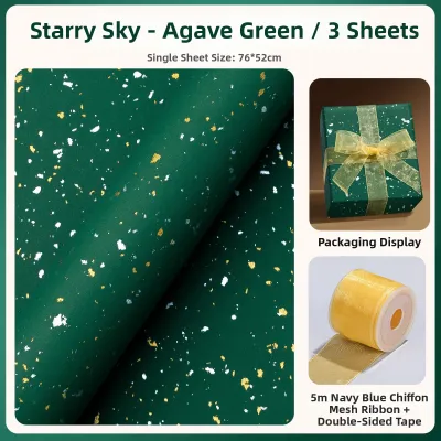
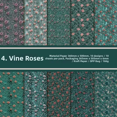
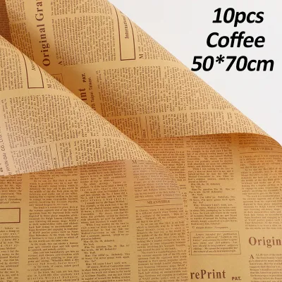
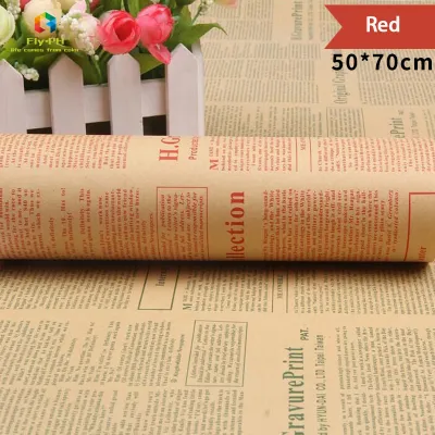
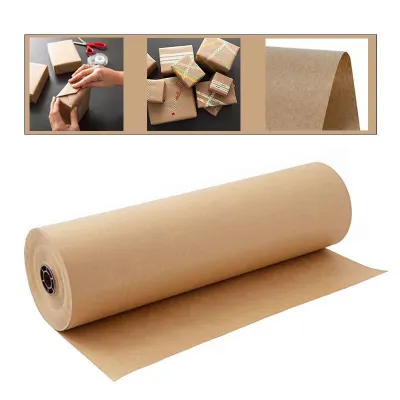

Prices are valid at publication and may change. Please refer to the product page for the latest price.
Pattern scale is another critical factor in achieving visual balance. If your gift wrapper paper features a busy, intricate print—such as dense floral motifs or geometric shapes—your ribbon should act as a visual resting place. Pair heavily patterned papers with solid-colored ribbons or those with a very subtle, single-tone weave. Conversely, if your paper is plain or solid, you have the freedom to use a bolder, patterned ribbon to add interest.
Finally, you must evaluate the visual weight of your materials to ensure the ribbon thickness and bow size are proportionate to the gift box. A tiny jewelry box wrapped in heavy, wide burlap ribbon will look overwhelmed and clumsy. Similarly, a large gift wrapped with a thin, delicate sewing thread will look unfinished. As a general guideline, the width of your ribbon should be roughly proportional to the scale of the box face.
How to Pair Ribbons With Specific Gift Wrapper Paper Finishes
Before you even look at color options, run your fingers over the surface of your chosen gift wrapper paper. The physical finish and reflectivity of the paper dictate how light bounces off the package and how the ribbon will sit against it. Identifying this dominant surface trait is the first step in selecting a compatible ribbon material.

The goal is to use texture contrast to prevent the ribbon and paper from blending into a single flat visual plane. If both the paper and the ribbon have the exact same level of shine or smoothness, the final presentation can look cheap or visually confusing. By pairing matte papers with textured ribbons, or glossy papers with light-absorbing fabrics, you create depth that makes the gift far more inviting to touch.
Kraft and Matte Papers
Uncoated, rustic, or matte papers—such as classic brown kraft paper—possess a flat, non-reflective surface that absorbs light. To elevate these minimalist papers, you should pair them with high-texture ribbons that offer a tactile contrast. Materials like rough jute burlap, plush velvet, or raw-edge cotton ribbon break up the flatness of the paper and add a luxurious, organic feel to the package.
When choosing colors for matte or kraft papers, you can take two distinct directions. Selecting earthy, muted tones like olive green or terracotta enhances the natural, rustic aesthetic of the paper. Alternatively, choosing vibrant, highly saturated colors like royal blue or bright scarlet creates a striking contrast that makes the ribbon pop dramatically against the neutral, understated background.
Glossy and Metallic Papers
Highly reflective, coated, or metallic papers present the opposite challenge, as they bounce a significant amount of light and can easily look overwhelming. To balance this intense shine, choose matte, grosgrain, or woven cotton ribbons. These materials absorb light rather than reflecting it, which anchors the presentation and reduces the harsh visual glare of the shiny paper.
You should generally avoid pairing high-shine metallic or glossy papers with equally reflective plastic or cheap satin ribbons. When shiny surfaces rub against each other, they create visual clutter and can make the entire package look overly synthetic. A ribbed grosgrain ribbon or a soft, matte cotton herringbone tape provides the perfect structural and visual counterweight to a gleaming foil wrap.
Patterned and Printed Papers
When dealing with patterned and printed papers, the key to success is restraint. To choose a ribbon color that feels integrated rather than accidental, look closely at the design and extract a secondary or accent color directly from the pattern. Using this minor color for your ribbon ties the entire presentation together, making it look custom-designed.
To keep the focus on the paper’s design and prevent visual clashing, stick to solid-colored ribbons. If you want to add texture without adding visual noise, look for ribbons with a very subtle, self-colored weave, such as a single-tone herringbone or a delicate grosgrain. This approach maintains the readability of the paper’s motif while still providing a premium, tactile finish.
Layering Ribbon Textures for a Polished Presentation
If you want to elevate your gift wrapping to a professional standard, layering multiple ribbons is an incredibly effective technique. By mixing different ribbon widths, you can build depth and complexity on the face of your gift. Start by laying down a wide, structural ribbon as your base, and then layer a much narrower, delicate accent ribbon directly over the center of it.
This technique also allows you to combine different material properties for both functional and aesthetic benefits. For instance, you can use a stiff, wired ribbon to construct a voluminous, structured bow that will not sag or lose its shape. You can then layer a soft, unwired fabric ribbon—like silk or soft cotton—through the center to create long, elegant, flowing tails that drape beautifully over the sides of the box.
When layering ribbons, securing the knots properly is essential to prevent the smoother ribbon from slipping out of the tighter, more textured base ribbon. Tie the wider, textured base ribbon securely around the box first, pulling the knot taut. When adding the second, smoother layer, thread it directly through the core of the first knot before tying your final bow, ensuring both layers remain locked in place.
Common Pairing Mistakes and Combinations to Avoid
One of the most common mistakes in gift wrapping is pattern clashing, which occurs when you pair a heavily patterned gift wrapper paper with a distinctly patterned or printed ribbon. For example, wrapping a plaid paper with a polka-dot ribbon creates visual chaos that strains the eyes. Unless you are working with a highly specific theme, keep one of the two elements completely solid.
Another critical error is failing to match the structural strength of your ribbon to the durability of your paper. Heavy, thick wired ribbons require a sturdy box and thick paper to hold their shape. If you attempt to use a heavy wired ribbon on delicate, thin tissue paper or easily torn, low-weight wrapping paper, the tension of the ribbon will crush the corners of the box or rip the paper entirely.
Finally, steer clear of low-contrast color combinations that cause the ribbon to visually disappear into the paper background. Pairing a medium-blue ribbon with a medium-blue paper of the same tone results in a flat, uninspired look where the ribbon loses its decorative purpose. Always ensure there is a clear distinction in either value (lightness versus darkness) or texture so that your hard work in tying the bow is clearly visible.
Building Your Step-by-Step Wrapping and Ribbon Plan
To ensure your next gift-wrapping project goes smoothly, follow this practical step-by-step plan before cutting your materials:
First, examine your gift wrapper paper’s dominant color, pattern density, and surface texture. Note whether it is matte, glossy, highly patterned, or solid.
Second, choose a primary ribbon that contrasts with the paper’s texture and complements its color scheme. Ensure the width of this ribbon is proportionate to the size of your gift box.
Third, if you want a more luxurious look, select a narrower, secondary ribbon in a contrasting texture or a coordinating accent color to layer on top.
Fourth, in warm, humid tropical climates, paper can absorb moisture from the air and become slightly soft or prone to tearing. Before wrapping the actual gift, cut a small scrap of your wrapping paper and wrap it around a spare box. Test your ribbon knot tension and visual balance on this scrap to ensure the paper does not tear and the ribbon does not slip.
Fifth, once you are satisfied with the test, wrap your gift box neatly, secure the corners, and tie your chosen ribbon combination with confidence.
Frequently Asked Questions (FAQ)
How do I keep ribbon from slipping on glossy gift wrapper paper?
Glossy and metallic wrapping papers have incredibly smooth, low-friction surfaces that make it easy for ribbons to slide out of place. To prevent this, apply a small piece of double-sided tape directly onto the paper at the exact intersection where the ribbons cross on the bottom and top of the box. Press the ribbon firmly onto the tape to anchor it securely.
Another highly effective method is to create a tight, structural anchor knot using a textured ribbon base, such as grosgrain or cotton, before adding any smoother, decorative top layers. The ribbed texture of the base ribbon naturally grips the corners of the box much better than slippery satin or plastic ribbons, keeping the entire assembly stable and beautifully aligned.

Community discussion
Share your experience or ask a question. Comments are reviewed before publication.