
Selecting the perfect combination of ribbon and gift wrapper can transform a simple present into a stunning work of art. The secret to a beautiful presentation lies in balancing visual weight, coordinating color palettes, and pairing complementary textures. When you match your wrapping materials thoughtfully, you create a cohesive design that shows your recipient how much care went into their gift before they even open it.
Achieving this balance does not require professional training, but it does require an eye for detail. By understanding how colors interact, how different textures feel, and how patterns can either harmonize or clash, you can elevate any standard gift box. Whether you are preparing a rustic parcel or an elegant, glossy package, mastering these pairing principles will ensure your gifts always stand out.
The Basics of Pairing Ribbons and Wrapping Paper
The primary objective of pairing a ribbon with a gift wrapper is to create a balanced, intentional look that enhances the gift rather than overwhelming it. A successful presentation guides the recipient’s eye smoothly across the package. If both the paper and the ribbon are competing for attention, the overall design can quickly look chaotic and unpolished.
Products mentioned in this guide
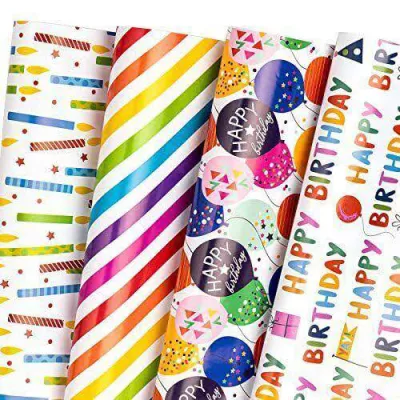
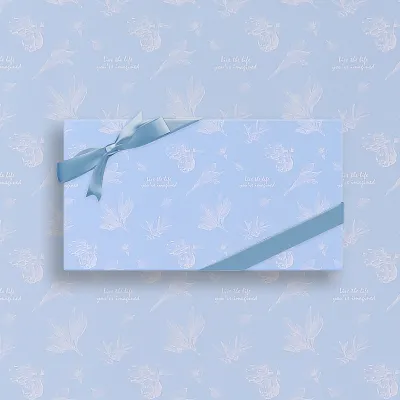
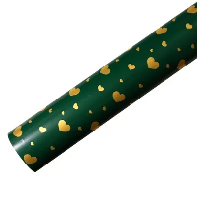
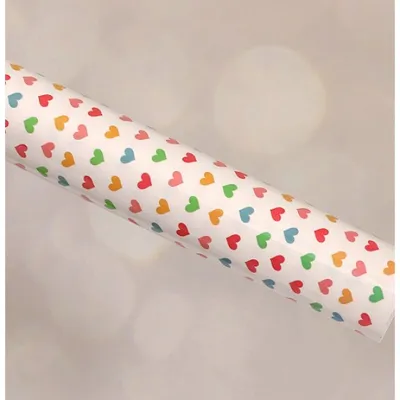
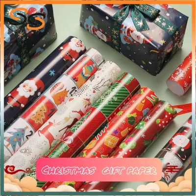

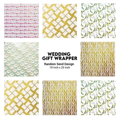
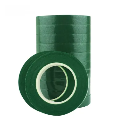
Prices are valid at publication and may change. Please refer to the product page for the latest price.
To prevent this visual competition, you should always follow the “rule of balance.” This rule dictates that busy, highly detailed, or heavily patterned wrapping paper requires a simpler, solid-colored ribbon to anchor the design. Conversely, plain, minimalist, or solid-colored wrapping paper provides the perfect blank canvas for wide, heavily textured, or intricately patterned ribbons that can serve as the focal point.
Your choice of materials should also reflect the occasion, the recipient, and the overall theme of your gift. For example, a rustic wedding gift might call for earthy tones and natural fibers, while a corporate milestone demands crisp lines and sophisticated metallics. In tropical climates like the Philippines, high humidity can cause thin papers to wilt or lose their crispness, making the structural integrity of both your paper and your ribbon choice an important practical consideration.
Matching Ribbon Colors to Wrapping Paper Palettes
Color is the first element the eye registers when looking at a wrapped gift. Applying basic color theory allows you to create intentional emotional responses, whether you want to evoke calm elegance or vibrant energy.

Monochromatic and Analogous Combinations
Monochromatic pairings utilize different shades, tones, or tints of a single color family. This approach is highly sophisticated, foolproof, and naturally pleasing to the eye. To execute this successfully, select a ribbon that is either noticeably lighter or darker than the dominant color of your gift wrapper to ensure there is enough contrast to prevent the ribbon from disappearing.
For example, pairing a deep navy blue wrapping paper with a light, ice-blue satin ribbon creates a striking, elegant contrast. Similarly, wrapping a gift in soft blush pink paper and securing it with a rich rose-gold or peach ribbon adds warmth and depth without introducing clashing colors. This technique works exceptionally well for formal events, weddings, and minimalist presentations.
Analogous combinations use colors that sit next to each other on the color wheel, such as green and yellow, or blue and purple. These pairings offer a bit more variety than monochromatic schemes while maintaining a harmonious, serene feel. Try pairing a forest green wrapping paper with a soft sage or gold-toned ribbon to create a natural, organic palette that feels cohesive and grounded.
Complementary and High-Contrast Pairings
Complementary pairings use colors that sit directly opposite each other on the color wheel. This method creates high-contrast, high-energy presentations that immediately draw attention. Because these combinations are so bold, the key is to manage their intensity so they do not cause visual strain.
Instead of using fully saturated primary colors, which can look harsh, opt for muted, deep, or pastel variations of complementary shades. For instance, pair a deep, earthy green paper with a rich crimson or burgundy ribbon rather than bright green and neon red. If you are using a soft, pale yellow paper, accent it with a muted lavender or plum ribbon to create a cheerful yet refined contrast.
When working with high-contrast pairings, keep the scale of your gift in mind. Smaller packages can easily be overwhelmed by too many contrasting elements, so limit your color palette to two dominant shades. Avoid using overly bright, clashing neon shades together unless you are intentionally aiming for a highly playful, novelty theme for a children’s party.
The Role of Metallics and Neutrals
Metallic and neutral ribbons serve as universal bridges in gift wrapping, making them invaluable tools for handling complex, multi-colored, or highly detailed wrapping papers. They can ground a chaotic design or elevate a simple one with minimal effort.
Metallic ribbons—such as gold, silver, copper, and bronze—add instant luxury to matte or plain papers. When dealing with a busy, multi-colored patterned paper, look closely at the print to see if there are any subtle metallic flecks or warm undertones. Choosing a metallic ribbon that matches those subtle details will instantly tie the entire presentation together.
Neutral tones like cream, charcoal, slate gray, and kraft brown are excellent for softening vibrant, highly saturated wrapping papers. A bright, multi-colored floral paper can be beautifully balanced with a simple cream or charcoal ribbon, which draws the eye to the pattern without competing with it for dominance.
Combining Ribbon Textures with Paper Finishes
While color theory handles the visual aspect of gift wrapping, texture addresses the tactile experience. Combining different physical textures adds physical depth and sensory interest to your package.
Matte and Kraft Papers
Matte and kraft papers have a flat, non-reflective surface that feels organic and down-to-earth. To complement this natural aesthetic, pair them with ribbons made from natural, matte fibers. Jute twine, cotton cord, burlap, or linen ribbons enhance the rustic, tactile appeal of the paper.
These natural textures are highly durable and hold knots exceptionally well, making them ideal for heavier packages. In humid environments, natural fibers like cotton and jute remain stable and slip-resistant, ensuring your bows stay tight and secure during transport.
Glossy and Coated Papers
Glossy, varnished, or laminated wrapping papers have a highly reflective, slick surface. If you pair these papers with equally shiny ribbons, the package can end up looking overly slick, plastic, or cheap. To avoid this, introduce a high-contrast, light-absorbing texture.
Velvet, suede, or raw-edge silk ribbons provide a beautiful matte contrast against glossy paper. The plush, dense texture of velvet absorbs light, creating a stunning visual depth when set against a reflective, shiny background. This combination feels incredibly luxurious and is perfect for holiday gifts.
Textured and Handmade Papers
Handmade, embossed, or heavily textured papers have unique surfaces that you want to highlight, not hide. Because the paper itself is the star of the show, your ribbon should be smooth and sleek to avoid competing with the paper’s physical texture.
Double-faced satin or sheer organza ribbons are excellent choices here. The smooth, glossy finish of satin glides visually over the rough, organic texture of handmade paper, highlighting its unique fibers. Organza, being translucent, allows the texture of the paper underneath to remain visible even where the ribbon is wrapped.
| Paper Finish | Best Compatible Ribbon Textures | Contrasting Ribbon Textures to Avoid |
|---|---|---|
| Kraft / Matte | Jute twine, cotton, burlap, linen, grosgrain | High-shine synthetic satin, metallic foil |
| Glossy / Coated | Velvet, suede, raw-edge silk, matte cotton | High-gloss plastic ribbons, cheap curling ribbon |
| Textured / Handmade | Double-faced satin, sheer organza, fine silk | Coarse burlap, heavy jute, thick cord |
Balancing Patterns: What to Mix and What to Avoid
Mixing patterns requires a careful eye to prevent your gift from looking messy. By establishing clear boundaries between your paper and ribbon designs, you can create a dynamic, professional-looking presentation.
The "One Focal Point" Rule
The most important guideline when dealing with patterns is the “One Focal Point” rule. If your gift wrapper features a loud, large-scale print—such as bold geometric shapes, large tropical florals, or busy holiday illustrations—your ribbon must be solid-colored.
To make this solid ribbon look integrated rather than random, select a color from the paper’s pattern that is not the dominant background color. For example, if your paper is white with large green leaves and small yellow flowers, choose a solid yellow ribbon. This picks up the minor accent color, drawing the design together beautifully.
Mixing Patterns Safely
If you want to challenge yourself by pairing a patterned ribbon with a patterned paper, you must vary the scale of the patterns significantly. Never pair two patterns of the same size, as they will blend together and create visual clutter.
If your wrapping paper features a large, wide-spaced pattern, pair it with a ribbon that has a very small, tight pattern, such as thin pinstripes or tiny polka dots. Ensure that the two patterns share at least one common color to maintain a sense of unity across the package.
Pairing Taboos
There are a few critical combinations you should avoid to keep your presentation looking high-end. First, never pair a busy, multi-colored patterned paper with an equally busy, multi-colored patterned ribbon. This completely destroys any sense of structure.
Second, avoid mixing clashing thematic textures. For example, pairing a rustic, frayed jute twine with a highly modern, glossy metallic foil paper looks mismatched and confusing. Keep your themes consistent: rustic with rustic, and modern luxury with modern luxury.
Step-by-Step Layering and Tying Techniques
Once you have selected your colors and textures, the physical application of the ribbon determines the final quality of your presentation. Proper layering and tying techniques ensure your hard work looks neat and stays secure.
Layering Order
Layering multiple ribbons is a fantastic way to add depth to a gift. Always start with your widest, most textured ribbon as the base layer. This could be a wide band of burlap, linen, or thick grosgrain.
Once the base ribbon is laid flat against the package, center a thinner, smoother, or high-contrast ribbon directly on top of it. A thin metallic gold ribbon layered over a wide, matte navy grosgrain ribbon creates a beautiful, dimensional border that looks incredibly professional.
Tying Methods
Your tying method should match the physical properties of the ribbon material you are using. Stiff, structured ribbons like grosgrain, heavy cotton, or wired-edge ribbons are perfect for creating crisp, voluminous bows that hold their shape.
Soft, flowing ribbons like silk, chiffon, or organza do not have the structural integrity to hold stiff bow loops. Instead, tie these materials into loose, elegant knots with long, cascading tails. Trying to force a soft silk ribbon into a structured bow will only result in a floppy, messy-looking knot.
Securing the Layers
To keep your layered ribbons from slipping or shifting—especially in warm, humid weather where paper can expand and contract—use small pieces of double-sided tape or acid-free glue dots. Place a tiny dot of adhesive directly under the center knot of your base ribbon, and another between the base ribbon and the top layer.
This technique keeps the ribbons perfectly centered and flat without damaging the gift wrapper underneath. Always trim your ribbon tails at an angle or in a clean “V” shape (chevron cut) using sharp fabric scissors to prevent fraying and give the package a polished, completed look.
Frequently Asked Questions (FAQ)
How wide should the ribbon be for standard gift boxes?
The width of your ribbon should scale proportionally with the surface area of your gift box. For small to medium boxes (such as jewelry boxes or book-sized packages), stick to thin ribbons ranging from 3/8 inch to 5/8 inch wide. For larger shirt boxes, deep shipping boxes, or gift hampers, use ribbons that are 1 inch to 1.5 inches wide, or even wider. If the ribbon is too thin, it will look lost on a large package; if it is too wide, it will completely obscure the wrapping paper.
Can I use fabric scraps instead of traditional ribbons?
Yes, fabric scraps like cotton strips, linen remnants, lace trim, or silk bias tape make beautiful, sustainable alternatives to traditional craft ribbons. When using raw fabric scraps, keep in mind that the edges will naturally fray, which can add a lovely, rustic charm to matte or kraft papers. If you prefer a cleaner look, you can fold the edges inward and press them with an iron before tying, or use pinking shears to cut a neat, zigzag edge that resists unraveling.

Community discussion
Share your experience or ask a question. Comments are reviewed before publication.