
Matching ribbons with an assorted design gift wrapper requires balancing the visual weight of the print with the texture, width, and color of the tie. To achieve a professional look, you must identify the dominant elements of the wrapping paper—such as its pattern density, color palette, and surface finish—and select a ribbon that either harmonizes with these features or provides a clean, grounding contrast. By treating the wrapper as the canvas and the ribbon as the defining frame, you can transform any assorted print into a cohesive, beautifully presented gift.
Assessing Your Gift Wrapper Patterns and Visual Weight
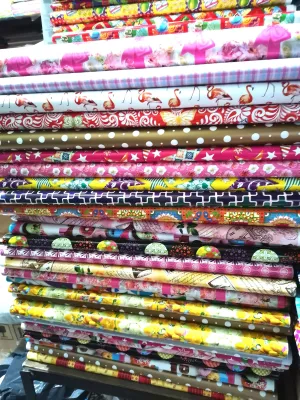
Before reaching for a spool of ribbon, take a moment to analyze the visual density of your gift wrapper assorted design. Wrapping papers generally fall into three categories of pattern density: sparse, medium, or busy. Sparse patterns, such as delicate scattered stars or minimalist sprigs, leave plenty of open space, allowing you to use wider, more elaborate ribbons without overwhelming the design. Medium patterns, like repeating geometric shapes or moderate florals, require a balanced approach where the ribbon complements rather than competes. Busy patterns, such as dense tropical foliage or intricate holiday collages, have high visual weight and are best paired with simpler, solid-colored ribbons that give the eye a place to rest.
Next, examine the color palette printed on the wrapper. Most assorted designs feature a primary background color, one or two dominant pattern colors, and tiny accent colors hidden within the details. Identifying these minor accent colors is the key to a sophisticated presentation, as pulling a subtle shade from the print for your ribbon makes the entire package look custom-designed.
Products mentioned in this guide
![[DKI ENTERPRISES] 20pcs All Occasions Gift Wrapper Assorted Designs (4 to 5 designs in 20pcs)](https://img.lazcdn.com/g/p/c2f00e3f74959ec0bd4bd5262ade0fdf.jpg_400x400q80.jpg_.webp)
![[DKI ENTERPRISES] 20pcs Birthday Gift Wrapper Assorted Designs (4 to 5 designs in 20pcs)](https://img.lazcdn.com/g/p/72eb622ea3041c34d6f16c93818c0dd3.jpg_400x400q80.jpg_.webp)
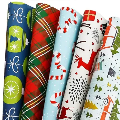
Prices are valid at publication and may change. Please refer to the product page for the latest price.
Finally, evaluate the surface finish of the wrapping paper. Matte papers absorb light and pair beautifully with rich, textured ribbons like velvet or rustic twine. Glossy or metallic papers reflect light, which means they require careful handling; pairing them with highly reflective ribbons can create a distracting glare, whereas pairing them with matte or semi-gloss ribbons creates a pleasing, sophisticated contrast. In humid tropical climates like the Philippines, paper finishes can also affect how ribbons sit; glossy papers may slide easily, making textured or slightly grippy ribbons a more practical choice to keep the wrap secure.
Color Matching Strategies for Printed Wrappers
Selecting the right color combination prevents your gift from looking chaotic, especially when dealing with assorted design wrappers that feature multiple hues. One of the most reliable strategies is the accent-pulling method. Instead of matching your ribbon to the dominant background color of the paper—which often causes the ribbon to disappear visually—look for the smallest, most vibrant accent color in the print. For example, if you are using a tropical leaf print wrapper with a dark green background and tiny pink hibiscus details, a pink satin ribbon will instantly pop and tie the entire look together.

When the wrapping paper is exceptionally colorful or features a highly complex multi-colored pattern, neutral ribbons serve as an excellent grounding element. Classic white, deep black, cream, or natural kraft ribbons can instantly tame a loud print and add an elegant, modern touch. Natural fibers like jute, raffia, or sinamay are particularly effective in the Philippines, as their earthy tones and organic textures beautifully balance bright, festive local prints while resisting the softening effects of high humidity.
For those who prefer a bold, high-contrast aesthetic, basic color wheel principles can guide your selection. Choosing a ribbon in a complementary color—directly opposite the wrapper’s dominant color on the color wheel—creates a vibrant, energetic look. If your wrapper is primarily a deep blue, a warm copper or gold metallic ribbon will create a striking contrast that feels celebratory and intentional. When using high-contrast pairings, keep the ribbon style clean and solid to avoid visual clutter.
Choosing Ribbon Textures and Widths for Balance
The physical dimensions of your ribbon—both its width and its material texture—must scale proportionally with both the gift box and the pattern on the wrapper. As a general rule, large boxes with oversized prints demand wider ribbons, typically 1.5 inches to 2 inches or more, to maintain visual balance. Conversely, a small jewelry box wrapped in a delicate, micro-print paper requires a narrow ribbon, such as a 1/4-inch or 3/8-inch tie, so the wrapping design is not completely obscured.
Texture contrast is another powerful tool for elevating your gift presentation. If your gift wrapper assorted design features a smooth, flat matte finish, pairing it with a highly textured ribbon like grosgrain, cotton herringbone, or velvet creates a tactile contrast that invites touch. If the paper is highly textured or embossed, a smooth, glossy double-faced satin ribbon provides a sleek, elegant counterpoint.
Structural needs should also dictate your ribbon choice. Wired-edge ribbons are ideal for creating large, voluminous bows that hold their shape over time, making them perfect for structured boxes or gifts that need to travel. However, if you are wrapping a soft package or prefer a minimalist, modern look, soft fabrics like chiffon, silk, or lightweight cotton tie into beautiful, flat knots and soft, cascading bows that drape naturally without adding unnecessary bulk.
Common Pairing Mistakes to Avoid
One of the most frequent mistakes when styling assorted design wrappers is overpowering a delicate or vintage print with a ribbon that is too heavy, stiff, or brightly colored. A soft, pastel watercolor floral print will lose its charm if bound by a thick, neon-colored plastic ribbon. Always match the mood and weight of the ribbon to the character of the print.
Another common error is clashing finishes. While mixing textures is encouraged, pairing a highly reflective holographic ribbon with a busy, multi-colored metallic wrapper can create visual chaos that looks cheap rather than festive. If your paper is metallic, opt for a matte fabric ribbon to ground the shine, or use a very simple, thin metallic cord in a matching metal tone.
Lastly, ignore the temptation to use the same ribbon style for every occasion. A rustic jute twine might look wonderful on a kraft-based botanical print for a casual birthday, but it can feel out of place on a sleek, geometric print intended for a formal corporate event or a milestone anniversary. Consider the recipient and the setting to ensure your ribbon choice enhances the overall sentiment of the gift.
Step-by-Step Wrapping and Tying Sequence
To ensure your carefully selected ribbon and wrapper combination looks flawless, follow a structured wrapping and tying sequence. Start by measuring and cutting your wrapping paper precisely. Excess paper leads to bulky, uneven folds that distort the pattern’s alignment, especially along the seams. Secure the paper tightly with double-sided tape for a clean, seamless finish that does not distract from the print.
Next, decide on the ribbon’s placement. You can align the ribbon to run parallel to the pattern’s natural visual grain, or cross it perpendicularly to create a structured, geometric frame. For busy patterns, a single off-center band of ribbon often looks cleaner and more modern than a traditional cross-tie. Lay the ribbon flat against the box, ensuring there are no twists on the underside of the package.
Finally, execute your knot or bow based on the ribbon’s material properties. For stiff or wired ribbons, tie a classic bow and gently fluff the loops to create volume. For soft, slippery ribbons like satin, tie a secure square knot first before forming the loops to prevent the bow from sagging or coming undone. Trim the ribbon tails at a sharp 45-degree angle or fold them in half to cut a classic V-shape chevron end, which prevents fraying and adds a professional, polished touch to your presentation.
Frequently Asked Questions (FAQ)
Can I Use Patterned Ribbon with Patterned Gift Wrapper?
Yes, you can combine patterned ribbons with patterned wrappers, but it requires a deliberate contrast in scale. If your gift wrapper assorted design features a large-scale floral or geometric print, pair it with a micro-patterned ribbon, such as thin stripes or tiny polka dots. To keep the presentation cohesive, ensure the background color of the ribbon matches one of the secondary colors in the wrapping paper, and keep the ribbon width relatively narrow so the two patterns do not compete for dominance.
What Is the Best Ribbon for Odd-Shaped Gifts with Printed Paper?
For odd-shaped gifts wrapped in printed paper, flexible yet supportive ribbons work best. Wired-edge ribbons are highly recommended because they can be molded around unusual contours and help hold the wrapping paper taut. If the item is heavy or highly irregular, consider using a wider grosgrain ribbon for its grip and strength, or employ a crisscross net-style tying method that secures the paper at multiple points without completely covering the printed design.

Community discussion
Share your experience or ask a question. Comments are reviewed before publication.