
Vintage journal stickers offer an accessible gateway into the world of creative scrapbooking, allowing you to transform ordinary notebook pages into nostalgic, visually rich layouts. For beginners, the key to mastering this aesthetic lies in understanding how to layer these delicate designs, balance colors, and pair them with complementary stationery elements. By learning a few fundamental techniques, you can confidently build cohesive spreads that tell a story without overwhelming your pages.
Working with vintage-style stickers is more than just peeling and pasting; it is an exercise in composition and texture. Whether you are documenting daily memories, planning your week, or simply enjoying the tactile process of paper crafting, a thoughtful approach to layout design will elevate your work. With the right tools and a bit of patience, you can turn any blank journal into a personalized work of art.
Gather the Right Tools and Materials for Vintage Scrapbooking
Before diving into sticker placement, assembling the proper toolkit ensures your journaling experience is smooth and your pages remain pristine. The foundation of any good scrapbook layout is the paper itself. In warm, humid tropical climates like the Philippines, paper is highly susceptible to absorbing moisture from the air, which can cause pages to warp or buckle when adhesives are applied. To prevent this, select journals with a paper weight of at least 100 gsm (grams per square meter), though 120 gsm to 160 gsm is highly recommended if you plan to combine stickers with wet mediums like fountain pen inks, stamps, or light watercolor washes.
Products mentioned in this guide
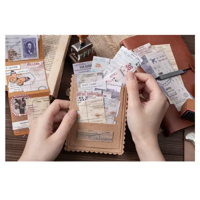
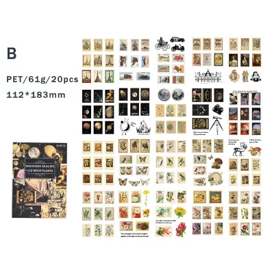
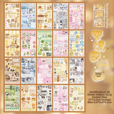
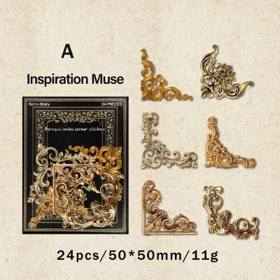
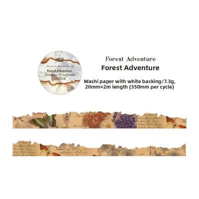
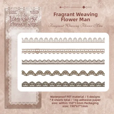
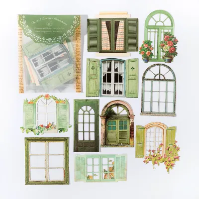
Prices are valid at publication and may change. Please refer to the product page for the latest price.
Vintage journal stickers are manufactured from several different materials, each offering a distinct visual finish and requiring specific handling. Washi paper stickers are translucent and matte, blending seamlessly into the page to mimic printed designs, but they can sometimes show dark lines or text underneath them. Matte paper stickers are opaque and excellent for covering up mistakes or grid lines, while clear PET (polyethylene terephthalate) plastic stickers offer high durability and water resistance, making them ideal for outer covers or high-contact pages. Understanding these material differences helps you choose the right sticker for each layer of your layout.
While many vintage stickers are self-adhesive, you will often want to incorporate non-adhesive ephemera like torn book pages, ticket stubs, or kraft paper scraps. For these elements, a high-quality, acid-free double-sided tape runner is the most reliable choice, as it provides a flat, dry bond without the wrinkling risks associated with liquid school glues. Additionally, keep a pair of fine-tipped tweezers nearby; they are invaluable for positioning tiny stickers precisely and keeping natural finger oils off the adhesive backing, which can degrade the stickiness over time.
To complete the vintage aesthetic, gather a few complementary embellishments that support the antique theme. Muted washi tapes in sepia, olive green, dusty rose, or slate gray tones work beautifully as borders or anchoring strips. Wooden rubber stamps featuring botanical prints, cursive script, or postmarks can be used with waterproof archival ink pads to add depth to the background. Always test your inks and adhesives on a spare page at the back of your journal first to verify drying speed, bleed resistance, and compatibility with your specific paper type.
Step-by-Step Techniques for Arranging and Applying Stickers
Creating a balanced vintage layout requires a structured approach to planning before any adhesive is permanently committed to the page. Begin by working on a dry layout, which means arranging your stickers, paper scraps, and ephemera on the blank page with their backings still intact. This trial phase allows you to experiment with different compositions, move elements around freely, and identify your primary focal point. A focal point is the visual anchor of your page—such as a large botanical sticker, a vintage portrait, or an antique clock illustration—and it is typically placed slightly off-center to create a more dynamic and engaging composition.

Once your focal point is established, you can begin building depth through layering. Start from the background and work your way forward. Place larger, flatter elements first, such as a piece of torn grid paper, a snippet of a vintage music sheet, or a wide strip of neutral-toned washi tape. Next, layer your medium-sized vintage journal stickers over these background elements, letting them overlap slightly. This overlapping technique is crucial because it visually connects the separate pieces, making them look like a curated collage rather than isolated stickers floating aimlessly on a blank page.
As you layer, pay close attention to the balance of negative space, which refers to the empty areas of your journal page. It is a common beginner mistake to fill every square inch of paper, but leaving thirty to forty percent of the page blank or minimally decorated is essential. Negative space gives the viewer’s eyes a place to rest, highlights your sticker arrangements, and provides clean areas for your actual written journal entries. If you are using a lined or dot-grid journal, let the natural pattern of the paper show through in these empty zones to maintain a clean, organized look.
When you are satisfied with your dry arrangement, take a quick photo of the page with your smartphone to serve as a visual reference. Carefully peel the backing off each sticker, starting with the bottom-most layers first. Use your tweezers to lower the sticker gently onto the page. To prevent air bubbles, creases, and wrinkles, press down firmly starting from the center of the sticker and smooth it outward toward the edges using a clean finger, a soft cloth, or a plastic bone folder. In humid conditions, ensure your hands are completely dry, as moisture can weaken the initial tack of the adhesive and cause the edges of paper stickers to curl.
Build Cohesive Layouts and Vintage Themes
Achieving a professional-looking vintage spread relies heavily on a disciplined color palette. The classic vintage aesthetic is defined by warm, muted, and desaturated tones. When selecting stickers for a specific layout, try to limit your color scheme to three or four coordinating colors, such as cream, sepia, sage green, and dusty gold. If you want to introduce a pop of color, opt for a rich, faded tone like burgundy or navy blue rather than a bright neon. Keeping your colors consistent across the left and right pages of a double-page spread instantly unifies the layout and makes it feel cohesive.
To make your scrapbook pages feel personal and lived-in, integrate your vintage journal stickers with handwritten text and authentic ephemera. You can write your thoughts directly onto the page, letting the text wrap naturally around the contours of your stickers, or write on separate pieces of tea-stained paper and tuck them underneath the sticker borders. If you use fountain pens or gel pens, verify that the ink is fully dry before placing translucent washi stickers over the writing, as some inks can smudge or bleed when trapped beneath plastic or wax-coated surfaces.
Creating a natural visual flow is another effective way to guide the reader’s eye across your journal spread. A reliable design technique is the diagonal flow, where you place your main decorative clusters in the top-left corner of the left page and the bottom-right corner of the right page. You can then use smaller, delicate stickers—such as tiny butterflies, falling leaves, postage stamps, or faux wax seals—as visual breadcrumbs that lead the eye along this diagonal path. This movement makes the entire double-page spread feel like a single, continuous canvas.
Finally, adapt your layout style to match the physical dimensions and binding of your notebook. If you are working in a compact A6 journal, focus on minimalist arrangements with small, delicate stickers to avoid overcrowding the limited space. For larger A5 or traveler’s notebooks, you have the freedom to create more elaborate, multi-layered collages. Be mindful of the notebook’s spine or rings; keep thick stickers and heavy paper layers slightly away from the center crease so that the journal can close flat without straining the binding or causing the inner edges of your stickers to peel over time.
Avoid Common Beginner Mistakes in Sticker Placement
As you begin experimenting with vintage scrapbooking, being aware of common pitfalls can save you time and protect your materials. One of the most frequent errors is overcrowding the page by using too many highly detailed stickers in a single layout. When a botanical print, a retro advertisement, a piece of sheet music, and a vintage portrait are all competing for attention, the page becomes visually exhausting. To correct this, select just one or two complex stickers to act as your main subjects, and use simpler, solid-colored paper scraps or neutral washi tapes to support them.
Another common issue is adhesive failure, where stickers begin to peel or curl at the edges shortly after application. This is often caused by ignoring the texture of your journal paper or failing to properly prep the surface. Heavily textured papers, such as cold-press watercolor paper, have microscopic ridges that prevent standard sticker adhesives from making full contact. If you are working on textured paper, reinforce your stickers by applying a thin, even layer of an acid-free glue stick to the back before pressing them down. Additionally, ensure the paper is completely free of dust, eraser shavings, and hand oils before application.
Clashing with the underlying page design can also disrupt the vintage aesthetic. Dark, prominent blue or black lines in standard notebooks can show through translucent washi stickers, making the layout look messy and disorganized. To solve this, you can create a solid base layer using a piece of blank kraft paper, a vintage book page, or an opaque cream-colored sticker sheet to block out the lines entirely before placing your delicate, translucent stickers on top. This simple step keeps your designs looking clean and intentional.
Store and Protect Your Vintage Sticker Collection
Proper storage is essential for maintaining the quality of your vintage journal stickers, especially in tropical regions where high humidity and heat can degrade adhesives and ruin paper products. Exposure to moisture can cause sticker backings to curl, make sheets stick together prematurely, or cause the printed designs to fade and discolor. To protect your collection, store your stickers in a cool, dry place away from direct sunlight. Avoid keeping them in damp basements, near open windows, or in non-ventilated plastic boxes that can trap ambient moisture.
An organized storage system not only protects your stickers but also makes your creative sessions much more efficient. Consider using a multi-pocket sticker book with silicone-coated release paper, which allows you to store and peel stickers easily. Alternatively, a binder with clear plastic pocket sleeves is excellent for organizing loose sticker sheets and die-cuts by theme (such as botanicals, celestial, retro ephemera, or vintage tickets) or by color palette. This visual setup allows you to quickly flip through your collection and find the perfect element for your next layout.
When handling delicate or older sticker sheets, take extra care to prevent tearing. Some vintage-style paper stickers can be thin and fragile, making them prone to ripping if peeled too quickly. Always use clean, dry hands, and use your fine-tipped tweezers to gently lift the sticker from its backing sheet, starting from a sturdy corner. If you have completed a journal page with thick, dimensional stickers or heavy ephemera, place a sheet of wax paper or glassine paper between the pages when closing the book to prevent the elements from sticking to the opposite page or transferring ink over time.
Frequently Asked Questions (FAQ)
How can I adapt physical vintage stickers for digital journaling?
To digitize your physical vintage stickers for use in digital journaling applications, place the stickers flat on a well-lit surface and take a high-resolution photograph, or use a flatbed scanner for the cleanest results. Import the image into a photo editing application or a dedicated background-removal tool to isolate the sticker design from its backing. Save the edited image as a PNG file with a transparent background. You can then organize these digital files into folders on your tablet or computer, making them easy to import into your digital planning or journaling app whenever you want to create a digital vintage layout.
How do I safely remove a misplaced sticker without tearing the page?
Removing a misplaced sticker requires patience and a gentle touch to avoid damaging the underlying journal paper. Slide a thin, flexible tool, such as a sticker lifting tool, a metal palette knife, or a clean fingernail, slowly under the edge of the sticker. Gently lift the sticker while pulling it back flat against itself at a sharp angle, rather than pulling straight up. If the adhesive is strong, you can apply mild heat from a hair dryer on its lowest setting for a few seconds to soften the glue before lifting. If the paper begins to tear, stop immediately; you can easily cover the mistake by layering another sticker or a piece of decorative paper directly over the spot.

Community discussion
Share your experience or ask a question. Comments are reviewed before publication.