
A beautifully arranged bouquet relies on the harmony between its blooms, the wrapping paper, and the ribbon that binds them. While the flowers are the main attraction, the wrapping paper and ribbon frame the entire presentation. Choosing the wrong combination can make an expensive arrangement look disorganized, while a thoughtful pairing elevates even simple garden blooms into a professional-grade gift.
In the warm, humid climate of the Philippines, selecting the right materials is also a practical decision. High humidity can cause certain papers to lose their crispness, and condensation from cold-stored stems can make some ribbons limp or cause their dyes to bleed. Understanding how to balance colors, textures, and weights ensures your floral presentations remain secure and visually striking from the florist’s table to the recipient’s hands.
Core Principles of Pairing Ribbons and Wrapping Paper
Before selecting specific materials, it helps to understand the foundational rules of visual balance. Color theory is your first tool. You can choose a monochromatic scheme, which uses different shades of the same color family, such as pairing a blush pink paper with a deep rose ribbon. This approach creates a soft, romantic, and cohesive look that does not compete with the flowers.
Products mentioned in this guide
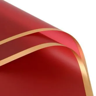
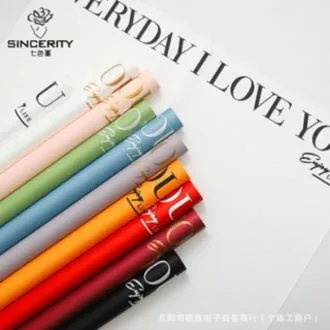
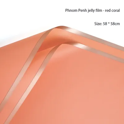
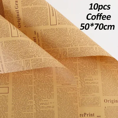
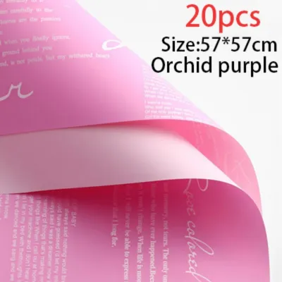
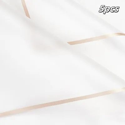
Prices are valid at publication and may change. Please refer to the product page for the latest price.
Alternatively, a contrasting color scheme uses complementary colors to make the bouquet pop. For example, pairing a deep forest green paper with a warm gold or cream ribbon creates a striking, high-impact frame. When using contrast, ensure one color remains dominant while the other serves as a clear accent to avoid visual confusion.
Texture interplay is equally important for creating visual depth. As a general rule, contrast your textures. If your wrapping paper is highly textured or completely matte, a smooth, slightly lustrous ribbon provides a pleasing counterpoint. If the paper is glossy or translucent, an opaque, textured ribbon helps anchor the design.
Proportional guidelines dictate that your ribbon width must match the scale of the bouquet. A massive, multi-layered bouquet wrapped in thick paper requires a wide ribbon, typically 1.5 to 2 inches, to look balanced. Conversely, a single-stem or minimalist wrap looks best with a delicate, narrow ribbon of 1/4 to 1/2 inch, or even a simple, clean cord.
Matching Ribbons with Kraft and Rustic Wrapping Paper
Kraft paper has a tactile, organic, and unrefined quality that has become a staple in modern floral design. To complement this rustic charm, choose ribbons made from natural fibers. Woven cotton, jute, burlap, or raw-edge linen ribbons work beautifully because they mirror the earthy, matte texture of the paper.

When it comes to color strategies, earth tones are an effortless choice. Olive green, terracotta, mustard yellow, and warm brown ribbons enhance the natural, forest-like aesthetic of kraft paper. These colors work particularly well for autumn-themed arrangements or rustic wildflower bouquets.
For a clean, modern contrast, a crisp white or cream cotton ribbon stands out sharply against the tan background of kraft paper. If you want a dramatic, festive look, deep jewel tones like burgundy, navy blue, or emerald green provide a rich, sophisticated contrast that elevates the humble paper into something elegant.
Avoid highly reflective, stiff synthetic ribbons when working with rustic papers. Cheap plastic curling ribbons or ultra-shiny metallic foils visually clash with the organic, understated aesthetic of kraft paper. These combinations often look disjointed and strip the arrangement of its natural appeal.
Pairing Ribbons with Cellophane and Glossy Paper
Cellophane and high-shine glossy papers are lightweight, highly reflective, and often completely transparent. Because these papers lack visual weight, they require a ribbon that offers a strong physical and visual anchor at the binding point. Opaque, solid ribbons are essential here.
Heavy satin, plush velvet, or ribbed grosgrain ribbons are excellent choices for glossy wraps. The dense weave of grosgrain or the deep texture of velvet cuts through the reflection of the cellophane, drawing the eye to the center of the bouquet and creating a clear focal point.
Because cellophane is highly reflective, subtle pastel ribbons can easily get lost in the glare. Opt for bold, high-contrast colors instead. Classic black, deep navy, or stark white ribbons create sharp, readable silhouettes. Metallic-edged ribbons can also work, provided the core of the ribbon is solid and opaque.
Avoid thin, flimsy ribbons when working with cellophane. The springy, voluminous nature of gathered cellophane requires a wider ribbon, at least 1 to 1.5 inches, to compress the wrap securely. A thin ribbon will look choked and lost amidst the shiny, crinkled folds of the plastic.
Styling Ribbons for Korean-Style and Matte Wrapping Paper
Korean-style wrapping paper is famous for its soft, waterproof matte finish and elegant, multi-layered folds. This style is highly popular for its delicate, cloud-like appearance. To match this aesthetic, choose ribbons that drape gracefully and flow naturally.
Chiffon, sheer organza, and fine silk ribbons are ideal for matte papers. These lightweight materials mimic the soft, airy layers of the paper itself. When the breeze catches the long, delicate tails of a chiffon ribbon, it adds a sense of movement and romance to the bouquet.
This styling method thrives on low-saturation, sophisticated color palettes. Coordinate your wraps with pastel tones, dusty rose, sage green, lavender, or cream. Tonal gradients, where the ribbon is just a shade lighter or darker than the paper, create a seamless, high-end look that feels incredibly curated.
When tying bows on layered matte paper, avoid pulling the knot so tight that it crushes the delicate folds of the paper. Use loose, flowing bow styles with long, cascading tails. The long tails complement the elongated, asymmetrical drapes characteristic of Korean-style floral presentations.
Common Pairing Mistakes and How to Avoid Them
One of the most common mistakes is ignoring how materials interact physically. Tying rough, abrasive jute twine around delicate tissue paper or soft matte sheets can easily tear the paper during the tying process. Always match the toughness of your ribbon to the durability of your paper.
Another frequent error is pattern overload. If you are using a wrapping paper with a busy floral or geometric print, pairing it with a patterned or multi-colored ribbon creates visual chaos. Keep it simple: pair patterned paper with a solid, neutral ribbon, and save your patterned ribbons for plain, solid-colored wraps.
Proportion errors can also ruin the balance of an otherwise beautiful bouquet. Tying a tiny, narrow ribbon around a massive, heavy bouquet makes the arrangement look top-heavy and structurally weak. Conversely, a massive, thick velvet bow on a single-rose wrap suffocates the flower. Always step back and evaluate the overall scale before cutting your ribbon.
Finally, always consider the moisture factor. Because bouquets often involve wet stems, cheap ribbon dyes can bleed when they come into contact with water, ruining light-colored wrapping paper. Before assembling your bouquet, perform a quick water-bleed test by pressing a damp white cloth against a small piece of the ribbon to ensure the color is stable.
Frequently Asked Questions (FAQ)
Can I use one versatile ribbon for all wrapping paper types?
While no single ribbon is perfect for every scenario, a high-quality double-faced satin or a fine grosgrain ribbon in a neutral tone like cream, champagne, or soft gray is the most versatile option. These materials offer a clean balance of structure and sheen that can adapt to both rustic kraft and elegant matte papers. However, they may still look slightly out of place on highly textured rustic burlap wraps or ultra-modern, completely transparent cellophane, where specialized textures are needed to achieve the best visual balance.
How do I keep ribbon from slipping on glossy or cellophane paper?
Glossy papers and cellophane have very low surface friction, causing ribbons to slide down the stem bundle easily. To prevent this, tie your initial knot tightly around the gathered base of the stems before wrapping, or use a small strip of double-sided tape hidden beneath the paper fold to anchor the ribbon in place. Another effective method is to wrap a thin layer of textured paper or floral tape around the binding point first, creating a high-friction foundation that grips the ribbon securely without requiring harsh adhesives.

Community discussion
Share your experience or ask a question. Comments are reviewed before publication.