
The choice between MD Notebook cream and white paper ultimately depends on your primary writing instruments, your sensitivity to visual glare, and how you plan to use the notebook. If you frequently use fountain pens, write for long hours under bright lights, or prefer a classic aesthetic for journaling, the cream variant is generally the more comfortable choice. Conversely, if you need high contrast for digital scanning, use fine-liners for detailed diagrams, or prefer a modern, crisp look, the white variant will serve you better. Because paper performance relies heavily on specific ink and nib combinations, use the following comparison to align the paper tone with your daily workflow and verify compatibility before committing to a full-sized notebook.
Core Differences in Paper Tone and Finish
When choosing between these two variants, the most immediate distinction is their visual tone. The cream paper features a warm, soft, off-white hue that feels organic and classic. This tone is designed to be gentle on the eyes, mimicking the look of traditional book pages. In contrast, the white variant offers a crisp, bright, and clean appearance that feels distinctly modern and minimalist. This stark white background provides a neutral canvas where colors appear exactly as formulated by the ink manufacturer, without the warm shift introduced by cream-colored fibers.
Despite the difference in color, both variants share the core design principles that define the MD Notebook line. Regardless of the paper tone you choose, you will experience the same iconic minimalist aesthetic, characterized by a cheesecloth-reinforced spine, thread-sewn binding that allows the notebook to lie completely flat, and a simple paper cover. This thread-sewn construction is highly valued by writers because it eliminates the annoying bump in the middle of the notebook, ensuring a smooth writing surface from the left margin to the right.
Products mentioned in this guide
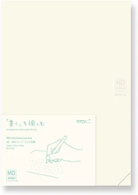
![MD Lined Notebook [A5]](https://img.lazcdn.com/g/p/f1d876af42e163099c1d64319e993db9.png_400x400q80.png_.webp)
![MD Notebook Cotton [A5]](https://img.lazcdn.com/g/p/76ba7b56fa92ccc9b0d8f04f77808bb3.png_400x400q80.png_.webp)
![MD Notebook Cotton [A5 Square]](https://img.lazcdn.com/g/p/9586073ebb3ad41d0974aa43514fde8d.png_400x400q80.png_.webp)
![MD Blank Notebook [A5]](https://img.lazcdn.com/g/p/db6bf65d85a48bb454a4c9daf1ec9891.png_400x400q80.png_.webp)
![MD Dotted Grid Notebook [A5]](https://img.lazcdn.com/g/p/62371ab8670f8d22ae56b425ecf06ee5.png_400x400q80.png_.webp)
Prices are valid at publication and may change. Please refer to the product page for the latest price.
However, do not assume that paper color dictates other physical properties like thickness or bleed resistance. It is essential to check the specific product label or manufacturer description for the exact paper weight, typically measured in grams per square meter (GSM). The paper’s thickness and surface sizing—the chemical treatment applied during manufacturing to control ink absorption—are what ultimately dictate ink bleed-through and feathering. These performance factors operate independently of the paper’s dye or tone, meaning a heavier weight or a more heavily sized sheet will always resist wet inks better, regardless of whether it is cream or white.
Matching Your Pens and Inks to the Paper
Fountain Pens and Wet Inks
Fountain pen users often gravitate toward cream paper because its warm background complements classic ink colors, such as deep blues, forest greens, and rich sepia tones. The warm undertone of the paper softens the edges of the ink, giving the handwriting a classic, archival appearance. However, because fountain pen inks vary wildly in their water content and dye concentration, you must verify dry times and check for feathering based on your specific ink saturation and nib size. A very wet, broad nib paired with a highly saturated ink may behave differently on cream paper than a fine nib paired with a dry ink.

In humid environments, such as during the tropical rainy season in the Philippines, paper fibers naturally absorb ambient moisture from the air, which can slightly prolong drying times and increase the risk of feathering. Performing a small test stroke on an inconspicuous page corner is an excellent way to verify how your specific pen and ink combination will behave. This simple trial helps you determine if you need to adjust your writing speed or switch to a drier ink formula to maintain clean lines.
Gel, Rollerball, and Ballpoint Pens
If your daily writing kit consists primarily of gel pens, rollerballs, or fine ballpoints, the white paper variant offers a highly satisfying experience. The crisp, neutral background provides a high-contrast canvas that makes modern gel inks visually pop. Vibrant colors like red, purple, turquoise, and bright green retain their true hue without being dulled or shifted by a warm background.
However, the smooth finish of high-quality paper can sometimes affect how quickly these inks dry and how the pen tip grips the surface. Some gel and rollerball inks rely on rapid absorption to prevent smudging; on highly finished paper, the ink may sit on the surface a fraction of a second longer. If you are left-handed or write quickly, verify the drying speed of your favorite gel pen on a sample sheet to avoid accidental smearing.
Markers and Highlighters
Using markers, brush pens, or highlighters for color-coding and bullet journaling requires careful consideration of paper limits. Heavy ink loads from water-based markers or alcohol-based art pens carry a high risk of bleed-through, where the ink penetrates completely to the reverse side of the sheet. Neither the cream nor the white variant is inherently designed to block heavy marker bleed-through on its own, as this resistance depends entirely on the paper’s density and sizing.
To protect your notebook from unsightly bleed-through, always test your highlighters on a single back page or check the manufacturer’s compatibility guidelines. If you plan to use heavy wet media, consider using a protective sheet or pencil board underneath the active page to catch any potential bleed. This precaution ensures that your creative layouts remain clean and do not ruin subsequent pages.
Visual Comfort and Reading Experience
The environment in which you write plays a significant role in how comfortable your notebook is to use. Writing on bright white paper under harsh artificial office lights or direct tropical sunlight can quickly lead to eye strain. The high reflectivity of white paper bounces light directly back to your eyes, creating a glare that can cause fatigue during long study sessions, journaling marathons, or professional meetings. If you frequently work in highly illuminated spaces, the stark contrast of white paper can make reading your own notes for extended periods surprisingly tiring.
Cream paper, on the other hand, possesses natural light-diffusing properties. The warm, off-white tone absorbs a portion of the light spectrum rather than reflecting it entirely, which significantly reduces contrast strain. This makes cream paper a common choice for long-form reading, creative writing, or low-light journaling by lamplight. The softer contrast between the dark ink and the warm paper allows your eyes to relax, making it easier to focus on your thoughts for hours at a time.
Because personal sensitivity to contrast and glare varies from person to person, there is no universal winner. If you are unsure which tone your eyes prefer, recommend testing a single sheet of colored paper or a smaller notepad under your typical desk lighting before purchasing a multi-notebook set or a premium journal. Observing how your eyes feel after fifteen minutes of continuous writing under your actual working lights will provide the most reliable guide for your purchase.
Ideal Use Cases for Cream vs. White Paper
Journaling and Long-Form Writing
For personal diaries, creative writing, and daily reflection, the cream paper variant is an excellent fit. The warm, inviting tone of the paper helps establish a relaxed, distraction-free atmosphere that feels less intimidating than a stark white page. Many writers find that a cream-colored canvas encourages a slower, more deliberate writing flow, making it ideal for capturing personal thoughts, poetry, or travel memories. It evokes the feeling of classic literature and vintage notebooks, adding an aesthetic pleasure to the physical act of writing.
Technical Drawing, Diagrams, and Scanning
If your work involves technical drawing, architectural sketching, precise diagrams, or mind mapping, the white paper variant is highly advantageous. The stark contrast between a black fine-liner and the bright white background ensures that every minute detail, thin line, and geometric shape is rendered with high clarity. Furthermore, white paper is a highly practical choice if you regularly digitize your notes. When you capture a photo or use a smartphone scanning app to upload your pages to a digital workspace, the white background is much easier for scanning software to process, crop, and convert into a clean, high-contrast digital document without awkward yellow shadows.
Archival and Document Storage
When choosing a notebook for records, sketches, or journals that you hope to preserve for decades, do not rely on paper color as an indicator of longevity. Color alone does not guarantee archival quality. Instead, you must check the manufacturer’s archival or acid-free specifications on the packaging or official product listings. Acid-free paper is chemically treated to resist yellowing, brittleness, and degradation over time, which is especially critical in hot, humid climates where paper can deteriorate more rapidly. Ensuring your notebook has verified acid-free properties is the only way to guarantee your writing remains legible and intact for the long term.
How to Decide: Cream or White?
To finalize your decision, take a moment to evaluate your primary writing tools, your typical workspace lighting, and your post-writing workflow. Aligning these factors with the unique characteristics of each paper tone will ensure you select a notebook that enhances your daily writing routine.
Choose the Cream Variant if:
- Your primary writing instruments are fountain pens, dip pens, or classic dark inks.
- You frequently write for long hours under bright overhead lights or direct sunlight and want to minimize eye strain.
- You prefer a warm, traditional, and cozy aesthetic for personal journaling, creative writing, or sketching.
Choose the White Variant if:
- You need high-contrast pages that are easy to scan, photograph, or digitize for online sharing and cloud storage.
- You primarily use fine-liners, gel pens, or colored ballpoints for detailed diagrams, technical drawings, or color-coded notes.
- You prefer a modern, clean, and crisp look that fits seamlessly into a professional office environment.
Verify First if:
- You plan to use heavy wet inks, broad markers, or watercolor washes; always check the exact paper weight (GSM) and sizing specifications on the official store listing or packaging.
- You require long-term archival preservation; verify that the specific notebook model is certified as acid-free before purchasing. If you are shopping on local online marketplaces, check the product descriptions carefully and read user reviews to confirm the exact specifications of the stock available in the Philippines, verifying the price in ₱ to ensure it fits your budget.
Frequently Asked Questions (FAQ)
Does the paper color affect how my ink dries?
No, the color or dye of the paper does not directly affect ink drying times. Drying speed is determined by the paper’s sizing, coating, density, and weight (GSM), as well as the specific formula of the ink you are using. Highly sized or coated papers resist ink absorption to prevent feathering, which naturally causes wet inks to sit on the surface longer and take more time to dry. To ensure a smudge-free experience, always test your favorite wet inks on a corner of the page to observe the actual dry times before writing extensively on both sides.
Can I use both cream and white paper in the same notebook system?
Yes, mixing cream and white paper is a highly effective way to organize a modular notebook system. Many writers use clear plastic covers or multi-notebook binders to hold different paper inserts simultaneously. Combining both variants allows you to use cream paper for long-form journaling and white paper for technical sketching or scanning within the same system. The visual contrast between the two paper types can also serve as an easy, color-coded way to navigate between different subjects or projects.

Community discussion
Share your experience or ask a question. Comments are reviewed before publication.