
Decorating a professional portfolio requires a deliberate balance between personal branding and polished restraint. The best stickers for a professional portfolio are those with matte, transparent, or subtle metallic finishes that integrate seamlessly with the cover material. By selecting minimalist geometric designs, clean typography, or organic botanical motifs, you can elevate your portfolio from a generic binder into a curated, tactile representation of your work. The key is to treat stickers not as random embellishments, but as intentional design elements that respect negative space and structural alignment.
When customizing your portfolio, the choice of sticker material must match the portfolio’s physical medium, whether it is a textured cardstock binder, a sleek leather folder, or a matte-laminated presentation book. A well-decorated portfolio should look like a cohesive, custom-printed piece of stationery rather than a collection of mismatched decals. By focusing on high-quality materials and thoughtful placement, you can create a memorable first impression that highlights your attention to detail and professional standards.
Defining a Professional Aesthetic for Your Portfolio
A professional aesthetic relies heavily on the principles of minimalism and the strategic use of negative space. In design, negative space is not merely empty area; it is a powerful tool that provides visual breathing room, allowing the viewer’s eyes to focus on the most important elements of your portfolio. When applying stickers, leaving ample open space around your designs prevents the cover from looking cluttered or chaotic. This clean approach signals to clients and employers that you value clarity, organization, and deliberate design choices.
Products mentioned in this guide
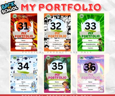
Prices are valid at publication and may change. Please refer to the product page for the latest price.
Your sticker selections should also align closely with your specific industry or creative field. For technical, corporate, or analytical professions, such as engineering, architecture, or finance, the visual language should favor structure, precision, and clean lines. In contrast, creative fields like graphic design, fashion, or editorial photography allow for more expressive elements, such as organic shapes, artistic illustrations, or unique textures. Understanding the visual conventions of your industry helps you tailor your portfolio’s cover to meet professional expectations while still standing out.
Balancing personal expression with formal presentation is the ultimate goal of portfolio customization. While it is tempting to showcase all your personal interests through colorful decals, a professional portfolio must remain focused on your work. Think of the cover as the introduction to a book; it should set the tone and build anticipation without giving everything away or distracting from the content inside. By choosing stickers that act as subtle accents rather than loud statements, you can express your unique style in a way that commands respect in any professional setting.
Recommended Sticker Materials and Finishes
Selecting the right sticker material is essential for ensuring that your portfolio looks polished and remains durable over time. Different portfolio covers—ranging from smooth plastics and matte laminates to textured book cloths and genuine leather—interact differently with sticker adhesives. Before purchasing any stickers, evaluate the surface texture of your portfolio cover to ensure a secure bond.

High-quality stickers should feature durable, non-peeling adhesives that lie completely flat without lifting at the corners. In warm, humid tropical climates, such as in the Philippines, low-grade adhesives can quickly degrade, causing stickers to curl, slide, or leave a sticky, dust-attracting residue. Prioritizing premium adhesives ensures your portfolio remains pristine during transport and frequent handling. Additionally, consider how different finishes react to various lighting conditions, as highly reflective surfaces can create distracting glare under harsh office lights.
Matte and Textured Paper Stickers
Matte and textured paper stickers, such as those crafted from premium washi paper or uncoated wood-free paper, offer a tactile, organic quality that blends beautifully with professional stationery. These stickers are particularly well-suited for uncoated paperboard covers, sketchbooks, and matte-laminated binders. Because they lack a plastic sheen, they absorb light rather than reflecting it, creating a sophisticated, integrated look that mimics custom printing.
When opting for paper-based stickers, it is important to verify their smudge resistance and ink stability, especially if your portfolio will be handled frequently by clients or reviewers. You can perform a simple test by rubbing a dry finger firmly across a sample sticker to check if the ink transfers or blurs. For portfolios that must endure heavy use, look for paper stickers printed with pigment-based inks or those featuring an ultra-thin, non-glossy protective seal that preserves the paper texture while safeguarding the print.
However, paper stickers have inherent limitations when exposed to humid environments. In tropical climates, uncoated paper fibers naturally absorb moisture from the air, which can lead to warping, bubbling, or edge curling over time. To mitigate this, ensure your portfolio is stored in a dry, well-ventilated space, or choose paper stickers that have been treated with a moisture-resistant matte coating to maintain their structural integrity.
Clear and Transparent Vinyl Decals
Clear and transparent vinyl decals are excellent for achieving a seamless, “printed-on” aesthetic. Unlike standard stickers that feature a white or colored border around the design, transparent decals allow the underlying color and texture of your portfolio cover to show through completely. This makes the graphic elements appear as if they were printed directly onto the binder, elevating the overall quality of the presentation.
This seamless look is highly effective on dark, patterned, or uniquely colored portfolio covers where a white sticker border would look jarring and unprofessional. When selecting transparent vinyl, it is crucial to verify the clarity of the adhesive. High-quality clear decals use optically clear adhesives that remain invisible, whereas lower-grade options can have a slightly cloudy or yellowish tint that becomes highly visible once applied to a dark surface.
Keep in mind that clear vinyl requires a very smooth, non-porous surface to adhere correctly. If your portfolio cover is made of highly textured book cloth, coarse canvas, or heavily grained leather, a transparent vinyl sticker may fail to create a complete seal. This can result in “silvering,” a phenomenon where tiny trapped air pockets make the transparent areas look shiny and uneven, detracting from the clean, professional look you want to achieve.
Subtle Metallic and Foil Accents
Metallic and foil stickers can introduce a premium, high-end feel to your portfolio when used with extreme restraint. The key to maintaining a professional look is to select muted, sophisticated tones such as brushed silver, matte gold, or rose gold. Avoid highly reflective, multi-colored holographic foils, which tend to look overly casual or distracting under professional lighting.
Use foil stickers strictly for structural or minimalist elements, such as thin border lines, elegant monograms, or small, precise focal points. Large, solid metallic stickers should be avoided, as they are highly susceptible to showing scratches, scuffs, and fingerprints. Over time, these minor damages can make your portfolio look worn and unpolished, especially if it is frequently slid into bags or stacked with other documents.
When incorporating metallic accents, ensure they complement the existing hardware of your portfolio binder. If your portfolio features brass rings, a gold zipper, or bronze corner protectors, matching those elements with warm gold or bronze foil stickers creates a cohesive, highly polished presentation. This attention to detail demonstrates a high level of design literacy and organizational care.
Styles and Themes to Enhance Visual Appeal
The visual style of your stickers should act as an extension of your professional identity, reinforcing the quality of the work contained within the portfolio. For technical, corporate, or analytical fields, geometric shapes, clean grids, and architectural lines work best. These structured elements convey organization, precision, and logical thinking, framing your work in a highly disciplined manner.
In creative, lifestyle, or design-oriented fields, minimalist botanical illustrations, abstract organic shapes, or soft watercolor washes can add a touch of warmth and artistic sensibility. These motifs should remain simple and stylized rather than overly detailed or busy, serving as a gentle frame for your creative output.
Typographic and monogram stickers offer an excellent way to personalize your portfolio cover without relying on illustrative graphics. A single, beautifully typeset letter of your initials or a clean, sans-serif label of your discipline can establish a strong visual identity right from the cover.
To maintain a cohesive look, stick to a strict color palette that matches or complements your portfolio’s contents. Limit your selection to two or three coordinating colors, such as warm neutrals, muted earth tones, or classic monochromatic shades. This ensures that the visual weight is distributed evenly and the stickers do not compete with your actual portfolio pieces.
Application and Placement Strategies
How you arrange your stickers is just as important as the designs you choose. Establishing a single, clear focal point—such as a centered monogram or a single, well-placed graphic on the lower right quadrant—creates an immediate visual hierarchy. Alternatively, you can use subtle corner accents to frame the cover, leaving the center clean and open.
Stickers can also serve functional purposes inside the portfolio. Use durable, matte tab stickers or folded index labels to mark different sections, case studies, or project types. This not only keeps your work organized but also demonstrates to prospective clients or employers that you possess strong attention to detail and organizational skills.
Before committing to a permanent placement, always test the sticker’s adhesive on an inconspicuous area of your portfolio, such as the inside back cover. This allows you to verify how the adhesive interacts with the cover material and whether it can be repositioned or removed without tearing the surface or leaving a sticky residue.
To achieve a balanced, deliberate layout, apply basic grid principles and symmetry. Use a ruler to measure the exact placement of your stickers, and lightly mark the spots with a pencil before peeling off the backing. Aligning your stickers with the physical edges of the portfolio binder ensures a clean, structured, and highly professional finish.
What to Avoid: Stickers That Undermine Professionalism
While customization is a great way to stand out, certain sticker choices can instantly undermine your professional credibility. Avoid high-gloss, cheap vinyl stickers. These materials reflect harsh overhead lights, creating a distracting glare, and they are highly prone to collecting unsightly fingerprints, smudges, and dust.
Steer clear of cartoonish illustrations, overly complex designs, meme-based graphics, or highly saturated, neon color schemes. While these styles are fun for personal journals or water bottles, they can distract from the serious nature of your professional work and may signal to a reviewer that you lack a sense of professional boundaries.
Prevent visual clutter by resisting the urge to cover every available square inch of your portfolio cover. A cluttered cover suggests a disorganized mind; leaving ample negative space shows confidence and allows your selected design elements to breathe.
Finally, recognize when your portfolio cover is already strong enough on its own. If you have a high-quality leather binder, a beautifully textured linen folder, or a cover with an elegant pre-embossed logo, adding stickers may actually cheapen the look. In these cases, limit your sticker customization to the interior dividers or skip them entirely to let the premium materials speak for themselves.
Frequently Asked Questions (FAQ)
Can I use washi tape instead of stickers for a professional portfolio?
Washi tape can be a highly effective alternative to traditional stickers, but it requires careful selection. Washi tape generally has a lighter visual weight and a semi-translucent quality compared to die-cut stickers, which can make it look softer and more integrated into paper surfaces. To maintain a professional look, avoid bright, whimsical patterns and instead opt for solid, muted colors or subtle, minimalist geometric patterns.
Rather than using washi tape purely for decoration, utilize it functionally within your portfolio. It is excellent for reinforcing the inner binding of paper folders, sealing the edges of mounted project sheets, or creating clean, uniform labels along the spine of your binder. This functional application ensures the tape looks purposeful and refined rather than casual.
How do I remove stickers without damaging my portfolio cover?
Removing stickers safely depends heavily on the material of your portfolio cover. Always check the manufacturer’s care instructions before applying any heat, moisture, or cleaning solvents to the surface. For sensitive materials like genuine leather, delicate book cloth, or coated paper, aggressive peeling can easily tear the fibers or strip away the protective finish.
To safely loosen the adhesive, use a gentle, low-heat method. Direct a hairdryer set to low heat toward the sticker for a few seconds to warm and soften the adhesive backing, then slowly peel the sticker back from one corner at an angle. If you notice any lifting, tearing, or discoloration of the cover material, stop the process immediately and consult a professional bookbinder or restoration specialist to avoid permanent damage.

Community discussion
Share your experience or ask a question. Comments are reviewed before publication.