
Sunflowers are a universal symbol of warmth, optimism, and loyalty, making them an incredibly popular motif for greeting cards. However, the visual style of a sunflower card—whether it features a delicate watercolor wash, a bold minimalist line drawing, or a dramatic gold-foiled pop-up—sets a specific tone that must align with your relationship with the recipient. Choosing the wrong style can lead to awkward misunderstandings, such as sending an overly romantic, dark-hued floral card to a corporate colleague, or a generic, flat-printed card to a long-term romantic partner. By understanding how design elements, paper textures, and message formats interact, you can select a card that perfectly conveys your sentiments while respecting the boundaries and expectations of your relationship.
Key Dimensions for Selecting a Sunflower Card
Before diving into specific artistic styles, it is essential to understand the physical and aesthetic variables that define a card’s overall quality and tone. The first major consideration is the paper stock and texture. Matte paper offers a classic, tactile feel that is highly receptive to handwritten notes, preventing ink from smudging. Glossy finishes make the yellow petals pop with vibrant intensity, but they require specific pens to avoid smearing. Recycled paper provides an earthy, organic texture that complements the rustic nature of sunflowers, though it may absorb ink more quickly, leading to slight feathering.
Size and format also play a critical role in how your message is received and delivered. A standard A6 card (105mm x 148mm) is highly versatile, fitting easily into standard mailing envelopes and offering just enough space for a concise, heartfelt note. Square formats present a modern, artistic aesthetic, though they often require specialized envelopes and can be more expensive to mail. For group gifts, such as an office departure or a large family gathering, oversized cards provide the necessary surface area for multiple signatures and short paragraphs without crowding the design.
Products mentioned in this guide
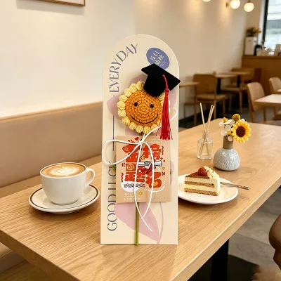
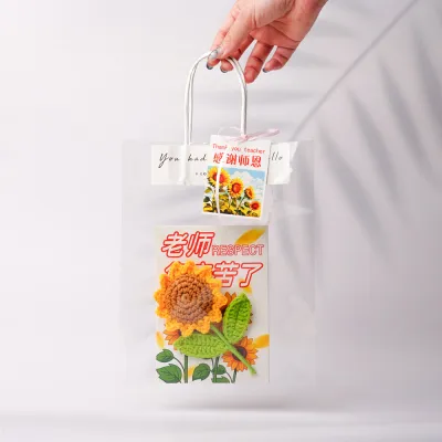
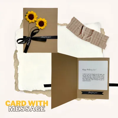
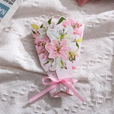
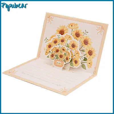
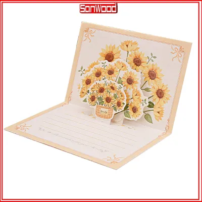
Prices are valid at publication and may change. Please refer to the product page for the latest price.
Finally, you must decide between pre-printed messages and blank interiors. Pre-printed sentiments offer convenience and a structured layout, which is helpful when you are short on words or writing to a casual acquaintance. Conversely, blank interiors demand more effort but allow for complete personalization. A blank card is almost always preferred for close friends, family members, and romantic partners, as it signals that you took the time to compose a unique, handwritten message specifically for them.
Casual and Minimalist Styles for Friends and Colleagues
For professional relationships, such as coworkers, managers, or business clients, the design of a sunflower card should remain clean, modern, and understated. Minimalist line art—featuring simple black ink outlines of sunflowers on a crisp white or cream background—strikes the perfect balance between thoughtful and professional. A single-stem illustration avoids the visual clutter of a full bouquet, keeping the card’s tone polite, respectful, and free of unintended emotional weight. This style shows appreciation without crossing professional boundaries.

When writing to close friends, you can transition to more playful and vibrant designs. Bright watercolor patterns with loose, expressive brushstrokes capture the joyful, energetic nature of friendship. These designs often pair beautifully with lighthearted or humorous typography on the cover, such as witty puns about sunshine or growing older. The key is to keep the mood celebratory and casual, reflecting shared jokes and informal bonds rather than formal sentimentality.
In both platonic and professional contexts, it is crucial to avoid design elements that carry romantic or deeply emotional connotations. Steer clear of heavy embellishments, deep red or pink secondary accents, and overly poetic pre-printed phrases. A card for a colleague should focus on appreciation, congratulations, or encouragement, utilizing clean layouts and bright, cheerful yellows that inspire positivity. Keeping the design simple ensures the card remains a delightful, uncomplicated gesture.
Warm and Traditional Designs for Family Members
Gifts for family members—such as parents, grandparents, aunts, and uncles—often call for designs that evoke warmth, nostalgia, and deep-seated respect. Classic oil painting reproductions or highly detailed, realistic watercolor illustrations of sunflowers are excellent choices. These traditional art styles carry a timeless, heirloom-like quality that shows you took the time to select something substantial and artistic, rather than a quick, disposable card from a convenience store.
To enhance this sense of warmth, look for cards that incorporate rich, nature-centric motifs. Sunflowers depicted in a lush garden setting, arranged in rustic woven baskets, or framed by vintage wooden borders resonate deeply with family themes of growth, roots, and home. These elements ground the design, making it feel cozy and familiar, which is particularly comforting for older relatives who appreciate traditional aesthetics and classic imagery.
Family milestones often inspire longer, more reflective messages that span generations. To accommodate these heartfelt letters, prioritize larger card formats, such as A5 or custom folding cards. Ensure the card comes with a high-quality, heavy-duty protective envelope. A sturdy envelope not only protects your writing from the high humidity typical of tropical climates like the Philippines but also ensures the card remains pristine if it is passed around during a family gathering or stored in a keepsake box for years to come.
Elegant and Expressive Cards for Romantic Partners
When selecting a sunflower card for a spouse or romantic partner, the design should feel premium, intimate, and distinctly elevated. Standard flat-printed cards can sometimes feel too casual for a significant other. Instead, look for cards featuring luxurious finishes like gold foil stamping along the edges of the petals, embossed textures that raise the sunflower design off the paper, or subtle glitter accents that catch the light. These tactile details transform the card from a simple greeting into a cherished keepsake.
For a truly memorable presentation, consider interactive or three-dimensional formats. Pop-up sunflower cards unfold into intricate, 3D paper sculptures when opened, creating an instant visual impact. These structural designs serve as beautiful display pieces that your partner can keep on their desk or bedside table, serving as a constant, physical reminder of your affection long after the occasion has passed.
The color palette also plays a vital role in establishing a romantic tone. While traditional sunflower cards use bright white or sky-blue backgrounds, romantic variations often utilize deep, rich, and sophisticated contrast. Sunflowers set against a background of dark navy blue, charcoal gray, or deep emerald green create a dramatic, moody aesthetic. This high-contrast look highlights the golden yellow of the petals while adding an air of elegance, mystery, and passion that is perfect for anniversaries, Valentine’s Day, or intimate milestones.
Comparing Sunflower Card Styles by Recipient
To help you quickly navigate your options, the table below summarizes how different design attributes align with specific recipient types. Use this matrix to filter your choices when browsing online stationery boutiques or local craft stores.
| Recipient Type | Recommended Style | Ideal Finish/Texture | Message Tone |
|---|---|---|---|
| Colleague | Minimalist line art, single-stem | Smooth matte, clean edges | Professional, appreciative, polite |
| Close Friend | Playful watercolor, bright patterns | Recycled or textured paper | Casual, cheerful, humorous |
| Family Member | Classic oil painting, rustic motifs | Heavy cardstock, linen texture | Warm, nostalgic, respectful |
| Romantic Partner | High-contrast, 3D pop-up, gold foil | Embossed, metallic accents | Intimate, elegant, deeply personal |
When using this table to guide your purchase, prioritize the features that match your primary goal. For instance, if you are buying a card for a coworker’s promotion, look for smooth matte finishes and minimalist designs. If you are celebrating a wedding anniversary, focus on finding cards with metallic foil or intricate pop-up structures that elevate the presentation.
Practical Checks Before Buying Sunflower Cards Online
Purchasing stationery online in the Philippines requires a few practical verifications to ensure the physical product matches the digital listing. First, always check the paper weight, which is measured in grams per square meter (GSM). A high-quality greeting card should ideally be printed on paper that is at least 250 GSM to 300 GSM. Anything lighter than 200 GSM may feel flimsy, cheap, and prone to tearing, while also being highly susceptible to warping in humid tropical environments.
Second, pay close attention to user reviews regarding color accuracy. Digital screens use RGB color profiles, which can make yellow and gold hues appear much brighter or more neon than they actually are in print. Look for customer-uploaded photos in the review section to verify that the sunflower’s yellow is a warm, natural golden hue rather than a washed-out mustard or an overly bright lemon yellow.
Finally, consider the shipping and packaging methods of the online seller. Because paper is highly vulnerable to moisture and physical bending, ensure the seller packages the cards with stiff cardboard backings or inside bubble mailers. This is especially critical during the rainy season in the Philippines, where high humidity and sudden downpours can easily ruin unprotected paper products during transit. Checking these details beforehand saves you the disappointment of receiving a creased, damp, or bent card.
Frequently Asked Questions (FAQ)
Can I use a sunflower card for a sympathy or get-well message?
Yes, sunflower cards can be highly appropriate for sympathy, get-well, or supportive messages, provided the design is chosen carefully. Sunflowers naturally symbolize loyalty, warmth, and enduring positivity, which can offer comfort during difficult times. However, you must avoid overly cheerful, neon, or humorous designs. Instead, opt for muted color palettes, such as soft watercolor washes or sketch-style illustrations on cream-colored paper. Ensure the typography is simple and respectful, and avoid cards with pre-printed celebratory text so you can write a gentle, personalized message of comfort.
What pen types work best on different sunflower card papers?
The best pen depends entirely on the card’s paper finish. For glossy or coated cardstock, use quick-drying gel pens, fine liners, or permanent felt-tip markers to prevent the ink from smudging on the non-porous surface. For matte, uncoated, or recycled paper, you have more flexibility; standard ballpoint pens and fountain pens work beautifully here, as the fibers absorb the ink quickly. However, because paper absorption rates vary, always perform a quick smudge test on a small, hidden area—such as the back of the card or the inside fold—before writing your main message to ensure the ink does not bleed through or smear.

Community discussion
Share your experience or ask a question. Comments are reviewed before publication.